Making Realistic Water Bubbles in Photoshop with the Liquefy Filter

Making Realistic Water Bubbles in Photoshop with the Liquefy Filter

Every water composite I did in my first two years of freelancing had the same problem, and I couldn’t figure out why they looked fake. The lighting was fine. The color grading was decent. But the bubbles – oh, the bubbles. Perfect little circles, every single one of them, floating around like clip art from a 2003 PowerPoint presentation. Turns out, that’s exactly what was wrong. Real bubbles in turbulent water are not spherical.

The 3-Minute Thumbnail Cutout That Actually Looks Professional (Thanks, Aaron Nace)

The 3-Minute Thumbnail Cutout That Actually Looks Professional (Thanks, Aaron Nace)

Thumbnails are one of those things I kept treating as an afterthought, right up until a client pointed out that my gorgeous composite was getting zero clicks because the preview image looked like a potato. Lesson learned. Since then I’ve been obsessive about figuring out the fastest, cleanest way to cut a subject out and make them pop against a background, which is exactly the problem this technique solves. In this Aaron Nace (PHLEARN) tutorial, he walks through a workflow that takes maybe three minutes once you’ve done it twice, and the results look polished enough that people assume you spent much longer on it.

How to Fake a Graduated Sky Filter in Photoshop (Without Touching a Single Slider)

How to Fake a Graduated Sky Filter in Photoshop (Without Touching a Single Slider)

There’s a specific kind of frustration that hits when you’ve got a genuinely great shot — good composition, interesting foreground, strong light — and the sky is just… beige. Flat, washed-out, completely uninspiring. You know the image has something, but the sky is dragging it down. I’ve been there more times than I’d like to admit, and my usual instinct was to reach for Hue/Saturation or start messing with Curves until something looked vaguely better.

How to Actually Separate a Subject from a Busy Background (Without Losing Your Mind)

How to Actually Separate a Subject from a Busy Background (Without Losing Your Mind)

There’s a specific kind of job that used to make me quietly dread opening my inbox. A parent, a friend, someone’s aunt, sends you a candid photo of a kid with a genuinely great expression, and the background is just… a gray wall of visual noise. The subject is good. The light is okay. But nothing separates the person from everything behind them, and the whole thing reads as flat. I used to either spend way too long on it or hand it back with minimal changes and feel vaguely embarrassed about it.

Build a Book Cover Template That Updates Across Every Mockup Automatically

Build a Book Cover Template That Updates Across Every Mockup Automatically

Here’s a workflow problem I used to solve the dumbest way possible. Client wants to see their book cover design on three different book mockups. Old me would place the design manually on each mockup, flatten everything, then realize I wanted to tweak the title font, and start the whole process over from scratch. Three times. I did this for longer than I’m willing to admit before someone pointed me toward smart objects and linked files.

How to Fake 3D Text in Photoshop Without Touching a Single AI Button

How to Fake 3D Text in Photoshop Without Touching a Single AI Button

Every few months I stumble across a technique that makes me feel like I’ve been doing things the hard way for no reason. This was one of those moments. I was working on a poster comp where the client wanted text that felt like it was physically wrapped around the subject, that kind of old-school carnival or vintage sports graphic energy. My first instinct was to reach for something complicated. Maybe export to a 3D program, maybe mess around with displacement maps, maybe just charge the client more and hope they forgot about it.

How to Fake Graffiti on Any Surface in Photoshop (Without It Looking Fake)

How to Fake Graffiti on Any Surface in Photoshop (Without It Looking Fake)

There’s a specific kind of client request that used to make me sweat: “Can you put some text/logo/graphic on that surface?” Not floating beside it. Not stamped on flat. Actually on it, following the curves, matching the lighting, looking like it was always there. Early in my freelance life I’d just nudge the layer around until it looked “close enough” and hope nobody zoomed in. Spoiler: clients zoom in. This technique is the proper answer to that problem.

Steal the Highlights: How to Build a Cinematic Vintage Glow in Photoshop From Scratch

Steal the Highlights: How to Build a Cinematic Vintage Glow in Photoshop From Scratch

There’s a particular flavor of client request that shows up in my inbox every few weeks: “Can you make it look more… cinematic? Like old film?” And for a long time, I’d reach for the same handful of tired presets, cross my fingers, and deliver something that looked okay but felt hollow. Presets are fast, sure, but you’re basically just renting someone else’s creative decisions. The moment a client asks you to tweak it, you’re stuck staring at sliders you don’t fully understand.

Stop Cropping Your Photos to Fit — Use These Photoshop Tricks Instead

Stop Cropping Your Photos to Fit — Use These Photoshop Tricks Instead

Every working photographer or designer hits this wall eventually. You’ve got a great shot, you need it to fill an 11x14 print (or a photo book spread, or a square social tile), and the aspect ratio just doesn’t cooperate. Your options feel like a bad multiple-choice question: crop out the part of the image you actually care about, or live with white bars on the sides like you’re watching a DVD on a 2003 flatscreen.

Curves vs. Levels in Photoshop: Which One Should You Actually Be Using?

Curves vs. Levels in Photoshop: Which One Should You Actually Be Using?

For years I used Levels for everything. Exposure fix? Levels. Quick color correction? Levels. Basically anything that required me to not completely ruin a client’s photo? Levels. It felt safe. Predictable. And I won’t lie, part of the reason I avoided Curves was that the interface looked like something out of a seismograph reading and I had no idea what I was supposed to do with it. Then I watched this Aaron Nace tutorial from PHLEARN and it genuinely reframed how I think about both tools.

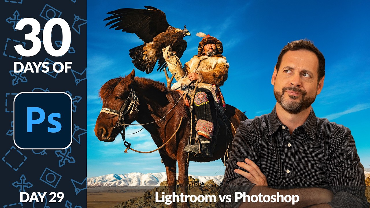
Lightroom First, Photoshop Second: Why Your Edit Order Is Wrecking Your Photos

Lightroom First, Photoshop Second: Why Your Edit Order Is Wrecking Your Photos

There’s a version of me from a few years ago who would open every photo straight in Photoshop. Raw file, JPEG, screenshot of a meme — didn’t matter. Photoshop was the big tool, so obviously that’s where the real work happened, right? Wrong. It took embarrassingly long for me to figure out that jumping past Lightroom (or Camera Raw) wasn’t a power move. It was leaving quality on the table before I’d even started.

Building Rain From Scratch in Photoshop: What I Learned From Aaron Nace's Motorcycle Edit

Building Rain From Scratch in Photoshop: What I Learned From Aaron Nace's Motorcycle Edit

There’s a specific kind of frustration that comes from spending an afternoon on a composite that still looks fake, and you can’t quite put your finger on why. For me, it’s usually the atmosphere. The subject is sharp, the lighting is close enough, but the scene feels like a cutout dropped onto a background. Rain, when it’s done right, is one of the fastest ways to sell a scene as real.