Adobe Just Put Photoshop Inside Slack—And It Actually Might Save Your Life

Adobe Just Put Photoshop Inside Slack—And It Actually Might Save Your Life

Your Slack Workspace Just Became a Creative Studio I’ll be honest—when I first heard Adobe was throwing a bunch of creative tools into Slack, my initial reaction was something like “cool, but why?” Then I actually thought about it, and now I’m convinced this is either going to revolutionize how creative teams work or become the most ignored feature in Slack history. There’s really no middle ground here. Here’s the deal: Adobe just packed over 70 tools from Photoshop, Illustrator, Premiere Pro, and their other creative apps directly into Slack.
Levels vs. Curves in Photoshop: When to Use Each (And Why You've Probably Been Guessing)

Levels vs. Curves in Photoshop: When to Use Each (And Why You've Probably Been Guessing)

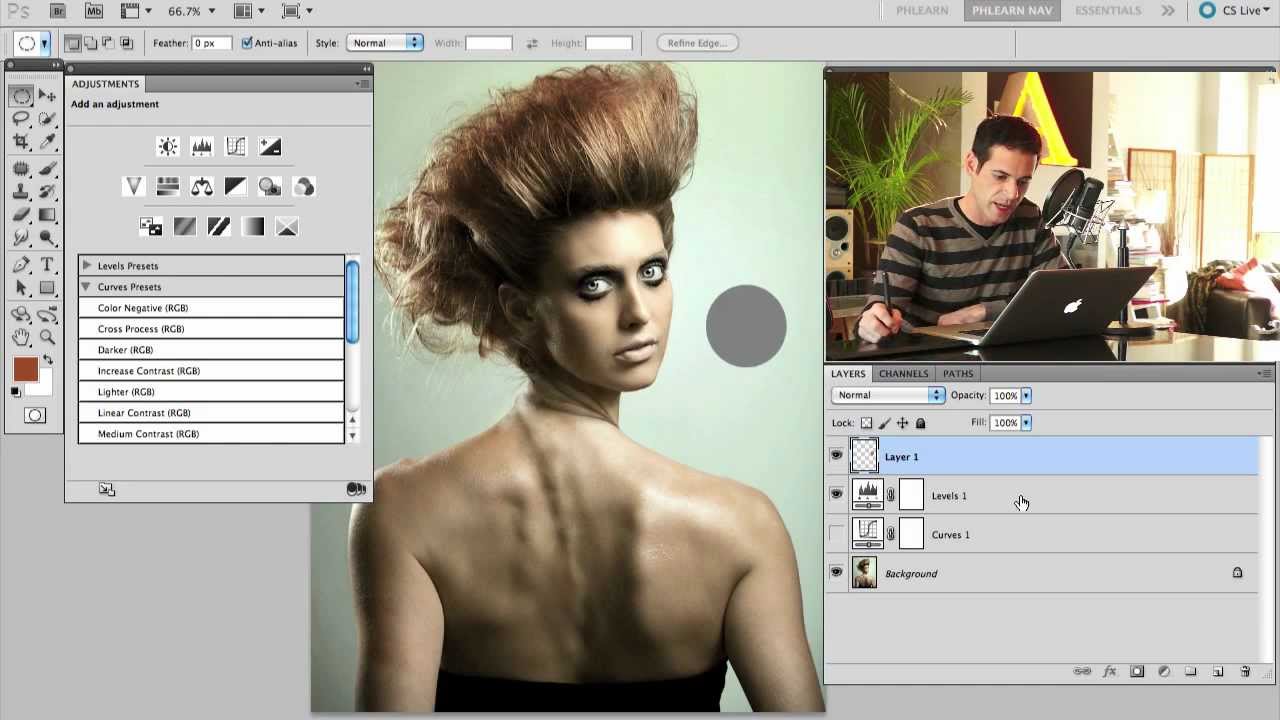
For an embarrassingly long time, I picked between Levels and Curves the same way I pick a parking spot — just grabbed whatever felt right and hoped for the best. Both tools live in the same neighborhood, both mess with tonal values, and neither one comes with a sign that says “use me for THIS.” So I’d open Curves when I felt fancy, open Levels when I felt lazy, and pretend I had a system.

How to Fake a VSCO Film Look in Photoshop Without Actually Using VSCO

How to Fake a VSCO Film Look in Photoshop Without Actually Using VSCO

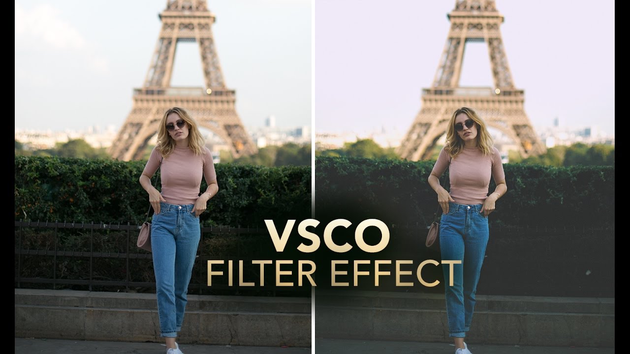
Client work has a funny way of humbling you. I spent the better part of an afternoon once trying to reverse-engineer that warm, slightly faded, film-ish look that’s all over Instagram and Lightroom preset packs, and I kept overshooting it. Everything either looked like a sepia disaster from a 2008 photo booth or a blown-out mess with a yellow tint that made the subject look unwell. The problem wasn’t my eye for color.

Rough, Fast, and Good Enough: How to Composite in Photoshop Without Losing Your Mind

Rough, Fast, and Good Enough: How to Composite in Photoshop Without Losing Your Mind

A few years back, I spent three full days on a composite. Three days of careful pen tool paths, obsessive masking, color matching that made my eyes water. A friend looked at it, nodded, then sat down and knocked out something that looked equally convincing in about twenty minutes using a workflow I’d never even considered. I wanted to flip my desk. Instead, I went home, opened YouTube, and started paying closer attention to how people who actually move fast think about this stuff.

Blend Two Exposures Into One Perfect Landscape Shot (No Filters Required)

Blend Two Exposures Into One Perfect Landscape Shot (No Filters Required)

I’m a freelance designer who mostly lives in the land of composites, logos, and whatever a client needs done by Thursday. But landscape photography editing crosses my desk more than you’d think, and the number one problem people bring me is the same every time: the sky looks great but the foreground is a muddy mess, or vice versa. Graduated ND filters solve this in the field, but what happens when you’re halfway up a hill and you left your filters in the car?

Painting Away Beards in Photoshop: The Manual Method That Actually Works

Painting Away Beards in Photoshop: The Manual Method That Actually Works

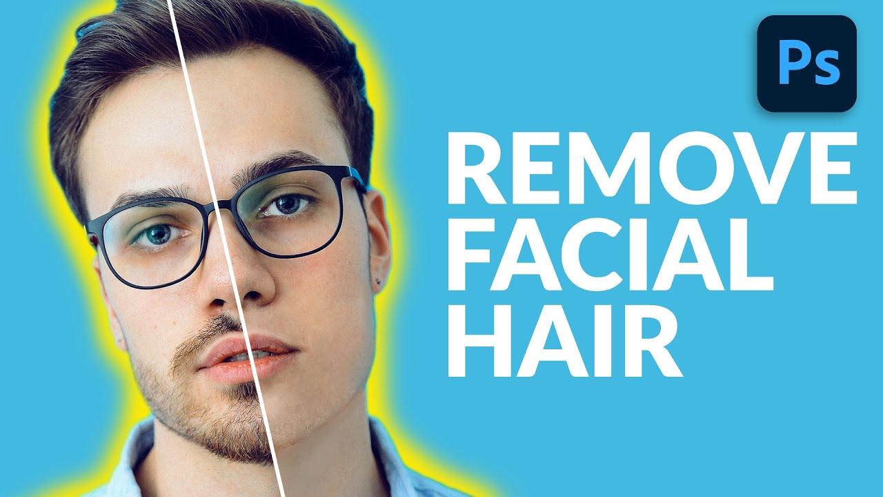
Retouching facial hair is one of those jobs that sounds simple until you’re forty-five minutes deep and your subject looks like they lost a fight with a rubber eraser. I’ve had clients send me portraits where the brief is something like “can you just clean him up a bit” - and that phrase, “clean him up,” almost always means removing a beard, a patch of stubble, or some combination of both.

Stop Faking Glow Effects: Here's How to Build a Real Cinematic Light Bloom in Photoshop

Stop Faking Glow Effects: Here's How to Build a Real Cinematic Light Bloom in Photoshop

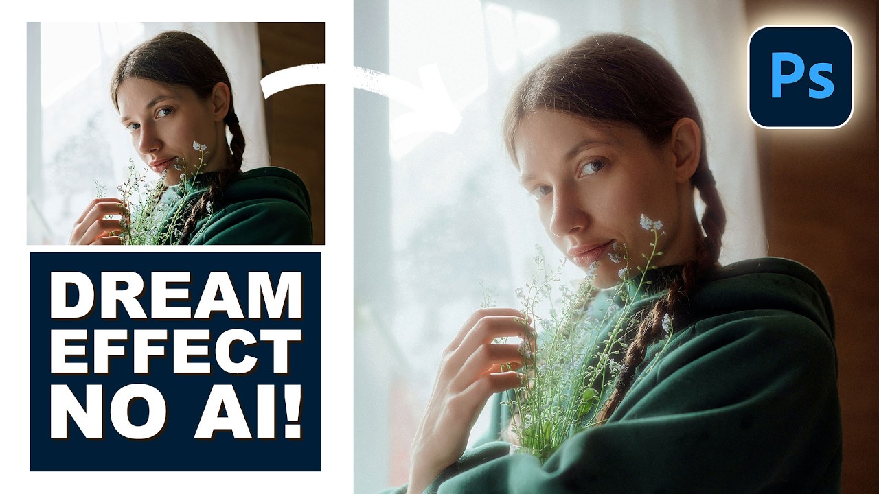
There’s a specific flavor of photo edit that I used to spend embarrassing amounts of time chasing. You’ve seen it. That soft, warm, almost-overexposed bloom around highlights that makes a photo look like it was shot on film that’s slightly too happy about itself. I kept trying to fake it by cranking up a Gaussian blur on a duplicated layer and hoping for the best. The result was always the same: muddy, flat, and sad.

Adobe Broke Save As and Here's How to Get It Back

Adobe Broke Save As and Here's How to Get It Back

If you’ve been using Photoshop long enough to have a muscle memory for certain workflows, you know how disorienting it is when Adobe quietly reshuffles something fundamental. A few weeks back, that’s exactly what happened with Save As, and the fallout was loud. Adobe changed how saving copies of files works, and if you were the kind of person who opened a RAW file, made some edits, and hit Save As to kick out a JPEG, you suddenly found yourself staring at a dialog box that seemed to be missing half its options.

Fake Fire That Actually Looks Real: A Photoshop Compositing Trick Worth Stealing

Fake Fire That Actually Looks Real: A Photoshop Compositing Trick Worth Stealing

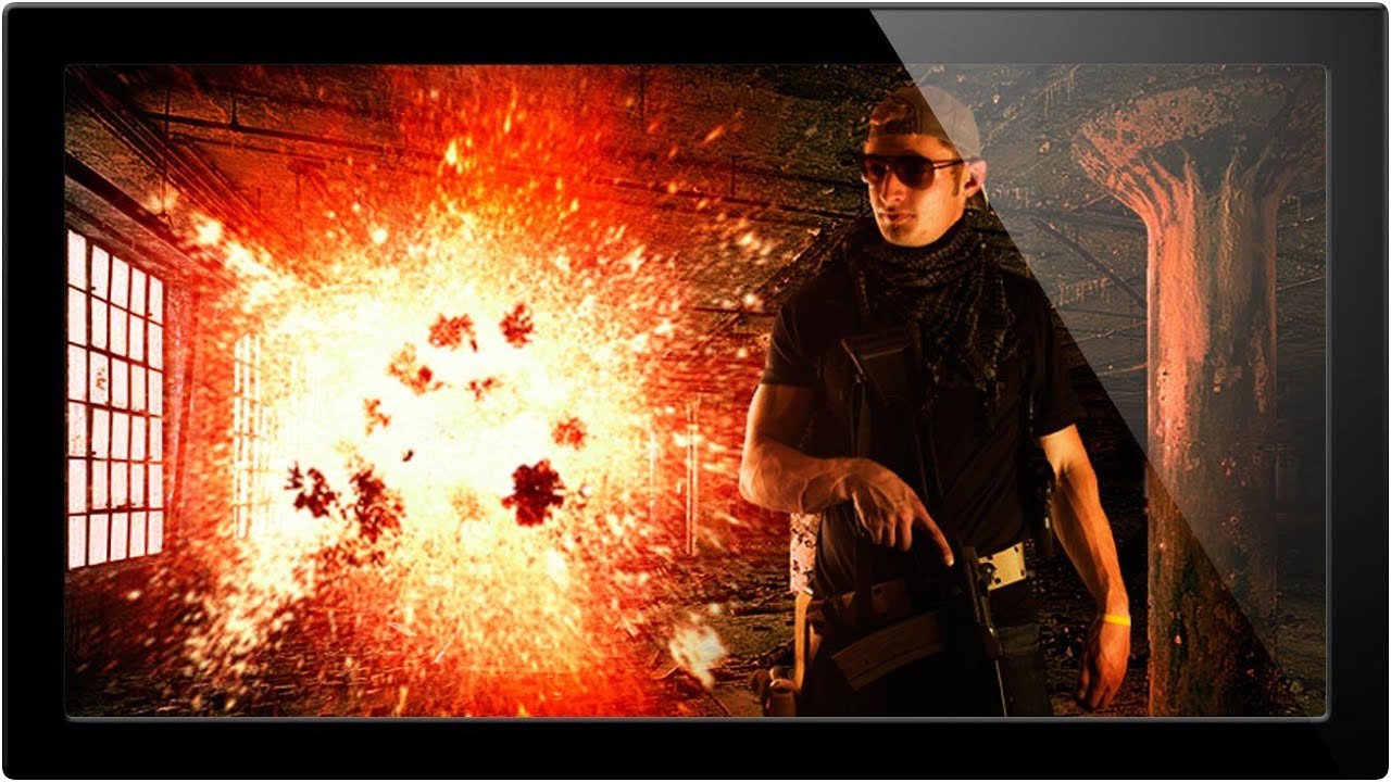
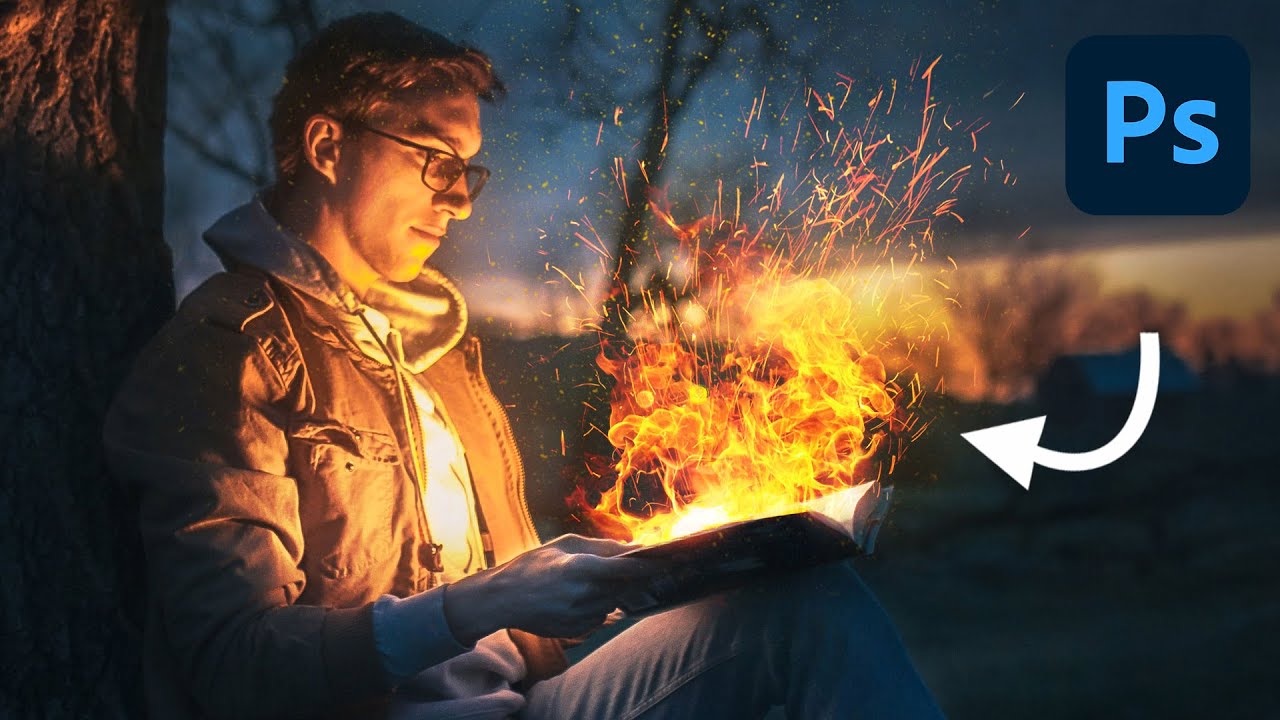
I’ve spent embarrassing amounts of time trying to manufacture drama in composite images. Explosions, sparks, light leaks — you name it, I’ve probably botched it. Fire especially has this reputation for being one of those effects that either looks jaw-dropping or immediately screams “I found a free brush pack on DeviantArt.” So when I stumbled on this Aaron Nace (PHLEARN) tutorial on creating realistic fire in Photoshop, I fully expected another overcomplicated mess of filters and adjustment layers.

How to Edit a Fall Landscape Like You Actually Know What You're Doing (A Lightroom + Photoshop Breakdown)

How to Edit a Fall Landscape Like You Actually Know What You're Doing (A Lightroom + Photoshop Breakdown)

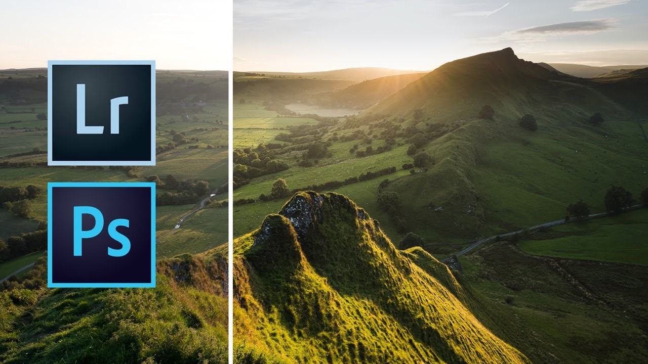
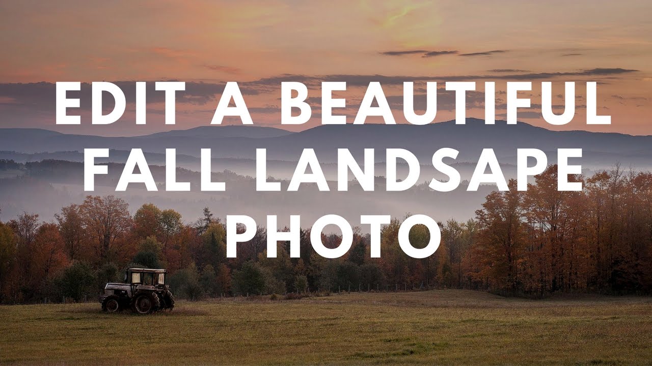
Fall photos are deceptively tricky. You’d think all that warm color does half the work for you, but if you’ve ever pulled a raw file of autumn foliage into Lightroom and just stared at it like it owes you money, you know exactly what I’m talking about. The sky is blown out, the shadows are muddy, and the colors look more “dying hospital plant” than “peak New England October.” I’ve been there more times than I’d like to admit.

Steal This Trick: How to Slap Textures onto Photos and Logos Without Making a Mess

Steal This Trick: How to Slap Textures onto Photos and Logos Without Making a Mess

Client work has a funny way of humbling you. I can’t count the number of times someone has handed me a logo or a portrait and said “make it feel more… gritty? Vintage? Lived-in?” and I’ve sat there staring at a flat layer like it owes me money. Adding texture sounds simple until you’re actually doing it and everything either looks like you rubbed sandpaper on a JPEG or the effect is so subtle it may as well not exist.

Stop Making Boring Type Layouts: A Guide to Photoshop's Dynamic Text Feature

Stop Making Boring Type Layouts: A Guide to Photoshop's Dynamic Text Feature

There’s a specific kind of embarrassment that comes from spending forty minutes manually nudging text layers around a composition, only to realize the alignment is still slightly off and you have no clean way to fix it. I’ve been there more times than I’d like to admit. Typography in Photoshop has always been capable of more than most people use it for, but the workflow for getting polished, multi-style type into a layout used to involve enough friction that you’d sometimes just settle for “good enough.