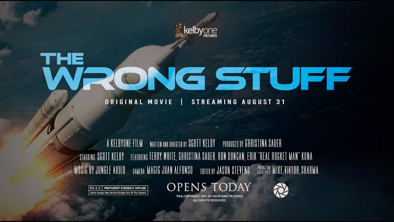
There’s a certain kind of tutorial that doesn’t look like a tutorial at all. It looks like a bit. A joke. A fully produced comedy sketch where someone is pitching a plan to be the first Photoshop guy in space. And then halfway through you realize you’ve been absorbing actual design workflow the whole time. That’s exactly what happened when I sat down with this KelbyOne Photoshop World 2021 promo, and I’m still a little annoyed it worked that well on me.
Watch the full tutorial on YouTube
What the video is, structurally, is a fake movie trailer built around a space mission concept. What it actually demonstrates is how you approach a themed design project from concept through execution: naming conventions, shape building, iterative feedback, and media packaging. If you’ve ever had a client who wanted something that felt “cinematic” without being able to tell you what that means, this video is a useful model to study. I’ve been doing freelance design work long enough to know that the brief is almost never the whole story. The brief here is “go to space,” and watching how the team negotiates that into something buildable is genuinely instructive.
Step 1: Start with the Concept Before You Touch Photoshop
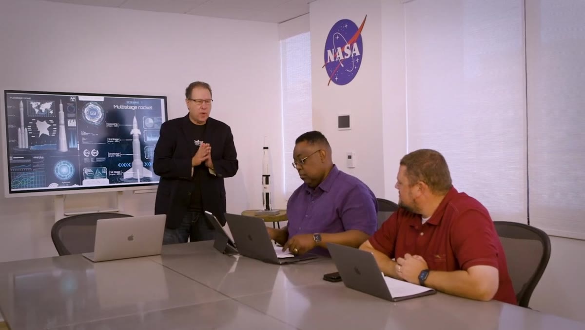 Scott pitching the space mission idea to his team
The video opens with a pitch meeting, not a blank canvas, and that’s deliberate. Before any tool gets launched, there’s a conversation about what the thing actually is. In this case: a custom spacecraft, a Texas launch site, a specific mission profile (going to the edge of space and turning around, which becomes a whole comedic bit about virality). The point is that the creative constraints come first. If you’re building a movie trailer comp or any themed composite, the strongest thing you can do is write out the concept in a few sentences before you open a single panel. What’s the tone? What does the audience need to believe? What are the non-negotiables?
Scott pitching the space mission idea to his team
The video opens with a pitch meeting, not a blank canvas, and that’s deliberate. Before any tool gets launched, there’s a conversation about what the thing actually is. In this case: a custom spacecraft, a Texas launch site, a specific mission profile (going to the edge of space and turning around, which becomes a whole comedic bit about virality). The point is that the creative constraints come first. If you’re building a movie trailer comp or any themed composite, the strongest thing you can do is write out the concept in a few sentences before you open a single panel. What’s the tone? What does the audience need to believe? What are the non-negotiables?
Step 2: Build Your Hero Shape with Basic Geometry
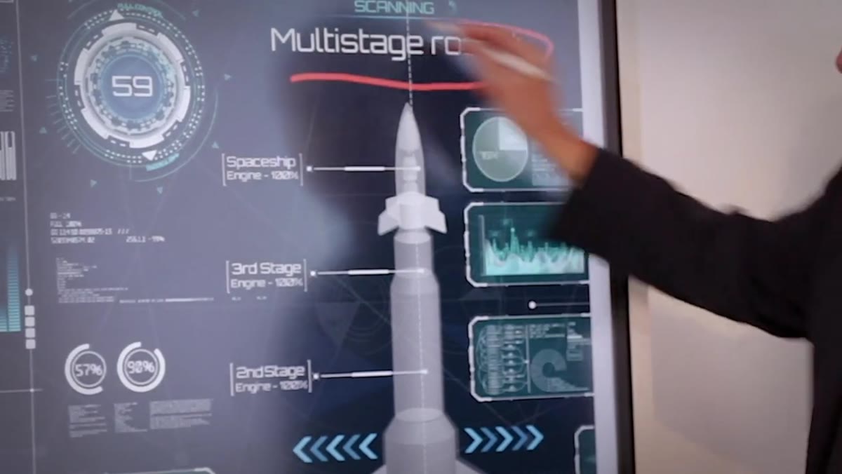 Beginning rocket design with a cylinder shape in Photoshop
When the actual design work starts, the rocket gets built from a simple cylinder. Straight up and down, nothing fancy. This is a good reminder that complex composites almost always start with primitive shapes that you refine through feedback. In Photoshop, you’d reach for the Rectangle Tool or Ellipse Tool here, draw your basic form, then use Free Transform to stretch and position it. Work with Shape Layers rather than rasterizing immediately. You want the flexibility to resize without degrading the edge quality, especially if this is going into a high-resolution poster or trailer title card.
Beginning rocket design with a cylinder shape in Photoshop
When the actual design work starts, the rocket gets built from a simple cylinder. Straight up and down, nothing fancy. This is a good reminder that complex composites almost always start with primitive shapes that you refine through feedback. In Photoshop, you’d reach for the Rectangle Tool or Ellipse Tool here, draw your basic form, then use Free Transform to stretch and position it. Work with Shape Layers rather than rasterizing immediately. You want the flexibility to resize without degrading the edge quality, especially if this is going into a high-resolution poster or trailer title card.
Step 3: Iterate on the Design Based on Client Feedback
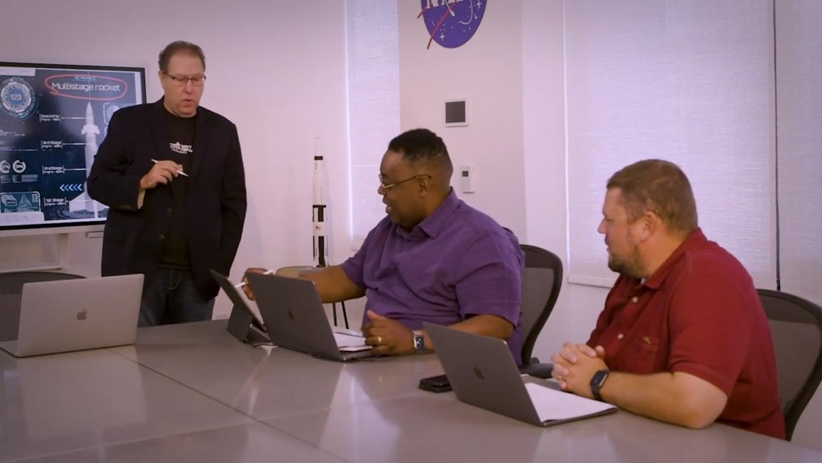 Rocket design getting revised after the initial concept is rejected
The first version of the rocket gets shot down. Literally, someone says no. So it gets revised. The capsule gets reworked, a couple of wing shapes get added to the external fuel tanks, and everyone agrees on the result. This back-and-forth is the actual design process, and the video doesn’t skip it or smooth it over. In Photoshop terms, this is where keeping everything on separate named layers saves you. If the capsule shape lives on its own layer, you can adjust it independently without blowing up the rest of the composition. Use groups for major components (capsule, body, tanks, fins) and label them from the start. Future you will not hate present you.
Rocket design getting revised after the initial concept is rejected
The first version of the rocket gets shot down. Literally, someone says no. So it gets revised. The capsule gets reworked, a couple of wing shapes get added to the external fuel tanks, and everyone agrees on the result. This back-and-forth is the actual design process, and the video doesn’t skip it or smooth it over. In Photoshop terms, this is where keeping everything on separate named layers saves you. If the capsule shape lives on its own layer, you can adjust it independently without blowing up the rest of the composition. Use groups for major components (capsule, body, tanks, fins) and label them from the start. Future you will not hate present you.
Step 4: Name Your Project Elements Like They Matter
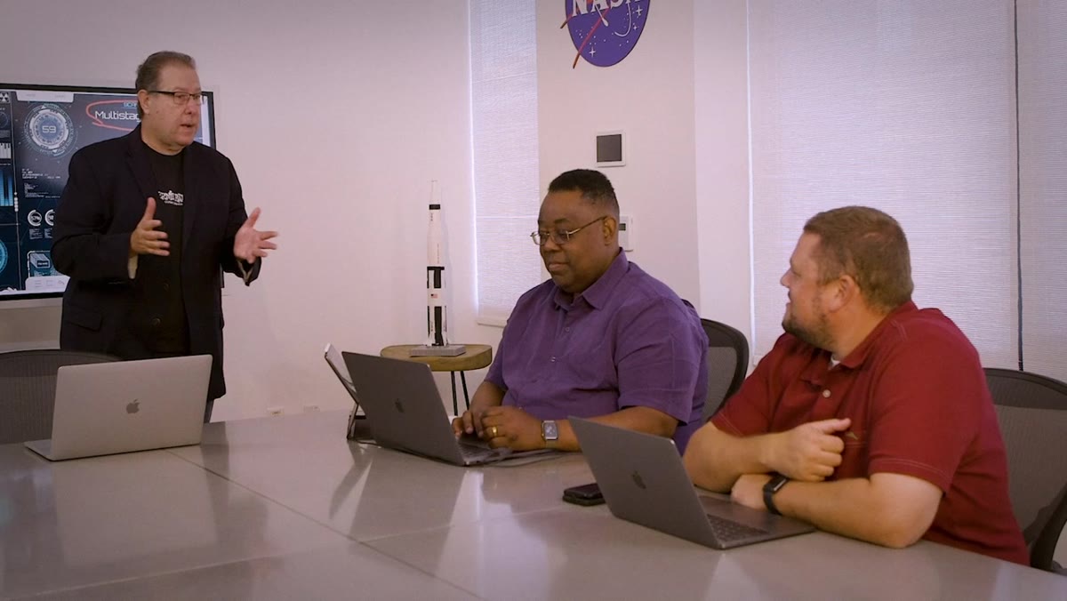 Team brainstorming names for the spacecraft capsule
There’s a sequence in the video where the team tries to name the capsule, and they run through a list of Photoshop filter names as candidates: Vanishing Point, Gaussian, Liquify, Unsharp Mask. It’s played for laughs, but the underlying idea is real. Naming things within a themed project creates coherence. When your layer names, file names, and exported assets all share a vocabulary, the project feels intentional. They land on “Layer One,” which is funny and also a dig at every Photoshop file that ever shipped with layers named “Layer 1 copy 3.” Name your layers. Every single one. Yes, even that one.
Team brainstorming names for the spacecraft capsule
There’s a sequence in the video where the team tries to name the capsule, and they run through a list of Photoshop filter names as candidates: Vanishing Point, Gaussian, Liquify, Unsharp Mask. It’s played for laughs, but the underlying idea is real. Naming things within a themed project creates coherence. When your layer names, file names, and exported assets all share a vocabulary, the project feels intentional. They land on “Layer One,” which is funny and also a dig at every Photoshop file that ever shipped with layers named “Layer 1 copy 3.” Name your layers. Every single one. Yes, even that one.
Step 5: Package the Concept for Media and Presentation
 Fake news broadcast presenting the space mission to the public
The back half of the video shifts into a fake news broadcast, complete with a lower-third graphic and a news anchor delivering mission details. This is the packaging layer of the project. In a real movie trailer design workflow, this is where you think about how the assets will be used: social graphics, press release mockups, broadcast-style title treatments. In Photoshop, this means creating separate artboards or comped-out layouts for each use case. A title card that works on a poster won’t automatically work as a thumbnail. Build the presentation materials as part of the project scope, not as an afterthought.
Fake news broadcast presenting the space mission to the public
The back half of the video shifts into a fake news broadcast, complete with a lower-third graphic and a news anchor delivering mission details. This is the packaging layer of the project. In a real movie trailer design workflow, this is where you think about how the assets will be used: social graphics, press release mockups, broadcast-style title treatments. In Photoshop, this means creating separate artboards or comped-out layouts for each use case. A title card that works on a poster won’t automatically work as a thumbnail. Build the presentation materials as part of the project scope, not as an afterthought.
Step 6: Let the Budget Reality Check Shape the Final Concept
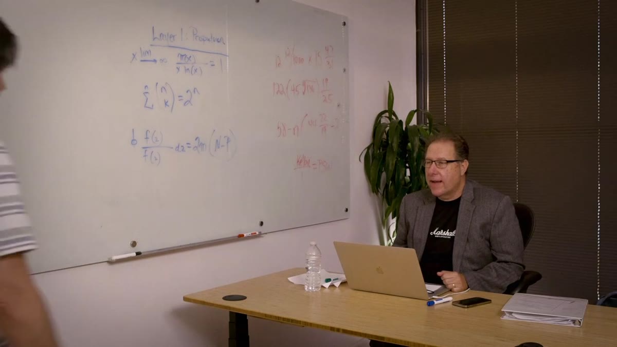 Accounting arrives to discuss the cost reality of the mission
Near the end, someone from accounting shows up to point out that rockets are expensive. This isn’t just a punchline. It’s a real design constraint dressed up as comedy. Budget conversations change the shape of what you build. In practical Photoshop terms, this is where you decide whether you’re building everything from scratch or working smarter with stock assets, pre-built mockups, or reusable smart objects. There is absolutely no shame in dropping a well-chosen stock image into a composite if it serves the concept. Knowing where to spend your hours and where to shortcut is a skill, not a cheat.
Accounting arrives to discuss the cost reality of the mission
Near the end, someone from accounting shows up to point out that rockets are expensive. This isn’t just a punchline. It’s a real design constraint dressed up as comedy. Budget conversations change the shape of what you build. In practical Photoshop terms, this is where you decide whether you’re building everything from scratch or working smarter with stock assets, pre-built mockups, or reusable smart objects. There is absolutely no shame in dropping a well-chosen stock image into a composite if it serves the concept. Knowing where to spend your hours and where to shortcut is a skill, not a cheat.
What I’d Add: Build the “Wrong” Version First
Every project has a version that goes sideways before it goes right. The rocket in this video goes through a rejected iteration before landing on the final design. I’ve started doing this deliberately now: building a version I’m pretty sure won’t work, presenting it to myself (or a trusted contact), and using the rejection to clarify what I actually want. It sounds like a waste of time. It isn’t. The wrong version teaches you things about the project that the brief never will. I spent three days on a composite once that a friend later rebuilt in twenty minutes using a technique I’d never seen. The difference wasn’t talent. It was that he’d already failed at it a different way before I’d even started.
The real takeaway from this KelbyOne video is that a strong creative concept and a clean Photoshop workflow aren’t separate things. The naming, the iteration, the packaging, the budget reality: all of it feeds into whether the final asset actually works. A trailer that looks cinematic usually has a hundred small decisions underneath it that nobody notices because they’re doing their job.
Watch the full tutorial on YouTube and pay attention to the moments that seem like jokes. Those are usually the ones with the most in them.
Comments
Leave a Comment