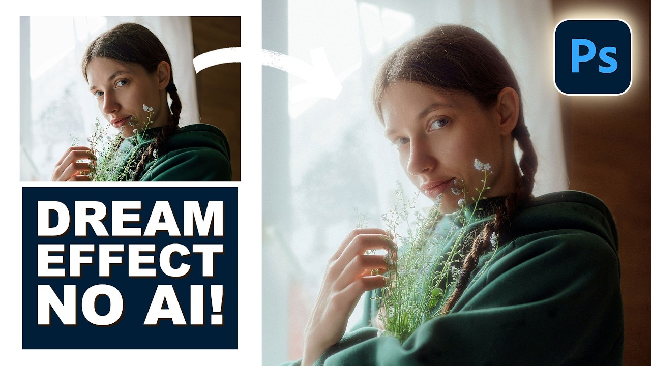
Stop Faking Glow Effects: Here's How to Build a Real Cinematic Light Bloom in Photoshop

Stop Faking Glow Effects: Here's How to Build a Real Cinematic Light Bloom in Photoshop

There’s a specific flavor of photo edit that I used to spend embarrassing amounts of time chasing. You’ve seen it. That soft, warm, almost-overexposed bloom around highlights that makes a photo look like it was shot on film that’s slightly too happy about itself. I kept trying to fake it by cranking up a Gaussian blur on a duplicated layer and hoping for the best. The result was always the same: muddy, flat, and sad.
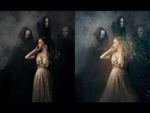

Smudge Tool Redemption: How to Add Moody Atmosphere to a Portrait in Photoshop

Smudge Tool Redemption: How to Add Moody Atmosphere to a Portrait in Photoshop

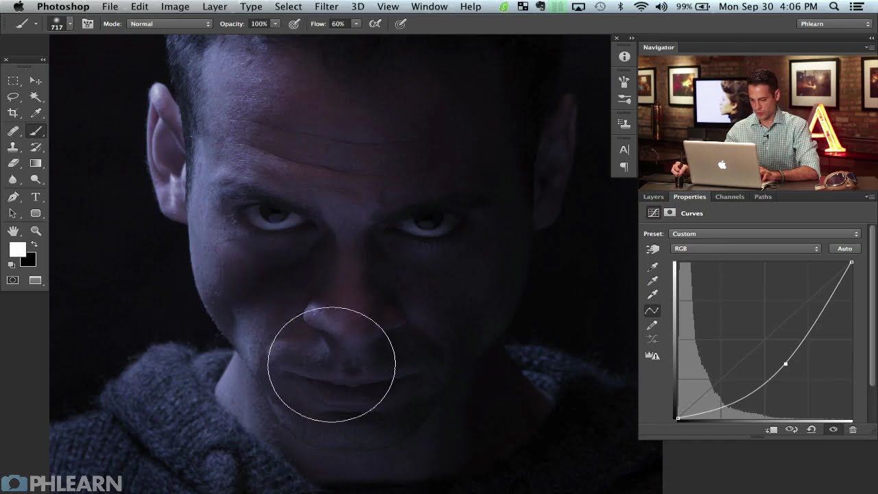
There’s a particular kind of client image that sits in my queue and stresses me out: the one that’s technically perfect but feels weirdly flat. Sharp, well-exposed, good composition. And yet something about it just doesn’t breathe. I’ve wasted more hours than I’d like to admit throwing adjustment layers at that problem, hoping a curves tweak or a color grade would somehow inject life into a photograph that needs something more textural.

Adobe Broke Save As and Here's How to Get It Back

Adobe Broke Save As and Here's How to Get It Back

If you’ve been using Photoshop long enough to have a muscle memory for certain workflows, you know how disorienting it is when Adobe quietly reshuffles something fundamental. A few weeks back, that’s exactly what happened with Save As, and the fallout was loud. Adobe changed how saving copies of files works, and if you were the kind of person who opened a RAW file, made some edits, and hit Save As to kick out a JPEG, you suddenly found yourself staring at a dialog box that seemed to be missing half its options.

Fake Fire That Actually Looks Real: A Photoshop Compositing Trick Worth Stealing

Fake Fire That Actually Looks Real: A Photoshop Compositing Trick Worth Stealing

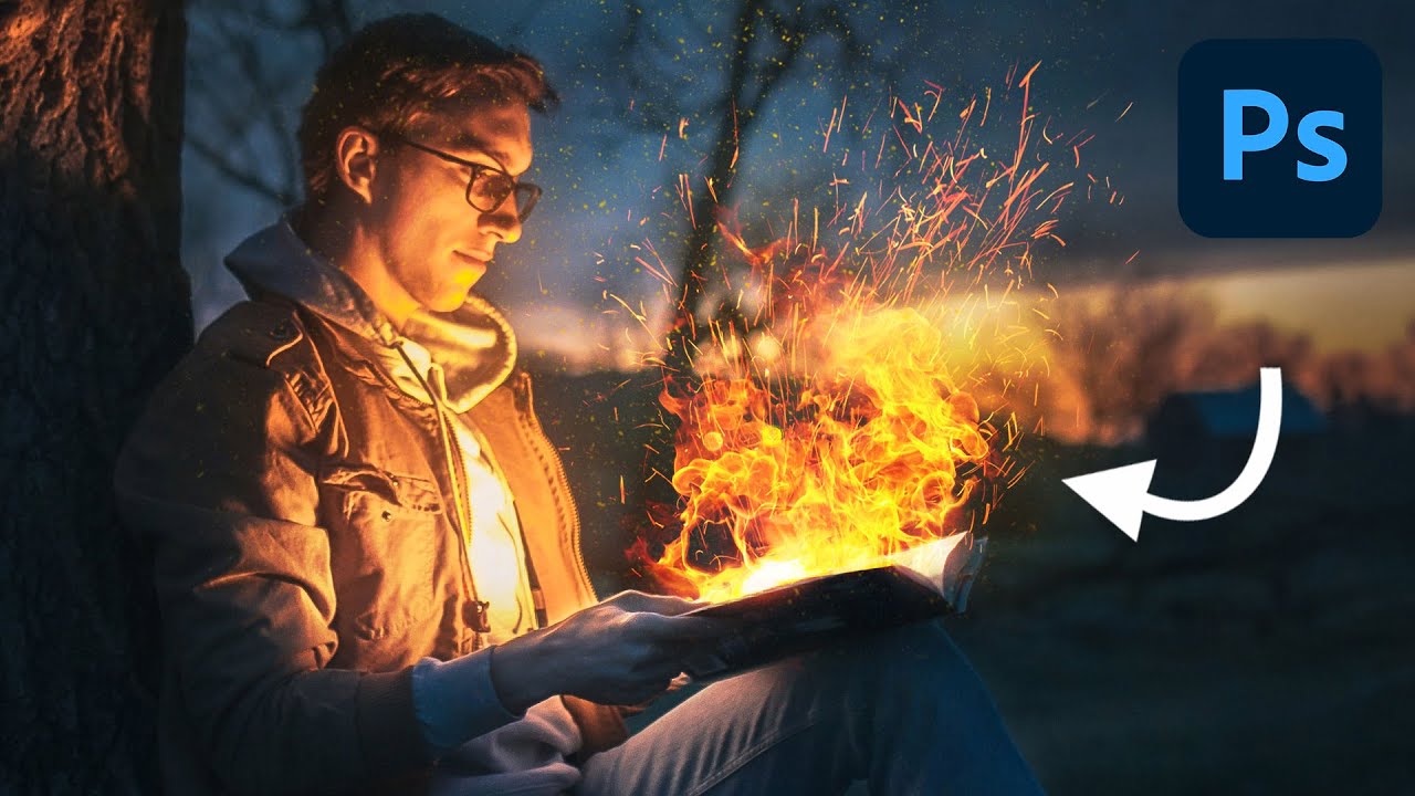
I’ve spent embarrassing amounts of time trying to manufacture drama in composite images. Explosions, sparks, light leaks — you name it, I’ve probably botched it. Fire especially has this reputation for being one of those effects that either looks jaw-dropping or immediately screams “I found a free brush pack on DeviantArt.” So when I stumbled on this Aaron Nace (PHLEARN) tutorial on creating realistic fire in Photoshop, I fully expected another overcomplicated mess of filters and adjustment layers.

How to Edit a Fall Landscape Like You Actually Know What You're Doing (A Lightroom + Photoshop Breakdown)

How to Edit a Fall Landscape Like You Actually Know What You're Doing (A Lightroom + Photoshop Breakdown)

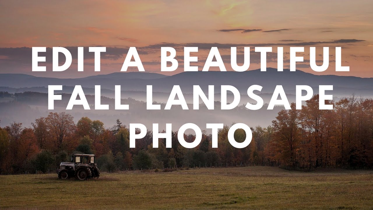
Fall photos are deceptively tricky. You’d think all that warm color does half the work for you, but if you’ve ever pulled a raw file of autumn foliage into Lightroom and just stared at it like it owes you money, you know exactly what I’m talking about. The sky is blown out, the shadows are muddy, and the colors look more “dying hospital plant” than “peak New England October.” I’ve been there more times than I’d like to admit.

Steal This Trick: How to Slap Textures onto Photos and Logos Without Making a Mess

Steal This Trick: How to Slap Textures onto Photos and Logos Without Making a Mess

Client work has a funny way of humbling you. I can’t count the number of times someone has handed me a logo or a portrait and said “make it feel more… gritty? Vintage? Lived-in?” and I’ve sat there staring at a flat layer like it owes me money. Adding texture sounds simple until you’re actually doing it and everything either looks like you rubbed sandpaper on a JPEG or the effect is so subtle it may as well not exist.

Open, Edit, Save: The Photoshop Workflow That Actually Sticks (Day 2 Breakdown)

Open, Edit, Save: The Photoshop Workflow That Actually Sticks (Day 2 Breakdown)

There’s a particular kind of embarrassment that comes from being a working designer and realizing you’ve been opening files the slow way for years. Not wrong, just slow. Inefficient in that quiet, compounding way that costs you ten seconds here, thirty seconds there, until one day you’re watching someone else work and they pull off three steps in the time it took you to reach for your mouse. That was me, earlier in my career, and honestly it still catches me off guard when I stumble onto a faster method.

Stop Making Boring Type Layouts: A Guide to Photoshop's Dynamic Text Feature

Stop Making Boring Type Layouts: A Guide to Photoshop's Dynamic Text Feature

There’s a specific kind of embarrassment that comes from spending forty minutes manually nudging text layers around a composition, only to realize the alignment is still slightly off and you have no clean way to fix it. I’ve been there more times than I’d like to admit. Typography in Photoshop has always been capable of more than most people use it for, but the workflow for getting polished, multi-style type into a layout used to involve enough friction that you’d sometimes just settle for “good enough.

How to Build a Cinematic Movie Poster Look in Photoshop (Riddick Style)

How to Build a Cinematic Movie Poster Look in Photoshop (Riddick Style)

Client work has a funny way of humbling you. I’ve lost count of the number of times someone has handed me a photo and said something like “make it look cinematic” with zero other direction, like I’m supposed to telepathically decode what “cinematic” means to them. After enough of those requests, I started reverse-engineering actual movie posters to build a mental library of techniques I could reach for. That’s what pulled me into this tutorial.

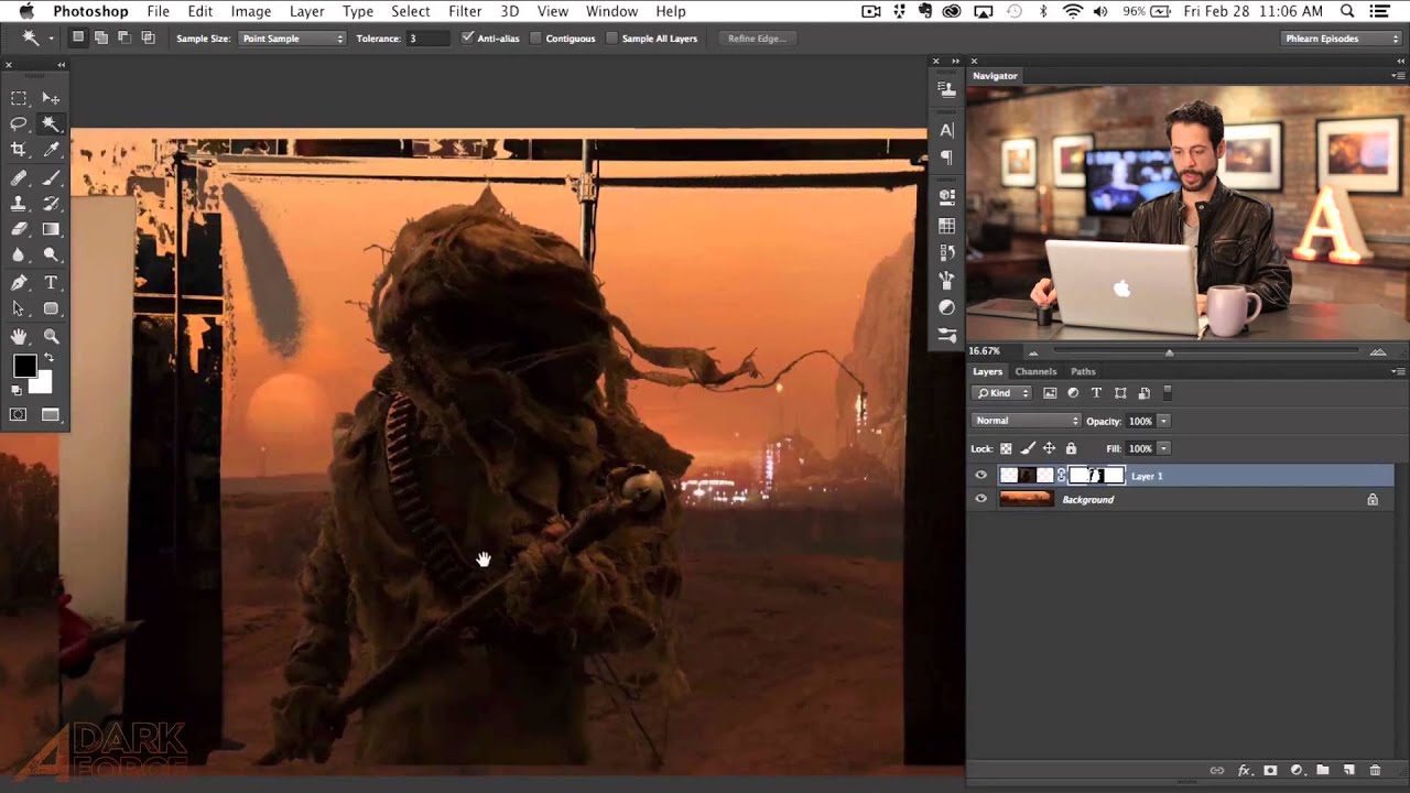
Stop Fighting the Magic Wand Tool — It's Actually Good (When You Use It Right)

Stop Fighting the Magic Wand Tool — It's Actually Good (When You Use It Right)

Compositing is where Photoshop either saves your project or humiliates you. I’ve been on both ends of that. There was a period where I spent three full days on a composite, painstakingly painting out a background pixel by pixel, only to have a friend glance at it, ask why I wasn’t using a smarter selection workflow, and then rebuild the whole thing in about twenty minutes while I sat there questioning my life choices.

The 3-Step Photoshop Glow Trick That Makes Over-Sharp Images Actually Look Good

The 3-Step Photoshop Glow Trick That Makes Over-Sharp Images Actually Look Good

There’s a specific kind of problem that creeps up constantly in my work: an image that’s been edited to within an inch of its life, technically perfect, and somehow still feels a little… aggressive. Too crisp. Like it’s trying too hard. You’ve nailed the exposure, the colors are singing, and yet something about the final result looks like it was sharpened with a grudge. I used to just ship it anyway and chalk it up to the image being what it was.

How to Blend Textures Into Photos Like a Pro (And Actually Make It Look Good)

How to Blend Textures Into Photos Like a Pro (And Actually Make It Look Good)

I have a hard drive full of photographs that are technically fine and creatively dead. A pelican I shot at golden hour with bad composition. A barn I pulled over for on a road trip outside of Austin, caught in the flattest midday light imaginable. A motorcycle at a car show, surrounded by other people’s shoulders and styrofoam cups. These aren’t bad photos exactly, they just have no reason to exist as finished work.