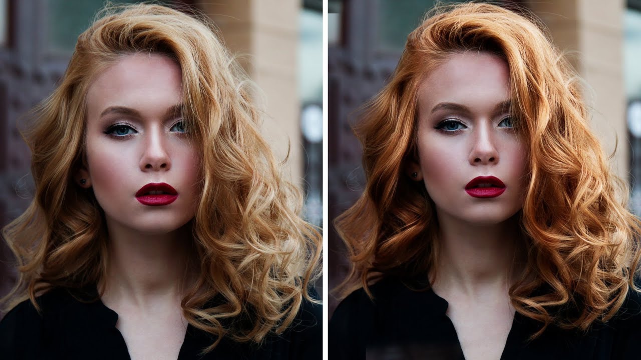
Hair retouching is one of those things that separates a decent retouch from a genuinely polished one. I spent an embarrassing amount of time early in my freelance career trying to make flat, lifeless hair look editorial by throwing contrast sliders at it. It doesn’t work. What actually works is a specific sequence of moves that address volume, color, and depth as separate problems. That’s exactly what Aaron Nace breaks down in this PHLEARN tutorial, and the reason it clicked for me is that he treats each issue with its own dedicated tool rather than hunting for one magic adjustment that does everything.
Watch the full tutorial on YouTube
The workflow covers three distinct phases: expanding the hair’s physical silhouette using the Liquify filter, adding tonal color using a Gradient Map adjustment layer, and then pushing contrast in the strands themselves with Dodge and Burn. None of these steps are complicated on their own. The value here is in how they stack. Each one builds on the last, and by the end the hair has a dimension that would take way longer to fake any other way.
Step 1: Duplicate Your Background Layer
 Background layer being duplicated in Layers panel
Before touching anything, duplicate your background layer. In practice this is just Cmd/Ctrl + J. All the Liquify work is going to happen on this duplicate. Keeping the original intact means you have a clean fallback if something goes sideways, and with Liquify, something can always go sideways.
Background layer being duplicated in Layers panel
Before touching anything, duplicate your background layer. In practice this is just Cmd/Ctrl + J. All the Liquify work is going to happen on this duplicate. Keeping the original intact means you have a clean fallback if something goes sideways, and with Liquify, something can always go sideways.
Step 2: Protect the Face With a Freeze Mask in Liquify
 Freeze Mask tool painting over subject’s face in Liquify dialog
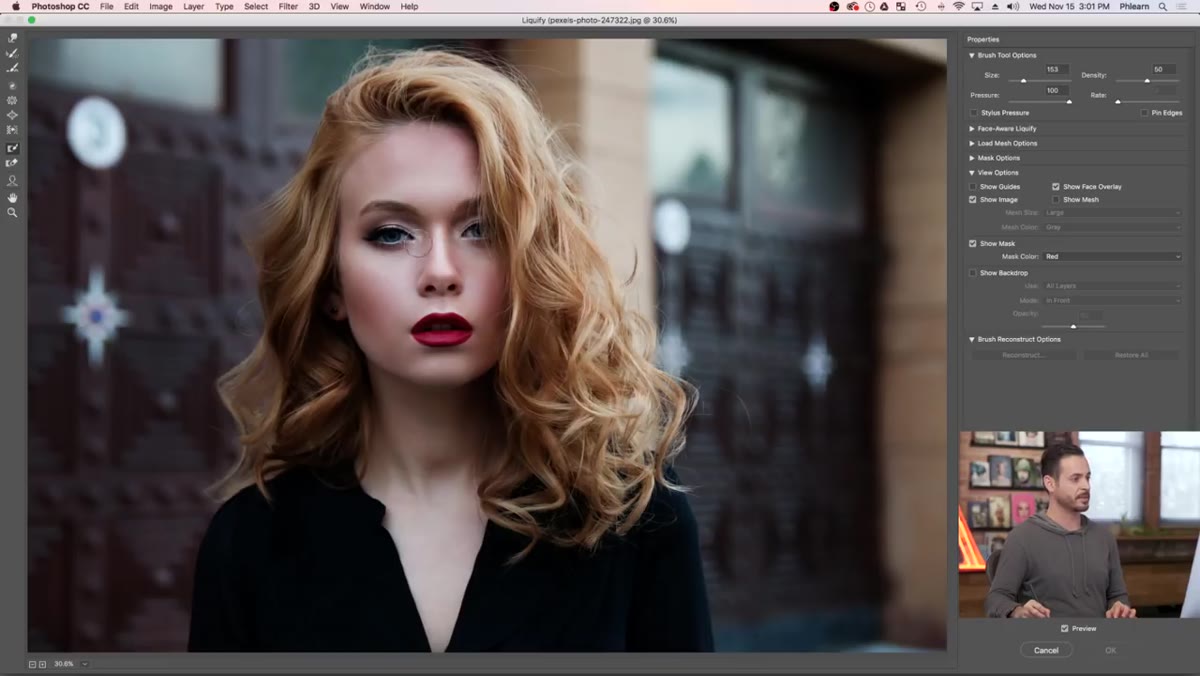
Open Liquify via Filter > Liquify. The first thing to do before pushing a single pixel is paint a Freeze Mask over the subject’s face. The Freeze Mask tool is in the Liquify toolbar, and it works like a protective coating: anything you paint over becomes immune to the distortion tools. Cover the eyes, nose, mouth, and a little of the forehead for good measure.
Freeze Mask tool painting over subject’s face in Liquify dialog
Open Liquify via Filter > Liquify. The first thing to do before pushing a single pixel is paint a Freeze Mask over the subject’s face. The Freeze Mask tool is in the Liquify toolbar, and it works like a protective coating: anything you paint over becomes immune to the distortion tools. Cover the eyes, nose, mouth, and a little of the forehead for good measure.
This is the step most people skip, and it’s the one that makes the difference between a retouch that looks natural and one where your subject looks like they got hit by a cartoon wind. The face anchors the viewer’s eye. If even one feature shifts slightly, the whole image reads as “something’s wrong here” even if the viewer can’t name it.
Step 3: Expand the Hair With a Large Liquify Brush
 Large Liquify brush pulling hair outward from inside hairline
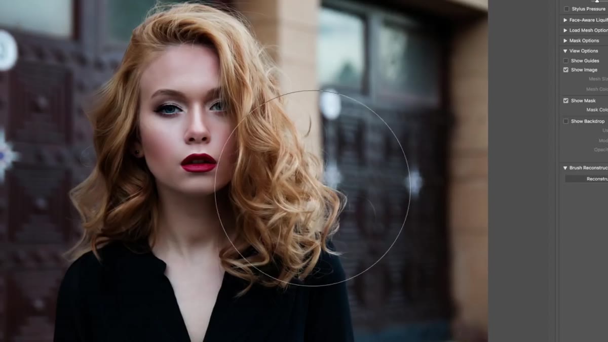
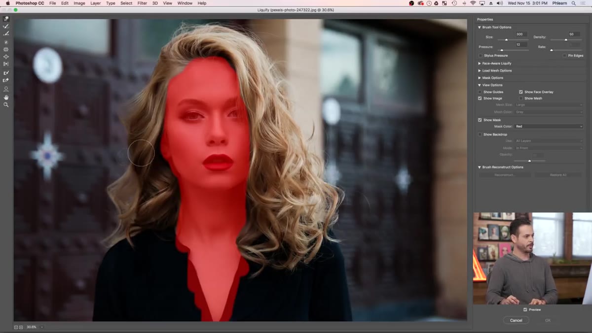
Now grab the Forward Warp tool (the default Liquify tool) and crank your brush size up. This is the counterintuitive part: a small brush gives you more control but produces messy, localized distortions that look completely fake and, crucially, will warp your background in an obvious, broken way. A large brush moves the background pixels along with the hair gradually, which reads as realistic.
Large Liquify brush pulling hair outward from inside hairline
Now grab the Forward Warp tool (the default Liquify tool) and crank your brush size up. This is the counterintuitive part: a small brush gives you more control but produces messy, localized distortions that look completely fake and, crucially, will warp your background in an obvious, broken way. A large brush moves the background pixels along with the hair gradually, which reads as realistic.
Start your stroke from inside the hair and push outward toward the edges. Work around the perimeter in a few broad passes rather than one dramatic yank. The goal is subtle volume, not a before-and-after slider you’d see on an infomercial. Keep an eye on the background the whole time. If there are straight vertical or horizontal lines visible, like a door frame or a lamp post, watch those carefully. You want them moving consistently across the image, not developing a kink where the hair ends.
Step 4: Color the Hair With a Gradient Map
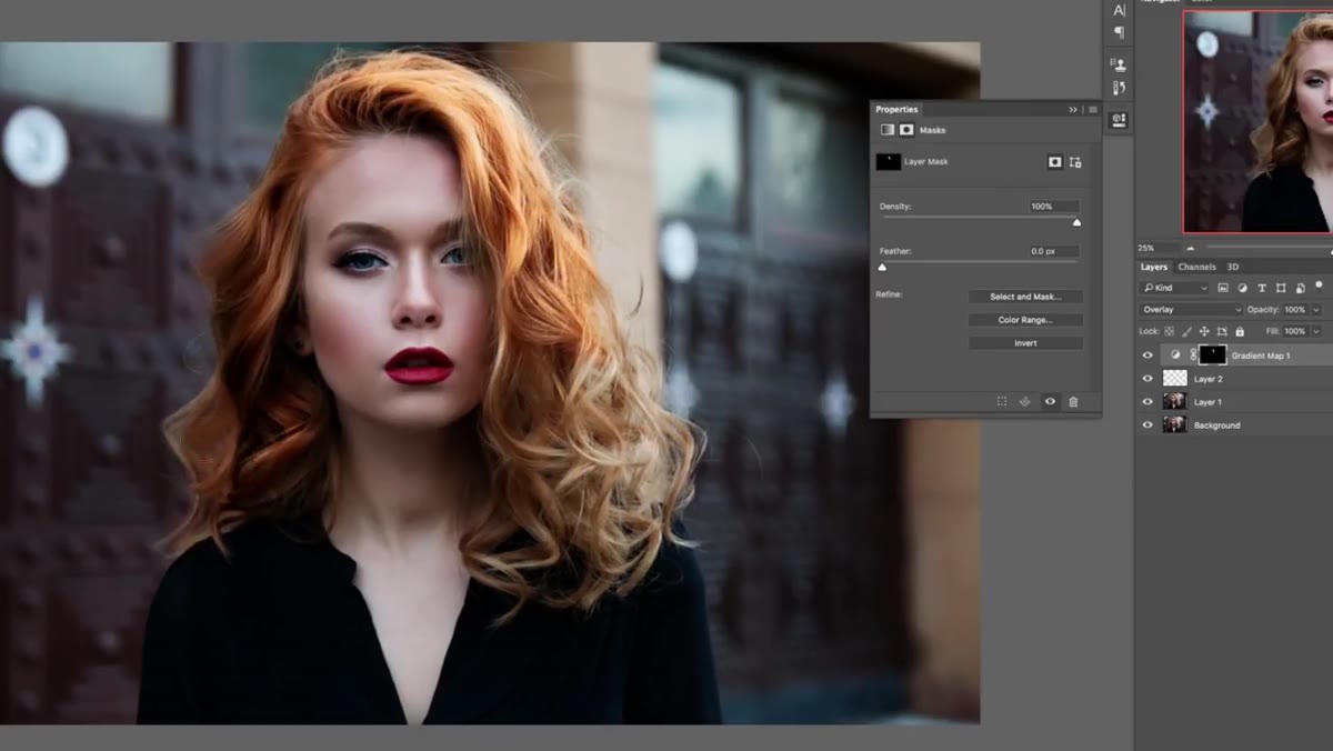 Gradient Map adjustment layer dialog showing shadow and highlight colors
A Gradient Map is one of those tools that sounds more complicated than it is. Create a new Gradient Map adjustment layer (Layer > New Adjustment Layer > Gradient Map) and clip it to your duplicated layer by holding Alt/Option and clicking between the two layers in the panel.
Gradient Map adjustment layer dialog showing shadow and highlight colors
A Gradient Map is one of those tools that sounds more complicated than it is. Create a new Gradient Map adjustment layer (Layer > New Adjustment Layer > Gradient Map) and clip it to your duplicated layer by holding Alt/Option and clicking between the two layers in the panel.
The Gradient Map assigns colors across the tonal range of the image: dark colors go to shadows, light colors go to highlights, and mid-tones land in the middle. Click the gradient bar in the Properties panel to open the editor. For hair that needs warmth and richness, try a deep reddish-brown in the shadows and a warm amber or gold in the highlights. The blend between them does the heavy lifting. Change the layer blend mode to something like Color or Soft Light depending on how much saturation you want. Color keeps the luminosity intact and just shifts the hue. Soft Light gives you the color shift plus a contrast boost, which can work beautifully if the hair is already well-exposed.
Step 5: Add Depth With Dodge and Burn
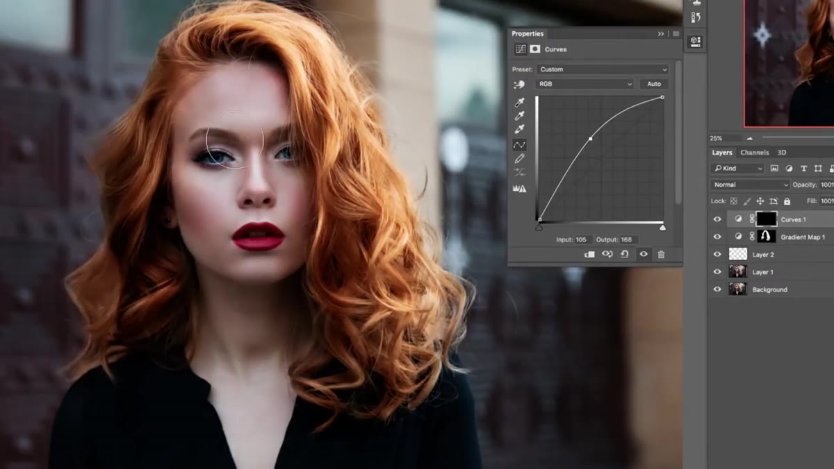 Dodge and Burn being applied to hair to enhance highlights and shadows
Create a new blank layer set to Soft Light blend mode and fill it with 50% gray (Edit > Fill > 50% Gray). This is the classic dodge-and-burn setup that lets you paint light and shadow non-destructively. On a 50% gray layer in Soft Light mode, gray is invisible. Anything lighter than gray lightens the layer below it. Anything darker burns it.
Dodge and Burn being applied to hair to enhance highlights and shadows
Create a new blank layer set to Soft Light blend mode and fill it with 50% gray (Edit > Fill > 50% Gray). This is the classic dodge-and-burn setup that lets you paint light and shadow non-destructively. On a 50% gray layer in Soft Light mode, gray is invisible. Anything lighter than gray lightens the layer below it. Anything darker burns it.
Use the Dodge tool set to Highlights at around 10-15% exposure and trace the natural highlight paths in the hair. These usually follow the direction of the strands and tend to cluster at the top of the head and wherever the main light source hits. Then switch to the Burn tool, set it to Shadows at similar low exposure, and deepen the areas between the hair groups. Multiple light passes beat one heavy one every time. The result is hair that looks three-dimensional rather than like a flat texture pasted onto a head.
A Note on Keeping This Subtle
The version I’ve seen blow up in practice is when someone goes too far on step two and makes the hair look like a cloud that is slowly escaping the photo. I’ve done it myself. The fix is simple: drop the Liquify layer opacity down to around 70-80% after you exit the filter dialog. Photoshop applies Liquify to the layer at full strength by default, but nothing says you can’t soften it back. Same goes for the Gradient Map. If the color looks great at 100% opacity but slightly theatrical, bring it down to 60% and the effect integrates instead of announces itself.
The three-step sequence in Aaron Nace’s tutorial works because it respects how hair actually behaves in real light. Volume is a shape problem. Color is a tonal problem. Depth is a contrast problem. Solving each one with a tool built for that job gives you a result that holds up at any zoom level. Watch the full tutorial on YouTube to see the before-and-after and get a feel for how aggressive to go on each step with different hair types.
Comments
Leave a Comment