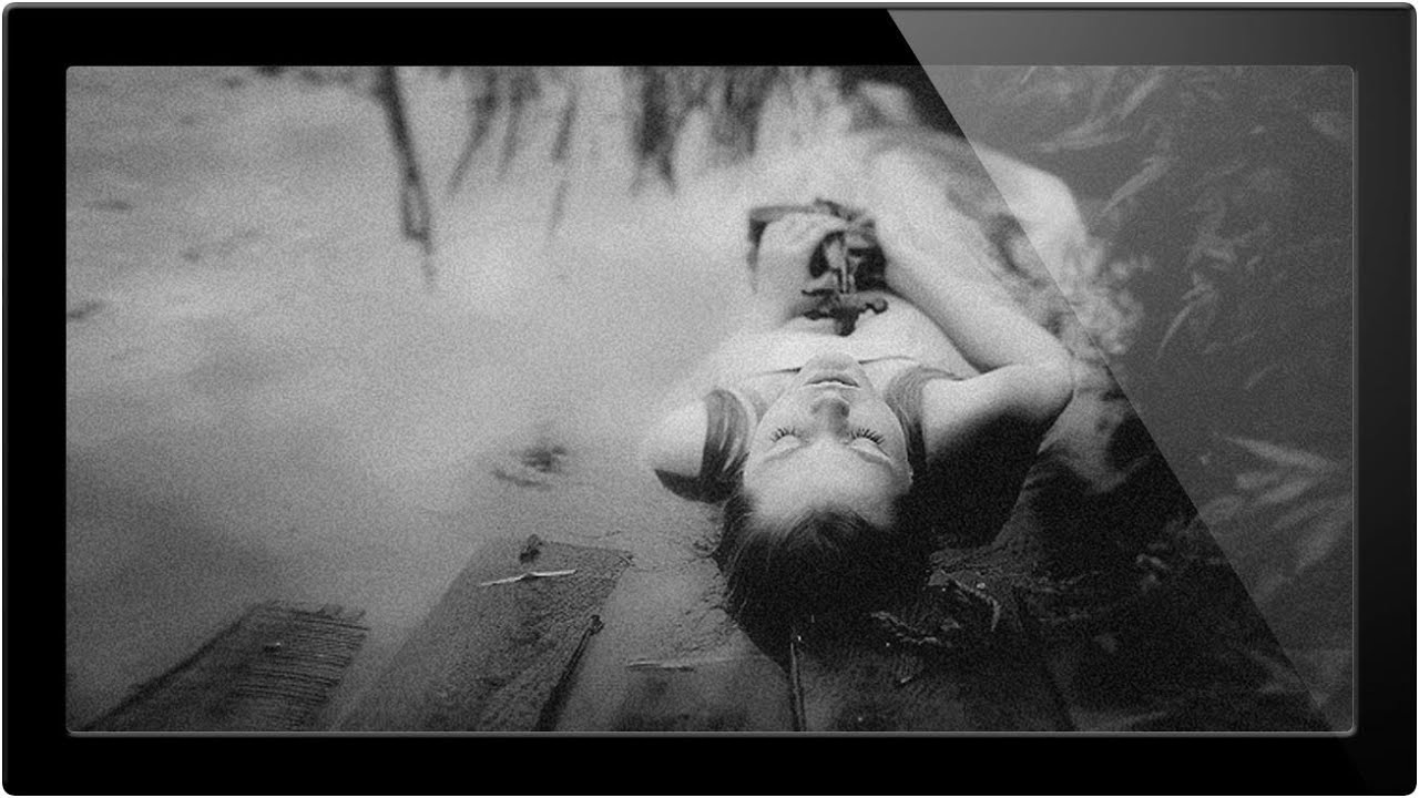
I used to desaturate everything. Image > Adjustments > Desaturate, done, moving on. It felt efficient. What it actually was, I eventually figured out, is the Photoshop equivalent of seasoning food with sadness. The result is flat, lifeless, and weirdly gray in all the wrong places. It wasn’t until I started digging into proper black and white conversion techniques that I understood why some monochrome photos feel punchy and cinematic while mine looked like a color photo that gave up.
In this Aaron Nace tutorial from PHLEARN, Watch the full tutorial on YouTube, the whole premise is that black and white isn’t just “remove the color.” It’s a conversion decision that affects tone, contrast, and where the viewer’s eye lands. That reframe alone is worth the watch time. Below I’ve broken down the key techniques so you can follow along in Photoshop without having to pause and rewind every thirty seconds.
The short version: different colors in your original image carry different tonal weight when converted. By controlling how each color channel maps to gray, you’re essentially sculpting the contrast of the final image. That’s a superpower desaturation doesn’t give you.
Step 1: Start with an Adjustment Layer, Not a Destructive Edit
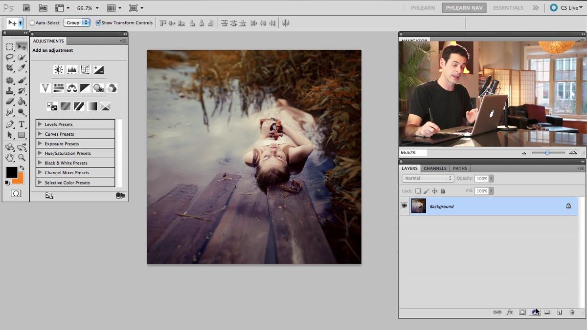 Adjustment layer panel open in Photoshop
First thing: resist the urge to flatten anything. Add a new adjustment layer from the Adjustments panel rather than going through Image > Adjustments. This keeps everything non-destructive, meaning you can come back and tweak your settings at any point without degrading the image. It’s a habit that sounds obvious but is genuinely easy to skip when you’re in a hurry. Ask me how I know. (Three days of work on a composite, no adjustment layers, client changed their mind. Never again.)
Adjustment layer panel open in Photoshop
First thing: resist the urge to flatten anything. Add a new adjustment layer from the Adjustments panel rather than going through Image > Adjustments. This keeps everything non-destructive, meaning you can come back and tweak your settings at any point without degrading the image. It’s a habit that sounds obvious but is genuinely easy to skip when you’re in a hurry. Ask me how I know. (Three days of work on a composite, no adjustment layers, client changed their mind. Never again.)
Step 2: Open the Channel Mixer and Check Monochrome
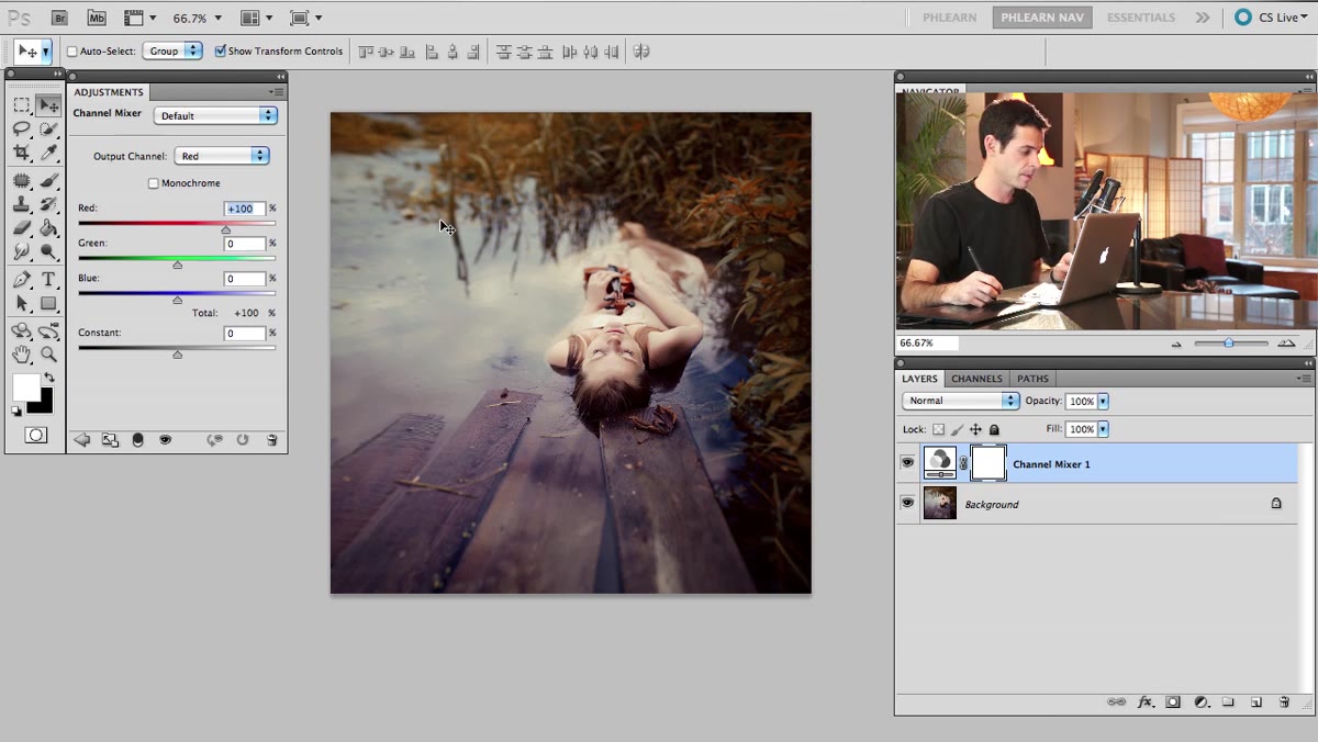 Channel Mixer panel with Monochrome checkbox highlighted
In your Adjustments panel, choose Channel Mixer. Once it opens, you’ll see a checkbox at the bottom labeled Monochrome. Check it. Your image goes black and white immediately, but here’s where it gets interesting: you’re not done. This is just the starting point, not the finish line. Most people check Monochrome and close the panel. That’s leaving most of the value on the table.
Channel Mixer panel with Monochrome checkbox highlighted
In your Adjustments panel, choose Channel Mixer. Once it opens, you’ll see a checkbox at the bottom labeled Monochrome. Check it. Your image goes black and white immediately, but here’s where it gets interesting: you’re not done. This is just the starting point, not the finish line. Most people check Monochrome and close the panel. That’s leaving most of the value on the table.
Step 3: Dial In Your Red, Green, and Blue Channel Sliders
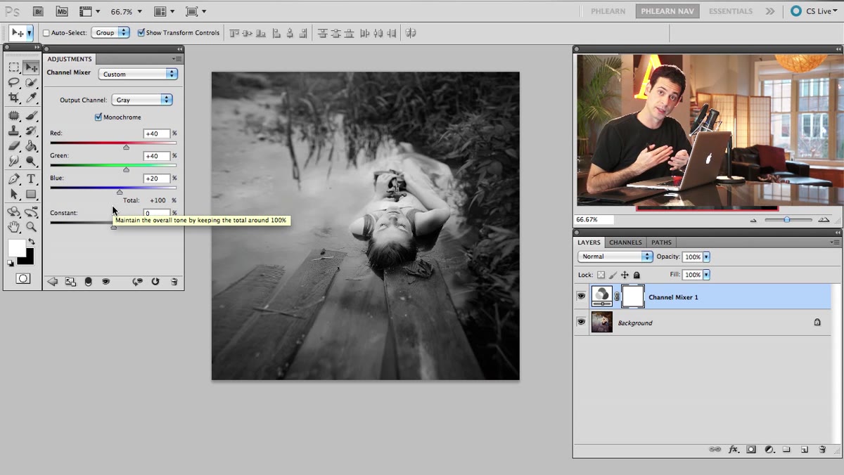 Channel Mixer with Red, Green, Blue sliders visible
With Monochrome checked, the Red, Green, and Blue sliders now control how much each color channel contributes to the final gray values in your image. Boosting the Red slider brightens areas of the photo that were originally red or warm-toned. For portraits, this is particularly useful because human skin contains a lot of red, and pulling that up brightens the subject’s face relative to the background. Pull Green up and you’ll brighten foliage and other green-heavy areas. Blue affects skies, shadows, and cooler tones.
Channel Mixer with Red, Green, Blue sliders visible
With Monochrome checked, the Red, Green, and Blue sliders now control how much each color channel contributes to the final gray values in your image. Boosting the Red slider brightens areas of the photo that were originally red or warm-toned. For portraits, this is particularly useful because human skin contains a lot of red, and pulling that up brightens the subject’s face relative to the background. Pull Green up and you’ll brighten foliage and other green-heavy areas. Blue affects skies, shadows, and cooler tones.
A practical starting point: try Red around +70, Green around +30, Blue around +10, and see what happens to your specific image. Every photo is different. The goal is contrast and separation, not hitting a magic number.
Step 4: Use the Constant Slider as Your Gamma Control
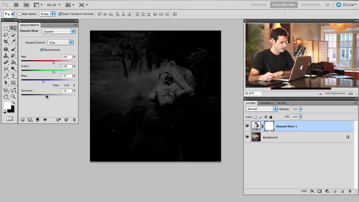 Constant slider being adjusted in Channel Mixer
Below the channel sliders sits one that often gets ignored: the Constant slider. Aaron describes it as functioning like a gamma control, and that’s a useful way to think about it. Pulling it negative pushes the overall image darker, which can help recover contrast if your channel adjustments have blown things out a bit. Nudging it positive brightens the overall output.
Constant slider being adjusted in Channel Mixer
Below the channel sliders sits one that often gets ignored: the Constant slider. Aaron describes it as functioning like a gamma control, and that’s a useful way to think about it. Pulling it negative pushes the overall image darker, which can help recover contrast if your channel adjustments have blown things out a bit. Nudging it positive brightens the overall output.
The Constant slider works best as a finishing trim rather than a primary tool. Get your channels where you want them, then use Constant to make the image feel balanced rather than either crushed or washed out. If you find yourself maxing it out to compensate, your channel sliders are probably off.
Step 5: Understand Why Stacking a Black and White Adjustment Layer Doesn’t Work the Way You’d Expect
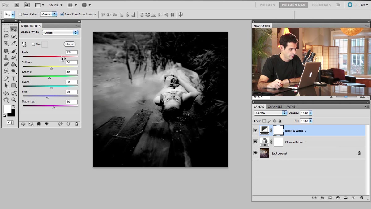 Black and White adjustment layer added above Channel Mixer layer
Here’s a gotcha that trips people up, and Aaron demonstrates it clearly. If you add a Black and White adjustment layer on top of a Channel Mixer layer that’s already rendering the image in monochrome, the Black and White layer’s color sliders become effectively useless. There’s no color information left for it to act on. You’re adjusting the relationship between colors that no longer exist in the image.
Black and White adjustment layer added above Channel Mixer layer
Here’s a gotcha that trips people up, and Aaron demonstrates it clearly. If you add a Black and White adjustment layer on top of a Channel Mixer layer that’s already rendering the image in monochrome, the Black and White layer’s color sliders become effectively useless. There’s no color information left for it to act on. You’re adjusting the relationship between colors that no longer exist in the image.
This matters because it means you need to think about your layer order and your conversion strategy before you start stacking adjustments. Do your color-based tonal work first, while the image still has color data. Once you’ve committed to black and white, you’ve given up that lever.
Step 6: Combine Effects Using Stamped Layers
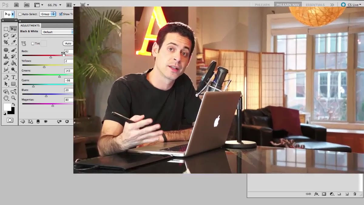 Visible layers being stamped in Photoshop layer stack
One technique Aaron touches on that’s genuinely useful for more complex edits is using stamped visible layers to combine effects at different stages. The shortcut for this is Cmd+Alt+Shift+E on Mac or Ctrl+Alt+Shift+E on Windows. It creates a flattened snapshot of everything visible at that point in the layer stack without deleting the layers below.
Visible layers being stamped in Photoshop layer stack
One technique Aaron touches on that’s genuinely useful for more complex edits is using stamped visible layers to combine effects at different stages. The shortcut for this is Cmd+Alt+Shift+E on Mac or Ctrl+Alt+Shift+E on Windows. It creates a flattened snapshot of everything visible at that point in the layer stack without deleting the layers below.
The use case here: apply your Channel Mixer conversion to get your base black and white, stamp a copy, then apply a second round of adjustments like curves or a different filter to that stamped layer. This gives you the ability to blend two different conversion treatments using layer masks, which opens up a lot of creative territory. It’s more involved than a single adjustment, but the control you get is worth it on images you care about.
My Addition: Try a Curves Layer on Top for Contrast Punch
After going through this workflow myself, the one thing I’d add is a Curves adjustment layer above everything else specifically for contrast, not exposure. Black and white images tend to need a bit more contrast than color images to feel punchy because you’ve lost the visual separation that color provides. A subtle S-curve (lift the highlights slightly, pull the shadows slightly) usually gets you there in under a minute.
Set the Curves layer’s blending mode to Luminosity if you’re working on a color-to-black-and-white conversion where you’ve kept color layers underneath. It keeps the curve from doing anything weird to any residual color information in the stack.
The single most important shift I made in my black and white editing was treating it as a conversion problem, not a color removal problem. Your original color values are data. How you map that data to grayscale determines whether your image has dimension or looks like a printout from a broken inkjet.
Watch the full tutorial on YouTube to see Aaron work through these techniques on actual images, which makes the effect of each slider change a lot more concrete than reading about it.
Comments
Leave a Comment