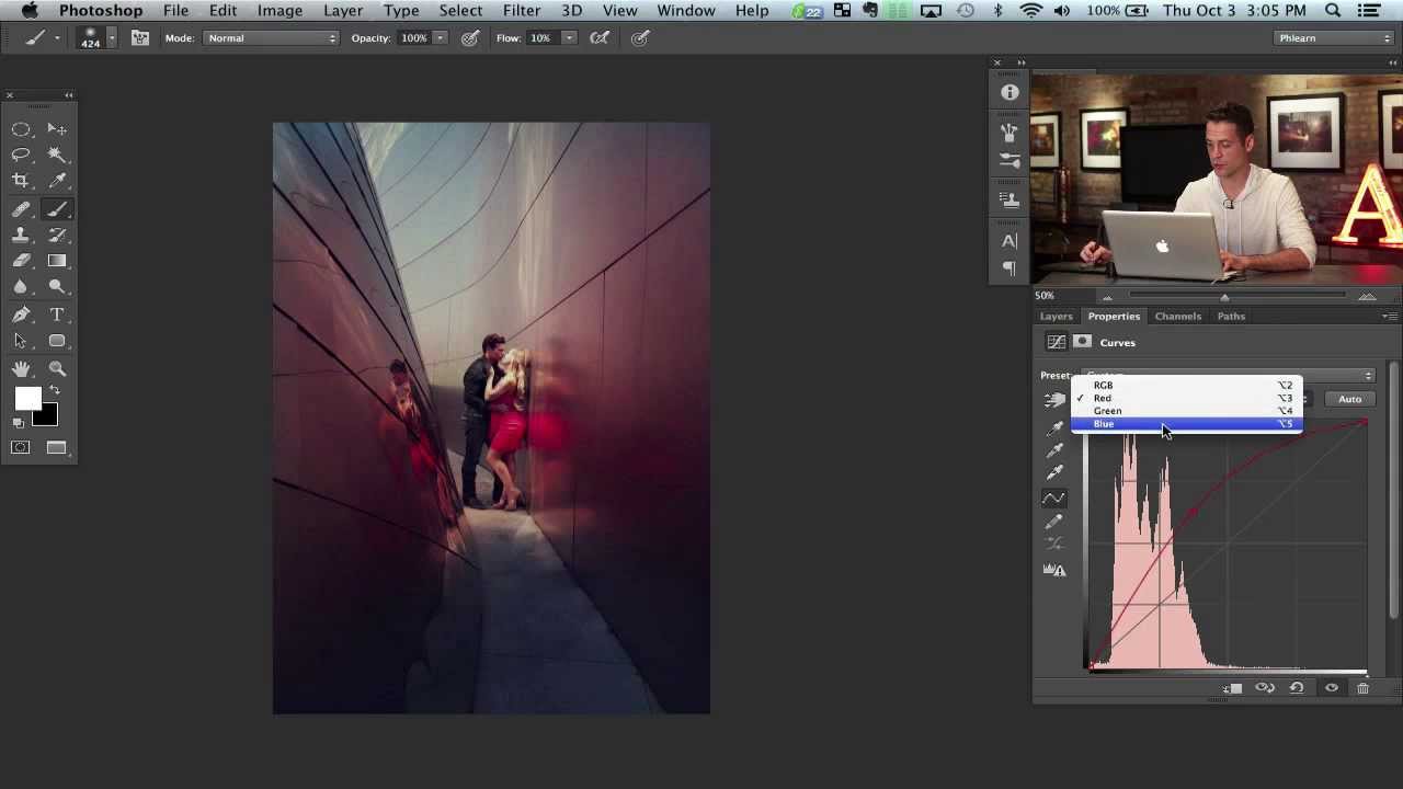
There’s a specific type of image that stops you mid-scroll. Not because of the subject, not even because of the composition, but because of the color. Something warm bleeding into something cool, colors that feel like they’re swirling around the focal point rather than just sitting on top of it. I spent an embarrassingly long time trying to fake that look with gradient maps and blending modes before I found a cleaner approach. In this Aaron Nace (PHLEARN) tutorial, he breaks down how to build layered color gradients using Curves adjustment layers and painted masks, and it’s one of those techniques that immediately changes how you think about color in post.
The core idea is deceptively simple: instead of applying one color grade to the whole image, you stack multiple Curves adjustments, each targeting a different color, and then paint them in selectively. The result feels organic rather than filtered, because you’re literally sculpting where each color lives. It also gives you a ton of control after the fact, since every adjustment stays non-destructive. Watch the full tutorial on YouTube if you want to see Aaron walk through the whole thing on a real photo. Otherwise, here’s the play-by-play.
Step 1: Create a Curves Adjustment Layer and Push Red
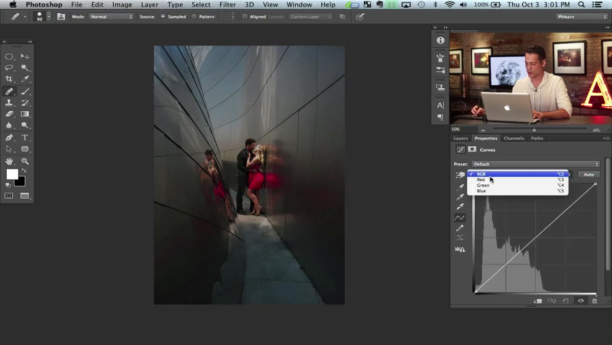 Aaron dragging red channel curve upward in Curves dialog
Start by opening your image and adding a Curves adjustment layer via the Adjustments panel or Layer menu. In the Curves dialog, switch from RGB to the Red channel using the dropdown. Pull the curve upward to push red into the image. Then switch to the Blue channel and pull it down, which will shift things toward orange. You’re not going for subtle here. Commit to the color. The goal is a warm, red-orange cast that’ll anchor one zone of your image.
Step 2: Invert the Layer Mask and Paint Color Back In
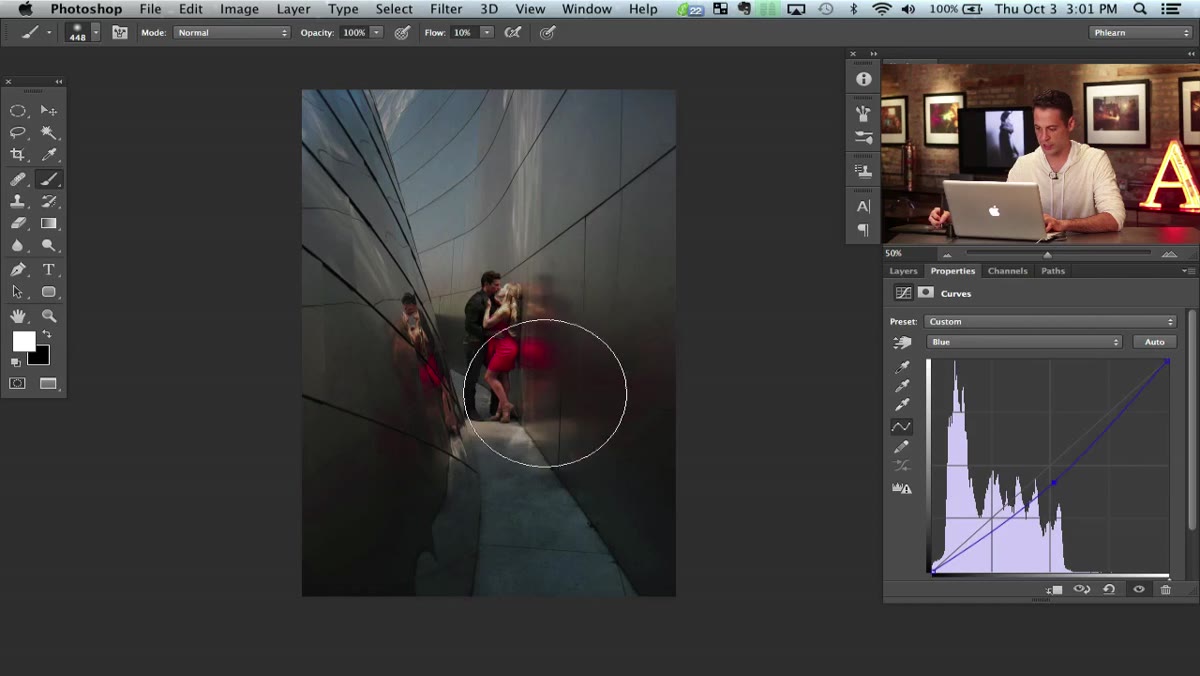 Black layer mask thumbnail visible on Curves adjustment layer
Once your Curves layer is set, click on its mask thumbnail and hit Command+I (Ctrl+I on Windows) to invert it to black. This hides the entire color adjustment from the image. Now grab a large, soft round brush, set your foreground color to white, and paint over the area where you want the warm color to appear. Think of it as revealing color rather than adding it. A low-hardness brush keeps the edges diffuse and natural, which is exactly what you want for a gradient-style effect.
This step is where a lot of people overthink things. You don’t need to be precise. You’re painting a mood, not masking hair. Keep the brush massive and let the softness do the blending work.
Step 3: Add a Second Curves Layer for the Transition Color
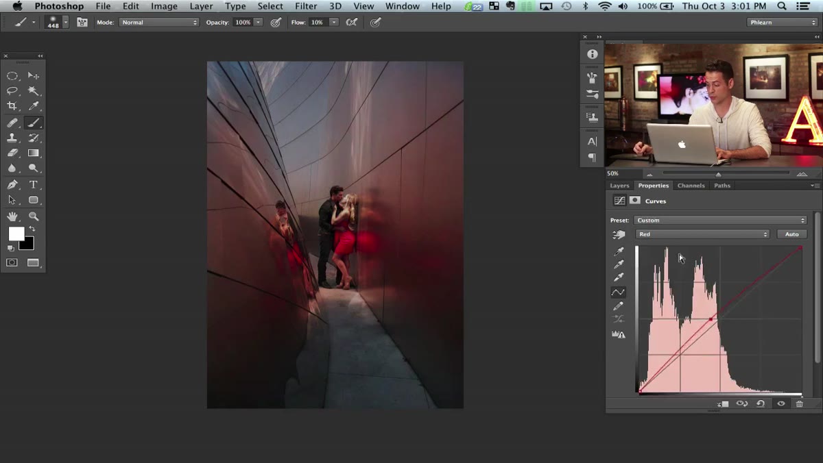 Second Curves layer open, red channel adjusted for orange-yellow tone
With your red zone established, add another Curves adjustment layer. This one is for the middle transition color, an orangey-yellow that’ll bridge warm and cool. Go back to the Red channel and push it up slightly less aggressively than before, then pull Blue down again, but not as far. The goal is a tone that feels like it lives between your first color and the cool blue you’ll add next.
Invert the mask on this layer too, then paint it into the transition zone, the area between your warm anchor and wherever you plan to drop the blue. Overlap slightly with the first layer’s painted area. That overlap is where the magic happens, the colors blend together visually without any actual gradient tool involved.
Step 4: Add a Third Curves Layer and Bring In the Blue
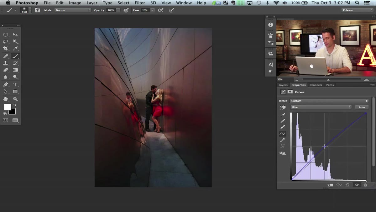 Blue channel curve pulled up sharply in third Curves adjustment layer
Third Curves layer, third color. This time switch to the Blue channel and pull that curve upward, hard. You want a clear, cool blue cast. Invert the mask, then paint this one in from the opposite end of the image, working from top to bottom or corner to corner depending on your composition.
The layered structure means the red, orange-yellow, and blue are each living on their own adjustment, which gives you the freedom to go back and tweak any one of them independently. Nudge the red a bit warmer, dial back the blue, whatever the image needs. That flexibility is the whole reason to do it this way instead of just smearing a gradient overlay on a merged layer.
Step 5: Add a Brightness Curves Layer for a Light Effect
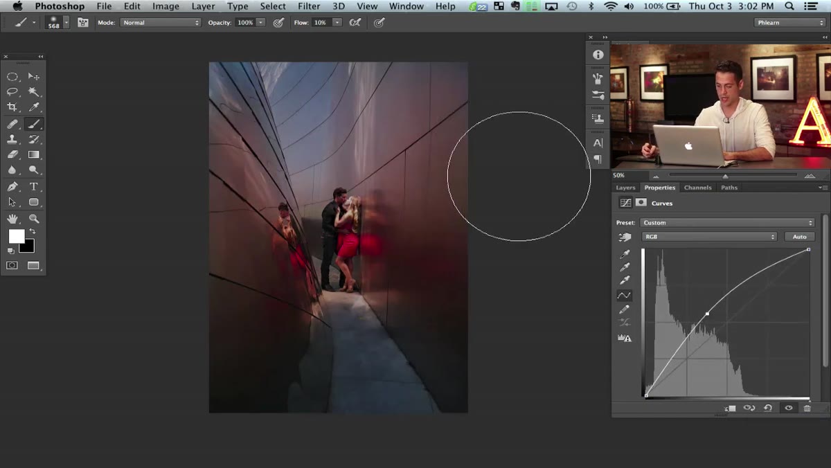 New Curves layer pulled upward in RGB mode for brightness boost
Once the color layers are in place, add one more Curves adjustment, this time staying in the default RGB channel. Pull the curve up to brighten the image. Invert the mask and leave it black for now. You’ll paint in the brightness selectively to suggest light coming from a specific direction, which ties the whole color gradient together and makes it feel less like a color grade and more like an actual light source in the scene.
Step 6: Use the Pen Tool to Define a Light Path
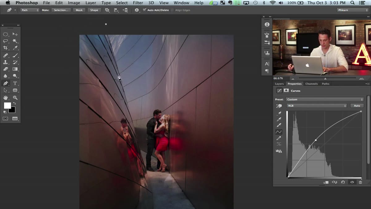 Pen tool creating curved path across the image
Here’s the detail that elevates the technique. Instead of painting the brightness adjustment in freehand, use the Pen tool (P) to draw a curved path across the image. Click to set anchor points, hold Ctrl/Command to adjust the curve handles, and draw a graceful arc that follows the natural flow of the composition. Right-click inside the path and choose Make Selection. Now paint white on the brightness mask only within that selection.
When you deselect (Command+D), the brightened strip looks like light cutting across the scene from behind. It’s a small move that adds a ton of depth and makes the whole thing feel intentional rather than painted-on.
What I’d Do Differently: Color Balance the Shadows Separately
One thing Aaron doesn’t go into here, probably because it’d double the tutorial length, is that this technique plays extremely well with a separate Color Balance adjustment targeting just the shadows. Once your Curves gradients are in, dropping a complementary cool tone into the shadow areas creates a counterpoint that makes the warm zones feel even more vibrant. It’s the same principle cinematographers use with split-toning. Takes about thirty seconds and adds a lot of visual punch, especially if your photo has deep, rich shadows to work with.
The real lesson from this tutorial isn’t about Curves specifically. It’s about the habit of building effects in stackable, non-destructive layers rather than committing to a single adjustment. Each color zone is editable, each mask is repaintable, and the whole thing can be torn apart and rebuilt without touching the original image. That’s the mindset that separates someone who finishes a composite in three hours from someone who finishes it in three days and hates the last two.
Watch the full tutorial on YouTube to see Aaron demonstrate the brush strokes and curve values in real time, including how the colors visually interact as each layer is painted in.
Comments
Leave a Comment