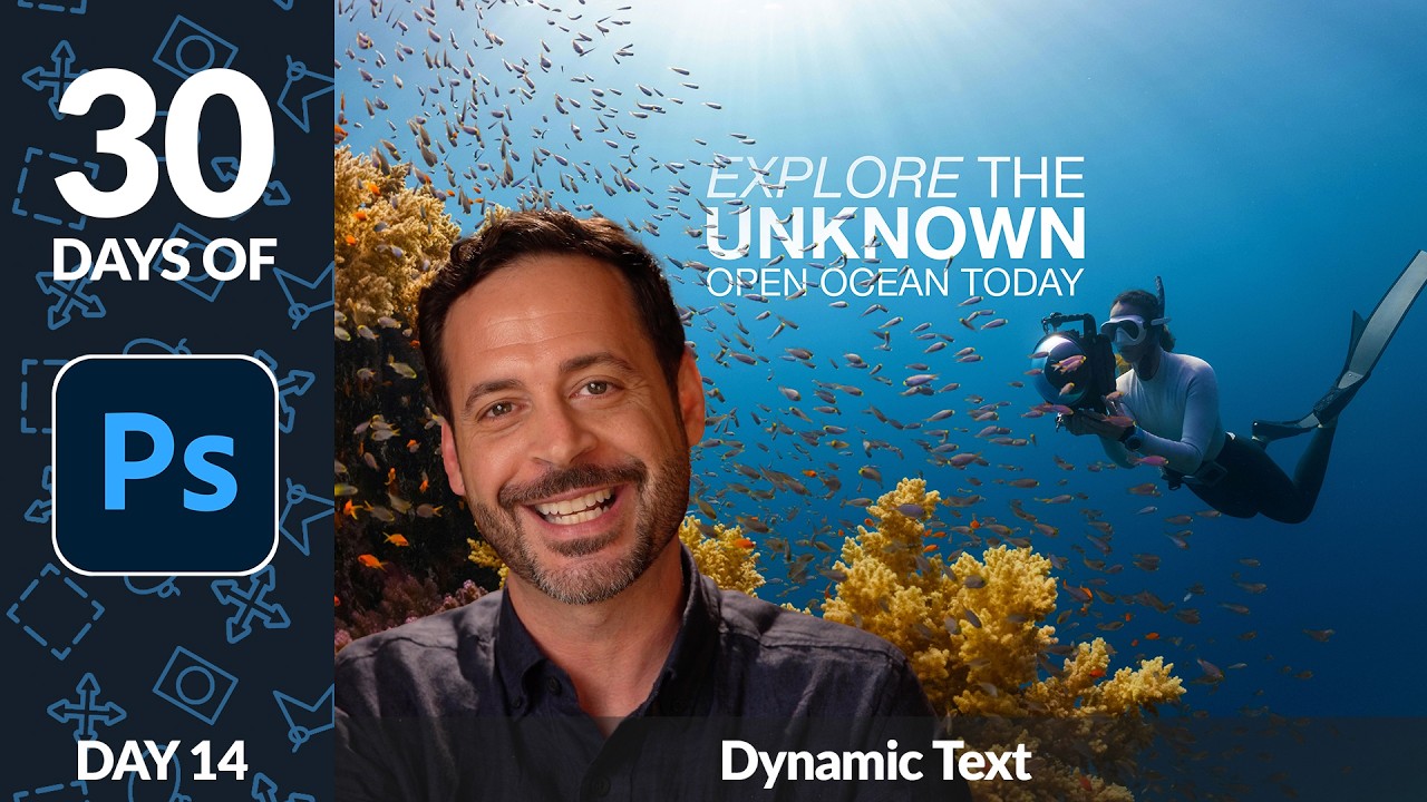
There’s a specific kind of embarrassment that comes from spending forty minutes manually nudging text layers around a composition, only to realize the alignment is still slightly off and you have no clean way to fix it. I’ve been there more times than I’d like to admit. Typography in Photoshop has always been capable of more than most people use it for, but the workflow for getting polished, multi-style type into a layout used to involve enough friction that you’d sometimes just settle for “good enough.” That changed when dynamic text arrived, and Aaron Nace over at PHLEARN walked through exactly how to use it in a way that made everything click for me.
In this Aaron Nace (PHLEARN) tutorial, he builds a travel advertisement from scratch using the Type tool, the Character panel, and the dynamic text feature that auto-formats your type as you work. Watch the full tutorial on YouTube - it’s part of a 30-day Photoshop series and the whole thing is worth bookmarking. What follows is my breakdown of the actual technique so you can apply it immediately without hunting through the video.
Step 1: Activate the Type Tool and Set Your Basic Options
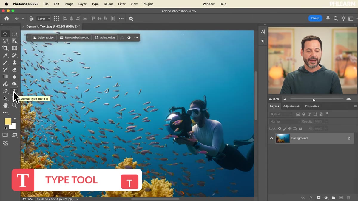 Type tool selected, options bar showing font and alignment controls
Hit T to grab the Type tool. Before you click anywhere on your canvas, scan the options bar running across the top of the screen. You’ve got your font family, font weight, font size, and alignment controls all sitting there waiting for you. It takes ten seconds to glance at these before you start typing and saves you from having to hunt them down mid-flow later.
Type tool selected, options bar showing font and alignment controls
Hit T to grab the Type tool. Before you click anywhere on your canvas, scan the options bar running across the top of the screen. You’ve got your font family, font weight, font size, and alignment controls all sitting there waiting for you. It takes ten seconds to glance at these before you start typing and saves you from having to hunt them down mid-flow later.
Click once on your canvas to place a point text cursor. If your alignment is set to right-align, your text is going to appear to the left of where you clicked, which is confusing until you know that’s what’s happening. Switch to left-align first, type your text, then reposition everything after. Aaron types “Explore the Unknown” as his working example, and it’s a good reminder that placeholder text with actual weight to it helps you make better layout decisions than “lorem ipsum” ever will.
Step 2: Open the Character Panel for Full Control
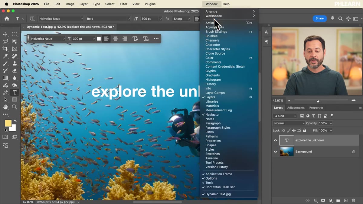 Character panel open showing leading, tracking, and weight options
The options bar gives you the basics, but the Character panel is where the real work happens. Go to Window, then Character to open it. This panel surfaces controls that don’t fit in the top bar: leading (the vertical spacing between lines), tracking (the horizontal spacing between every letter), and individual character styling options like fake bold, fake italic, and all caps.
Character panel open showing leading, tracking, and weight options
The options bar gives you the basics, but the Character panel is where the real work happens. Go to Window, then Character to open it. This panel surfaces controls that don’t fit in the top bar: leading (the vertical spacing between lines), tracking (the horizontal spacing between every letter), and individual character styling options like fake bold, fake italic, and all caps.
One thing worth knowing: “fake bold” and “fake italic” in the Character panel are Photoshop synthesizing those styles, not pulling them from the actual font file. If your font has a true Bold or Italic weight available, always use that instead. It will look sharper, especially at larger sizes where the difference becomes obvious.
Step 3: Mix Font Weights Within a Single Line
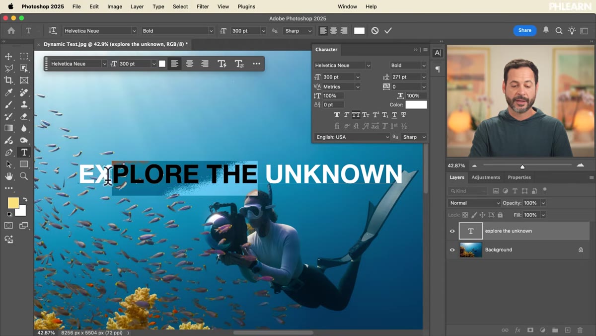 “Explore the” selected in regular weight, “Unknown” remaining in bold
This is where it gets genuinely useful. You don’t have to apply the same weight to your entire text layer. Click and drag to select only the words you want to restyle, then change the weight in the Character panel. Aaron keeps “Unknown” in bold while switching “Explore the” to regular, and the visual contrast that creates is exactly the kind of typographic hierarchy that makes a layout feel designed rather than just typed.
“Explore the” selected in regular weight, “Unknown” remaining in bold
This is where it gets genuinely useful. You don’t have to apply the same weight to your entire text layer. Click and drag to select only the words you want to restyle, then change the weight in the Character panel. Aaron keeps “Unknown” in bold while switching “Explore the” to regular, and the visual contrast that creates is exactly the kind of typographic hierarchy that makes a layout feel designed rather than just typed.
The practical application here is significant. Instead of creating two separate text layers, managing two sets of positioning, and trying to keep them visually aligned, you’re doing everything inside one layer. Less clutter in your layers panel, easier to move as a unit, and you can still edit it all at once if the client changes the copy.
Step 4: Break Text Across Lines for Layout Control
 “Unknown” moved to second line, two-line layout visible
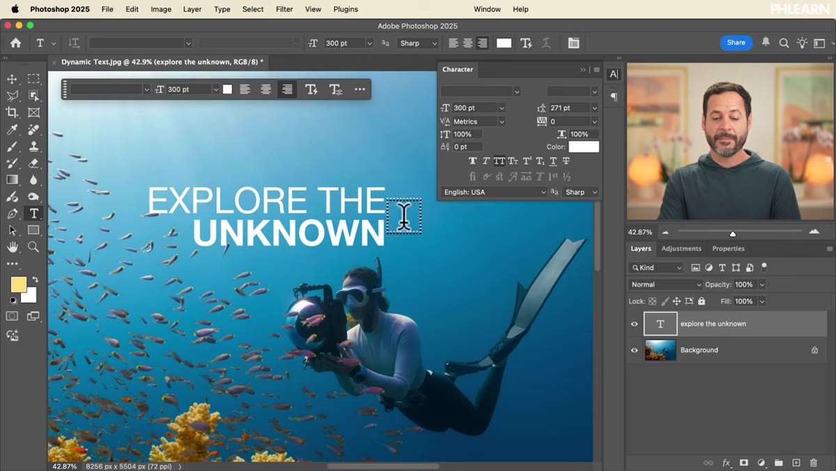
With your cursor placed before the word you want on a new line, hit Enter. That’s it. Aaron puts “Unknown” on its own line so it sits beneath “Explore the,” creating a two-line layout where the bold word gets its own visual real estate. Simple, but it transforms the hierarchy completely.
“Unknown” moved to second line, two-line layout visible
With your cursor placed before the word you want on a new line, hit Enter. That’s it. Aaron puts “Unknown” on its own line so it sits beneath “Explore the,” creating a two-line layout where the bold word gets its own visual real estate. Simple, but it transforms the hierarchy completely.
Once you have multiple lines, your alignment choices start to matter more. Select all your text first with Ctrl/Cmd + A before switching alignment modes. If you only have one word selected when you hit center-align, Photoshop will center just that word, which produces a result that looks broken rather than intentional.
Step 5: Move Text Without Switching Tools
 Text being repositioned by holding Cmd/Ctrl and dragging
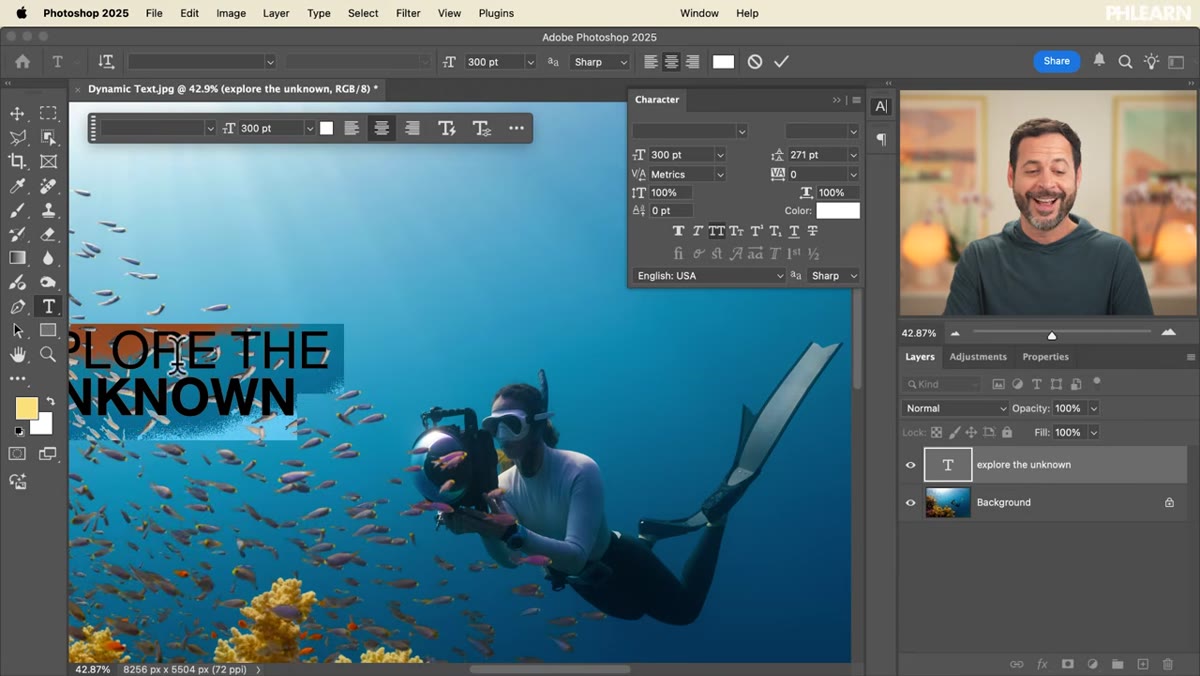
This is the shortcut I wish someone had told me years ago. While you’re in the Type tool and actively editing text, hold Ctrl (Windows) or Cmd (Mac) and click and drag. Your cursor temporarily becomes a move cursor, letting you reposition the text layer without committing your edits, switching to the Move tool, and then switching back to the Type tool again.
Text being repositioned by holding Cmd/Ctrl and dragging
This is the shortcut I wish someone had told me years ago. While you’re in the Type tool and actively editing text, hold Ctrl (Windows) or Cmd (Mac) and click and drag. Your cursor temporarily becomes a move cursor, letting you reposition the text layer without committing your edits, switching to the Move tool, and then switching back to the Type tool again.
It sounds minor until you’re doing it twenty times in a session. The old way adds up to a lot of unnecessary tool-switching, and anything that keeps you in flow while laying out type is worth burning into muscle memory immediately.
Step 6: Adjust Leading and Tracking for Polish
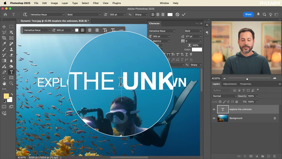
 Character panel with leading and tracking values being adjusted
Back in the Character panel, leading controls the breathing room between your lines. Tight leading can make text feel urgent and punchy. Loose leading gives it air and a more editorial feel. Tracking is your letter-spacing across a selection or the whole layer. Increasing tracking slightly on headlines set in all caps is a classic move for a reason: it reads cleaner at large sizes and feels more intentional.
Character panel with leading and tracking values being adjusted
Back in the Character panel, leading controls the breathing room between your lines. Tight leading can make text feel urgent and punchy. Loose leading gives it air and a more editorial feel. Tracking is your letter-spacing across a selection or the whole layer. Increasing tracking slightly on headlines set in all caps is a classic move for a reason: it reads cleaner at large sizes and feels more intentional.
Neither of these have a “correct” value. They’re tools you adjust by eye until the text reads the way you want it to in context with the rest of the image. The all caps toggle in the Character panel is also worth using here rather than just typing in caps, because it gives Photoshop more control over how those letterforms are rendered.
A Note From My Own Work: Keep One Eye on the Layers Panel
Something Aaron doesn’t dwell on but I’ve learned the hard way: every text layer you create this way is still a live, editable layer. Name them the moment you make them. “Headline - Bold” tells you everything. “Type Layer 3” tells you nothing at 11pm when you’re trying to find the right layer before a deadline.
I started doing this after a project where I had eleven unnamed text layers stacked on top of each other and had to click through every single one to find the headline. It’s a small habit with a disproportionately large return on frustration saved.
The core lesson from this tutorial is that most people are underusing the Character panel and treating text layers as single-style objects when they don’t have to be. Mixing weights within one layer, using keyboard shortcuts to reposition without switching tools, and controlling leading and tracking intentionally separates layouts that look composed from layouts that look assembled.
Watch the full tutorial on YouTube to see Aaron walk through the whole thing, including the dynamic text auto-formatting feature that the video builds toward. It’s worth seeing in motion.
Comments (2)
Finally someone explains this in a way that actually makes sense.
Shared this with my photography group. Everyone loved it.
Leave a Comment