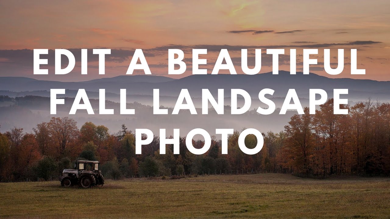
Fall photos are deceptively tricky. You’d think all that warm color does half the work for you, but if you’ve ever pulled a raw file of autumn foliage into Lightroom and just stared at it like it owes you money, you know exactly what I’m talking about. The sky is blown out, the shadows are muddy, and the colors look more “dying hospital plant” than “peak New England October.” I’ve been there more times than I’d like to admit.
In this Matt Kloskowski tutorial, he walks through his complete start-to-finish workflow on a gorgeous fall scene shot in New Hampshire at sunrise – a RAW file you can actually download and follow along with. Watch the full tutorial on YouTube – but if you want the breakdown with actionable steps you can reference without scrubbing through a video, that’s what this is for. Matt’s a photographer I’ve learned a lot from, and this particular workflow is packed with smart decisions that are easy to miss if you’re just half-watching.
What I like about his approach is that it’s not a preset-dump situation. He’s making deliberate choices at each stage, and once you understand why he’s moving a slider a certain direction, you start building actual instincts instead of just copying numbers.
Step 1: Start in the Basic Panel – Highlights and Shadows First
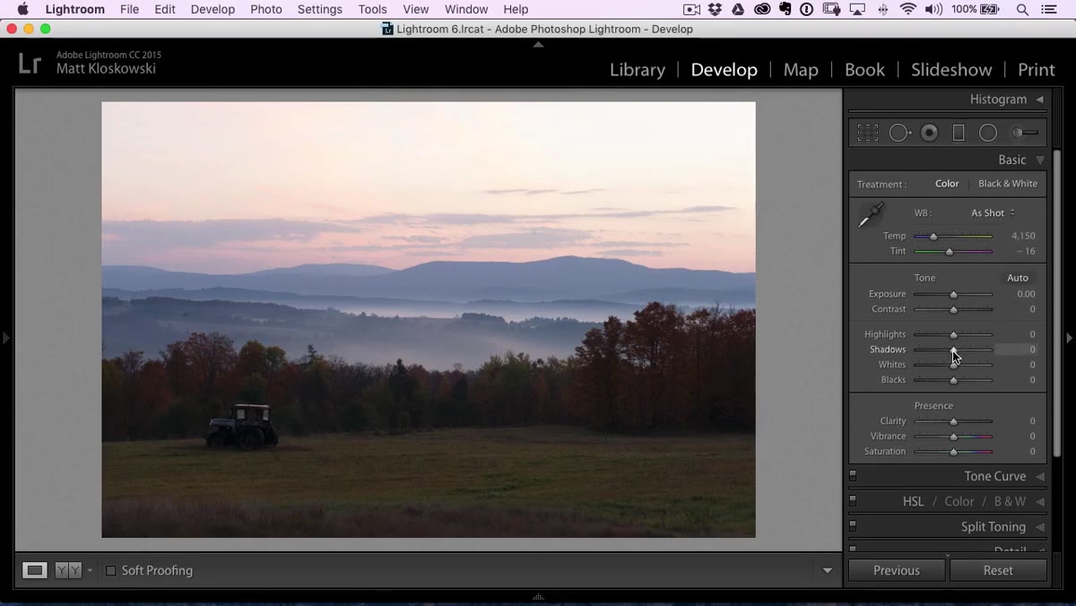 Basic panel open in Lightroom with highlight slider being adjusted
Before touching exposure, Matt goes straight for Highlights and Shadows. The logic is sound: dragging overall exposure down to recover the sky kills your foreground, and dragging it up blows out everything else. Instead of that tug-of-war, pull the Highlights slider down hard to start recovering sky detail. Then crank the Shadows slider up – and he means up, not a polite nudge. This separation between the two sliders is what gives a landscape image that sense of depth without flattening the whole thing.
Basic panel open in Lightroom with highlight slider being adjusted
Before touching exposure, Matt goes straight for Highlights and Shadows. The logic is sound: dragging overall exposure down to recover the sky kills your foreground, and dragging it up blows out everything else. Instead of that tug-of-war, pull the Highlights slider down hard to start recovering sky detail. Then crank the Shadows slider up – and he means up, not a polite nudge. This separation between the two sliders is what gives a landscape image that sense of depth without flattening the whole thing.
The exposure slider stays relatively conservative throughout this stage. Let the targeted sliders do the heavy lifting first. You can always come back.
Step 2: Set White and Black Points Using the Alt/Option Trick
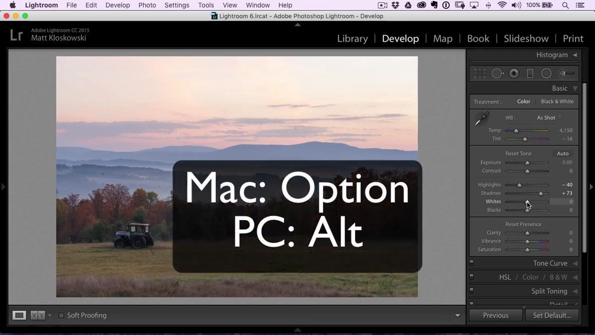 White slider being dragged with Alt key held, clipping preview visible
This is one of those techniques that sounds fussy until you try it once and wonder how you lived without it. Hold Alt (Windows) or Option (Mac) while dragging the Whites slider to the right. Your screen will go black, and small colored patches will start appearing as you push highlights toward clipping – that’s the clipping preview. Drag until you just start to see those patches, then back off slightly. That’s your white point.
White slider being dragged with Alt key held, clipping preview visible
This is one of those techniques that sounds fussy until you try it once and wonder how you lived without it. Hold Alt (Windows) or Option (Mac) while dragging the Whites slider to the right. Your screen will go black, and small colored patches will start appearing as you push highlights toward clipping – that’s the clipping preview. Drag until you just start to see those patches, then back off slightly. That’s your white point.
Do the same thing with Blacks, but drag left. The screen goes white this time, and patches appear when shadows start clipping. You’re essentially telling Lightroom exactly where your tonal range lives, which gives every subsequent adjustment a clean foundation to build on. Matt calls it “a good base for the photo,” and he’s right – it’s not a magic formula, but it works consistently enough that it belongs in your standard opener.
Step 3: Add Clarity and Warm the Temperature
 Temperature slider being dragged right, image visibly warming
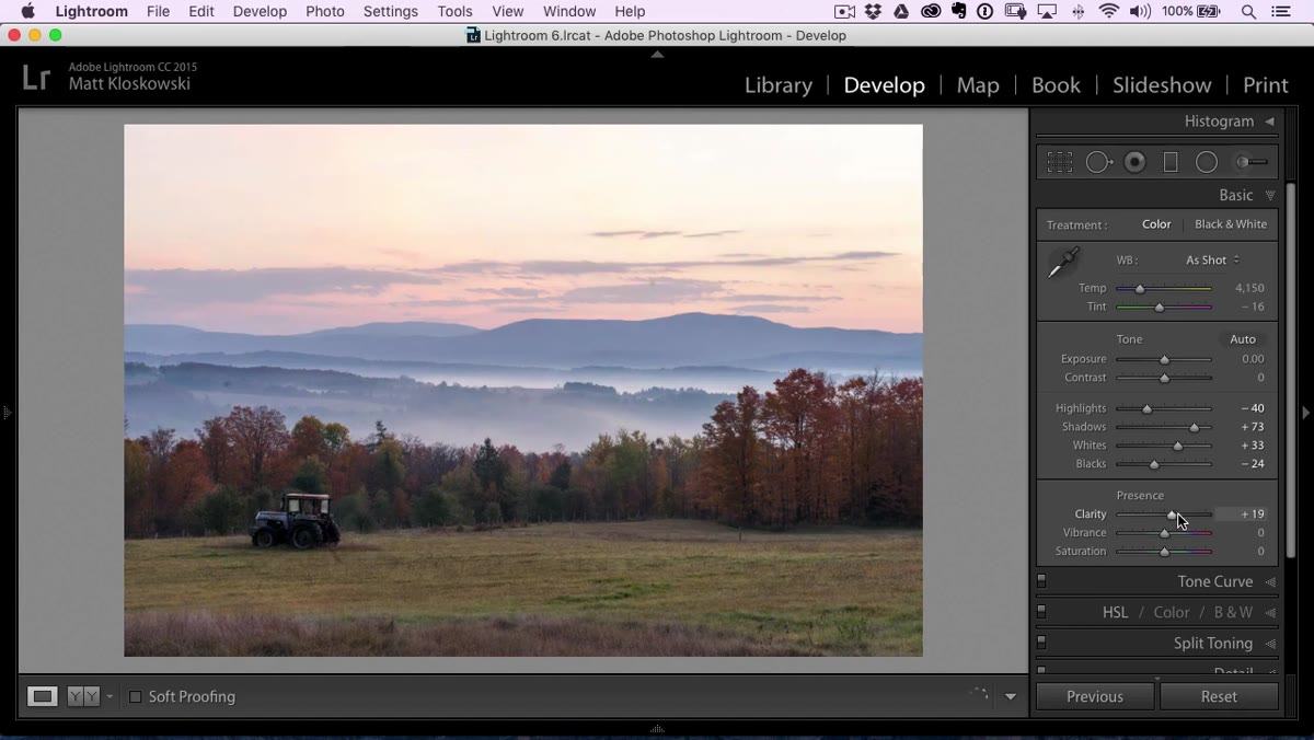
After locking in the tonal range, Matt bumps Clarity up a bit. Clarity adds midtone contrast, which on a landscape translates to texture and presence in things like foliage and water. Don’t go nuts with it – this isn’t 2011 and HDR-face isn’t a good look on trees either. A moderate push is enough to add some bite.
Temperature slider being dragged right, image visibly warming
After locking in the tonal range, Matt bumps Clarity up a bit. Clarity adds midtone contrast, which on a landscape translates to texture and presence in things like foliage and water. Don’t go nuts with it – this isn’t 2011 and HDR-face isn’t a good look on trees either. A moderate push is enough to add some bite.
Then comes the Temperature slider, and he moves it meaningfully to the right to warm the image up. For a sunrise fall scene, this makes total sense – the light was already golden, and the raw file tends to flatten that. Warming the image leans into what the scene actually looked like rather than fighting it. If your fall images consistently look cooler and duller than the actual moment felt, this is usually the fix.
Step 4: Use HSL Luminance to Shape the Foliage
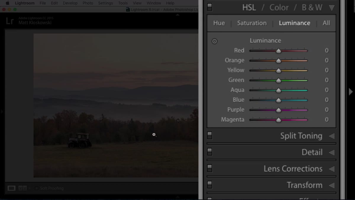 HSL panel open, Luminance tab selected, yellow and orange sliders visible
This is where it gets interesting. In the HSL panel, Matt switches to the Luminance tab – not Saturation, which would be the obvious move. Luminance controls how bright specific color ranges appear, which means you can make the yellows and oranges in the foliage pop without making them look like a neon sign.
HSL panel open, Luminance tab selected, yellow and orange sliders visible
This is where it gets interesting. In the HSL panel, Matt switches to the Luminance tab – not Saturation, which would be the obvious move. Luminance controls how bright specific color ranges appear, which means you can make the yellows and oranges in the foliage pop without making them look like a neon sign.
He experiments with the Yellow and Orange luminance sliders to find what looks right for the foreground. Pushing yellows lighter can make that foreground foliage feel sunlit and airy. The key insight here is that this adjustment is targeted – it’s affecting those specific hues and not the whole image. It’s a much more surgical approach than just reaching for Vibrance and hoping for the best.
Step 5: Sharpen Strategically in the Detail Panel
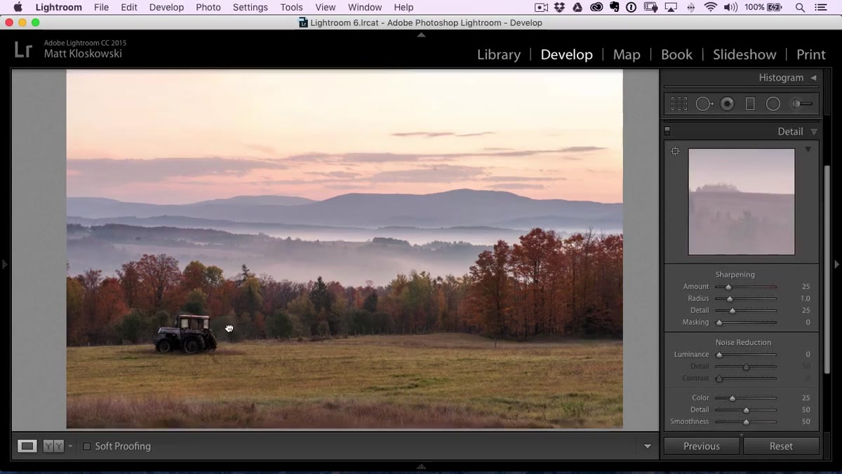 Detail panel open, sharpening sliders with landscape zoomed in to 100%
For landscape photos, Matt sharpens more aggressively than you might expect. He zooms into a critical area of the image – somewhere with important texture – before touching any sliders, because sharpening at fit-to-screen view is basically useless. You need to be at 100% to see what’s actually happening.
Detail panel open, sharpening sliders with landscape zoomed in to 100%
For landscape photos, Matt sharpens more aggressively than you might expect. He zooms into a critical area of the image – somewhere with important texture – before touching any sliders, because sharpening at fit-to-screen view is basically useless. You need to be at 100% to see what’s actually happening.
His sharpening amount goes up to around 90, which sounds like a lot but works for landscapes where fine detail matters. Radius he keeps around 1.4, which is a solid middle-ground for natural textures. Then he increases the Detail slider carefully, watching for the point where it starts to look “crunchy” – his word, and the right one. The moment the texture starts looking artificially etched rather than naturally present, you’ve gone too far. Back it off.
What I’d Add: Don’t Skip the Color Check Before You Leave Lightroom
Matt’s workflow here is tight and efficient, which is exactly what you want from someone who’s clearly done this hundreds of times. The one thing I’d layer on top – especially for fall edits – is a quick pass through the Saturation tab in HSL after you’ve done the Luminance work. Luminance changes how bright a color appears, but it doesn’t change how saturated it is, and sometimes boosting luminance on a yellow or orange can make it look slightly washed out in a weird way. A subtle saturation bump on those same channels can bring the richness back without cranking the overall Vibrance and turning your whole image into a pumpkin.
I learned this the hard way after spending an afternoon on a fall composite that looked great on my laptop and completely oversaturated on my client’s monitor. Doing targeted HSL saturation checks before export has been part of my process ever since.
The single biggest takeaway from this tutorial is the Highlights-and-Shadows-first approach combined with the Alt/Option clipping trick – that combination alone will improve almost any landscape you throw at it, and it takes about thirty seconds once it becomes muscle memory.
Matt’s got the rest of the workflow in the full video, including whatever Photoshop work comes in later episodes, and it’s worth watching start to finish.
Watch the full tutorial on YouTube
Comments (2)
Love how you break down complex stuff into manageable steps.
Applied this to my portfolio shots and the improvement is noticeable.
Leave a Comment