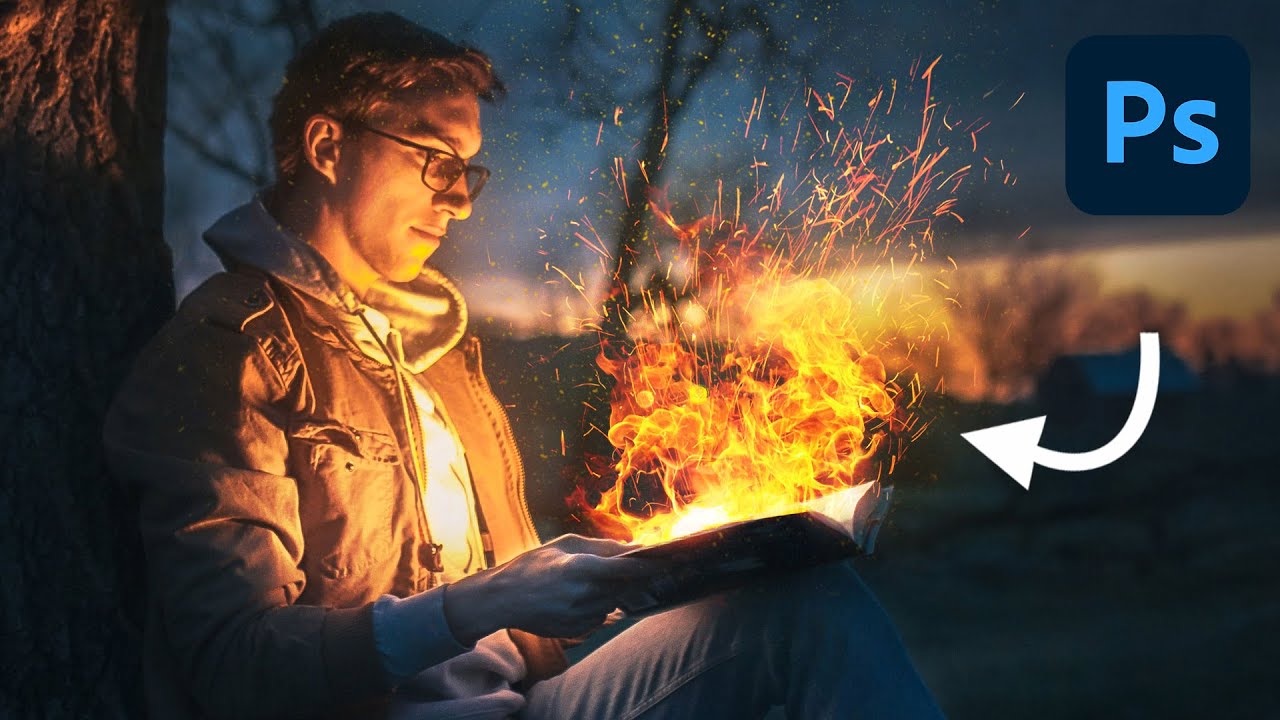
I’ve spent embarrassing amounts of time trying to manufacture drama in composite images. Explosions, sparks, light leaks — you name it, I’ve probably botched it. Fire especially has this reputation for being one of those effects that either looks jaw-dropping or immediately screams “I found a free brush pack on DeviantArt.” So when I stumbled on this Aaron Nace (PHLEARN) tutorial on creating realistic fire in Photoshop, I fully expected another overcomplicated mess of filters and adjustment layers. It is not that. It is almost offensively simple, and that’s exactly why it works.
Watch the full tutorial on YouTube
The core idea is this: fire is a light source, so your base image needs to already have a light source where you want the fire to appear. That single constraint eliminates the number one reason fire composites look fake. If you’re slapping orange flames onto a photo that’s lit from above with a soft studio light, no amount of blend mode wizardry is going to save you. Get that right upfront, and the rest is actually pretty painless.
Step 1: Load Your Images Into a Stack
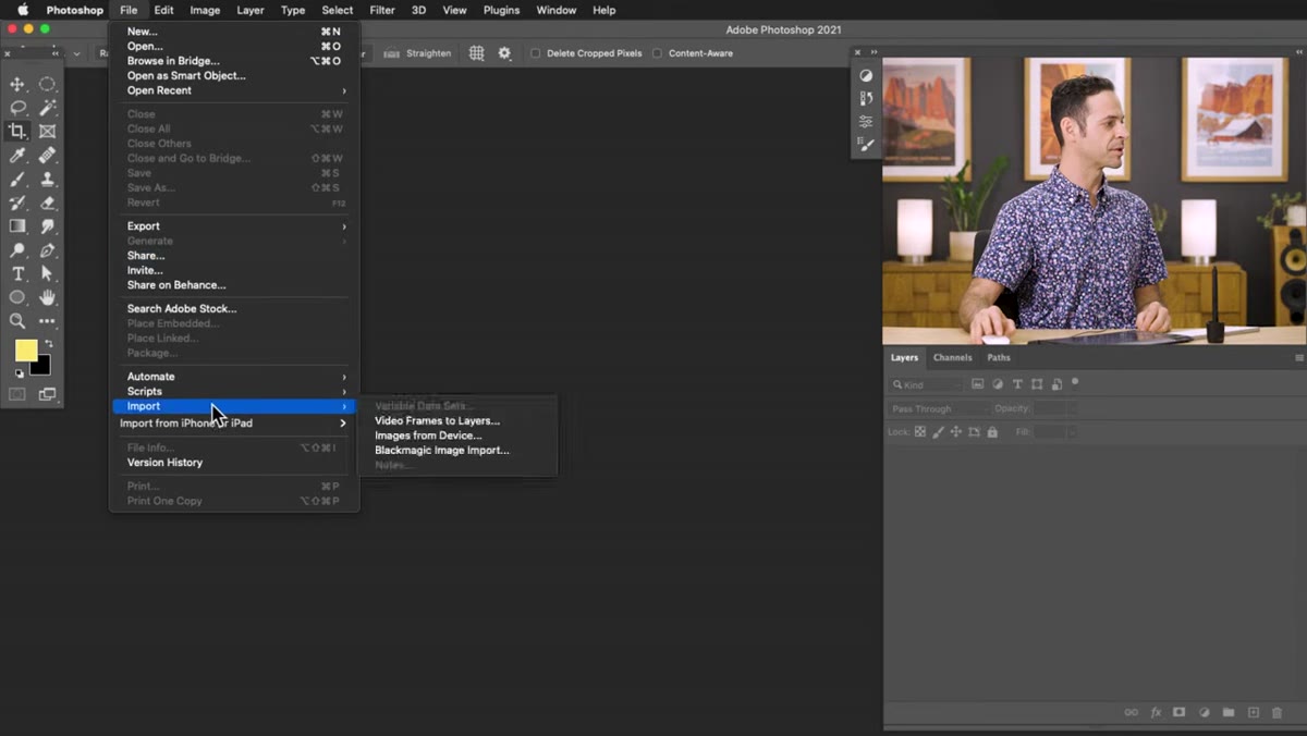 Loading fire stock images via File > Scripts > Load Files into Stack
Go to File, then Scripts, then Load Files into Stack. This command lets you pull multiple images, your base photo plus all your fire stock images, into a single Photoshop document with each one sitting on its own layer. It’s a huge time-saver versus opening and dragging files one by one. Aaron uses a handful of different fire stock photos here, all shot against a dark background, which is key for the next step. You can find similar assets on Adobe Stock, Unsplash, or PHLEARN’s own site where they offer downloads to go along with the tutorial.
Loading fire stock images via File > Scripts > Load Files into Stack
Go to File, then Scripts, then Load Files into Stack. This command lets you pull multiple images, your base photo plus all your fire stock images, into a single Photoshop document with each one sitting on its own layer. It’s a huge time-saver versus opening and dragging files one by one. Aaron uses a handful of different fire stock photos here, all shot against a dark background, which is key for the next step. You can find similar assets on Adobe Stock, Unsplash, or PHLEARN’s own site where they offer downloads to go along with the tutorial.
Once loaded, drag your base subject photo to the very bottom of the layer stack. Everything above it will be fire.
Step 2: Switch All Fire Layers to Screen Blend Mode
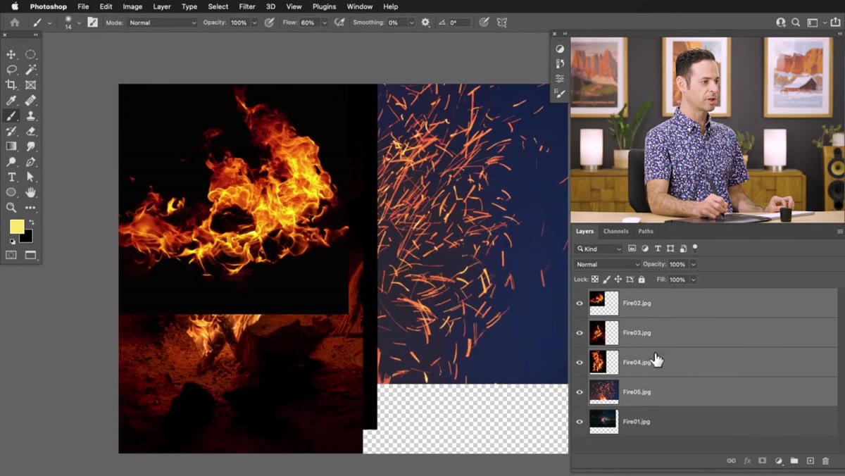 All fire layers selected with blend mode changed to Screen
Shift-click to select all the fire layers at once, then change their blend mode from Normal to Screen. This is where the magic happens, and it takes about three seconds. Screen blend mode mathematically drops out anything dark and keeps anything bright, so the black backgrounds on your fire stock photos become completely transparent while the fire itself remains visible. What was a stack of black rectangles with orange blobs suddenly looks like fire floating over your subject. No masking required yet, no complicated extraction.
All fire layers selected with blend mode changed to Screen
Shift-click to select all the fire layers at once, then change their blend mode from Normal to Screen. This is where the magic happens, and it takes about three seconds. Screen blend mode mathematically drops out anything dark and keeps anything bright, so the black backgrounds on your fire stock photos become completely transparent while the fire itself remains visible. What was a stack of black rectangles with orange blobs suddenly looks like fire floating over your subject. No masking required yet, no complicated extraction.
If you’ve never really leaned on Screen mode for compositing, this tutorial will convert you. It’s the same reason photographers use it for adding bokeh, lens flares, or any bright element shot against black.
Step 3: Crop and Clean Up with Levels
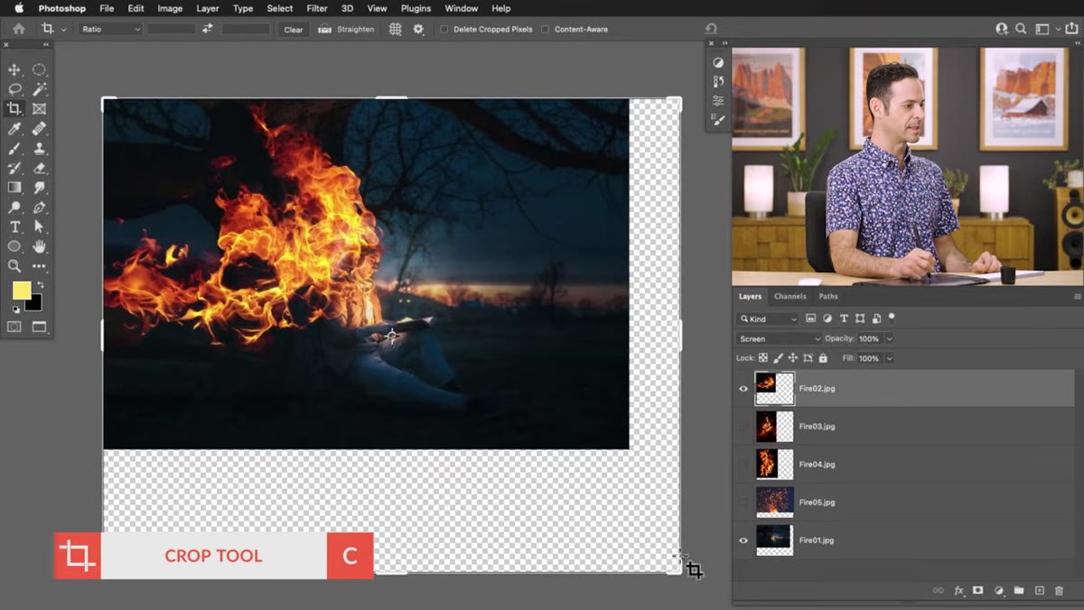 Cropping the canvas to the final image size
Hit C for the Crop tool and trim your canvas down to your final composition. Once that’s done, you’ll probably notice some of the fire layers have edges that aren’t quite disappearing, places where the background wasn’t perfectly black in the stock photo. Fix this fast with Levels: hit Ctrl/Cmd + L and drag the left (shadows) input slider to the right. This forces the near-black areas to go fully black, which Screen mode then renders as fully transparent. A small adjustment here goes a long way toward making the composite look seamless.
Cropping the canvas to the final image size
Hit C for the Crop tool and trim your canvas down to your final composition. Once that’s done, you’ll probably notice some of the fire layers have edges that aren’t quite disappearing, places where the background wasn’t perfectly black in the stock photo. Fix this fast with Levels: hit Ctrl/Cmd + L and drag the left (shadows) input slider to the right. This forces the near-black areas to go fully black, which Screen mode then renders as fully transparent. A small adjustment here goes a long way toward making the composite look seamless.
Don’t overdo it. Push too far and you’ll start clipping the fire itself, eating into the orange and yellow tones you actually want.
Step 4: Transform and Position the Fire
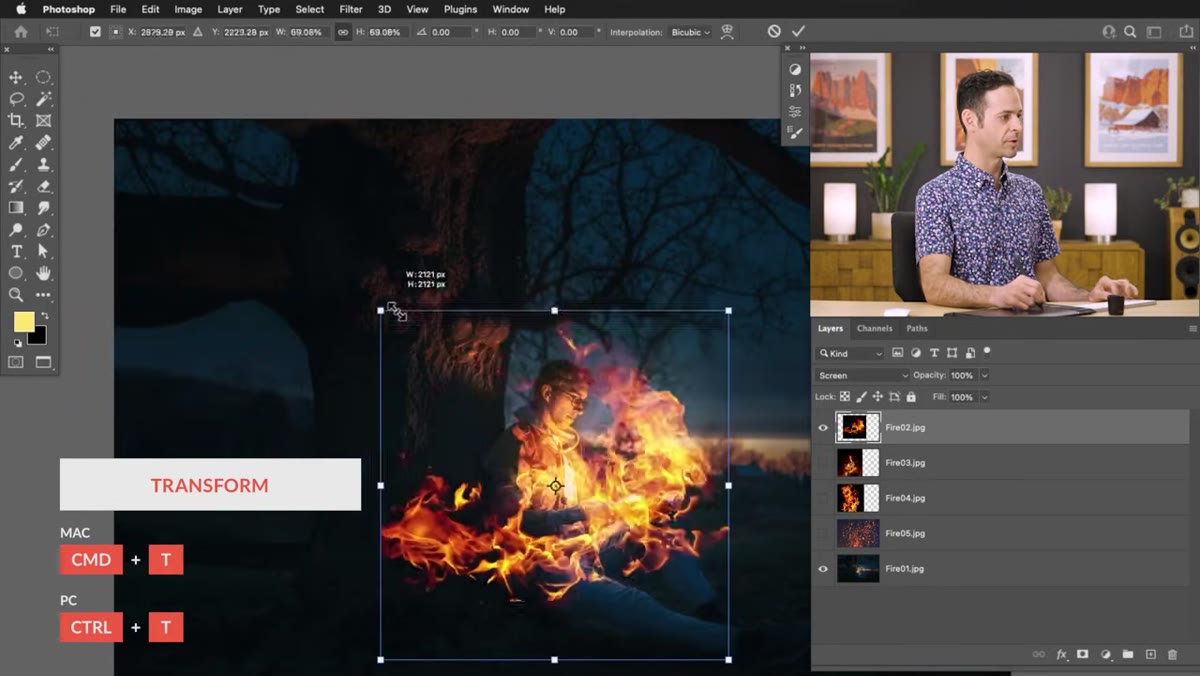 Using Free Transform to resize and position fire over the subject
With each fire layer selected, hit Ctrl/Cmd + T to bring up Free Transform. Resize and reposition the flames so they sit naturally over whatever is supposed to be burning. At this stage, it helps to think about how fire actually behaves. It moves upward, it’s denser at the base, and it tapers as it rises. Use that mental image to guide your placement rather than just centering the stock photo over your subject. Rotate slightly if needed. Try multiple fire images layered on top of each other at different scales to build up density and variation.
Using Free Transform to resize and position fire over the subject
With each fire layer selected, hit Ctrl/Cmd + T to bring up Free Transform. Resize and reposition the flames so they sit naturally over whatever is supposed to be burning. At this stage, it helps to think about how fire actually behaves. It moves upward, it’s denser at the base, and it tapers as it rises. Use that mental image to guide your placement rather than just centering the stock photo over your subject. Rotate slightly if needed. Try multiple fire images layered on top of each other at different scales to build up density and variation.
This is also where having multiple fire stock images earns its keep. One fire layer usually looks too uniform. Stacking two or three with slightly different positions creates the chaotic, organic feel that makes fire convincing.
Step 5: Add Layer Masks to Control Where Fire Appears
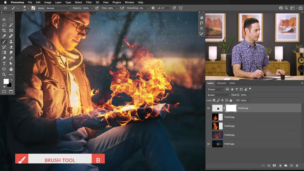 Painting black on a layer mask to hide fire from the subject’s hand
Add a layer mask to each fire layer (the square icon with a circle at the bottom of the Layers panel), grab a soft round brush, set your foreground color to black, and paint over any areas where the fire shouldn’t appear. In the tutorial, Aaron paints the fire away from the person’s hand since only the book is supposed to be burning. Black on a mask hides, white reveals, that’s the whole logic.
Painting black on a layer mask to hide fire from the subject’s hand
Add a layer mask to each fire layer (the square icon with a circle at the bottom of the Layers panel), grab a soft round brush, set your foreground color to black, and paint over any areas where the fire shouldn’t appear. In the tutorial, Aaron paints the fire away from the person’s hand since only the book is supposed to be burning. Black on a mask hides, white reveals, that’s the whole logic.
For a more controlled approach on a specific layer, try inverting the mask immediately after adding it: hit Ctrl/Cmd + I right after creating the mask and it turns completely black, hiding everything. Then paint with white to reveal only the fire you want. This is especially useful when you’re adding a smaller, more targeted burst of flame to a specific area.
Step 6: Paint Fire Back In Strategically Using Inverted Masks
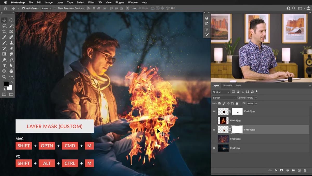 Painting white on an inverted mask to reveal fire selectively
This is the step Aaron emphasizes that most people skip: think about fire’s actual shape when you’re painting your mask. Don’t just fade the fire out with a low-opacity brush, that produces a soft, wispy disappearing act that looks nothing like real fire. Instead, follow the natural edge of a flame. Find where a tongue of fire would logically end and cut it off there. Use a brush with varied pressure and edge sharpness. The difference between fire that looks composited and fire that looks captured comes down to whether the edges respect fire’s physical behavior.
Painting white on an inverted mask to reveal fire selectively
This is the step Aaron emphasizes that most people skip: think about fire’s actual shape when you’re painting your mask. Don’t just fade the fire out with a low-opacity brush, that produces a soft, wispy disappearing act that looks nothing like real fire. Instead, follow the natural edge of a flame. Find where a tongue of fire would logically end and cut it off there. Use a brush with varied pressure and edge sharpness. The difference between fire that looks composited and fire that looks captured comes down to whether the edges respect fire’s physical behavior.
My Own Add-On: Match the Color Temperature
One thing the tutorial doesn’t spend much time on but that I always add to this workflow: a Hue/Saturation or Color Balance adjustment layer clipped to the subject, pushing warm orange and yellow tones into the shadowed areas nearest the fire. Real fire throws warm, amber light onto everything around it. If your subject’s skin tones or clothing stay perfectly neutral while orange flames dance nearby, the brain clocks it as fake even if it can’t articulate why. A subtle warm push in the shadows, maybe 10 to 15 points toward red and yellow, sells the whole thing considerably harder.
The single most important thing I took from this tutorial: your stock fire photos need dark, near-black backgrounds, and your base image needs a real motivated light source. Get those two things right before you open Photoshop and the Screen blend mode trick does most of the heavy lifting for you. Everything else is refinement.
Watch the full tutorial on YouTube and follow along with PHLEARN’s downloadable assets if you want to practice on the exact same images Aaron uses. Genuinely one of the faster wins I’ve found in compositing.
Comments (2)
Printing this out and pinning it next to my monitor. That good.
Shared this with my photography group. Everyone loved it.
Leave a Comment