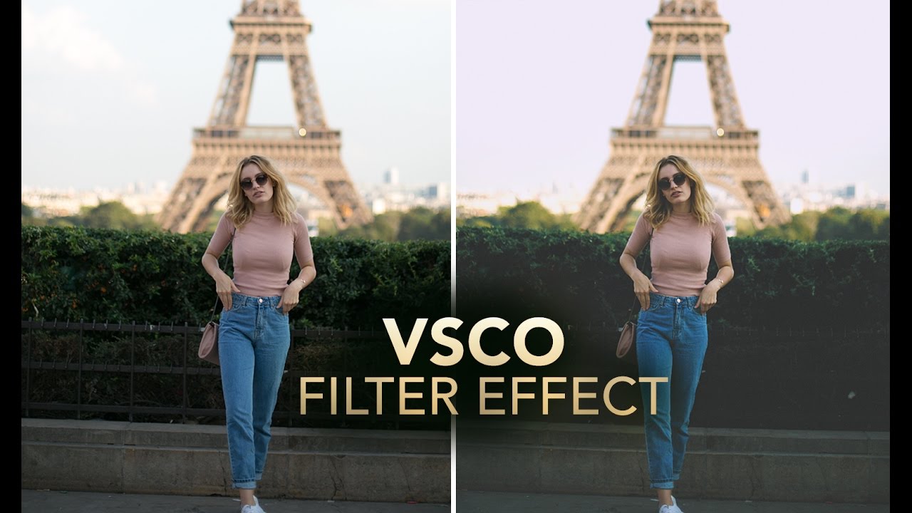
Client work has a funny way of humbling you. I spent the better part of an afternoon once trying to reverse-engineer that warm, slightly faded, film-ish look that’s all over Instagram and Lightroom preset packs, and I kept overshooting it. Everything either looked like a sepia disaster from a 2008 photo booth or a blown-out mess with a yellow tint that made the subject look unwell. The problem wasn’t my eye for color. It was that I was trying to get there in one or two moves, and that’s not how this effect works.
That’s exactly what clicked for me when I watched this Jessica Kobeissi tutorial on recreating a VSCO-style vintage film effect entirely inside Photoshop. Watch the full tutorial on YouTube. What she does well, and what I hadn’t been doing, is build the effect in layers, letting each adjustment contribute a small piece of the overall look rather than asking one slider to do all the heavy lifting. The whole thing is non-destructive and surprisingly quick once you understand what each step is actually doing.
Step 1: Knock Down the Vibrance First
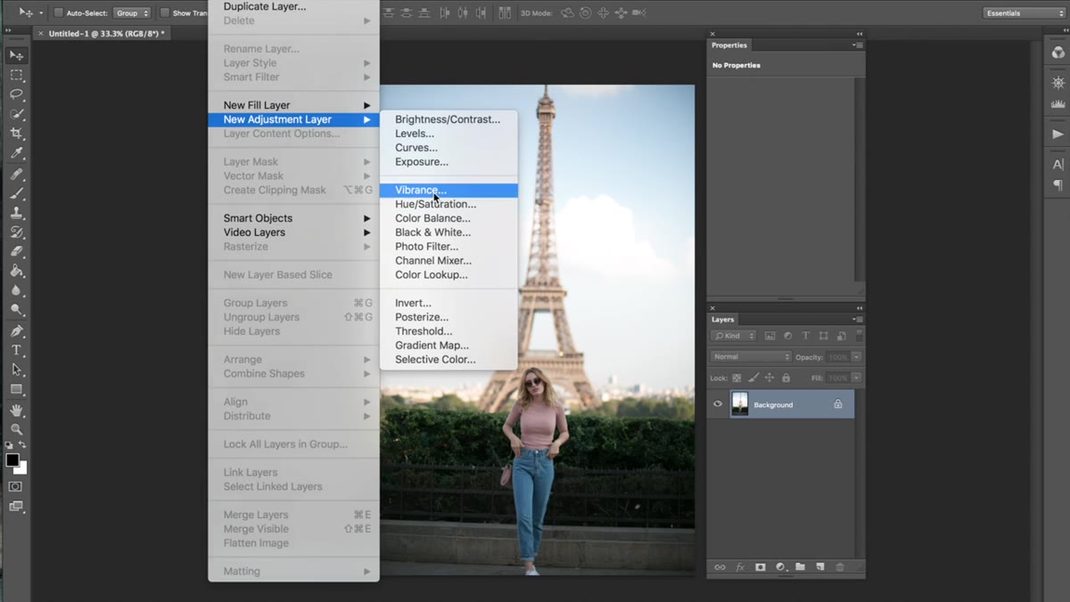 Vibrance adjustment layer panel with value set to -6
Before anything else, Jessica adds a Vibrance adjustment layer and pulls it back to around -6. That’s it. Just a gentle desaturation to take the edge off the colors before you start pushing them in a new direction. It sounds like a nothing move, but think of it as priming a canvas. If you start color grading on an image with fully saturated, punchy colors, any vintage toning you add will fight against those colors the whole way. A small vibrance reduction gives you a neutral starting point without flattening the image entirely.
Vibrance adjustment layer panel with value set to -6
Before anything else, Jessica adds a Vibrance adjustment layer and pulls it back to around -6. That’s it. Just a gentle desaturation to take the edge off the colors before you start pushing them in a new direction. It sounds like a nothing move, but think of it as priming a canvas. If you start color grading on an image with fully saturated, punchy colors, any vintage toning you add will fight against those colors the whole way. A small vibrance reduction gives you a neutral starting point without flattening the image entirely.
Step 2: Build Your Contrast Base with Levels
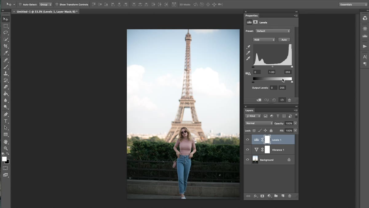 Levels adjustment layer with input and output sliders adjusted
This is where the foundation of the effect actually gets built, and it’s the step most people skip straight past. Open a Levels adjustment layer and, in the RGB channel, set the black input to 18 and pull the white input down to around 93. That’s a modest contrast boost. Then bring the white output slider (the right side of the Output Levels bar at the bottom) down to about 237. That last move is the key one. Pulling the white output down caps the highlights, so the brightest parts of your image can no longer reach pure white. That soft, slightly milky highlight is one of the defining characteristics of film, and you just got it with one slider.
Levels adjustment layer with input and output sliders adjusted
This is where the foundation of the effect actually gets built, and it’s the step most people skip straight past. Open a Levels adjustment layer and, in the RGB channel, set the black input to 18 and pull the white input down to around 93. That’s a modest contrast boost. Then bring the white output slider (the right side of the Output Levels bar at the bottom) down to about 237. That last move is the key one. Pulling the white output down caps the highlights, so the brightest parts of your image can no longer reach pure white. That soft, slightly milky highlight is one of the defining characteristics of film, and you just got it with one slider.
Step 3: Add a Warm Color Shift in the Blue Channel
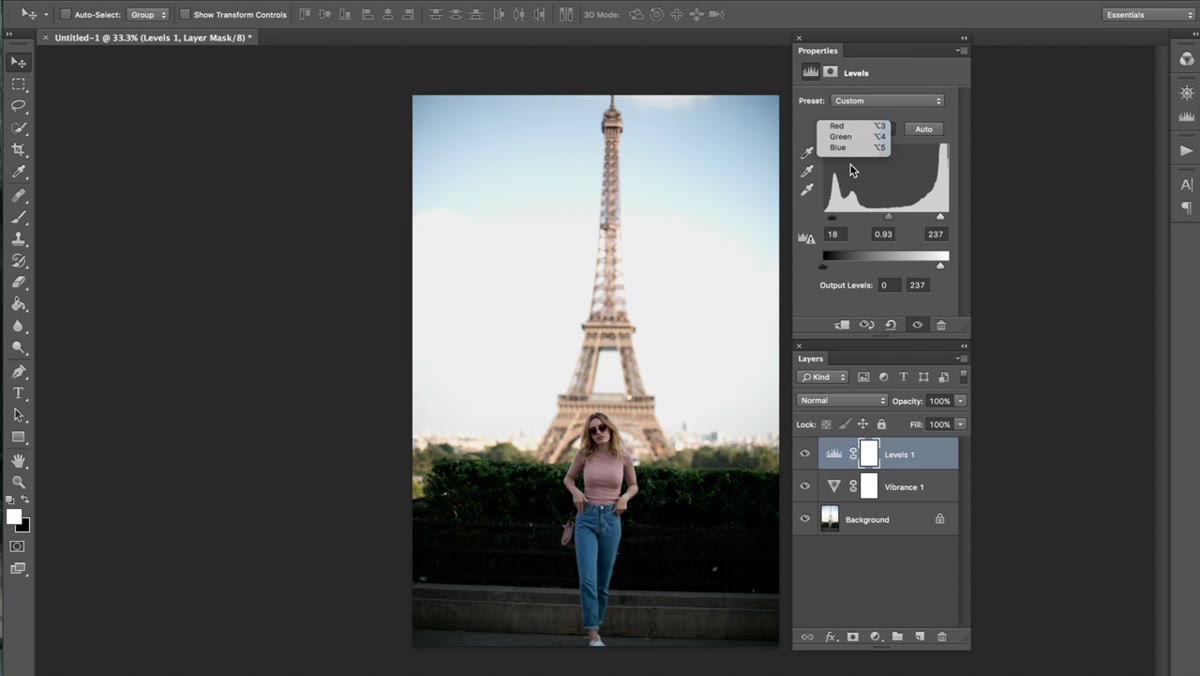 Levels panel switched to Blue channel with output blacks raised
Still inside that same Levels layer, switch the channel dropdown from RGB to Blue. Set the blue midtone input to about 0.91, which nudges the overall image slightly toward yellow-gold. Then, in the Output Levels for the blue channel specifically, bring the black output up to around 20 and the white output down to about 253. This lifts the shadows out of true black and shifts them toward a faint warm tone, while the slight tweak to the midtone input tilts the whole image in that golden direction. These are small numbers, but the cumulative effect is what starts to feel genuinely vintage rather than just “filtered.”
Levels panel switched to Blue channel with output blacks raised
Still inside that same Levels layer, switch the channel dropdown from RGB to Blue. Set the blue midtone input to about 0.91, which nudges the overall image slightly toward yellow-gold. Then, in the Output Levels for the blue channel specifically, bring the black output up to around 20 and the white output down to about 253. This lifts the shadows out of true black and shifts them toward a faint warm tone, while the slight tweak to the midtone input tilts the whole image in that golden direction. These are small numbers, but the cumulative effect is what starts to feel genuinely vintage rather than just “filtered.”
Step 4: Shape the Tones with Curves
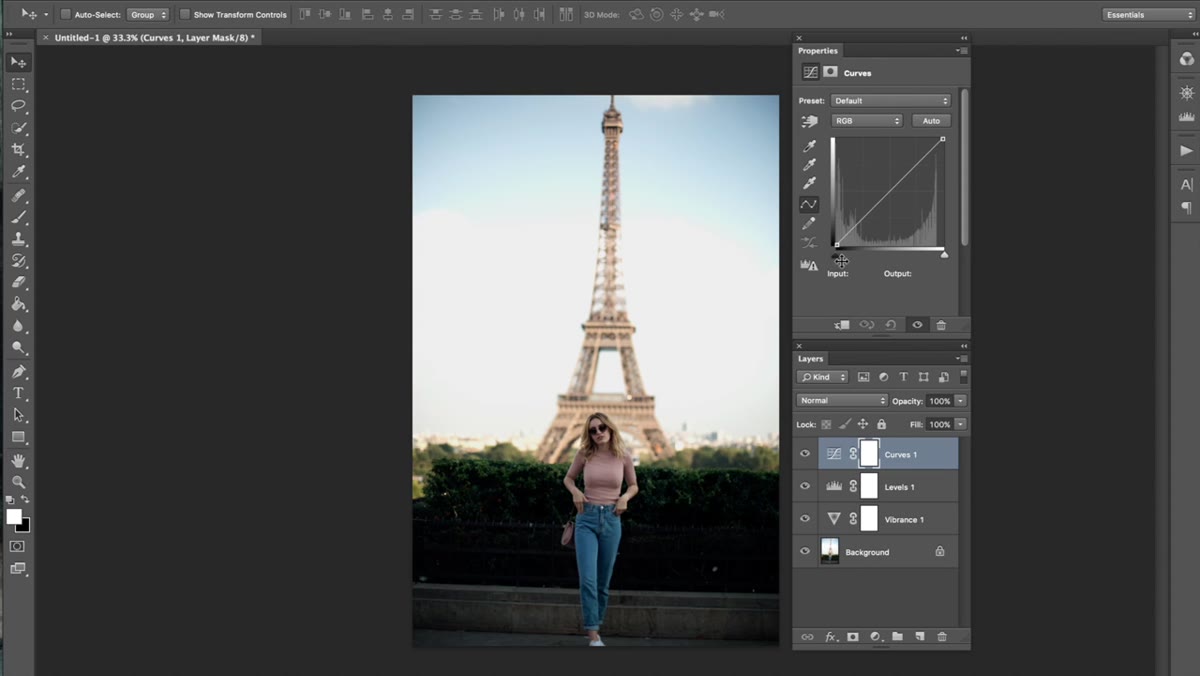 Curves adjustment layer open with RGB channel curve being adjusted
Add a Curves adjustment layer. In the RGB channel, pull a gentle S-curve, but keep it subtle. The goal here is refinement, not drama. Then skip over to the Green channel and add a soft curve adjustment that introduces a slight color push into the midtones. The Green and Blue curve channels are where you can steer the color temperature and mood of the whole image, and even tiny adjustments here have a visible impact. In the Blue channel, drag a point near the highlights up slightly (more blue in the bright areas) and drag a point in the shadows down slightly (pushing those toward yellow-orange). The result is a color grade that feels dimensional rather than like a flat filter was dropped on top.
Curves adjustment layer open with RGB channel curve being adjusted
Add a Curves adjustment layer. In the RGB channel, pull a gentle S-curve, but keep it subtle. The goal here is refinement, not drama. Then skip over to the Green channel and add a soft curve adjustment that introduces a slight color push into the midtones. The Green and Blue curve channels are where you can steer the color temperature and mood of the whole image, and even tiny adjustments here have a visible impact. In the Blue channel, drag a point near the highlights up slightly (more blue in the bright areas) and drag a point in the shadows down slightly (pushing those toward yellow-orange). The result is a color grade that feels dimensional rather than like a flat filter was dropped on top.
Step 5: Add a Subtle Offset with Exposure
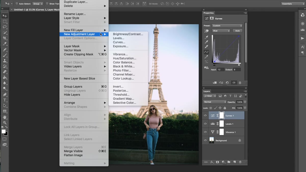 Exposure adjustment layer panel with Offset slider slightly adjusted
Add an Exposure adjustment layer. Leave the Exposure slider exactly where it is and only touch the Offset. The Offset lifts the shadows uniformly, which is another classic characteristic of film stocks that don’t actually render true black. Keep the move small here. Even a slight increase gives the image a softer, airier feel without washing anything out. This is one of those steps where less is genuinely more, and overshooting it is the easiest mistake to make.
Exposure adjustment layer panel with Offset slider slightly adjusted
Add an Exposure adjustment layer. Leave the Exposure slider exactly where it is and only touch the Offset. The Offset lifts the shadows uniformly, which is another classic characteristic of film stocks that don’t actually render true black. Keep the move small here. Even a slight increase gives the image a softer, airier feel without washing anything out. This is one of those steps where less is genuinely more, and overshooting it is the easiest mistake to make.
Step 6: Drop a Solid Color Layer Set to Exclusion
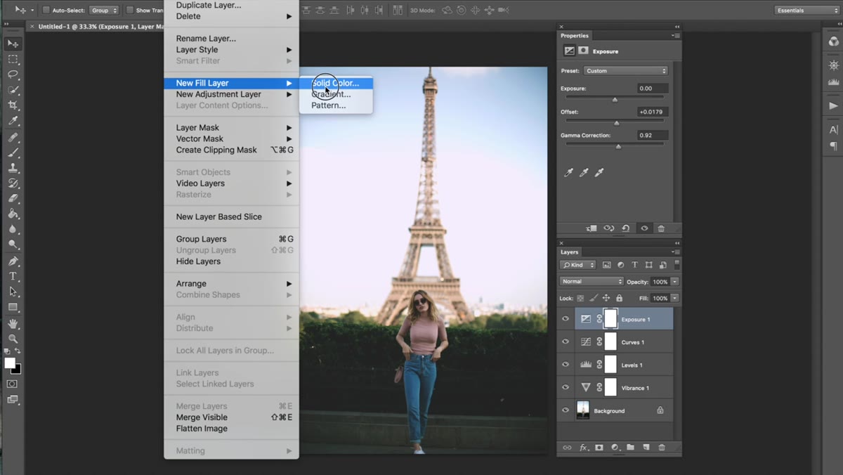 Solid Color fill layer dialog with gray selected
This is the sneaky one. Go to Layer, New Fill Layer, then Solid Color. Pick a neutral gray from the color picker, confirm it, and then change the blending mode of that layer from Normal to Exclusion. Your image will look absolutely terrible at full opacity. That’s normal. Don’t panic. Now drag the layer opacity down to something very low, somewhere in the range of 5 to 15 percent depending on your image. At low opacity, the Exclusion blending mode introduces a subtle color shift and a slight flattening of contrast that reads as that vintage, slightly-faded-print quality. It’s a small layer doing a lot of quiet work.
Solid Color fill layer dialog with gray selected
This is the sneaky one. Go to Layer, New Fill Layer, then Solid Color. Pick a neutral gray from the color picker, confirm it, and then change the blending mode of that layer from Normal to Exclusion. Your image will look absolutely terrible at full opacity. That’s normal. Don’t panic. Now drag the layer opacity down to something very low, somewhere in the range of 5 to 15 percent depending on your image. At low opacity, the Exclusion blending mode introduces a subtle color shift and a slight flattening of contrast that reads as that vintage, slightly-faded-print quality. It’s a small layer doing a lot of quiet work.
My Caveat: Save This as an Action and Stop Rebuilding It Every Time
I burned three separate sessions rebuilding this effect from scratch on different projects before I had the obvious thought of saving it as a Photoshop Action. Record yourself running through all six of these adjustment layers on a test image, stop the recording, and you’ve got a one-click vintage base that you can tweak per image from there. Each adjustment layer stays fully editable, so you’re not locked in. The Solid Color layer opacity in particular tends to need a small nudge depending on the image, but having the starting point ready saves a significant chunk of time on any shoot where you’re color-grading a full gallery.
One more thing worth knowing: this effect is intentionally buildable. If you want a heavier, older look, go back into the Curves Blue channel and push that shadow anchor further toward yellow. If you want it fresher and slightly cooler, reduce the Offset in your Exposure layer and back off the blue channel output adjustments in Levels. The structure Jessica builds here gives you a set of levers to pull, which is more useful than a preset you can’t understand.
The biggest thing this tutorial taught me is that vintage color grading is a layering problem, not a single-slider problem. Every adjustment contributes something small, and none of them work in isolation. Get that part right, and the effect stops looking like a filter and starts looking like an intentional creative choice.
Watch the full tutorial on YouTube to see Jessica walk through the curve adjustments in real time, which is genuinely helpful for getting a feel for how far to push each channel before things get weird.
Comments
Leave a Comment