How to Build a Cinematic Movie Poster Look in Photoshop (Riddick Style)

How to Build a Cinematic Movie Poster Look in Photoshop (Riddick Style)

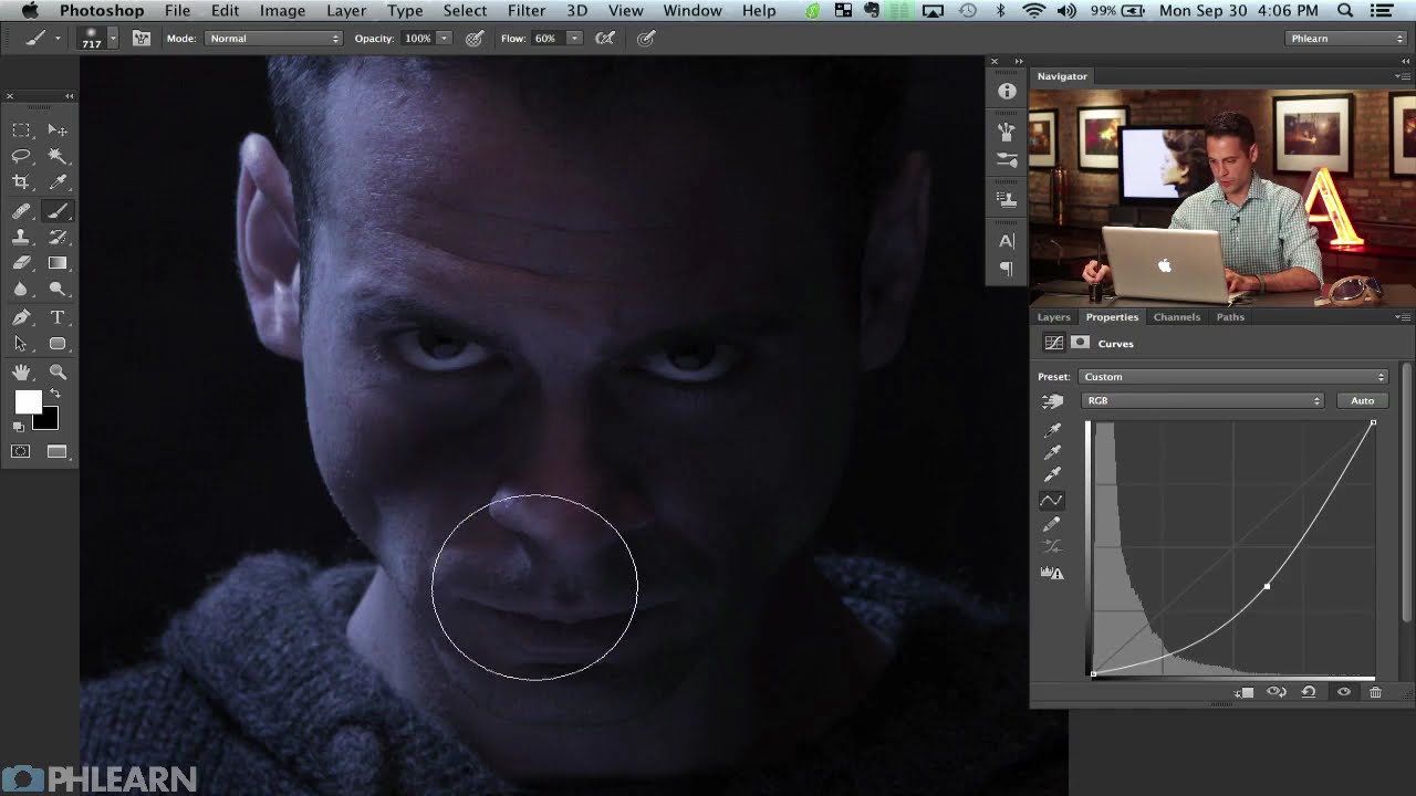
Client work has a funny way of humbling you. I’ve lost count of the number of times someone has handed me a photo and said something like “make it look cinematic” with zero other direction, like I’m supposed to telepathically decode what “cinematic” means to them. After enough of those requests, I started reverse-engineering actual movie posters to build a mental library of techniques I could reach for. That’s what pulled me into this tutorial.
Stop Painting Every Pixel: Photoshop's Focus Area Selection Does the Heavy Lifting

Stop Painting Every Pixel: Photoshop's Focus Area Selection Does the Heavy Lifting

There’s a specific kind of Tuesday afternoon misery that comes from manually painting a selection around a subject with a detailed, wispy, complicated edge. Hair. Fur. Wedding veils. If you’ve spent forty-five minutes with the Quick Selection tool only to end up with a result that looks like your subject was cut out with safety scissors, you know exactly what I’m talking about. The good news is that if your source photo has a blurred background, caused by shallow depth of field, you’re sitting on a selection shortcut that most people scroll right past in the Select menu.

How to Bend a Vegetable Into a Heart Shape (And Actually Make It Look Real)

How to Bend a Vegetable Into a Heart Shape (And Actually Make It Look Real)

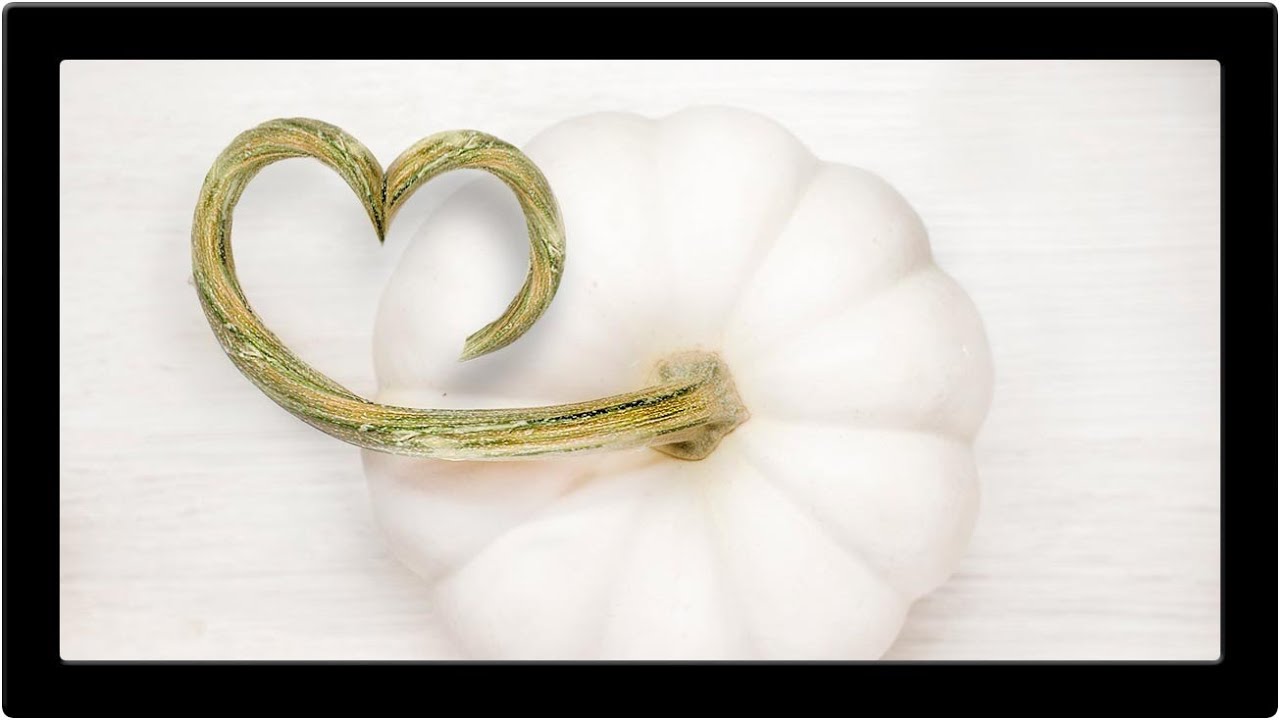
There’s a specific kind of client brief that used to make me sweat: “make it look natural, but also… different.” You know the one. A product photo where the stem of a flower needs to curl into a logo shape, or a branch needs to extend three inches further than it actually does in real life. Clean, simple, advertising-ready. The kind of thing that looks effortless until you try to pull it off and end up with a smeared, obviously-Photoshopped disaster at 2am.

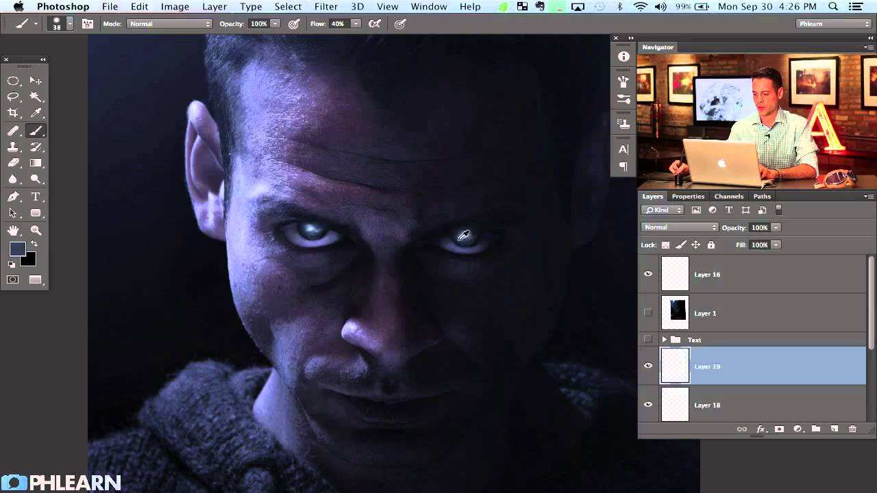
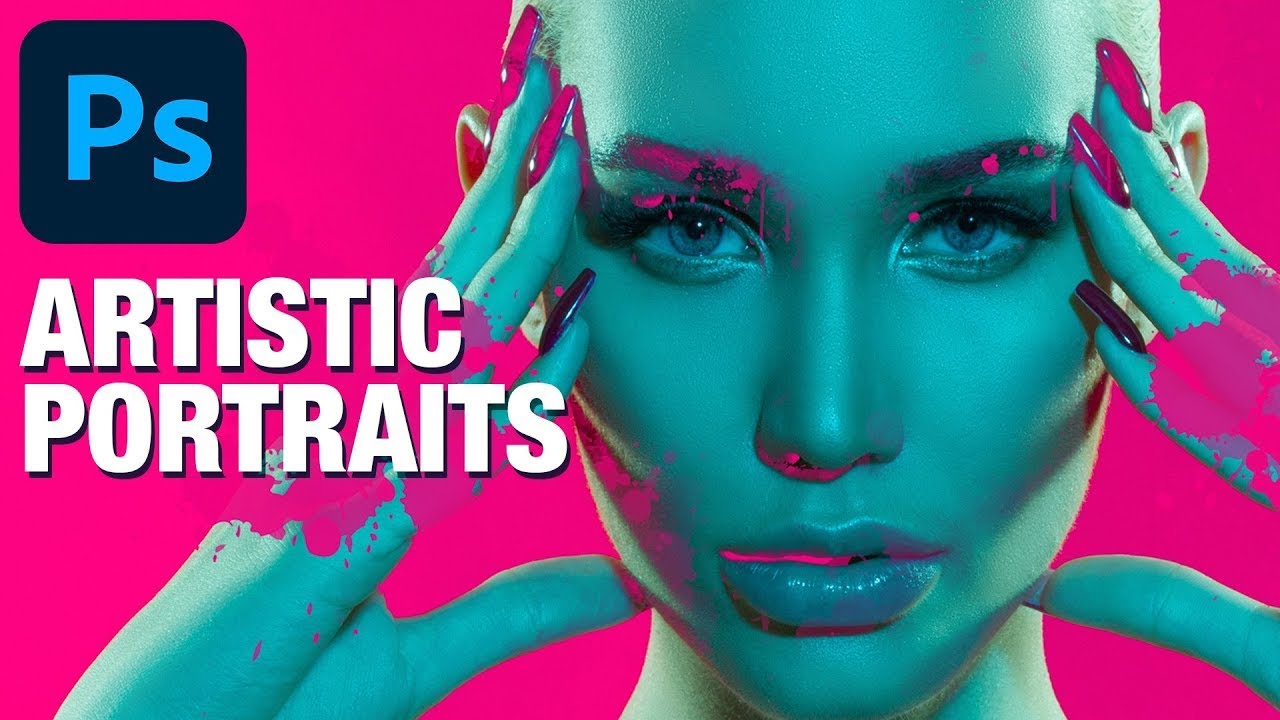
How to Paint Glowing Sci-Fi Eyes and Nail Movie Poster Text in Photoshop

How to Paint Glowing Sci-Fi Eyes and Nail Movie Poster Text in Photoshop

There’s a specific kind of panic that sets in when a client asks you to “make it look cinematic.” They don’t mean anything precise by that. They just mean it should look like it costs more than it does. After years of freelancing, I’ve figured out that about 80% of “cinematic” comes down to two things: eyes that feel alive and type that feels intentional. Get those right and suddenly everything else reads as professional.

Why Your Photo Composites Look Fake (And the Luminosity Trick That Fixes Them)

Why Your Photo Composites Look Fake (And the Luminosity Trick That Fixes Them)

I spent three days on a composite last year. Three days. The brief was simple enough: put a model into a moody, overcast cityscape. I rebuilt the sky twice, ran probably forty iterations of color grading, and kept feeling like something was off in a way I couldn’t name. The edges were fine. The colors were close. But the model looked like a cardboard cutout someone had glued onto a postcard.

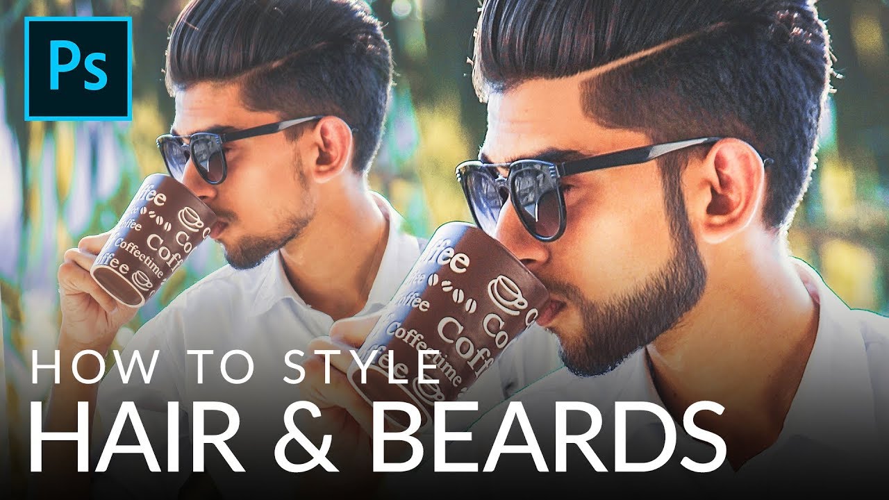
Fake It Till You Make It: How to Paint Realistic Hair and Beards in Photoshop

Fake It Till You Make It: How to Paint Realistic Hair and Beards in Photoshop

I’ve taken on enough portrait retouching gigs to know that hair is the thing that separates “pretty good” from “actually professional.” Skin? Frequency separation handles most of it. Eyes? A little dodging and burning. But hair, and especially beards, will absolutely expose you if you don’t know what you’re doing. Patchy beards, thin hairlines, awkward shapes that don’t match the light in the scene. Clients notice, even if they can’t articulate why something looks off.

How to Fake Graffiti on Any Surface in Photoshop (Without It Looking Fake)

How to Fake Graffiti on Any Surface in Photoshop (Without It Looking Fake)

There’s a specific kind of client request that used to make me sweat: “Can you put some text/logo/graphic on that surface?” Not floating beside it. Not stamped on flat. Actually on it, following the curves, matching the lighting, looking like it was always there. Early in my freelance life I’d just nudge the layer around until it looked “close enough” and hope nobody zoomed in. Spoiler: clients zoom in. This technique is the proper answer to that problem.

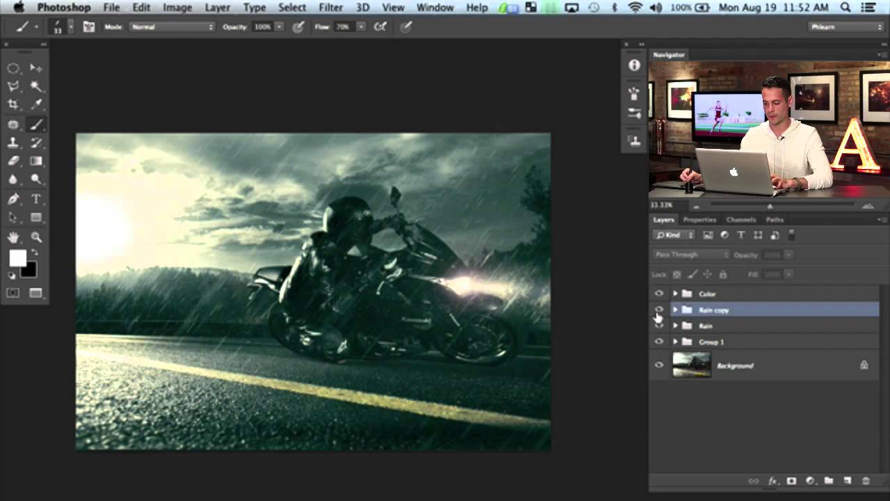
Building Rain From Scratch in Photoshop: What I Learned From Aaron Nace's Motorcycle Edit

Building Rain From Scratch in Photoshop: What I Learned From Aaron Nace's Motorcycle Edit

There’s a specific kind of frustration that comes from spending an afternoon on a composite that still looks fake, and you can’t quite put your finger on why. For me, it’s usually the atmosphere. The subject is sharp, the lighting is close enough, but the scene feels like a cutout dropped onto a background. Rain, when it’s done right, is one of the fastest ways to sell a scene as real.

Stop Blending Modes, Start Using Channels: The Smarter Way to Overlay Graphics on Portraits

Stop Blending Modes, Start Using Channels: The Smarter Way to Overlay Graphics on Portraits

There’s a specific kind of Photoshop frustration that hits when you drop a graphic element onto a portrait, slap on Multiply or Screen, and think “okay, close enough.” It works, sort of, but the colors are off, the opacity feels wrong, and the whole thing looks like you gave up halfway through. I’ve shipped work like that. Not proud of it, but I’ve done it. The problem isn’t the blending mode itself.

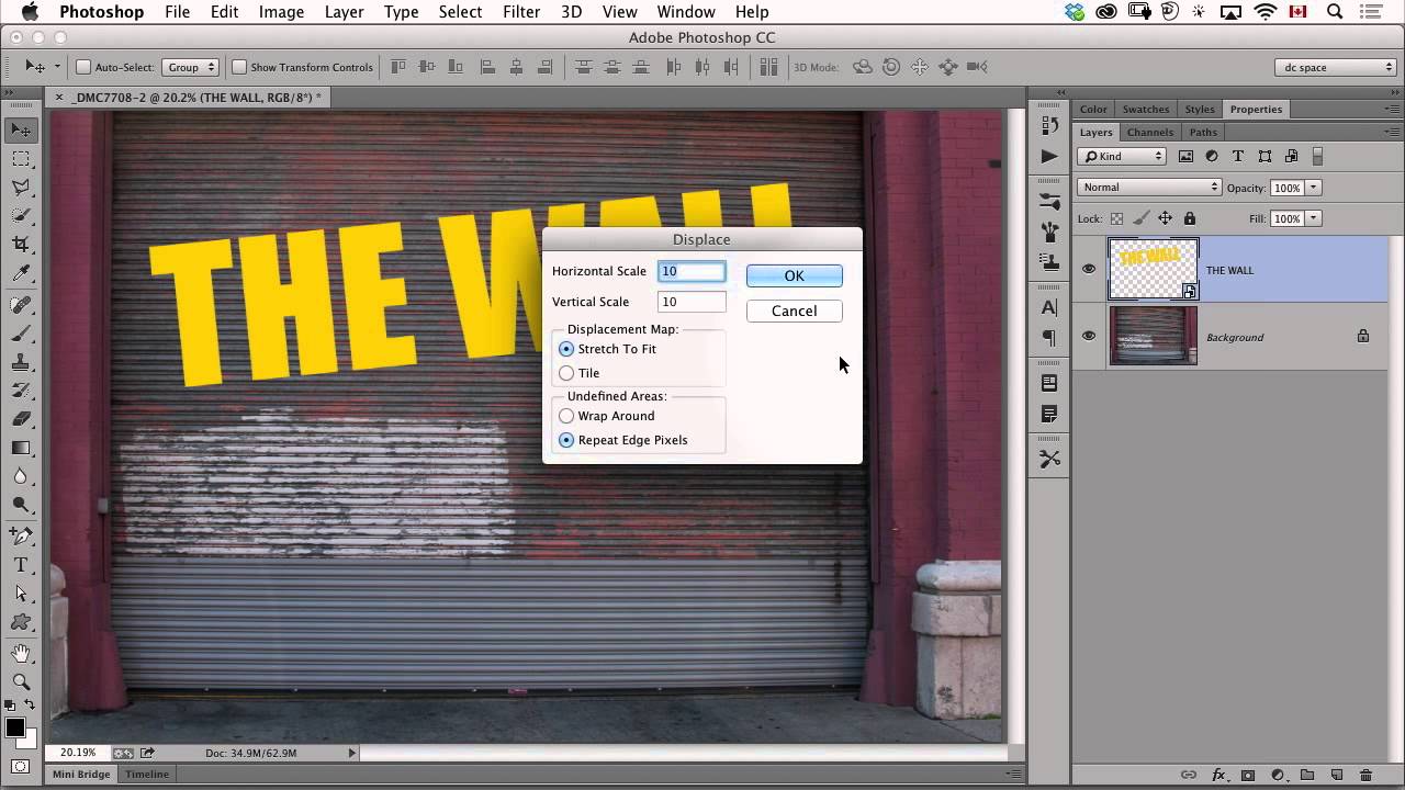
Make Text Look Painted on a Wall Using Photoshop's Displace Filter

Make Text Look Painted on a Wall Using Photoshop's Displace Filter

There’s a specific kind of client request that used to make me quietly panic: “Can you make the logo look like it’s actually on the wall? Like painted there, not just slapped on top?” Sure, no problem. And then I’d spend an hour fiddling with blend modes, drop shadows, and layer opacity, and it would still look exactly like a logo slapped on top of a photo. Flat. Fake. Wrong. The displacement map technique I picked up from this CreativeLive tutorial is the thing that finally cracked that problem for me.

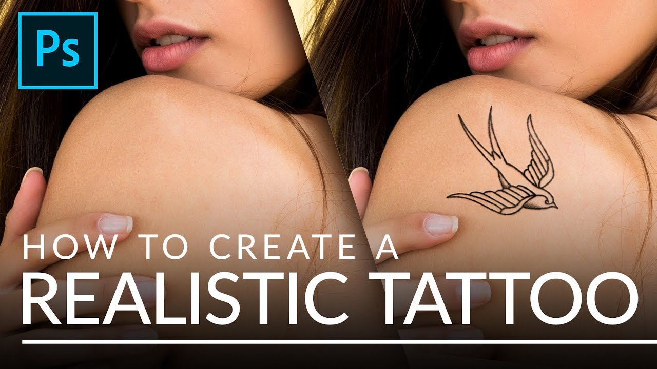
How to Make Any Design Look Like a Real Tattoo in Photoshop (Without Owning a Needle)

How to Make Any Design Look Like a Real Tattoo in Photoshop (Without Owning a Needle)

Client work has a way of throwing curveballs you didn’t see coming. I’ve had more than a few people slide into my DMs asking for a “quick” tattoo mockup, usually with a logo they made in Illustrator, a reference photo of someone’s arm, and the energy of someone who thinks this takes about four minutes. The truth is, slapping a design onto skin and calling it done looks terrible. The lines are too perfect, the contrast is wrong, and it screams “I copied and pasted this.

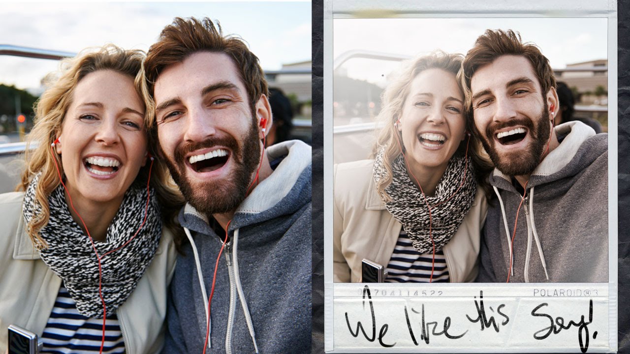
Give Your Photos a Polaroid Makeover Using Photoshop's Layer Mask Trick

Give Your Photos a Polaroid Makeover Using Photoshop's Layer Mask Trick

Client asks for “something vintage, you know, like a Polaroid vibe.” You nod confidently. You have no plan. This has happened to me more times than I care to admit, usually while nursing a cold brew at my usual corner table at whatever coffee shop I’ve colonized that week. The good news is that the actual technique is way simpler than it looks, and once you’ve done it once, you can knock it out in about ten minutes.