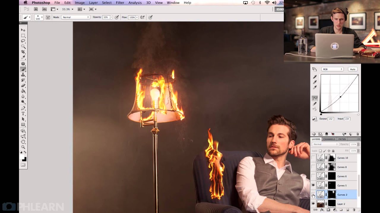
Compositing is one of those skills where you can do 90% of the work — great masking, solid lighting logic, believable color matching — and still have the image look… off. Like something’s not quite sitting in the scene. I’ve been there more times than I’d like to admit, usually staring at a layered PSD at 1am in whatever coffee shop hasn’t kicked me out yet, wondering why my composite looks like a collage and not a photograph. More often than not, the missing piece is targeted tonal work, and specifically, Curves.
In this Aaron Nace (PHLEARN) tutorial, photographer Rob Woodcox takes over to walk through the editing process behind one of his fire composites. The shoot itself sounds intense (real fire, careful safety protocols, one element lit at a time), but the editing process is where the real magic is. Rob doesn’t just slap a general Curves adjustment on the whole image and call it done. He’s using individual Curves layers, clipped to specific elements, to make each piece of fire feel like it actually belongs in the scene. That’s the approach I want to break down here, because it changed how I think about compositing adjustments entirely.
Watch the full tutorial on YouTube
Step 1: Review Your Base Image Before Touching Anything
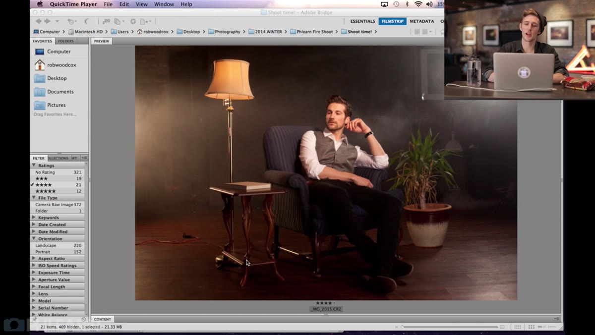 Base composite image open in Photoshop with layer stack visible
Before Rob does any color or tonal work, he walks through his layer stack from the bottom up. This isn’t housekeeping, it’s strategy. He knows what each layer is doing before he starts adjusting anything. In practice, this means taking five minutes to toggle layers on and off, note where your light sources are, and identify which composited elements look out of place in terms of brightness or color temperature. If you skip this step, you end up applying global adjustments that fix one element and break two others.
Step 2: Extend the Scene with Content-Aware Selections
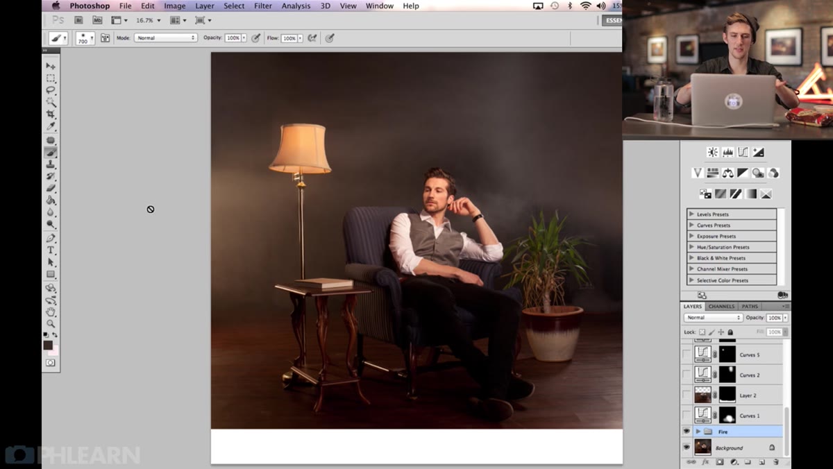 Selection tool active around smoke area in center of image
Rob’s original shot didn’t have enough canvas at the bottom or sides, so he used the rectangular Marquee tool to select a section of the existing smoke in the center of the frame. He copied it (Cmd/Ctrl+C), pasted it as a new layer (Cmd/Ctrl+V), and repositioned and blended those copies into the empty areas at the edges using reduced opacity and layer masks. This is worth noting because it’s not a fancy technique, it’s a practical one. When your source image is a little short, you don’t always need to reshoot. You can borrow from the image itself, especially with organic textures like smoke that don’t have hard edges to betray the repetition.
Step 3: Bring in Each Fire Element on Its Own Layer
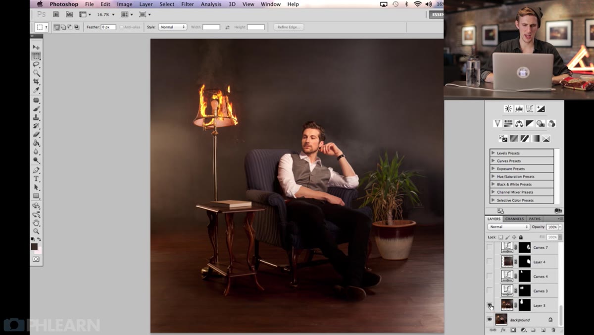 Lamp fire element on separate layer with soft mask applied
Every single piece of fire in Rob’s composite was photographed separately and placed on its own layer. The lamp, the burning bush, other flame elements, each one is its own layer with its own mask. He used soft-edged masks (a low-hardness brush on the layer mask) to blend the edges into the smoke and background. The key point here is that soft masking alone isn’t enough when the brightness levels don’t match. A fire element photographed against a dark background will have a different apparent luminosity than the same fire sitting inside a smoky composite scene. That mismatch is what the next steps fix.
Step 4: Add a Clipped Curves Layer to Match Brightness
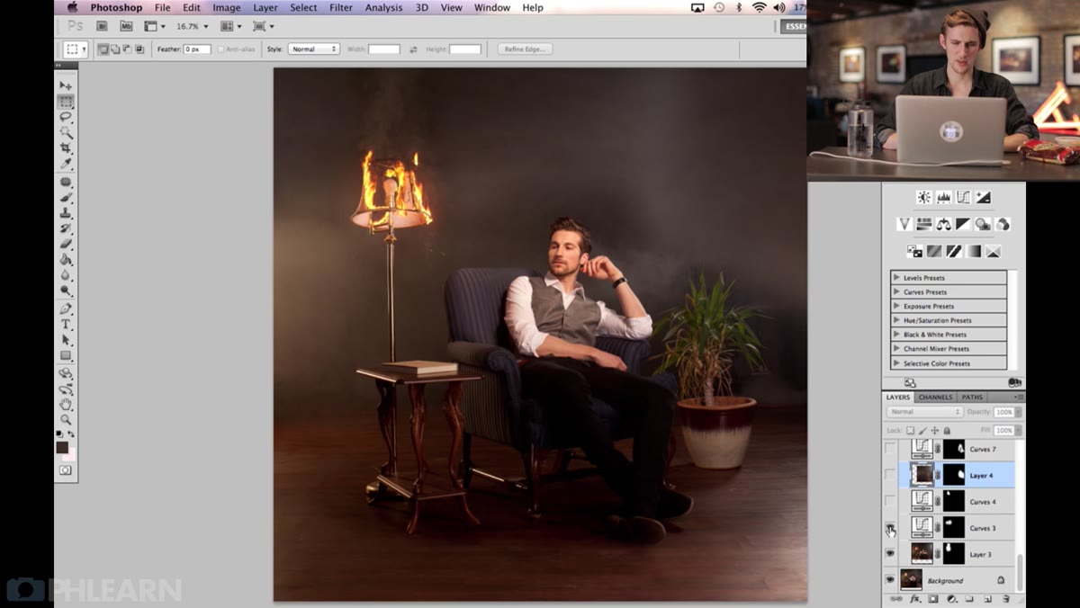 Curves adjustment layer clipped to lamp layer, S-curve applied
This is where Rob’s workflow gets genuinely smart. Instead of adjusting the fire element itself, he adds a Curves adjustment layer and clips it to the fire layer below (Alt/Option+click between the two layers in the panel). This means the Curves only affects that one element. He then brightens or darkens the curve to match the fire’s brightness to the overall scene. For the lamp element, he used this to make sure the lamp and its immediate surroundings felt like they were lit by the same source. No hard numbers are given, and honestly, that’s the point. You’re using your eyes, not a preset.
Step 5: Use a Second Curves Layer to Add Color to the Smoke
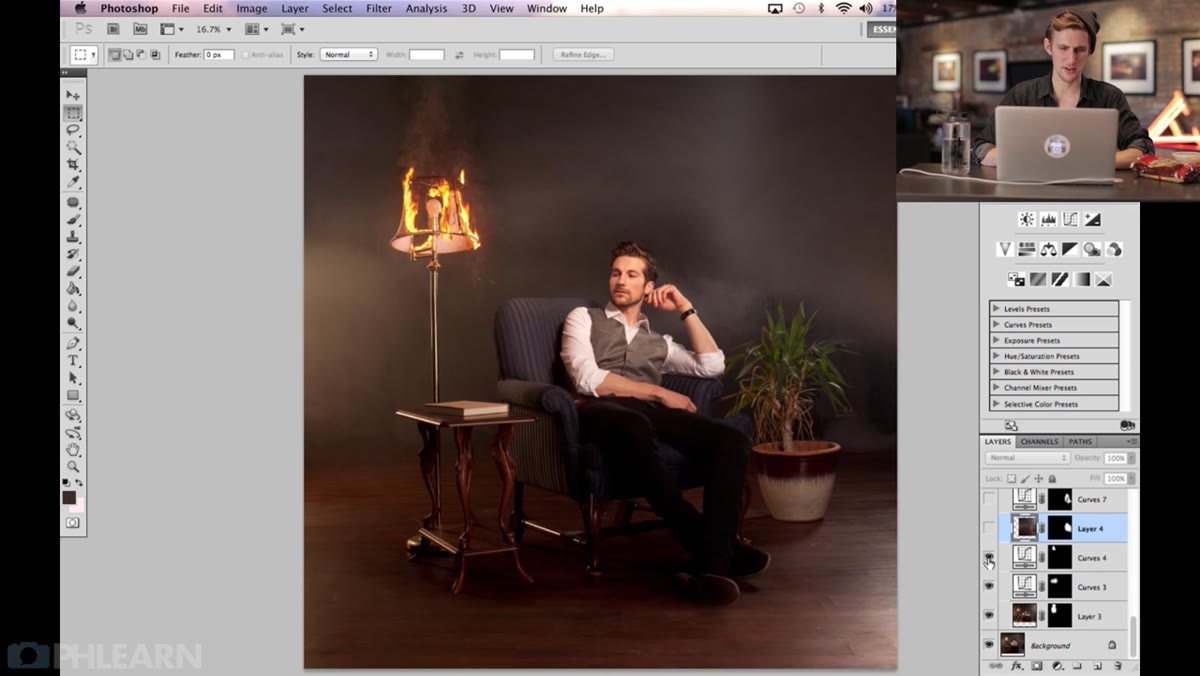 Second Curves layer adding warm tone to smoke above lamp
Once the lamp element was brightness-matched, Rob added another Curves layer, this time to push warm color into the smoke directly above the lamp. His logic: if there’s a fire burning, the smoke should pick up some of that orange-amber glow. Without this step, the smoke just sits there looking neutral, which breaks the illusion. To do this yourself, go into the individual RGB channels inside Curves. Pull the Red channel up slightly, add a little to the Green channel, and leave Blue alone or pull it down a touch. The result is a warm, fire-lit quality that reads as natural light interaction rather than a color grade.
Step 6: Repeat the Process for Every Composite Element
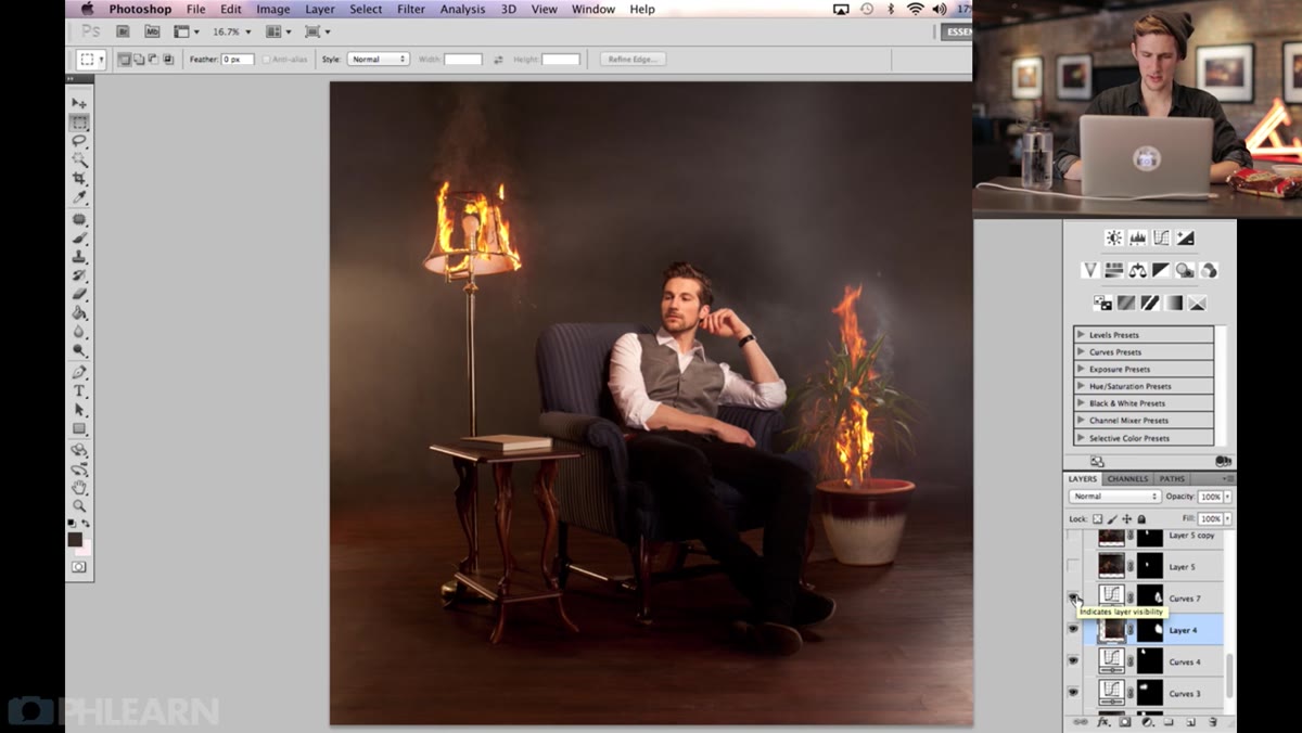 Curves layer clipped to burning bush element, curve pulled up
Rob repeats this same two-step approach (brightness Curves, then color Curves) for each fire element in the composite. For the burning bush, he noticed the lamp flame was visually brighter and more prominent, so the bush needed a little extra lift to compete. He added a gentle Curves boost clipped to that layer. The principle he keeps coming back to is visual comparison, not technical precision. Hold each element up against the others and ask whether the lighting story makes sense. Is this thing as bright as it should be given where the fire is? Does the color temperature feel consistent?
What I’d Add: Luminosity Masks for Cleaner Tonal Targeting
Rob’s approach of using clipped Curves is solid, and I’d use it exactly as described. Where I’d take it further on a complex composite is with luminosity masks to control where the Curves actually bites into the image. Say you’ve boosted the Reds on a Curves layer to warm up some smoke, but it’s also warming up a highlight area that should stay neutral. A luminosity mask lets you restrict the adjustment to just the midtones or shadows, so you get the color where you want it without cooking the bright areas. You can build basic luminosity masks from the Channels panel, or use a plugin like TK Actions if you do this kind of work regularly. It adds a step, but on anything with real fire and smoke, it saves you from chasing your tail through five rounds of minor corrections.
The single most useful thing Rob demonstrates here is also the simplest: one Curves layer per problem. Not one Curves layer for the whole image, not a giant master grade at the end. A small, clipped, purposeful adjustment for each element that needs to feel more believable. That’s the discipline that separates a composite that looks assembled from one that looks photographed.
Watch the full tutorial on YouTube to see Rob’s full walkthrough, including how the complete layer stack comes together from base image to finished fire composite.
Comments (3)
Simple but effective. Sometimes that's all you need.
Just subscribed. If the rest of your content is this good, I'm in.
The before and after really sells it. Incredible difference.
Leave a Comment