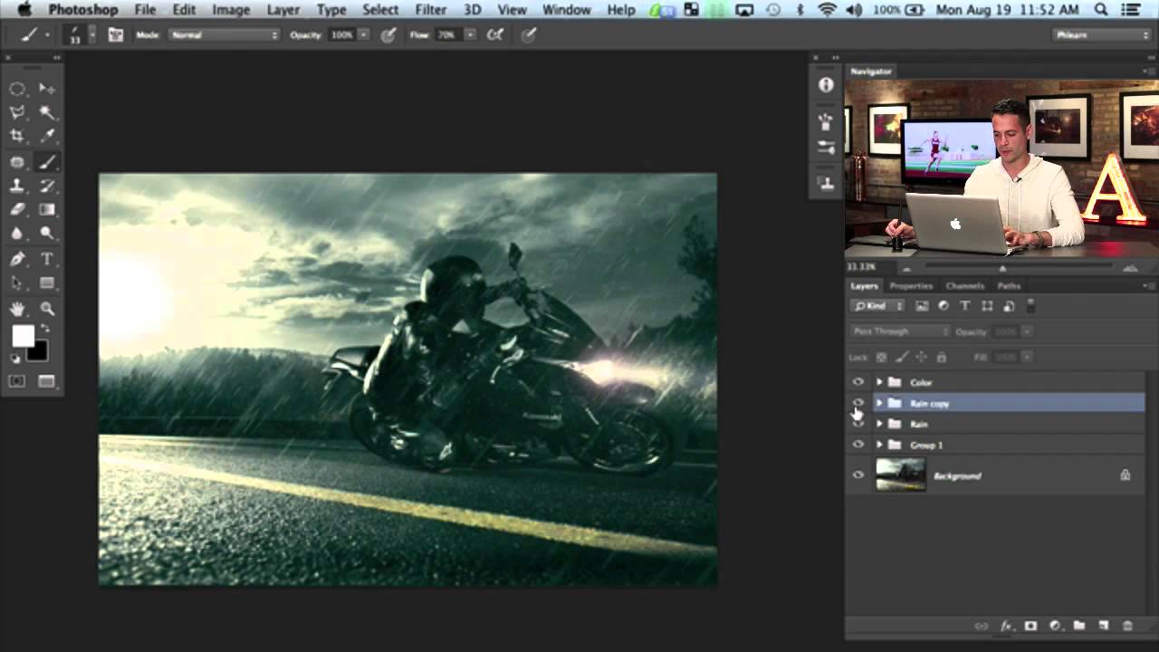
There’s a specific kind of frustration that comes from spending an afternoon on a composite that still looks fake, and you can’t quite put your finger on why. For me, it’s usually the atmosphere. The subject is sharp, the lighting is close enough, but the scene feels like a cutout dropped onto a background. Rain, when it’s done right, is one of the fastest ways to sell a scene as real. It adds motion, texture, and a reason for everything to feel slightly chaotic. I stumbled onto a method that actually works while working through part two of Aaron Nace’s PHLEARN motorcycle composite series, and it’s one of those techniques that sounds too simple to be useful until you see it in practice.
In this Aaron Nace (PHLEARN) tutorial, the goal is finishing off a dramatic motorcycle edit, and the rain section alone is worth the watch. Watch the full tutorial on YouTube before or after reading this, but either way, here’s a full walkthrough of the rain technique so you can build it directly into your own workflow.
Step 1: Create a New Layer and Open the Brush Panel
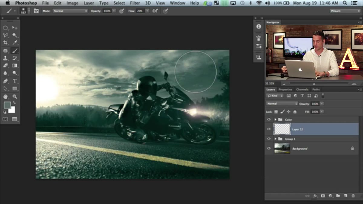 New layer created, Brush panel open in Photoshop
Before touching anything else, create a blank new layer above your image. This keeps your rain completely non-destructive and lets you adjust opacity, blending mode, or just throw the whole thing away if it’s not working. Set your foreground color to white. Then go to Window and open the Brush Settings panel. You’re going to be spending a few minutes in here building a custom brush, and having it visible as a floating panel makes the whole process less annoying than digging through menus every 30 seconds.
New layer created, Brush panel open in Photoshop
Before touching anything else, create a blank new layer above your image. This keeps your rain completely non-destructive and lets you adjust opacity, blending mode, or just throw the whole thing away if it’s not working. Set your foreground color to white. Then go to Window and open the Brush Settings panel. You’re going to be spending a few minutes in here building a custom brush, and having it visible as a floating panel makes the whole process less annoying than digging through menus every 30 seconds.
Step 2: Configure the Base Brush Shape
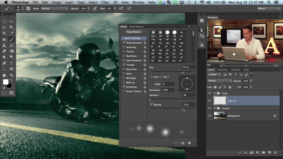 Brush spacing increased, showing spaced dot pattern
Start with a basic hard round brush. The first thing to change is the spacing. Crank it up until the brush leaves individual dots rather than a continuous stroke. Think of it as separating each raindrop so they’re distinct from one another. Once you have that spacing set, go to the Roundness field and drop it down to around 2%. That turns each dot into a narrow streak. Then set the Angle to somewhere around 50 degrees. Ninety degrees gives you perfectly vertical rain, which looks fine for a static scene, but for a motorcycle coming toward the camera there’s implied motion and the rain should reflect that. A slight diagonal reads more naturally here.
Brush spacing increased, showing spaced dot pattern
Start with a basic hard round brush. The first thing to change is the spacing. Crank it up until the brush leaves individual dots rather than a continuous stroke. Think of it as separating each raindrop so they’re distinct from one another. Once you have that spacing set, go to the Roundness field and drop it down to around 2%. That turns each dot into a narrow streak. Then set the Angle to somewhere around 50 degrees. Ninety degrees gives you perfectly vertical rain, which looks fine for a static scene, but for a motorcycle coming toward the camera there’s implied motion and the rain should reflect that. A slight diagonal reads more naturally here.
Step 3: Dial In the Spacing and Size
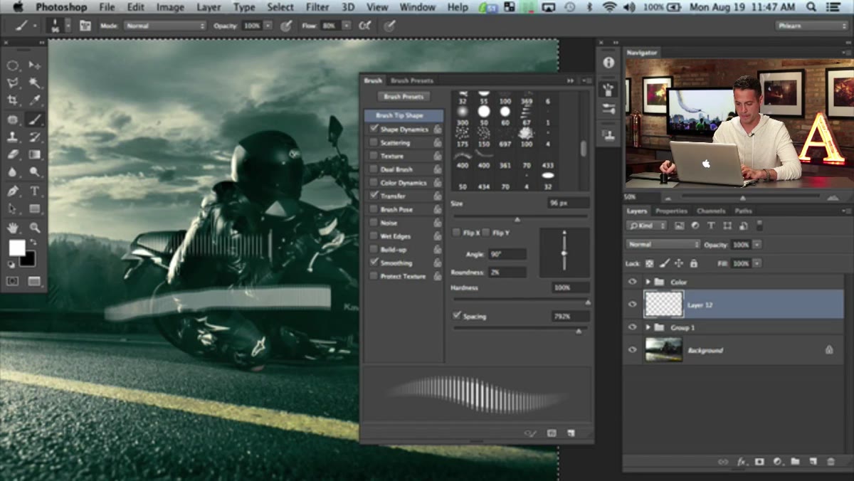 Brush panel showing spacing and size settings adjusted
With the shape looking roughly right, pull the spacing out a bit more. You want the streaks to feel scattered, not like you’re drawing parallel lines. If your brush still looks too uniform when you do a test stroke on a blank area, keep adjusting spacing until you get that organic randomness. This is also a good time to bump your brush size up. A tiny rain brush is going to take forever to fill a frame. Find a size where a single broad stroke covers a good chunk of the canvas without looking too dense. You can always lower opacity on the layer later to thin things out.
Brush panel showing spacing and size settings adjusted
With the shape looking roughly right, pull the spacing out a bit more. You want the streaks to feel scattered, not like you’re drawing parallel lines. If your brush still looks too uniform when you do a test stroke on a blank area, keep adjusting spacing until you get that organic randomness. This is also a good time to bump your brush size up. A tiny rain brush is going to take forever to fill a frame. Find a size where a single broad stroke covers a good chunk of the canvas without looking too dense. You can always lower opacity on the layer later to thin things out.
Step 4: Turn On Shape Dynamics
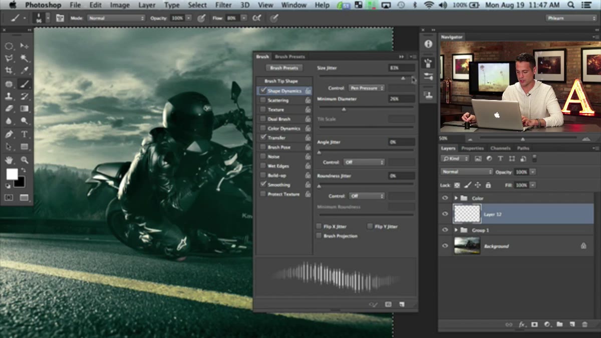 Shape Dynamics panel open, Size Jitter at maximum
Still in the Brush Settings panel, click on Shape Dynamics. Push the Size Jitter all the way up and set the Minimum Diameter to zero. What this does is randomize the length of each individual streak so some raindrops appear closer to the camera (larger) and some appear farther back (smaller). Without this step, the rain looks like a pattern someone tiled. With it, it starts to feel like depth. You can also nudge the roundness up slightly here if the streaks feel too hair-thin for your particular image.
Shape Dynamics panel open, Size Jitter at maximum
Still in the Brush Settings panel, click on Shape Dynamics. Push the Size Jitter all the way up and set the Minimum Diameter to zero. What this does is randomize the length of each individual streak so some raindrops appear closer to the camera (larger) and some appear farther back (smaller). Without this step, the rain looks like a pattern someone tiled. With it, it starts to feel like depth. You can also nudge the roundness up slightly here if the streaks feel too hair-thin for your particular image.
Step 5: Add Scattering
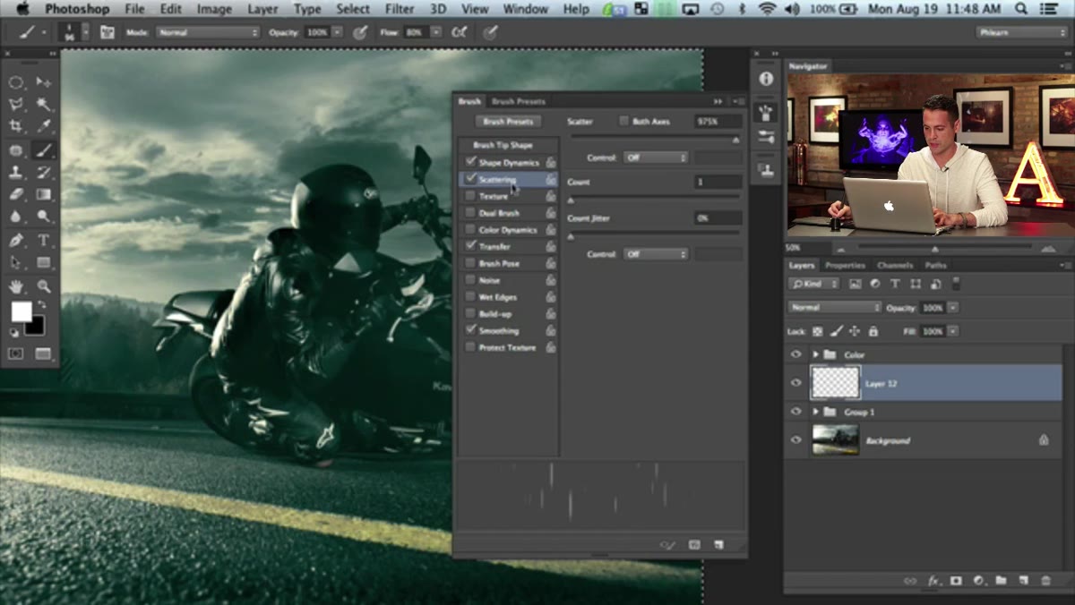 Scattering options enabled with Both Axes checked
Click into the Scattering section and enable it. Check the “Both Axes” option. Scattering is what makes this look like actual rainfall rather than a deliberate brush stroke. It randomly offsets each individual mark so they’re distributed across the canvas without following your cursor’s exact path. Paint a test stroke across a dark area of your canvas to preview the effect. If it looks too sparse, bring the scatter amount down. If it looks like static noise, dial it back. The goal is controlled chaos, enough randomness to read as weather, not so much that it looks like grain.
Scattering options enabled with Both Axes checked
Click into the Scattering section and enable it. Check the “Both Axes” option. Scattering is what makes this look like actual rainfall rather than a deliberate brush stroke. It randomly offsets each individual mark so they’re distributed across the canvas without following your cursor’s exact path. Paint a test stroke across a dark area of your canvas to preview the effect. If it looks too sparse, bring the scatter amount down. If it looks like static noise, dial it back. The goal is controlled chaos, enough randomness to read as weather, not so much that it looks like grain.
Step 6: Paint and Save the Brush
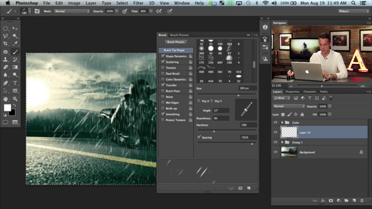 Custom brush being saved in the Brush Settings panel
Once you’re happy with the preview, close or collapse the Brush panel and do a few test strokes across your image layer. Paint over the whole frame, adjusting your coverage as you go. Pay more attention to areas with dark backgrounds where the white streaks will actually show up. Highlights and bright areas will absorb the rain visually, so don’t stress too much about overpainting those zones. After you’ve got a result you like, save this brush. In the Brush Settings panel there’s a menu option to create a new brush preset. Name it something useful. “Rain 50deg” is better than “Brush 47.” You built it, you might as well keep it.
Custom brush being saved in the Brush Settings panel
Once you’re happy with the preview, close or collapse the Brush panel and do a few test strokes across your image layer. Paint over the whole frame, adjusting your coverage as you go. Pay more attention to areas with dark backgrounds where the white streaks will actually show up. Highlights and bright areas will absorb the rain visually, so don’t stress too much about overpainting those zones. After you’ve got a result you like, save this brush. In the Brush Settings panel there’s a menu option to create a new brush preset. Name it something useful. “Rain 50deg” is better than “Brush 47.” You built it, you might as well keep it.
My Take: Adjust the Angle Per Shot, Not Per Style
The instinct is to pick one rain angle and use it for everything, but the angle of your rain should actually be driven by the story of the specific image. A parked car in the rain? Vertical, maybe slight diagonal. A motorcycle at speed? More horizontal, because motion blur would physically drag the drops sideways. I’ve started treating rain angle the same way I treat light direction: it has to be consistent with the other visual logic in the frame. If your subject is a runner mid-sprint and your rain is falling perfectly vertical, something will feel off even if the viewer can’t name it. Match the environmental logic and your composites will hold up to closer scrutiny.
Building rain in Photoshop from a custom brush takes maybe five minutes once you’ve done it once. The technique from this Aaron Nace tutorial is a solid foundation you can build on, whether you want subtle mist or a full downpour. The biggest thing I took away is that atmosphere isn’t about adding one big dramatic element. It’s about layering small, randomized details until the whole frame feels like it exists in a real environment. Start with rain. Add some fog. Suddenly your composite stops looking like a composite.
Watch the full tutorial on YouTube and catch part one if you haven’t already. The rain technique is just one piece of a much bigger edit.
Comments (2)
Would love to see a follow-up going deeper into this topic.
Bookmarked. Coming back to this one for sure.
Leave a Comment