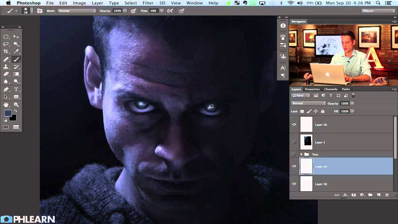
There’s a specific kind of panic that sets in when a client asks you to “make it look cinematic.” They don’t mean anything precise by that. They just mean it should look like it costs more than it does. After years of freelancing, I’ve figured out that about 80% of “cinematic” comes down to two things: eyes that feel alive and type that feels intentional. Get those right and suddenly everything else reads as professional.
That’s why I kept coming back to this Aaron Nace (PHLEARN) tutorial on recreating the Riddick movie poster. Part one handled the heavy color grading work. Part two, which I’m breaking down here, is where things get genuinely interesting. Aaron tackles how to paint convincing eyes essentially from scratch inside Photoshop, and then moves into the kind of text treatment you see on actual theatrical one-sheets. Watch the full tutorial on YouTube if you want to follow along with the video while you read through the steps below.
One thing I want to flag before we dive in: this is the kind of technique that looks deceptively simple when someone experienced does it. The actual painting is fast once you understand the logic behind it. Stick with the process and it clicks.
Step 1: Create a New Layer and Make Your Eye Selections
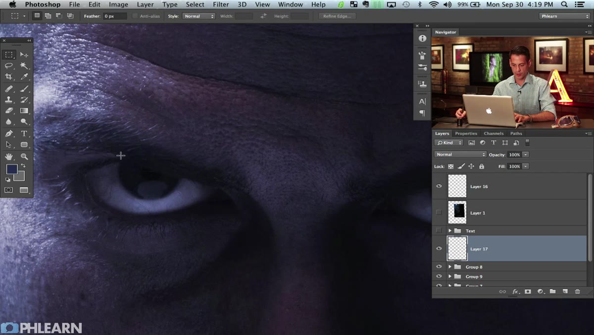 New blank layer created above composite in Layers panel
Start by creating a new blank layer above your composite. Grab the Elliptical Marquee tool and draw a selection around one eye. To add the second eye to the same selection without losing the first, hold Shift while dragging the second ellipse. You end up with both eyes selected simultaneously, which keeps everything on one layer and makes blending much easier down the line.
New blank layer created above composite in Layers panel
Start by creating a new blank layer above your composite. Grab the Elliptical Marquee tool and draw a selection around one eye. To add the second eye to the same selection without losing the first, hold Shift while dragging the second ellipse. You end up with both eyes selected simultaneously, which keeps everything on one layer and makes blending much easier down the line.
Don’t stress about getting the selection perfectly tight at this stage. The next step handles the edge softness anyway.
Step 2: Feather the Selection Using Quick Mask and Gaussian Blur
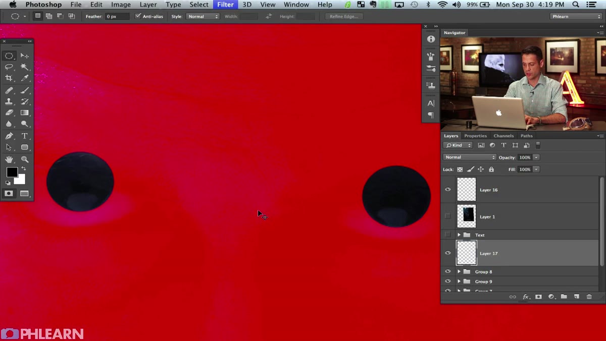 Quick Mask mode active, red overlay visible over selection area
Here is the tip that genuinely changed how I approach selections with soft edges. Instead of digging through the Select menu to find the Feather option, press Q to enter Quick Mask mode. Your selection becomes a red overlay that you can treat like a regular image layer. Run a Gaussian Blur on it (Filter > Blur > Gaussian Blur) at whatever radius gives you the softness you want, then press Q again to convert it back to an active selection.
Quick Mask mode active, red overlay visible over selection area
Here is the tip that genuinely changed how I approach selections with soft edges. Instead of digging through the Select menu to find the Feather option, press Q to enter Quick Mask mode. Your selection becomes a red overlay that you can treat like a regular image layer. Run a Gaussian Blur on it (Filter > Blur > Gaussian Blur) at whatever radius gives you the softness you want, then press Q again to convert it back to an active selection.
What you get is a selection with a genuine feathered edge, not just a hard marquee line. When you paint inside it, the color naturally fades toward the boundary. For eyes specifically, this is the difference between painted circles that look pasted on and irises that feel embedded in the face.
Step 3: Sample Existing Colors and Block In the Base Iris Tones
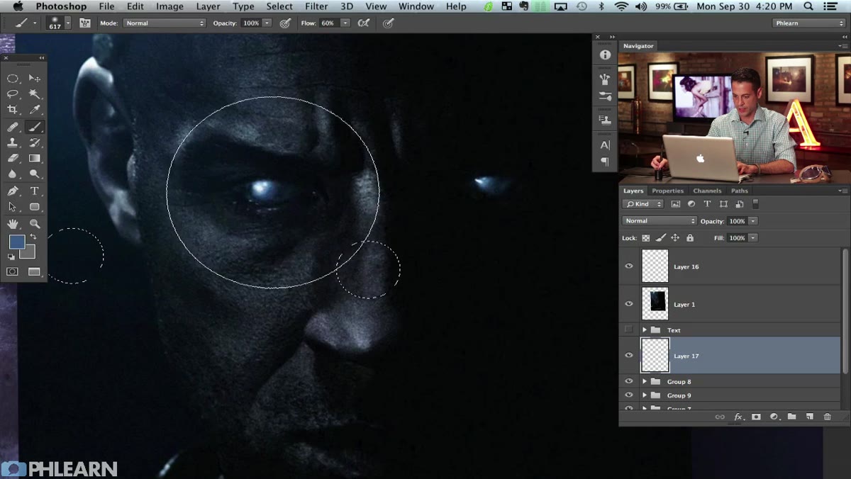 Soft round brush painting color into eye selection on new layer
With your feathered selection active, use the Eyedropper tool to sample colors that already exist in the eye area of your subject photo. This gives you a starting point that’s already harmonized with the overall color grade from part one. Don’t invent colors out of thin air at this stage. Borrow from what’s there.
Soft round brush painting color into eye selection on new layer
With your feathered selection active, use the Eyedropper tool to sample colors that already exist in the eye area of your subject photo. This gives you a starting point that’s already harmonized with the overall color grade from part one. Don’t invent colors out of thin air at this stage. Borrow from what’s there.
Switch to a soft round brush and paint the base iris color in broad strokes. Use Command + H to hide the selection marquee while you work so you can actually see what you’re doing without the marching ants getting in the way. The selection is still active even when hidden. This is one of those shortcuts I use constantly and I’m still surprised how many people don’t know it exists.
Step 4: Build Up Layers of Color from Dark to Light
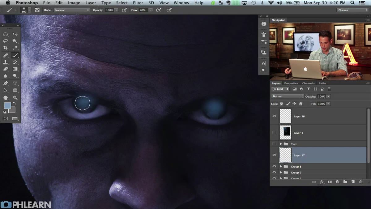 Multiple color tones layered within the eye selection, zoomed in
Real eyes aren’t a flat circle of one color. They have a darker outer ring, a mid-tone body, and lighter reflective detail moving toward the pupil. Once your base is down, reduce your brush size and start painting progressively lighter tones on top. Think of it like painting a small landscape in miniature.
Multiple color tones layered within the eye selection, zoomed in
Real eyes aren’t a flat circle of one color. They have a darker outer ring, a mid-tone body, and lighter reflective detail moving toward the pupil. Once your base is down, reduce your brush size and start painting progressively lighter tones on top. Think of it like painting a small landscape in miniature.
Aaron works outward to inward, darkening the rim and brightening toward the center. He also zooms out regularly to check how it reads at full poster scale. I do the same thing now. Something that looks beautifully detailed at 300% zoom can look muddy or overworked when you step back. Make it read small first, then refine the detail.
Step 5: Add the Bright Specular Highlights and White Tones
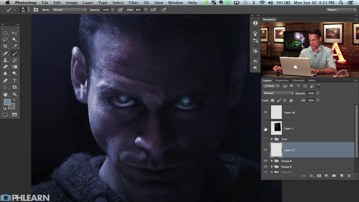 Small white brush strokes adding highlights and shine to iris
This is where the sci-fi character quality comes in for the Riddick look specifically, but the principle applies any time you want eyes to feel lit from within. Reduce your brush to a small, soft tip and paint the lightest tones, near-white or actual white, in the areas where light would naturally reflect. For this style, those highlights are slightly exaggerated compared to a naturalistic portrait.
Small white brush strokes adding highlights and shine to iris
This is where the sci-fi character quality comes in for the Riddick look specifically, but the principle applies any time you want eyes to feel lit from within. Reduce your brush to a small, soft tip and paint the lightest tones, near-white or actual white, in the areas where light would naturally reflect. For this style, those highlights are slightly exaggerated compared to a naturalistic portrait.
Keep your pressure and opacity low and build these up gradually. Smashing in a full-opacity white stroke looks like a mistake. Layering up to white looks like craft. The difference in time is about thirty seconds. The difference in result is everything.
Step 6: Use Texture Brushes to Add Iris Detail
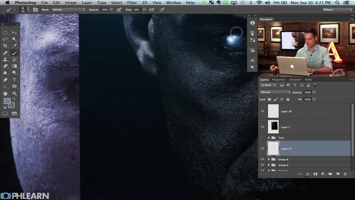 Textured brush strokes creating fiber-like iris detail
Once the basic tonal structure is in place, switch to a textured brush to suggest the fine fibrous detail of an actual iris. You don’t need a hyper-realistic result here. You just need enough visual complexity that the viewer’s brain fills in the rest. A few well-placed texture strokes in the mid-tone zone of the iris can make the whole thing feel grounded.
Textured brush strokes creating fiber-like iris detail
Once the basic tonal structure is in place, switch to a textured brush to suggest the fine fibrous detail of an actual iris. You don’t need a hyper-realistic result here. You just need enough visual complexity that the viewer’s brain fills in the rest. A few well-placed texture strokes in the mid-tone zone of the iris can make the whole thing feel grounded.
Aaron mentions he’ll demonstrate this in more detail, and it’s worth watching that section of the video closely. The key is keeping these strokes subtle and radiating outward from the pupil, the way iris fibers actually run.
What I’d Do Differently (or Add)
The Quick Mask blur trick is something I now use way beyond eye painting. Any time I need a selection that transitions gradually rather than cuts hard, it’s my first move. Where I’d extend Aaron’s approach is by keeping each tone of the iris on its own sublayer inside a group, rather than painting everything onto a single layer. It adds about twenty seconds of setup and saves you an enormous amount of grief if you decide the whole thing is too blue at the end. Non-destructive habits are the kind of thing that seems unnecessary until the moment it becomes the only thing that matters. Ask me how I know.
The single most important thing this tutorial demonstrates isn’t any one technique. It’s the habit of zooming out constantly and evaluating your work at presentation scale, not just at the scale where you’re comfortable painting. Movie poster work lives or dies at thumbnail size. Eyes that pop at 100% zoom but flatten out at 25% are eyes that don’t work.
If you’re working on any kind of character composite or editorial piece and the eyes feel dead, the approach Aaron walks through here is worth your time. Watch the full tutorial on YouTube and follow along with part one as well if you haven’t already. The color grading foundation makes everything in part two land harder.
Comments (2)
This is exactly what I needed today. Been struggling with this for weeks.
Great breakdown. The step-by-step approach really helps.
Leave a Comment