There’s a very specific kind of bad that happens when you drop a photo on top of a texture or frame and it just… sits there. No interaction, no depth, no relationship between the two layers. It looks like a sticker. It looks like clip art. It looks, as Pete Collins memorably puts it in this KelbyOne tutorial, like it was plunked. Maximum plunkage. I’ve been there more times than I’d like to admit, especially early on when I was cranking out quick composites for clients and thinking opacity was the only tool I had for blending layers together. It wasn’t until I really started paying attention to blending modes that my composites stopped looking like ransom notes made from stock photos.
Watch the full tutorial on YouTube
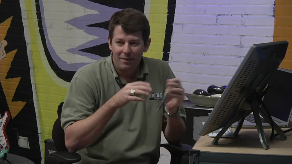
In this KelbyOne tutorial from Photoshop User TV, Pete Collins walks through a technique for placing a photograph inside a Polaroid-style frame and making the two elements actually interact. The secret weapon is blending modes, specifically using duplicated layers with different blend settings to preserve the texture and character of the frame while still letting your photo show through. It sounds simple, and it mostly is, but the exact approach matters. Here’s how it works.
Step 1: Start With Your Frame on a Separate Layer
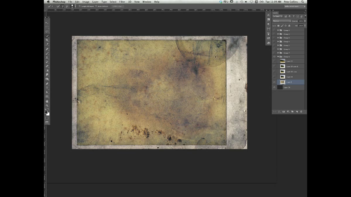
 Farm photo and Polaroid frame open as separate layers
Before anything else, make sure your frame graphic and your photograph are sitting on separate layers in the same document. In Pete’s example, he’s got a farm photo and a Polaroid-style background, each on its own layer. The Polaroid sits on top, and the photo is beneath it. This layer order matters because your selection work in the next step depends on being able to isolate the inside of the frame cleanly. If your layers are merged or your frame is a flattened JPEG, stop now and fix that first.
Step 2: Select the Interior of the Polaroid Using Quick Selection
 Quick Selection tool active, dragging inside Polaroid frame
Grab the Quick Selection tool (W) and drag it around the inside of the Polaroid opening. Photoshop will do a reasonable job finding the edges, but it will probably bleed over into areas you don’t want selected, especially near hard-edged borders or areas with similar tones. The fix is straightforward: hold Alt (Option on Mac) and drag along the edge where the selection overshot. This subtracts from the selection, and the Quick Selection tool is smart enough to snap back to the actual boundary. Take a little time here. A sloppy selection at this stage means a sloppy composite at the end.
Step 3: Reposition the Selection Over Your Photo
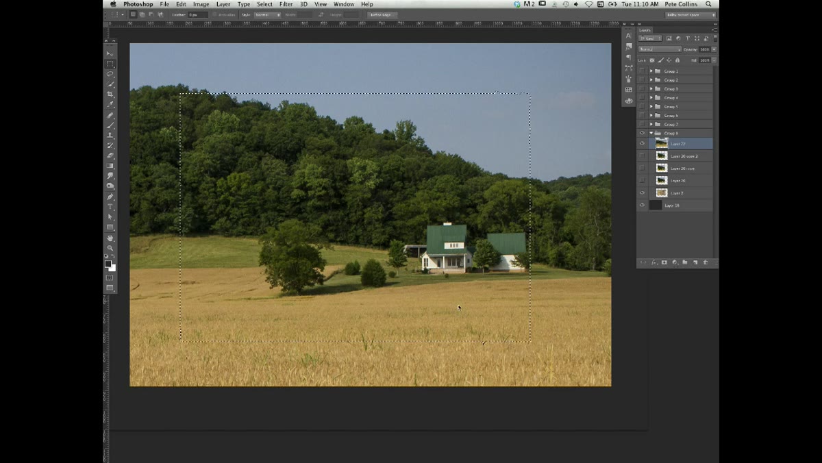 Marquee tool active, marching ants being repositioned over photograph
Once you’ve got a clean selection of the Polaroid’s interior, turn on your photograph layer so you can see it underneath. Here’s a move that a lot of people don’t think to use: switch to the Rectangular Marquee tool (M) and you can actually move the selection outline independently of any layer content. Just click and drag inside the marching ants. This lets you choose which part of the photo will be cropped into the frame, which is a huge deal if you’re working with a landscape or any image where composition matters. Nudge it around until the framing feels right.
Step 4: Extract the Photo Into the Frame With Command/Ctrl + J
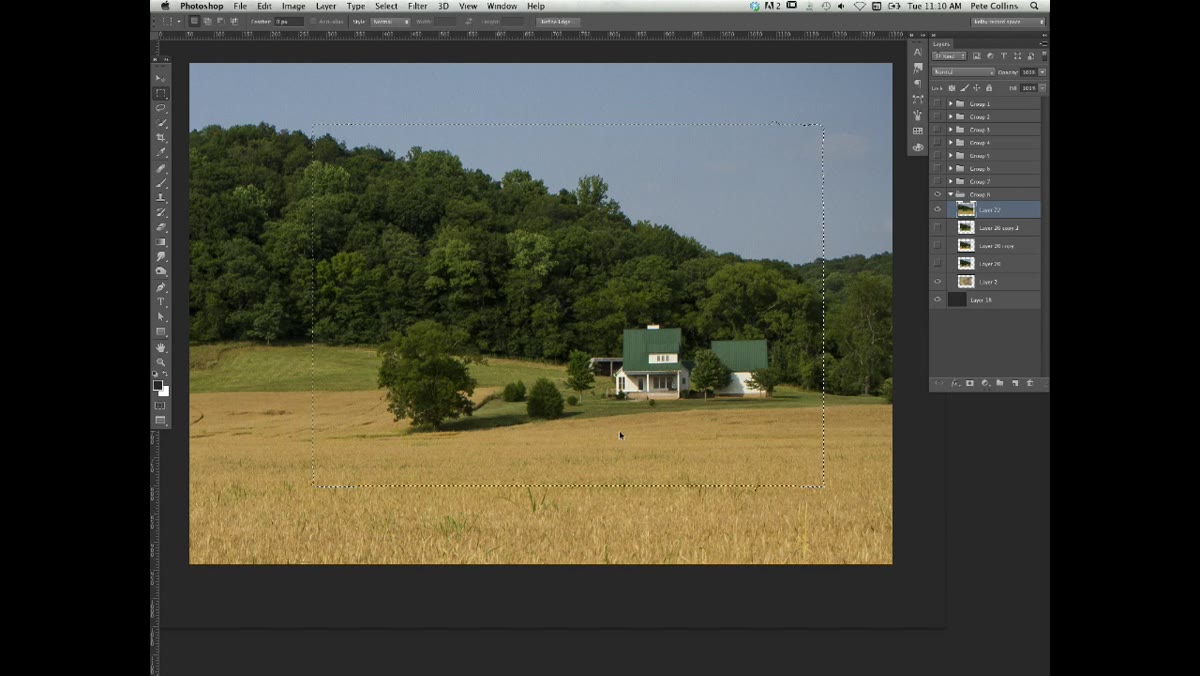 New layer created from selection, photo cropped to Polaroid shape
With the selection positioned where you want it and your photo layer active, hit Command+J (Ctrl+J on Windows). This duplicates just the selected portion of your photo onto a new layer. Hide the original photo layer, and you’ll see the cropped image sitting exactly within the Polaroid boundary. Use your arrow keys to nudge it by single pixels if the alignment isn’t quite right. You want the edges of your photo to sit cleanly within the frame opening, not poking out or leaving gaps. This is your base layer, and it’s going to look flat and plunked at this point. That’s expected. This is where the blending work starts.
Step 5: Duplicate That Layer Twice
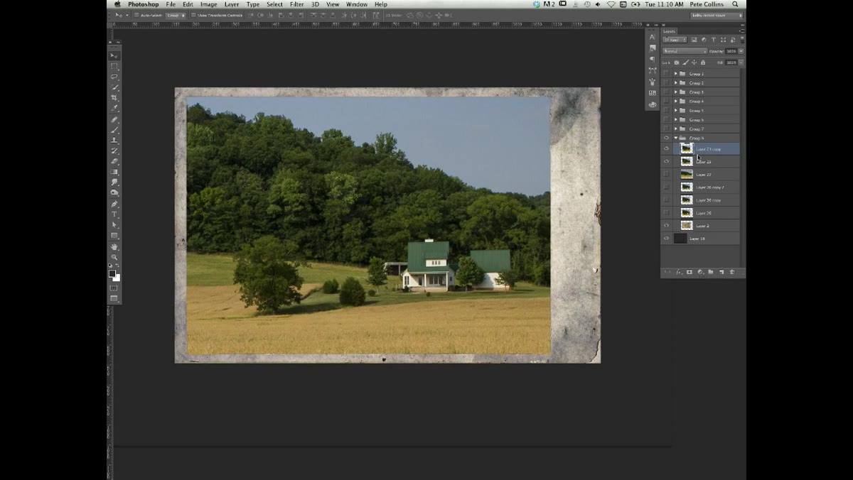 Two duplicate layers visible in Layers panel above base photo layer
Here’s where the technique gets interesting. Take that extracted photo layer and duplicate it twice, so you end up with three copies of the same cropped image stacked on top of each other. This sounds redundant, but each copy is going to do a different job. Think of it like printing the same image on different types of paper and stacking them. Each one contributes something different to the final look. Keep them all visible for now and name them if you want to stay organized, though I’ll be honest, I usually skip naming layers and then hate myself for it twenty minutes later.
Step 6: Apply Different Blending Modes to Each Duplicate
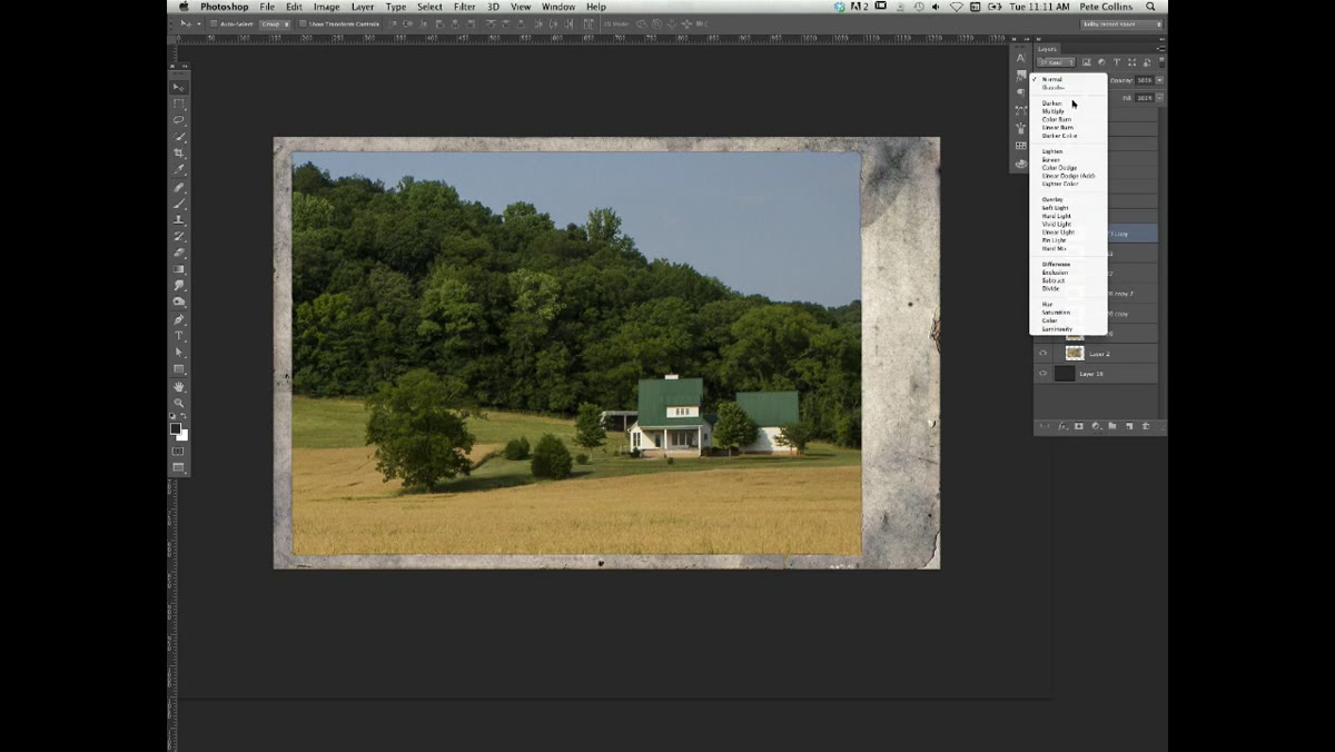 Blending mode dropdown open on one of the duplicate photo layers
This is the core of the whole technique. Each of your duplicate layers gets a different blending mode applied, which controls how it interacts with the Polaroid frame texture below it. The specific modes Pete uses allow the grain, lines, and surface detail of the Polaroid to show through the photo rather than being covered up by it. Modes like Multiply and Soft Light are common choices for this kind of work, but experiment based on your specific frame texture. The goal is to get the photo looking like it was actually printed inside the frame, not dropped on top of it. You may also reduce opacity on one or more of the duplicate layers to dial in the balance between photo clarity and texture integration.
My Take: This Scales Beyond Polaroids
I’ve used a version of this exact approach to drop photos into grunge textures, old paper backgrounds, and magazine mockups for clients. The multi-layer blending method is especially useful when your frame or background has strong surface character that you want to preserve. Where I’d push this further: try using a layer mask on your topmost blended layer to bring back full clarity on a subject’s face or a key focal point, while keeping the textured look around the edges. It gives you more control than just cranking the opacity down on everything uniformly. Also, if you’re doing this repeatedly across a project, convert your base photo layer to a Smart Object before you start duplicating. You can swap the photo out later without redoing any of the blending work.
The single most transferable idea from this tutorial is that a believable composite isn’t about one layer sitting on top of another. It’s about layers interacting with each other. Blending modes are how you create that interaction, and using multiple copies of the same layer with different modes gives you way more control than any single blend setting alone. It’s a small conceptual shift with a big visual payoff.
Watch the full tutorial on YouTube to see Pete walk through this live, including the quick selection refinements and the layer setup in real time.
Comments
Leave a Comment