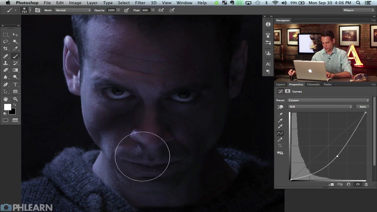
Client work has a funny way of humbling you. I’ve lost count of the number of times someone has handed me a photo and said something like “make it look cinematic” with zero other direction, like I’m supposed to telepathically decode what “cinematic” means to them. After enough of those requests, I started reverse-engineering actual movie posters to build a mental library of techniques I could reach for. That’s what pulled me into this tutorial. In this Aaron Nace (PHLEARN) tutorial on recreating the Riddick movie poster in Photoshop, there are some genuinely sharp fundamentals buried inside what looks like a fun vanity project. Aaron photographed himself in the Riddick pose, straight out of camera, and then walks through the process of transforming that raw photo into a stylized, moody one-sheet. Watch the full tutorial on YouTube
Part one of this two-part series covers the foundational color and lighting work, which is honestly where most composite and poster jobs live or die. The later glamour stuff gets all the attention, but if your base image doesn’t have the right tone and shadow structure, no amount of texture overlays will save it. What I like about Aaron’s approach here is that it’s practical and sequenced well. He starts with color, then addresses light and shadow, which is the correct order because your curves adjustments behave differently depending on whether a colorize layer is sitting above or below them. That’s not obvious when you’re starting out, and it bit me more than once before I understood why.
Step 1: Set Up Your Reference Image In-Canvas
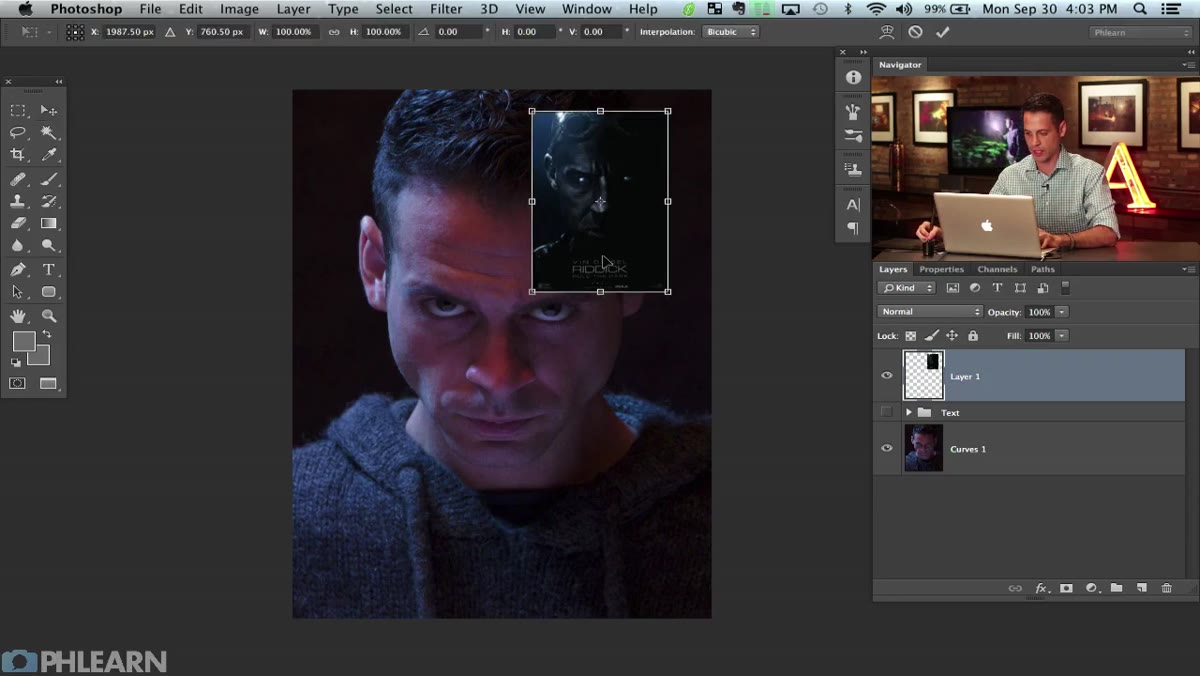 Reference poster and source photo side by side in canvas
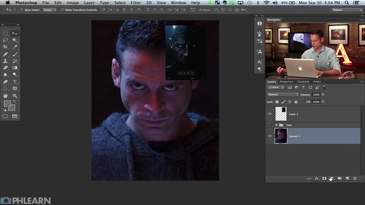
Before touching a single adjustment, Aaron drops the Riddick reference poster directly into the working document. He scales it up with Command + T and parks it right there alongside the source photo. This sounds trivially simple, but it changes how you work. Having the reference inside the document means you’re not alt-tabbing to a browser or squinting at a thumbnail pinned to a corner of your screen. You’re making direct visual comparisons in the same color environment, which matters more than people think. Browser windows and external monitors can throw off your perception of tone. Keep the reference in-canvas, at least for the early stages.
Reference poster and source photo side by side in canvas
Before touching a single adjustment, Aaron drops the Riddick reference poster directly into the working document. He scales it up with Command + T and parks it right there alongside the source photo. This sounds trivially simple, but it changes how you work. Having the reference inside the document means you’re not alt-tabbing to a browser or squinting at a thumbnail pinned to a corner of your screen. You’re making direct visual comparisons in the same color environment, which matters more than people think. Browser windows and external monitors can throw off your perception of tone. Keep the reference in-canvas, at least for the early stages.
Step 2: Apply a Hue/Saturation Colorize for the Base Color Grade
 Hue/Saturation dialog open with Colorize checkbox active
This is the move that establishes the whole poster’s palette. Create a Hue/Saturation adjustment layer and check the Colorize box. This converts the image to a monochromatic tint, which is exactly the look on the actual Riddick poster. From there, Aaron dials the Hue slider into the blue-green range and pulls Saturation down from the default so it doesn’t look garish. He also nudges Lightness down slightly to keep things moody rather than flat. The key finishing touch: drop the opacity of this adjustment layer below 100%. He keeps some of the original image information showing through underneath the tint, which adds depth and stops the result from looking like a cheap Instagram filter. How far you pull the opacity depends on your source image, but somewhere in the 70-85% range is a decent starting point.
Hue/Saturation dialog open with Colorize checkbox active
This is the move that establishes the whole poster’s palette. Create a Hue/Saturation adjustment layer and check the Colorize box. This converts the image to a monochromatic tint, which is exactly the look on the actual Riddick poster. From there, Aaron dials the Hue slider into the blue-green range and pulls Saturation down from the default so it doesn’t look garish. He also nudges Lightness down slightly to keep things moody rather than flat. The key finishing touch: drop the opacity of this adjustment layer below 100%. He keeps some of the original image information showing through underneath the tint, which adds depth and stops the result from looking like a cheap Instagram filter. How far you pull the opacity depends on your source image, but somewhere in the 70-85% range is a decent starting point.
Step 3: Use a Curves Layer to Deepen the Shadows on One Side
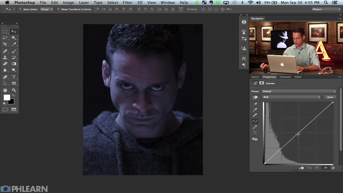 Curves adjustment layer dragged down to darken, mask inverted to black
The Riddick poster has deep, almost total shadow eating up one side of the face. To replicate that, Aaron adds a Curves adjustment layer and drags the curve down hard to darken the overall image. Then, critically, he inverts the layer mask immediately with Command + I, turning it solid black so the darkening effect is completely hidden. From there he paints back the effect selectively using a large, soft white brush over the side of the face he wants to go dark. This is the standard dodge-and-burn-via-curves workflow, and it’s more controllable than using the actual Dodge and Burn tools because you can adjust the curve after the fact without repainting anything. Soft brush, low pressure, multiple passes. Don’t try to get there in one stroke.
Curves adjustment layer dragged down to darken, mask inverted to black
The Riddick poster has deep, almost total shadow eating up one side of the face. To replicate that, Aaron adds a Curves adjustment layer and drags the curve down hard to darken the overall image. Then, critically, he inverts the layer mask immediately with Command + I, turning it solid black so the darkening effect is completely hidden. From there he paints back the effect selectively using a large, soft white brush over the side of the face he wants to go dark. This is the standard dodge-and-burn-via-curves workflow, and it’s more controllable than using the actual Dodge and Burn tools because you can adjust the curve after the fact without repainting anything. Soft brush, low pressure, multiple passes. Don’t try to get there in one stroke.
Step 4: Layer Order Matters - Curves Below, Color Above
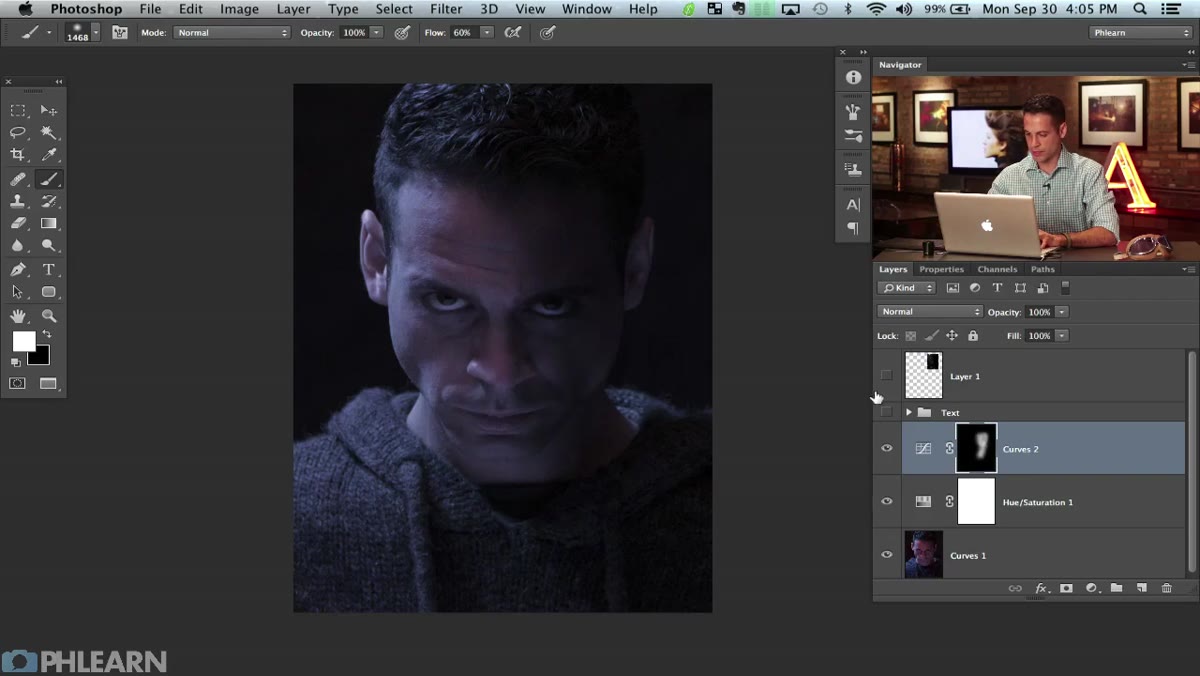 Adjustment layers panel showing Hue/Saturation above Curves layer
Aaron catches something here that’s easy to miss: he makes sure the Curves darkening layer sits below the Hue/Saturation colorize layer in the stack. The reason is mechanical. When you colorize an image and then run a curves adjustment on top of that, the curves can shift the hue itself, not just the luminosity. The tint you carefully dialed in starts drifting. By putting curves underneath the colorize layer, the luminosity changes happen first and the color grade sits cleanly on top. If your color is doing weird things when you add luminosity adjustments, check your layer order before anything else. This has probably cost me an embarrassing amount of time over the years.
Adjustment layers panel showing Hue/Saturation above Curves layer
Aaron catches something here that’s easy to miss: he makes sure the Curves darkening layer sits below the Hue/Saturation colorize layer in the stack. The reason is mechanical. When you colorize an image and then run a curves adjustment on top of that, the curves can shift the hue itself, not just the luminosity. The tint you carefully dialed in starts drifting. By putting curves underneath the colorize layer, the luminosity changes happen first and the color grade sits cleanly on top. If your color is doing weird things when you add luminosity adjustments, check your layer order before anything else. This has probably cost me an embarrassing amount of time over the years.
Step 5: Begin Sculpting Localized Shadow Areas
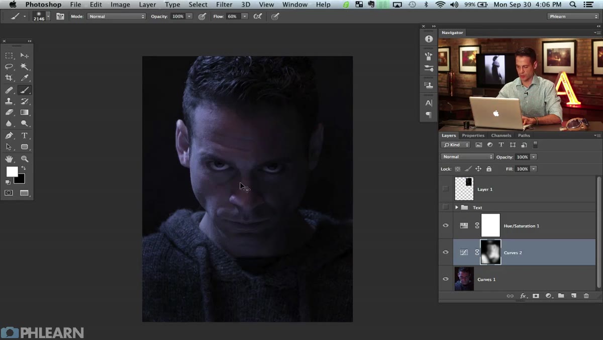 Soft white brush painting shadow areas into the Curves mask
Once the overall darkening layer is in place, Aaron moves into more targeted shadow work. This is where the portrait starts getting its cinematic muscle. Using the same brush-on-mask technique, he begins isolating specific areas to push darker, building contrast zone by zone rather than applying a blanket adjustment. The goal isn’t photorealism at this point, it’s establishing a dramatic lighting structure that reads as intentional. Think of it like chiaroscuro for digital work. You’re not just making things dark, you’re directing where the viewer’s eye goes. Use a lower-opacity brush here, maybe 20-30%, and build up gradually. Aggressive single-pass strokes look harsh and obvious.
Soft white brush painting shadow areas into the Curves mask
Once the overall darkening layer is in place, Aaron moves into more targeted shadow work. This is where the portrait starts getting its cinematic muscle. Using the same brush-on-mask technique, he begins isolating specific areas to push darker, building contrast zone by zone rather than applying a blanket adjustment. The goal isn’t photorealism at this point, it’s establishing a dramatic lighting structure that reads as intentional. Think of it like chiaroscuro for digital work. You’re not just making things dark, you’re directing where the viewer’s eye goes. Use a lower-opacity brush here, maybe 20-30%, and build up gradually. Aggressive single-pass strokes look harsh and obvious.
A Note on Working With Low-Contrast Source Material
If you’re attempting this technique on a photo that wasn’t shot with dramatic lighting to begin with, you’ll run into resistance fast. The Curves trick can push shadows deep, but it can’t invent light that was never there. I once spent most of an afternoon trying to make a flat, evenly lit headshot look like it was shot in a dark industrial corridor. It never quite worked because there was no existing shadow structure to amplify. The lesson I took from that is to push for contrast in camera when you can, even subtle. A slightly dramatic light position gives the Curves layer something to grip onto. If you’re stuck with a flat source image, try a high-contrast black and white conversion first, use that as a reference to identify where your shadows should logically fall, then paint accordingly on your masks.
The single most important thing Part 1 of this tutorial demonstrates is that movie poster aesthetics aren’t about exotic filters or plugin magic. They’re about disciplined layer order, monochromatic color control, and using adjustment masks to sculpt light the way a cinematographer does it with actual lights. Get that foundation right and everything else in Part 2 will have something solid to build on.
Watch the full tutorial on YouTube
Comments (2)
My workflow just got 10x faster. Not even kidding.
I tried this on a client project yesterday and the results were way better than expected.
Leave a Comment