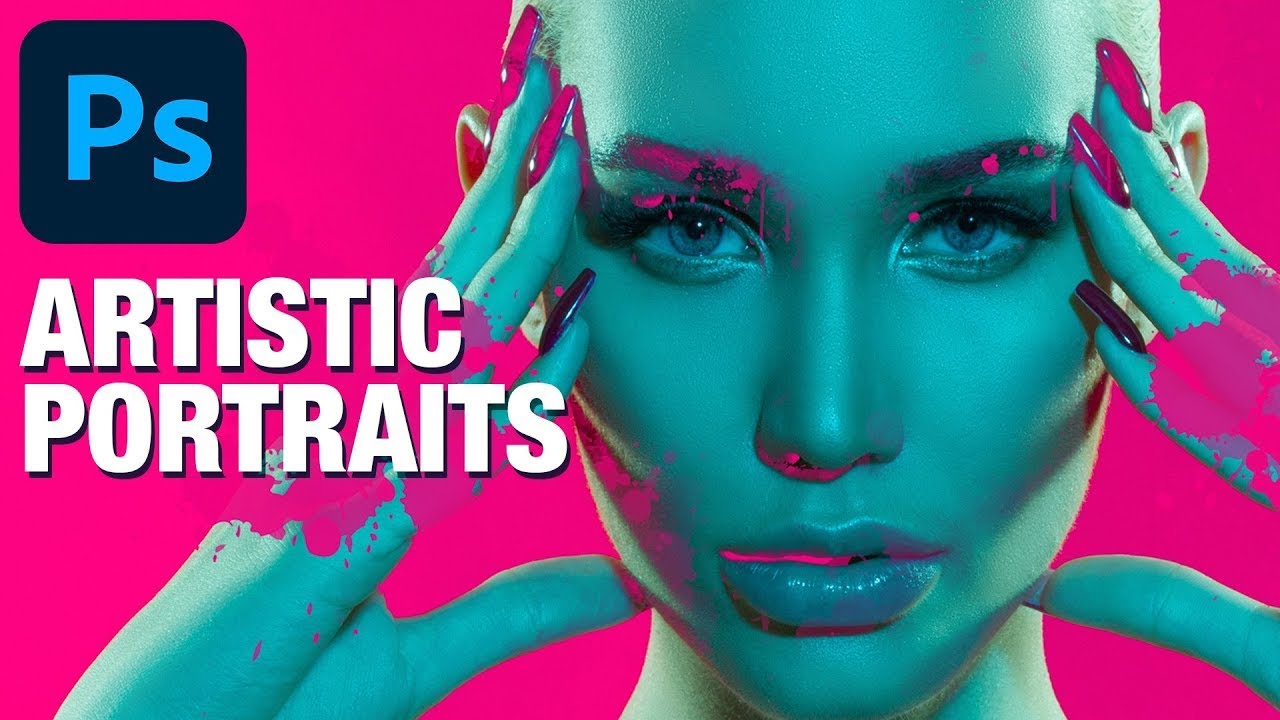
There’s a specific kind of Photoshop frustration that hits when you drop a graphic element onto a portrait, slap on Multiply or Screen, and think “okay, close enough.” It works, sort of, but the colors are off, the opacity feels wrong, and the whole thing looks like you gave up halfway through. I’ve shipped work like that. Not proud of it, but I’ve done it. The problem isn’t the blending mode itself. The problem is that blending modes are a compromise, and sometimes you need precision instead of a happy accident.
That’s exactly the gap that Aaron Nace over at PHLEARN plugs in this tutorial. Watch the full tutorial on YouTube before or after reading through this, because seeing it move helps. The concept on the page: take a splatter graphic from Adobe Stock, use channels to build a clean selection with real transparency baked in, fill it with a specific color pulled directly from the background, and let it sit naturally over a portrait. The result looks intentional and designed rather than “I found a PNG and hoped for the best.”
The technique itself is the kind of thing that once you know it, you’ll use it constantly. Isolating any graphic element with channels rather than a basic selection tool gives you graduated transparency, meaning the edges of your graphic feather out realistically instead of being hard-cut. It’s the difference between a logo that feels stamped on top of an image and one that feels like it belongs there.
Step 1: Resist the Blending Mode Temptation
 Normal blend mode selected in the Layers panel dropdown
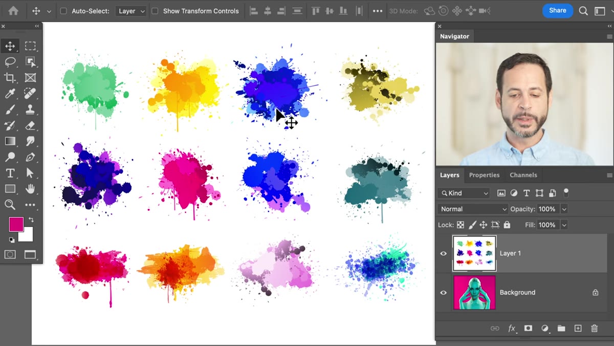
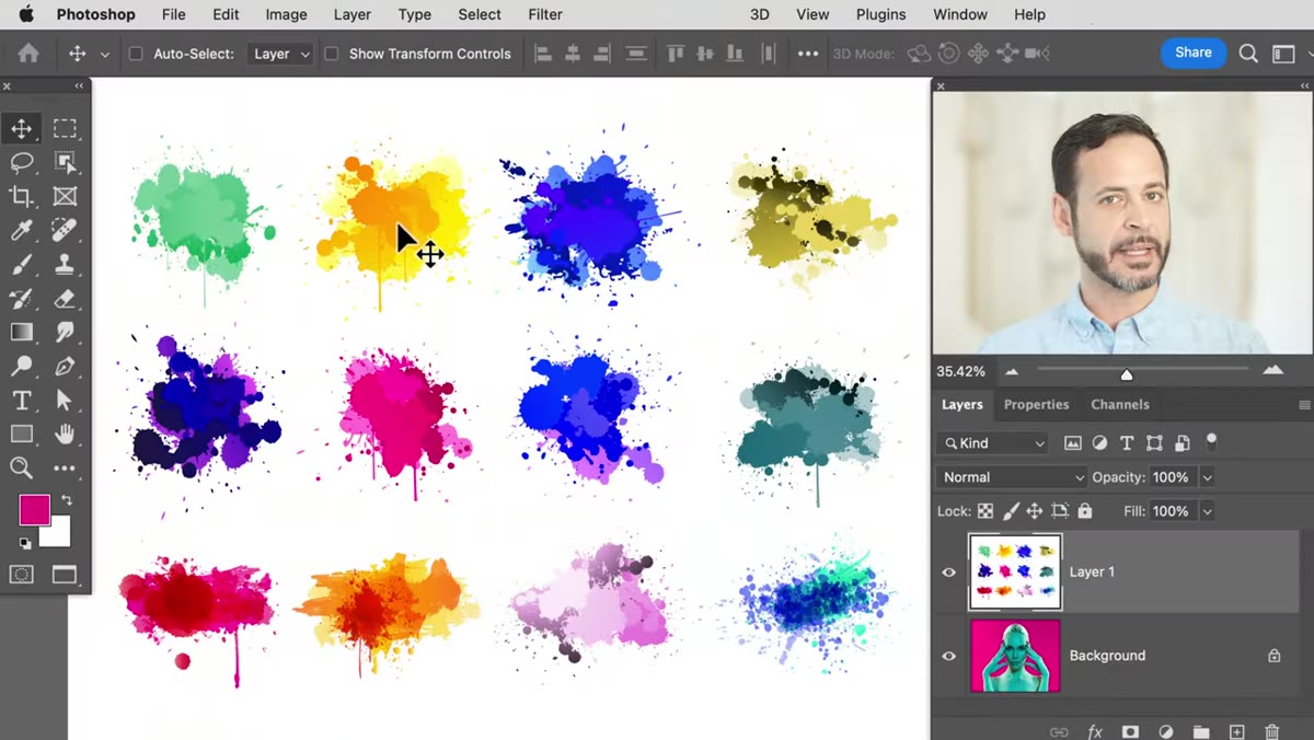
Open your portrait and place your graphic layer on top. Your first instinct will be to change the layer’s blend mode from Normal to Multiply or Overlay and call it a day. Go ahead and try it once so you see why it doesn’t work. The colors from the graphic will bleed into your portrait in unpredictable ways, and you lose the ability to control the actual hue of your overlay. In Aaron’s example, the splatter graphic goes greenish under Multiply when the whole point was to match a specific magenta from the background. Switch back to Normal blend mode before moving on. You’ll get the effect you actually want through the selection process, not through a blend mode hack.
Normal blend mode selected in the Layers panel dropdown
Open your portrait and place your graphic layer on top. Your first instinct will be to change the layer’s blend mode from Normal to Multiply or Overlay and call it a day. Go ahead and try it once so you see why it doesn’t work. The colors from the graphic will bleed into your portrait in unpredictable ways, and you lose the ability to control the actual hue of your overlay. In Aaron’s example, the splatter graphic goes greenish under Multiply when the whole point was to match a specific magenta from the background. Switch back to Normal blend mode before moving on. You’ll get the effect you actually want through the selection process, not through a blend mode hack.
Step 2: Open the Channels Panel
 Channels panel open showing RGB, Red, Green, Blue thumbnails
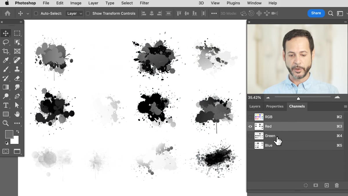
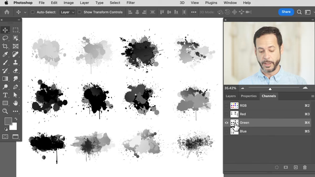
Go to Window in the top menu bar and select Channels. This opens a panel that shows you the Red, Green, and Blue channel breakdowns of your selected layer. If you’ve never used channels before, here’s the only thing you need to know right now: light areas in a channel will become selected, and dark areas will not. The channel thumbnails show you where the brightness lives in each color range, and you’re going to use that brightness information to generate a selection that carries natural transparency with it, rather than a flat binary “selected vs. not selected” edge.
Channels panel open showing RGB, Red, Green, Blue thumbnails
Go to Window in the top menu bar and select Channels. This opens a panel that shows you the Red, Green, and Blue channel breakdowns of your selected layer. If you’ve never used channels before, here’s the only thing you need to know right now: light areas in a channel will become selected, and dark areas will not. The channel thumbnails show you where the brightness lives in each color range, and you’re going to use that brightness information to generate a selection that carries natural transparency with it, rather than a flat binary “selected vs. not selected” edge.
Step 3: Pick the Channel With the Most Contrast
 Green channel thumbnail selected, showing bright splatter detail
Click through the Red, Green, and Blue channel thumbnails one at a time and look at which one gives you the most visible detail and contrast in your graphic element. In Aaron’s case with the splatter, the Green channel wins. It has the most information, meaning the splatters are bright and visible while the background stays relatively dark. You want strong contrast between your graphic and its background at this stage because that contrast is what builds the quality of your eventual selection. A flat, low-contrast channel will give you a mushy selection. A punchy, high-contrast channel gives you clean edges with natural feathering.
Green channel thumbnail selected, showing bright splatter detail
Click through the Red, Green, and Blue channel thumbnails one at a time and look at which one gives you the most visible detail and contrast in your graphic element. In Aaron’s case with the splatter, the Green channel wins. It has the most information, meaning the splatters are bright and visible while the background stays relatively dark. You want strong contrast between your graphic and its background at this stage because that contrast is what builds the quality of your eventual selection. A flat, low-contrast channel will give you a mushy selection. A punchy, high-contrast channel gives you clean edges with natural feathering.
Step 4: Load the Channel as a Selection
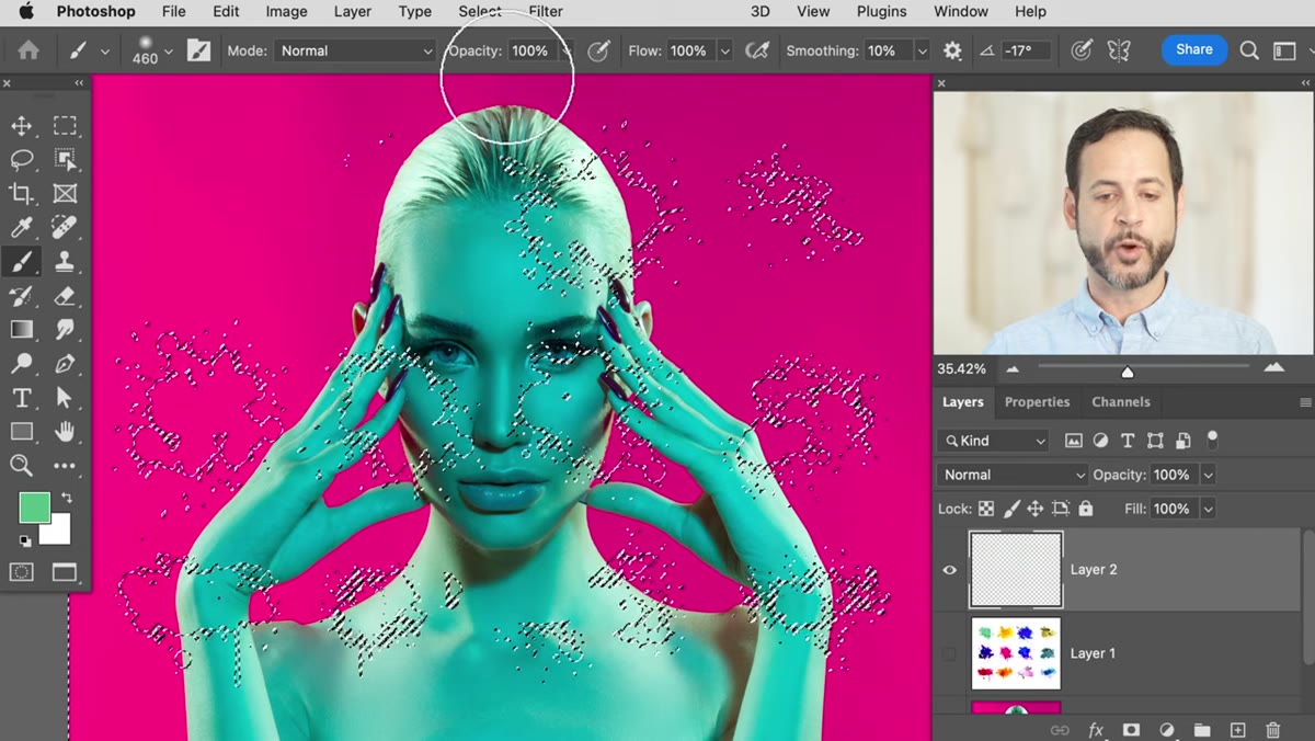
 Marching ants selection appearing after channel is loaded
Hold Ctrl (or Cmd on Mac) and click the thumbnail of your chosen channel. You’ll see the marching ants selection appear on screen. Alternatively, you can click the “Load channel as selection” icon at the bottom of the Channels panel, which looks like a dotted circle. Either method does the same thing. What you’ve just done is turn the brightness values of that channel into a live selection, with full, partial, and no selection all existing at once depending on pixel brightness. This is the key move. You’re not drawing a selection around something. You’re extracting a selection from the image data itself, which is why it carries transparency information so naturally.
Marching ants selection appearing after channel is loaded
Hold Ctrl (or Cmd on Mac) and click the thumbnail of your chosen channel. You’ll see the marching ants selection appear on screen. Alternatively, you can click the “Load channel as selection” icon at the bottom of the Channels panel, which looks like a dotted circle. Either method does the same thing. What you’ve just done is turn the brightness values of that channel into a live selection, with full, partial, and no selection all existing at once depending on pixel brightness. This is the key move. You’re not drawing a selection around something. You’re extracting a selection from the image data itself, which is why it carries transparency information so naturally.
Step 5: Inverse the Selection
 Select menu open with Inverse option highlighted
Here’s where direction matters. Because channels select the lighter areas, and in most graphic-on-background situations the graphic itself is the darker element, your selection is currently the wrong way around. Go to Select in the top menu and choose Inverse. Keyboard shortcut: Shift+Ctrl+I on Windows or Shift+Cmd+I on Mac. Now the darker parts of your graphic, the actual splatter shapes, are selected instead of the background. Before you move on, switch back to your Layers panel. Create a new empty layer above your graphic layer. This is where your color fill is going to live.
Select menu open with Inverse option highlighted
Here’s where direction matters. Because channels select the lighter areas, and in most graphic-on-background situations the graphic itself is the darker element, your selection is currently the wrong way around. Go to Select in the top menu and choose Inverse. Keyboard shortcut: Shift+Ctrl+I on Windows or Shift+Cmd+I on Mac. Now the darker parts of your graphic, the actual splatter shapes, are selected instead of the background. Before you move on, switch back to your Layers panel. Create a new empty layer above your graphic layer. This is where your color fill is going to live.
Step 6: Fill the Selection With a Matching Color
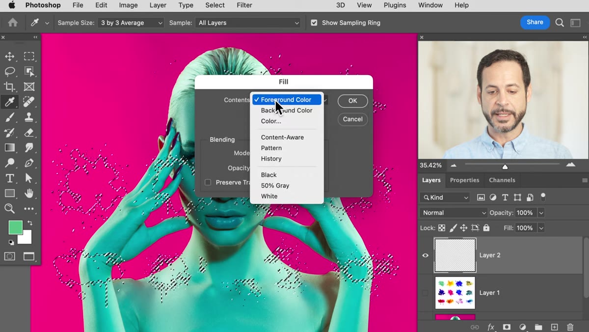 Fill dialog box open with Contents set to Color
With your new empty layer active and your selection still live, go to Edit and then Fill. In the Fill dialog box, change the Contents dropdown to Color. Your color picker will open. Here’s the clever part Aaron shows: instead of manually entering a hex code, move your cursor outside the color picker window and directly over a color in your canvas. The cursor automatically becomes an eyedropper. Click the background color of your portrait, or whatever color you want the graphic to actually be. Hit OK in the color picker, then OK in the Fill dialog. Press Ctrl+D (or Cmd+D) to deselect. Toggle the original graphic layer off and you’ll see the filled splatter sitting cleanly on a transparent background, shaped by real channel data, colored exactly how you want it.
Fill dialog box open with Contents set to Color
With your new empty layer active and your selection still live, go to Edit and then Fill. In the Fill dialog box, change the Contents dropdown to Color. Your color picker will open. Here’s the clever part Aaron shows: instead of manually entering a hex code, move your cursor outside the color picker window and directly over a color in your canvas. The cursor automatically becomes an eyedropper. Click the background color of your portrait, or whatever color you want the graphic to actually be. Hit OK in the color picker, then OK in the Fill dialog. Press Ctrl+D (or Cmd+D) to deselect. Toggle the original graphic layer off and you’ll see the filled splatter sitting cleanly on a transparent background, shaped by real channel data, colored exactly how you want it.
Why I’d Push This Further: Swap the Color Non-Destructively
Aaron’s technique gets you exactly where you need to be, but my habit when I’m working for clients is to add one extra step: instead of filling directly on a regular layer, I’ll fill onto the layer and immediately convert it to a Smart Object, then drop a Hue/Saturation adjustment clipped to it. That way if a client comes back and says “can we try it in teal instead,” I’m not rebuilding the channel selection from scratch. The color is a live, adjustable value. Given that I’ve rebuilt entire comp elements from zero because a client changed their mind at the last minute, this extra fifteen seconds of setup has saved me hours.
The single biggest takeaway here is that channels aren’t exotic or scary. They’re just a more precise way to build selections, and that precision pays off every time you need a graphic to sit on top of an image and actually look like it belongs there. Blending modes are a starting point, not a solution.
Watch the full tutorial on YouTube to see Aaron walk through the full portrait build, including how the final composite comes together with the colored splatter in place.
Comments
Leave a Comment