Content Aware Scale: The Photoshop Feature I Keep Forgetting I Need (Until I Desperately Need It)

Content Aware Scale: The Photoshop Feature I Keep Forgetting I Need (Until I Desperately Need It)

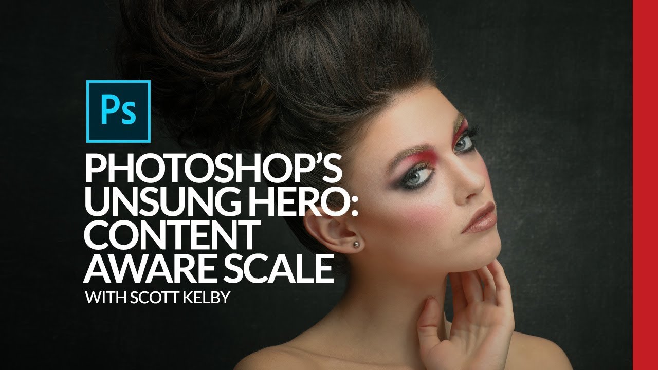
There’s a specific kind of design panic that hits when you’re building a thumbnail, a print layout, or a client deliverable and the photo just doesn’t fit the canvas the way you need it to. The subject is dead center, you need room on one side for text, and if you just scale the whole image you’ll either crop something important or squash the person in the frame into a funhouse mirror version of themselves.

Build a Photoshop Photo Book Template That Actually Saves You Time (Scott Kelby Method)

Build a Photoshop Photo Book Template That Actually Saves You Time (Scott Kelby Method)

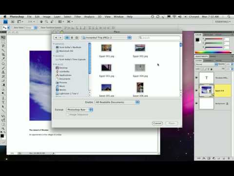
Client photo books used to wreck my workflow. Not the creative part, I enjoy that. The part where you build twelve nearly-identical pages and have to manually swap out every image, resize it, reposition it, and pray nothing shifts. I burned more hours than I’ll admit before I stumbled across a smarter approach. In this Scott Kelby tutorial from his three-part photo book series, Kelby walks through building photo book pages directly in Photoshop CS4.

Rescuing a Wrecked Brochure Photo in Photoshop: A Real-World Walkthrough

Rescuing a Wrecked Brochure Photo in Photoshop: A Real-World Walkthrough

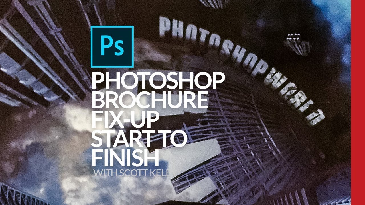
Client sends you a photo taken on an iPhone, under bad lighting, of a bent, faded, color-cast piece of paper. No raw file. No scanner. Just that. If you’ve been doing design or photo work for any length of time, you’ve been here. I’ve been here more times than I’d like to admit, usually sitting in a coffee shop trying to work miracles on someone’s terrible source material before a deadline hits.

The Flip-and-Match Trick That Saves Your Covers When You Shot the Wrong Orientation

The Flip-and-Match Trick That Saves Your Covers When You Shot the Wrong Orientation

There’s a specific kind of dread that hits when a client asks for a vertical crop of a photo you shot horizontal. It doesn’t matter how good the image is. If the canvas is taller than the frame, you’ve got dead space, and dead space on a magazine cover is a career-limiting move. I’ve been there more times than I’d like to admit, usually sitting in a coffee shop frantically masking gradients into skies that don’t quite match, hoping the client doesn’t zoom in.

The Paper Slit Effect: A Clever Holiday Photoshop Trick You Can Pull Off in 15 Minutes

The Paper Slit Effect: A Clever Holiday Photoshop Trick You Can Pull Off in 15 Minutes

Every December I end up scrambling for last-minute holiday graphics. Social posts, promo banners, gift guides, you name it. And every year I default to the same tired snowflake overlays and gradient red backgrounds that look like everyone else’s work. So when I came across this Scott Kelby tutorial, I stopped scrolling pretty fast. The technique is deceptively simple: you make it look like a gift card or product is physically peeking through a slit cut into paper.

From Flat to Finished: Scott Kelby's Intermediate Lightroom Workflow (With a Photoshop Assist)

From Flat to Finished: Scott Kelby's Intermediate Lightroom Workflow (With a Photoshop Assist)

There’s a specific kind of photo that lives on every photographer’s hard drive. Not the hero shot. Not the portfolio piece. The “I was walking by and this looked interesting” shot. The one you almost delete but don’t, because something about it nags at you. I have a folder full of those, and for a long time I treated them as lost causes, spending all my energy on the obvious winners and ignoring everything else.