Client photo books used to wreck my workflow. Not the creative part, I enjoy that. The part where you build twelve nearly-identical pages and have to manually swap out every image, resize it, reposition it, and pray nothing shifts. I burned more hours than I’ll admit before I stumbled across a smarter approach.
In this Scott Kelby tutorial from his three-part photo book series, Kelby walks through building photo book pages directly in Photoshop CS4. The whole thing is built around a reusable template system powered by Smart Objects, and once it clicked for me, I rebuilt my entire photo book process around it. The technique is old enough that it predates half the apps people use today, but the core logic is still airtight. If you’ve ever manually rebuilt the same layout six times in a row, this is going to feel embarrassing in the best way.
Watch the full tutorial on YouTube
Step 1: Create a Landscape Document at the Right Size
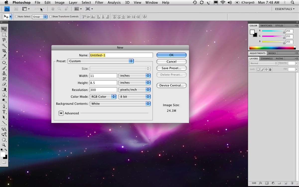 New document dialog open with landscape dimensions entered
Go to File > New and set your document to 11 inches wide by 8.5 inches tall. That’s the key detail people miss: Photoshop defaults to portrait orientation, so you’re not picking a preset and calling it done. You type 11 into the width field, hit Tab, then type 8.5. This gives you a standard US letter page in landscape, which maps cleanly to most photo book print specs. Set resolution to 300 PPI if you’re printing, and keep the background white for now.
New document dialog open with landscape dimensions entered
Go to File > New and set your document to 11 inches wide by 8.5 inches tall. That’s the key detail people miss: Photoshop defaults to portrait orientation, so you’re not picking a preset and calling it done. You type 11 into the width field, hit Tab, then type 8.5. This gives you a standard US letter page in landscape, which maps cleanly to most photo book print specs. Set resolution to 300 PPI if you’re printing, and keep the background white for now.
Step 2: Place Your Photo as a Smart Object (Not Open, Not Drag)
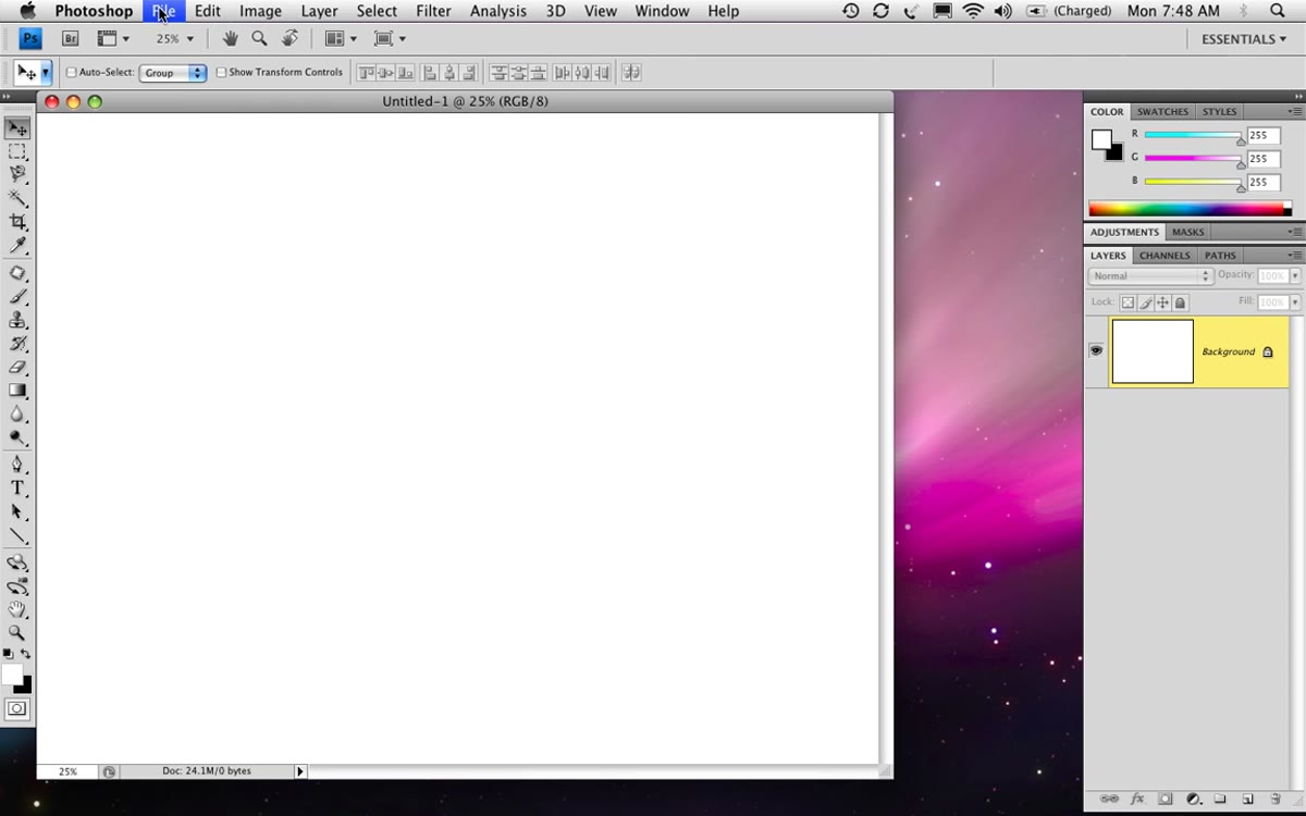 File menu open with Place command highlighted
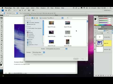
This is the step that changes everything. Instead of opening your photo and dragging it in, go to File > Place. Same result on the surface, completely different under the hood. Placing a file brings it in as a Smart Object, which means Photoshop stores the original image data separately from whatever transformations you apply on the canvas. You can scale it down, then scale it back up later without degrading quality. If you’ve ever shrunk a photo to thumbnail size and then needed it bigger again, you know exactly why this matters.
File menu open with Place command highlighted
This is the step that changes everything. Instead of opening your photo and dragging it in, go to File > Place. Same result on the surface, completely different under the hood. Placing a file brings it in as a Smart Object, which means Photoshop stores the original image data separately from whatever transformations you apply on the canvas. You can scale it down, then scale it back up later without degrading quality. If you’ve ever shrunk a photo to thumbnail size and then needed it bigger again, you know exactly why this matters.
I actually learned this the hard way on a client project years ago. Dragged in a bunch of images, scaled them all down to fit, then the client wanted the layout changed and suddenly everything was soft and pixelated. Smart Objects would have saved that entire afternoon.
Step 3: Size and Position the Photo with Intention
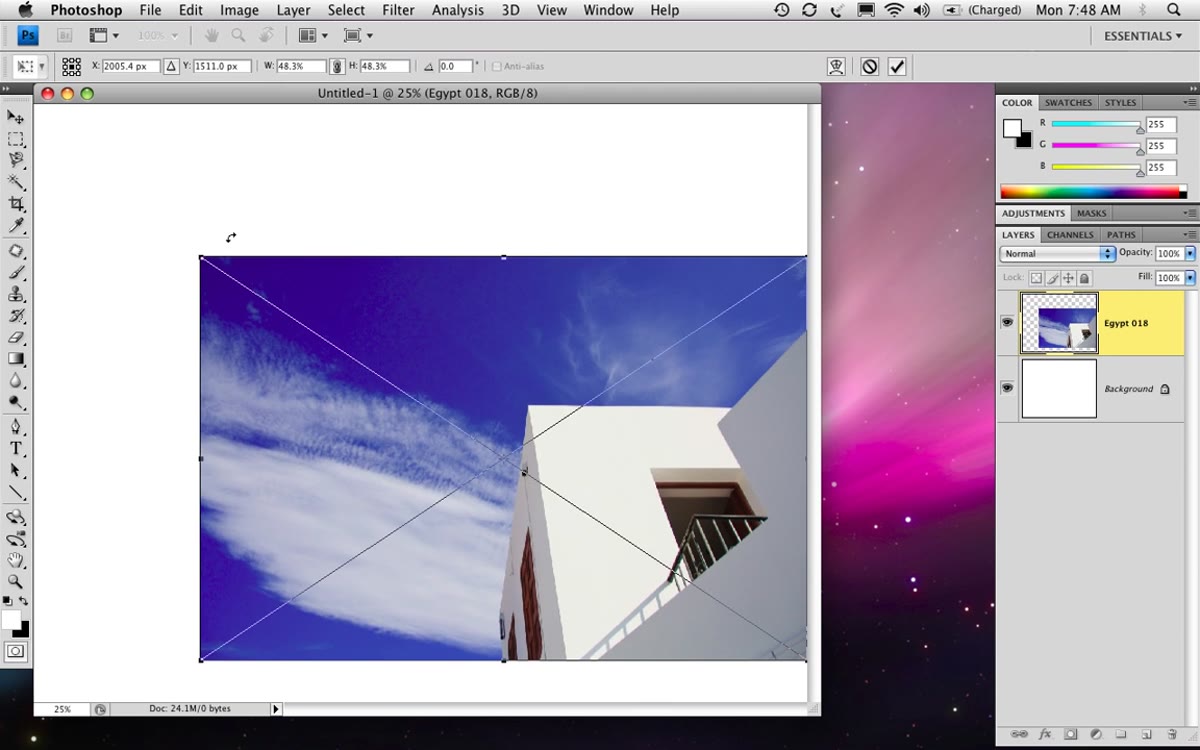 Photo scaled down on white canvas with visible white border
After placing the image, Photoshop drops it in with transform handles active. Scale it down so there’s generous white space on all four sides, similar to how Apple’s iPhoto books used to look. That breathing room is what makes a layout feel designed rather than just assembled. Kelby’s approach is to leave roughly equal margins on the left, right, and bottom, but push the photo slightly above center vertically. It creates subtle visual balance without being perfectly symmetrical, which tends to look more intentional.
Photo scaled down on white canvas with visible white border
After placing the image, Photoshop drops it in with transform handles active. Scale it down so there’s generous white space on all four sides, similar to how Apple’s iPhoto books used to look. That breathing room is what makes a layout feel designed rather than just assembled. Kelby’s approach is to leave roughly equal margins on the left, right, and bottom, but push the photo slightly above center vertically. It creates subtle visual balance without being perfectly symmetrical, which tends to look more intentional.
To nail the horizontal centering without eyeballing it, click the Background layer, then Shift-click your photo layer to select both, and use the align horizontal centers button in the options bar up top. It snaps to exact center instantly. Then nudge the photo up a bit using the Move tool.
Step 4: Add Text in the iPhoto Style
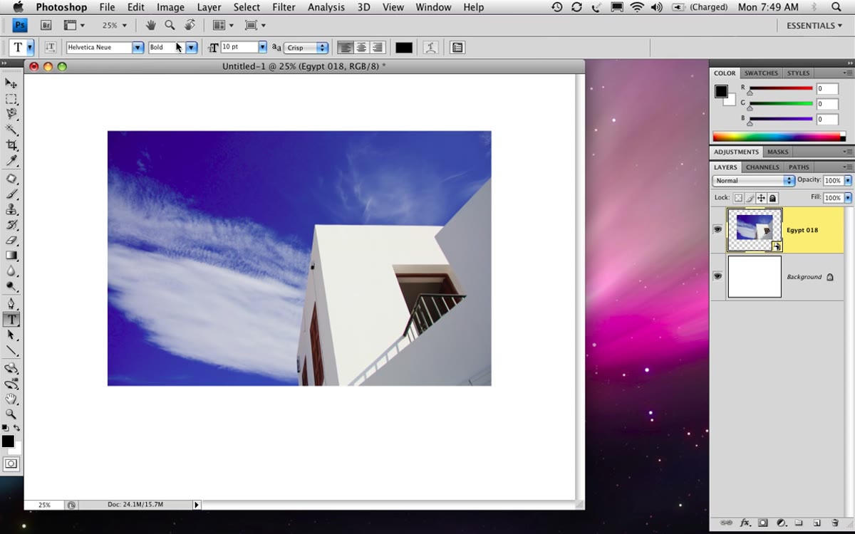 Text tool active with Helvetica typed below centered photo
Kelby uses Helvetica for both text elements, which is the same clean sans-serif Apple leaned on for iPhoto books. Add a text layer below the photo’s vertical midpoint. The layout uses two tiers: a bold line for the main title and a regular weight line for the subtitle or location detail. Type your main title, hit return a couple of times for spacing, then type the secondary line. Select just the top line and apply bold. Keep font sizes modest, this is a supporting element, not a headline poster.
Text tool active with Helvetica typed below centered photo
Kelby uses Helvetica for both text elements, which is the same clean sans-serif Apple leaned on for iPhoto books. Add a text layer below the photo’s vertical midpoint. The layout uses two tiers: a bold line for the main title and a regular weight line for the subtitle or location detail. Type your main title, hit return a couple of times for spacing, then type the secondary line. Select just the top line and apply bold. Keep font sizes modest, this is a supporting element, not a headline poster.
Position the text so it sits comfortably below the photo with a consistent gap. The whole composition should feel like it has room to breathe at every edge.
Step 5: Save It as a Named Template
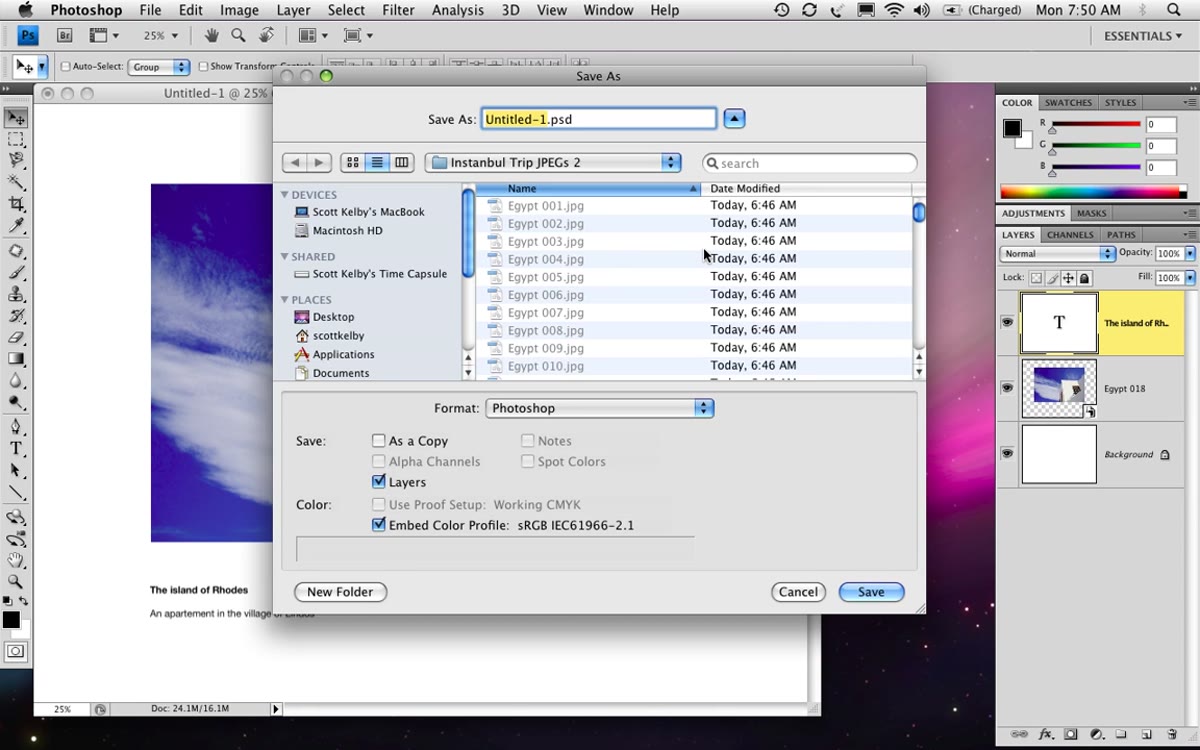 Save dialog with filename “white background one photo”
Once your layout looks right, save the file with a descriptive name like “white-background-one-photo.psd”. This is your master template. Every time you need to build a new page with this layout, you open this file and work from it. Sounds obvious, but most people skip the naming convention and end up with a folder full of files called “untitled-3” and “photo-book-FINAL-v2.” The naming here is doing real organizational work.
Save dialog with filename “white background one photo”
Once your layout looks right, save the file with a descriptive name like “white-background-one-photo.psd”. This is your master template. Every time you need to build a new page with this layout, you open this file and work from it. Sounds obvious, but most people skip the naming convention and end up with a folder full of files called “untitled-3” and “photo-book-FINAL-v2.” The naming here is doing real organizational work.
Step 6: Swap Photos Using Replace Contents
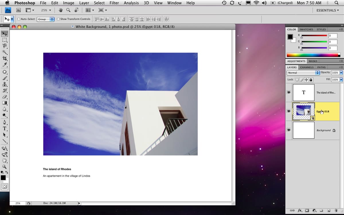 Right-click context menu showing Replace Contents option on Smart Object layer
Here’s where the Smart Object investment pays off. To use your template for a new photo, Control-click (Mac) or right-click (PC) on the Smart Object layer in the Layers panel and choose Replace Contents. Navigate to your new image, click Place, and it drops straight into the same position and scale as the original. You don’t resize, you don’t reposition. It just works. Then update your text and you’re done. What would have taken ten minutes of fiddling takes about thirty seconds.
Right-click context menu showing Replace Contents option on Smart Object layer
Here’s where the Smart Object investment pays off. To use your template for a new photo, Control-click (Mac) or right-click (PC) on the Smart Object layer in the Layers panel and choose Replace Contents. Navigate to your new image, click Place, and it drops straight into the same position and scale as the original. You don’t resize, you don’t reposition. It just works. Then update your text and you’re done. What would have taken ten minutes of fiddling takes about thirty seconds.
Step 7: Switch to a Dark Background Layout
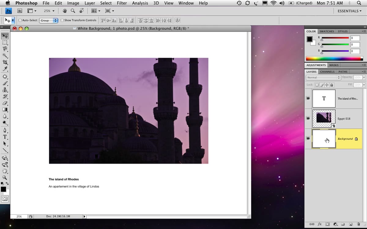 Canvas filled with black, text layer switched to white
For pages where you want a black background, click the Background layer, press D to reset your foreground color to black, then hit Option+Delete on Mac or Alt+Backspace on PC to fill it. Double-click your text layer and change the font color to white. Save this as a separate template, “black-background-one-photo.psd.” If you already have a black background and want to flip it back to white without refilling it manually, Command+I on Mac or Control+I on PC inverts the layer. Handy.
Canvas filled with black, text layer switched to white
For pages where you want a black background, click the Background layer, press D to reset your foreground color to black, then hit Option+Delete on Mac or Alt+Backspace on PC to fill it. Double-click your text layer and change the font color to white. Save this as a separate template, “black-background-one-photo.psd.” If you already have a black background and want to flip it back to white without refilling it manually, Command+I on Mac or Control+I on PC inverts the layer. Handy.
What I’d Add: Organize Your Templates as a Starting Library
Kelby’s system gives you the core idea, but I’d push it further. Build a small library of template files before you start any photo book project: one photo landscape, two photos landscape, one photo with full bleed, dark and light versions of each. Seven or eight files total. When a project comes in, you’re not designing from scratch, you’re just populating layouts you already know work.
I keep mine in a folder called “book-starters” and honestly it’s one of the most-used folders on my machine. The other thing worth doing is setting up a paragraph style for your text layers so the font, size, and leading stay consistent across every page. Kelby doesn’t go into that in this tutorial, but it’s the natural next step once your template library grows past a handful of files.
The single most important thing to take away here is the Place command over open-and-drag. Everything else in this workflow, the centering trick, the invert shortcut, the replace contents swap, flows from that one decision. Smart Objects give your templates real flexibility instead of just a head start.
Watch the full tutorial on YouTube and pay attention to how quickly Kelby moves once the template is set up. That speed is what you’re building toward.
Comments
Leave a Comment