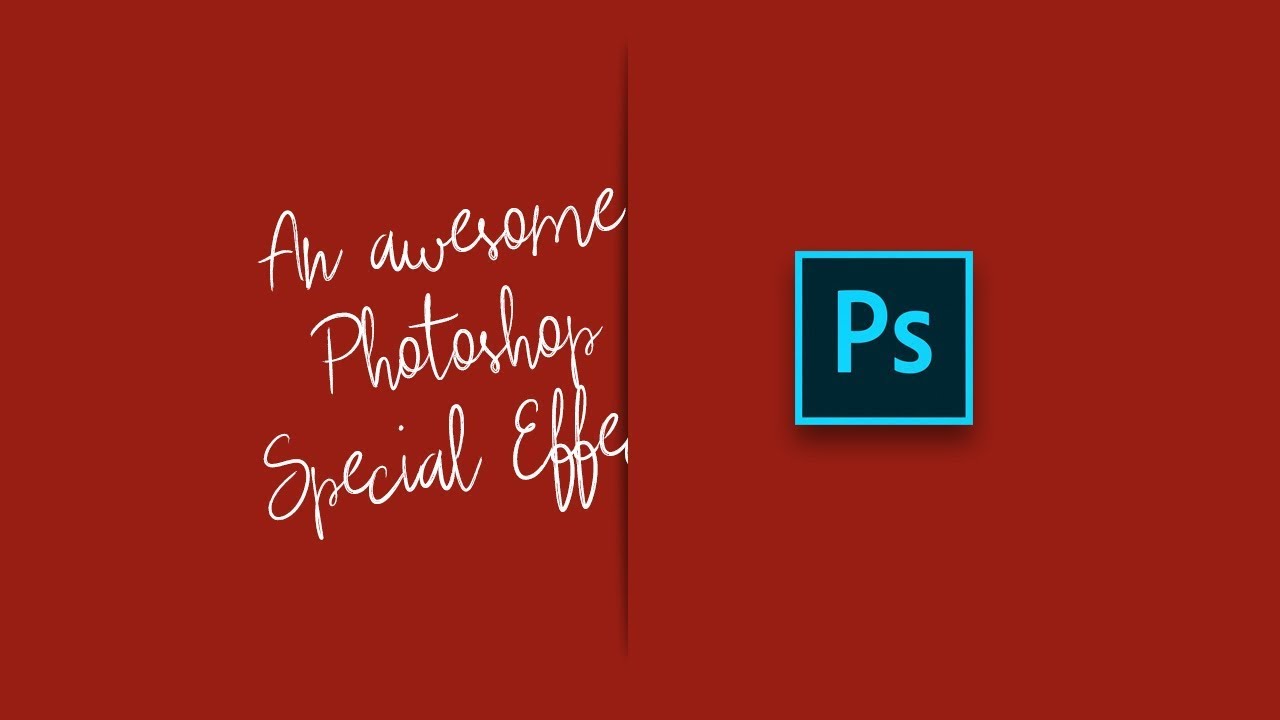
Every December I end up scrambling for last-minute holiday graphics. Social posts, promo banners, gift guides, you name it. And every year I default to the same tired snowflake overlays and gradient red backgrounds that look like everyone else’s work. So when I came across this Scott Kelby tutorial, I stopped scrolling pretty fast. The technique is deceptively simple: you make it look like a gift card or product is physically peeking through a slit cut into paper. It sounds like a small thing, but the result has a tactile, almost physical quality that makes it stand out from flat digital graphics.
Watch the full tutorial on YouTube
The beauty here is that it uses tools you already know. No plugins, no third-party assets you have to hunt down, no channel masking rabbit holes. The whole thing is built from elliptical selections, Gaussian blur, and some smart layer manipulation. I rebuilt it myself in a coffee shop on a 13-inch laptop screen and it came together in about 15 minutes. Here’s exactly how it works.
Step 1: Set Up Your Background
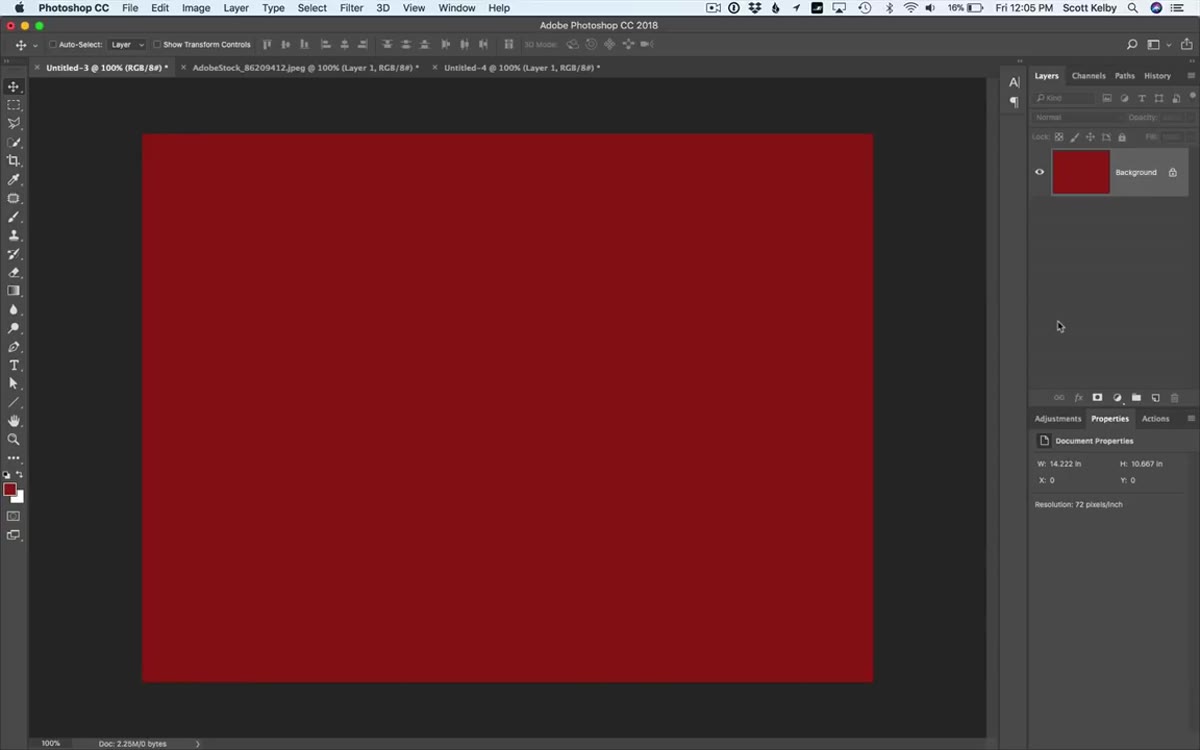 Red background layer freshly filled in Photoshop
Start with a new document and fill your background layer with a solid festive red. Kelby uses what he calls “official Christmas red,” which is just a rich, saturated red, something in the neighborhood of #CC0000 or similar. Use the Paint Bucket tool or go to Edit > Fill and choose your foreground color after setting it in the color picker. This is your canvas, so pick a red you’d actually want to present to a client. The contrast this color creates with darker elements is what makes the whole illusion pop later.
Red background layer freshly filled in Photoshop
Start with a new document and fill your background layer with a solid festive red. Kelby uses what he calls “official Christmas red,” which is just a rich, saturated red, something in the neighborhood of #CC0000 or similar. Use the Paint Bucket tool or go to Edit > Fill and choose your foreground color after setting it in the color picker. This is your canvas, so pick a red you’d actually want to present to a client. The contrast this color creates with darker elements is what makes the whole illusion pop later.
Step 2: Draw and Fill a Thin Oval
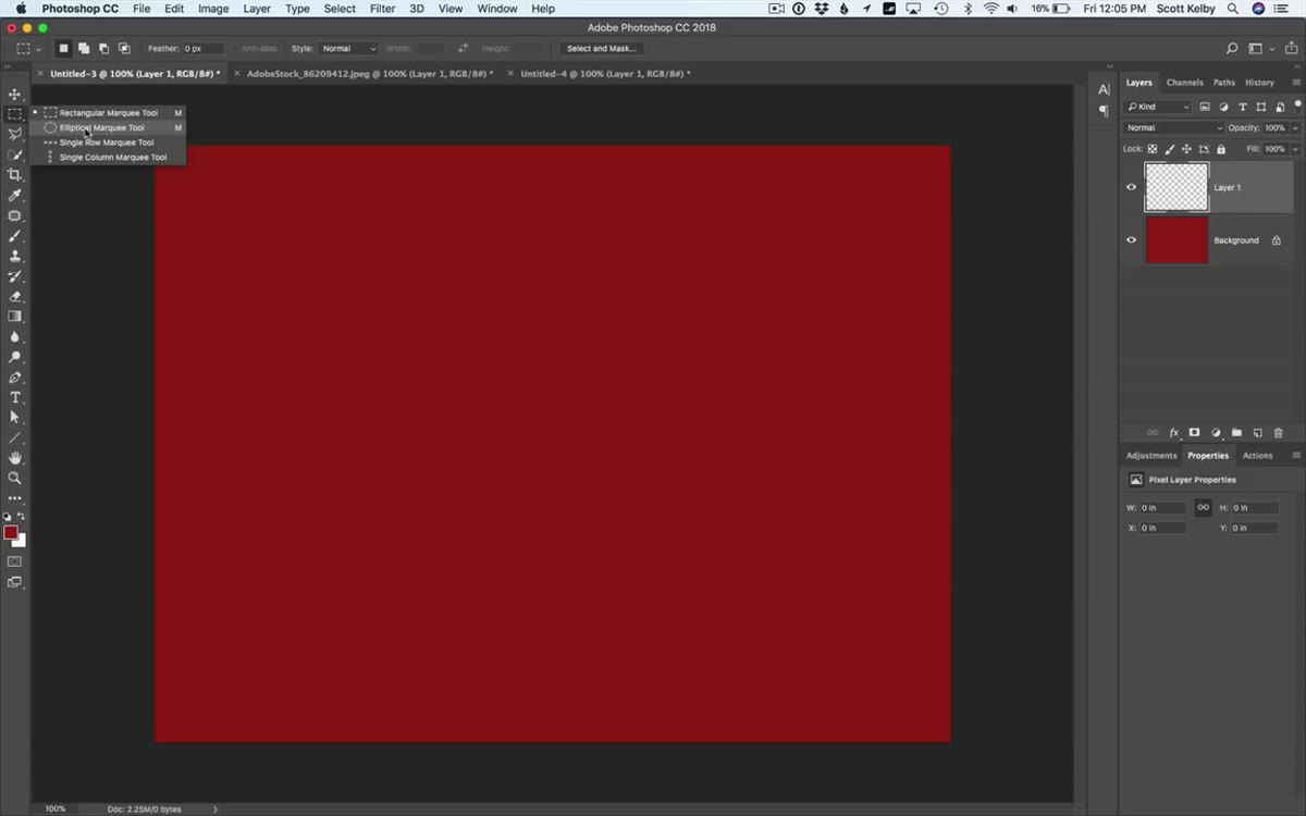 Thin elliptical marquee selection on a blank layer
Create a new blank layer above the background. Grab the Elliptical Marquee Tool (M) and draw a very thin, elongated horizontal oval, think the shape of a slit or a gap in paper, not a circle. If your selection drifts while you’re drawing, hold the spacebar to reposition it without letting go of the mouse. Once you have your thin oval sitting where you want it, press D to reset your foreground color to black, then fill the selection with black using Alt+Delete (Mac: Option+Delete). Deselect with Cmd/Ctrl+D. That flat black oval is your shadow foundation, and it needs to exist before you blur it.
Thin elliptical marquee selection on a blank layer
Create a new blank layer above the background. Grab the Elliptical Marquee Tool (M) and draw a very thin, elongated horizontal oval, think the shape of a slit or a gap in paper, not a circle. If your selection drifts while you’re drawing, hold the spacebar to reposition it without letting go of the mouse. Once you have your thin oval sitting where you want it, press D to reset your foreground color to black, then fill the selection with black using Alt+Delete (Mac: Option+Delete). Deselect with Cmd/Ctrl+D. That flat black oval is your shadow foundation, and it needs to exist before you blur it.
Step 3: Apply a Gaussian Blur
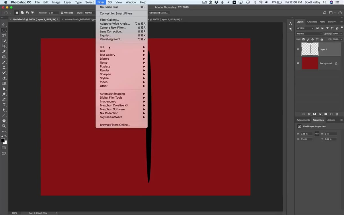 Gaussian Blur dialog box with 5 pixel radius setting
With your oval layer still selected, go to Filter > Blur > Gaussian Blur. A radius of around 5 pixels works well at standard web graphic sizes. What you’re doing here is softening that hard black oval into something that reads as a shadow inside a paper slit. Too much blur and it looks like a smudge. Too little and it looks like a stamp. Five pixels hits the believable middle ground. The blur is the thing that sells the depth, so don’t skip it or rush the value.
Gaussian Blur dialog box with 5 pixel radius setting
With your oval layer still selected, go to Filter > Blur > Gaussian Blur. A radius of around 5 pixels works well at standard web graphic sizes. What you’re doing here is softening that hard black oval into something that reads as a shadow inside a paper slit. Too much blur and it looks like a smudge. Too little and it looks like a stamp. Five pixels hits the believable middle ground. The blur is the thing that sells the depth, so don’t skip it or rush the value.
Step 4: Create the “Slit” Layer
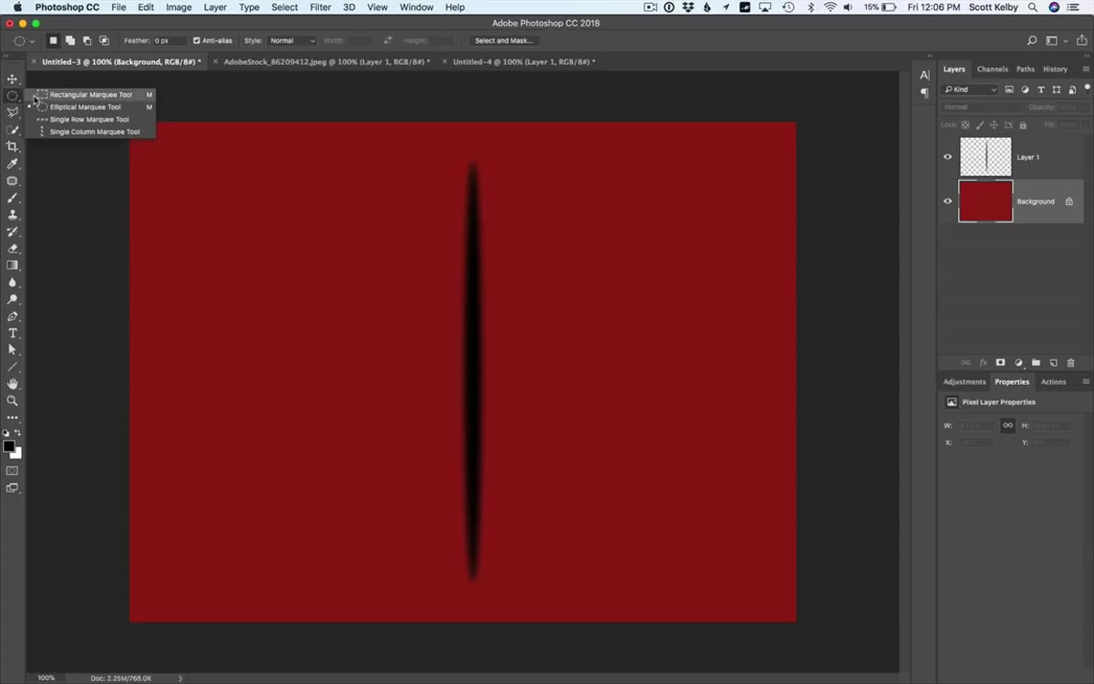 Rectangular marquee drawn over lower portion of the oval
Click back onto your background layer in the Layers panel. Grab the Rectangular Marquee Tool (M) and draw a selection that covers roughly the bottom two-thirds of your blurred oval. You’re selecting a chunk of the background layer, not the oval layer. The idea is to isolate a strip of the background that will sit on top of the oval and simulate the upper edge of a paper slit. Once your rectangle is positioned, press Cmd+J (Ctrl+J on Windows) to copy just that selected area up onto its own new layer. Toggle the other layers off to see it in isolation. It’s just a strip of red, but in context it becomes the top lip of your paper cut.
Rectangular marquee drawn over lower portion of the oval
Click back onto your background layer in the Layers panel. Grab the Rectangular Marquee Tool (M) and draw a selection that covers roughly the bottom two-thirds of your blurred oval. You’re selecting a chunk of the background layer, not the oval layer. The idea is to isolate a strip of the background that will sit on top of the oval and simulate the upper edge of a paper slit. Once your rectangle is positioned, press Cmd+J (Ctrl+J on Windows) to copy just that selected area up onto its own new layer. Toggle the other layers off to see it in isolation. It’s just a strip of red, but in context it becomes the top lip of your paper cut.
Step 5: Position the Slit Layer and Drop the Opacity
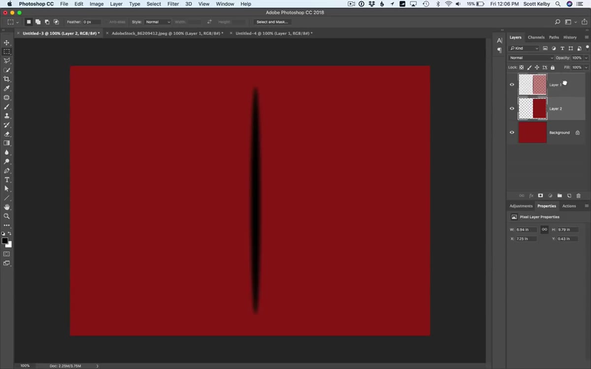 Slit layer moved up, revealing shadow beneath it
Move that new strip layer upward slightly so it overlaps the top portion of your blurred oval below. As you drag it up, you’ll see the shadow start to peek out underneath, and suddenly it looks like someone took scissors to the paper. The illusion clicks into place fast. Once you like the position, drop the opacity of the slit layer down, somewhere between 70-85% works well. This lets just a hint of the shadow show through the paper edge, which makes it feel physically grounded rather than pasted on.
Slit layer moved up, revealing shadow beneath it
Move that new strip layer upward slightly so it overlaps the top portion of your blurred oval below. As you drag it up, you’ll see the shadow start to peek out underneath, and suddenly it looks like someone took scissors to the paper. The illusion clicks into place fast. Once you like the position, drop the opacity of the slit layer down, somewhere between 70-85% works well. This lets just a hint of the shadow show through the paper edge, which makes it feel physically grounded rather than pasted on.
Step 6: Paste Your Product or Image into the Slit
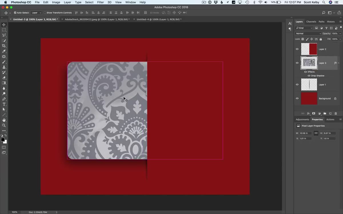 Gift card image pasted and sitting inside the slit
Open the image you want to show peeking through the slit. Kelby uses a gift card from Adobe Stock, but this works with any product shot, illustration, or even text-based graphic. Copy it (Cmd/Ctrl+C), go back to your main document, and paste (Cmd/Ctrl+V). The pasted layer will land above everything. Use Free Transform (Cmd/Ctrl+T) to resize and rotate it slightly, a few degrees of tilt makes it look like the item is casually slipped in rather than mechanically placed. Position it so the bulk of the image sits below the slit layer, as if the paper is hiding most of the card and only letting a corner breathe.
Gift card image pasted and sitting inside the slit
Open the image you want to show peeking through the slit. Kelby uses a gift card from Adobe Stock, but this works with any product shot, illustration, or even text-based graphic. Copy it (Cmd/Ctrl+C), go back to your main document, and paste (Cmd/Ctrl+V). The pasted layer will land above everything. Use Free Transform (Cmd/Ctrl+T) to resize and rotate it slightly, a few degrees of tilt makes it look like the item is casually slipped in rather than mechanically placed. Position it so the bulk of the image sits below the slit layer, as if the paper is hiding most of the card and only letting a corner breathe.
Step 7: Add Your Type
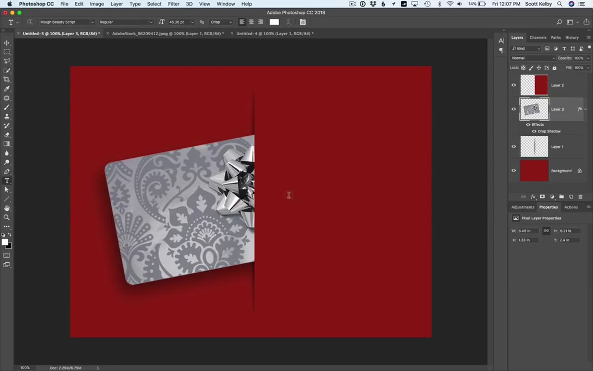 Holiday type layer added above the red background layer
Grab the Type Tool (T) and write your headline, Kelby uses “Holiday Savings” as an example. Before you type, check your Layers panel and make sure your text layer ends up above the red background but not covering your slit effect. If the type layer lands in the wrong position, just drag it in the panel. Use Free Transform to scale it up once you’ve typed it. For the holiday feel, Kelby pulls out a script font called Ruff Beauty from MyFonts, which he grabbed on sale for around $7. Any good script or display font does the job here. Just avoid anything too thin, it won’t read at smaller sizes.
Holiday type layer added above the red background layer
Grab the Type Tool (T) and write your headline, Kelby uses “Holiday Savings” as an example. Before you type, check your Layers panel and make sure your text layer ends up above the red background but not covering your slit effect. If the type layer lands in the wrong position, just drag it in the panel. Use Free Transform to scale it up once you’ve typed it. For the holiday feel, Kelby pulls out a script font called Ruff Beauty from MyFonts, which he grabbed on sale for around $7. Any good script or display font does the job here. Just avoid anything too thin, it won’t read at smaller sizes.
Where I’d Take This Further
The paper slit idea isn’t just a holiday trick. I’ve already been thinking about how this plays for other contexts: a product launch graphic where a new item is “breaking through” the surface, or a before/after reveal where one image peeks out behind another. The shadow layer doing the heavy lifting on the illusion is the transferable idea. You could also try this on a dark background with a light product, or experiment with a curved slit shape instead of a straight horizontal one by using the Warp tool on your slit layer after the fact.
One thing worth noting: if you’re using a product image that has a white background, do a quick Remove Background pass before you paste it in. Nothing kills the effect faster than a white box sitting in your slit.
The biggest thing I took away here is that Photoshop illusions that look complicated are almost always built from boring fundamentals. A blurred oval. A copied strip of background. A well-placed layer. The trick is knowing which boring tools to stack and in what order. Kelby’s been teaching this stuff for decades and that sequencing instinct is exactly what makes his tutorials worth your time.
Watch the full tutorial on YouTube
Comments (2)
The tip about the paper slit effect a clever was the missing piece for me. Thank you.
Clear and practical. No fluff. Appreciate that.
Leave a Comment