
There’s a specific kind of photo that lives on every photographer’s hard drive. Not the hero shot. Not the portfolio piece. The “I was walking by and this looked interesting” shot. The one you almost delete but don’t, because something about it nags at you. I have a folder full of those, and for a long time I treated them as lost causes, spending all my energy on the obvious winners and ignoring everything else.
What Scott Kelby’s tutorial reframed for me is that those “nothing” images are actually where your editing skills get tested the hardest. There’s no dramatic light or cinematic subject doing the heavy lifting for you. It’s just you, the RAW file, and whether you actually know what you’re doing. Watch the full tutorial on YouTube – it follows a single image Kelby shot while walking through a village in China, a small shop display that looks completely unremarkable at first glance. By the end, it’s a tight, atmospheric photo worth publishing. Here’s how he gets there.
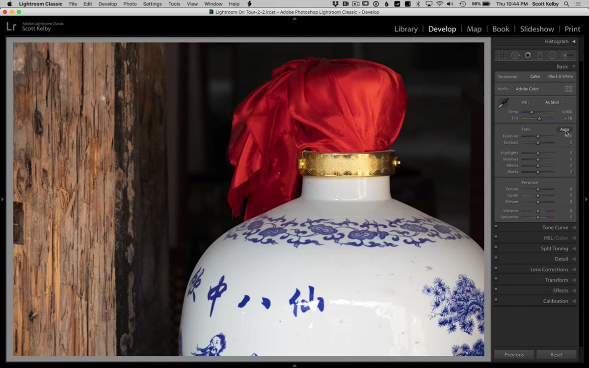
Step 1: Start in the Develop Module and Hit Auto (Then Fix What It Gets Wrong)
 Auto button clicked in Lightroom Develop module
The first move is opening the image in Lightroom’s Develop module and pressing the Auto button. Not because Auto is magic, but because it gets you in the ballpark fast. Think of it as a starting line, not a finish line. In this case, Auto does most of the heavy lifting on white balance and overall tone, but it pushes the exposure a little too far. The image reads as slightly overexposed.
Auto button clicked in Lightroom Develop module
The first move is opening the image in Lightroom’s Develop module and pressing the Auto button. Not because Auto is magic, but because it gets you in the ballpark fast. Think of it as a starting line, not a finish line. In this case, Auto does most of the heavy lifting on white balance and overall tone, but it pushes the exposure a little too far. The image reads as slightly overexposed.
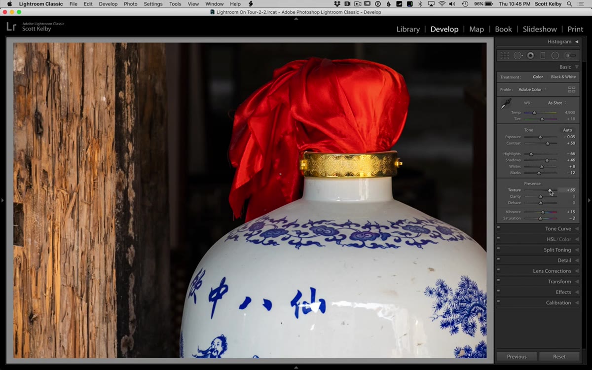
From there, Kelby manually pulls the Exposure down to compensate and then cranks the Contrast slider up. That second move is important. A lot of editors hit Auto, nudge one or two things, and call it done. Contrast is almost always undercooked by Auto, and adding it back manually is what gives an image some backbone.
Step 2: Add Texture (and Use It Instead of Clarity)
 Texture and Clarity sliders in the Basic panel
This is where Kelby drops a distinction that I wish someone had explained to me years ago. The Texture slider and the Clarity slider both add visual punch, but they work differently. Texture pulls out fine detail without shifting your overall tone. Clarity cranks up midtone contrast, which does shift the tone and can make things look heavy or HDR-adjacent if you overdo it.
Texture and Clarity sliders in the Basic panel
This is where Kelby drops a distinction that I wish someone had explained to me years ago. The Texture slider and the Clarity slider both add visual punch, but they work differently. Texture pulls out fine detail without shifting your overall tone. Clarity cranks up midtone contrast, which does shift the tone and can make things look heavy or HDR-adjacent if you overdo it.
His approach: go heavy on Texture, light on Clarity. For an image with physical surfaces like wood and metal, Texture is doing a lot of work here. It brings out grain, patina, and surface detail that would otherwise disappear in the final file. If you’ve been leaning on Clarity as your go-to for “making things pop,” try swapping some of that load onto Texture and see what happens to your shadows.
Step 3: Darken the Distracting Side with a Graduated Filter
 Graduated filter dragged across bright wood area on the right
Human eyes go to the brightest part of a frame first. That’s not a preference, it’s just how vision works. In this image, a blown-out wood panel on one side of the frame is pulling attention away from the actual subject. The fix is a Graduated Filter dragged across that area to bring the exposure down.
Graduated filter dragged across bright wood area on the right
Human eyes go to the brightest part of a frame first. That’s not a preference, it’s just how vision works. In this image, a blown-out wood panel on one side of the frame is pulling attention away from the actual subject. The fix is a Graduated Filter dragged across that area to bring the exposure down.
Before dragging anything, Kelby double-clicks the word “Effect” in the Graduated Filter panel. That resets all sliders to zero, which is the right way to start a new filter. Then he drops the Exposure slider down around negative 1.85 and drags the gradient across the problem area. The goal isn’t to make it look dark, it’s to make it look like it’s not screaming for attention. Subtle is the target. If it looks obviously filtered, pull back.
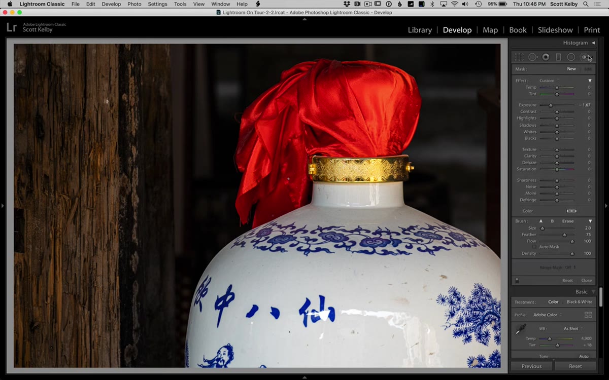
Step 4: Use the Adjustment Brush to Recover Blown Highlights
 Adjustment brush painting over bright highlight area to pull back detail
There’s a patch of brightness near one of the objects in the scene that’s losing detail. Not the whole image, just a localized hot spot. The Graduated Filter can’t handle something that specific, so Kelby switches to the Adjustment Brush.
Adjustment brush painting over bright highlight area to pull back detail
There’s a patch of brightness near one of the objects in the scene that’s losing detail. Not the whole image, just a localized hot spot. The Graduated Filter can’t handle something that specific, so Kelby switches to the Adjustment Brush.
Same move as before: double-click “Effect” to zero everything out, then drop the Highlights slider into negative territory. Now paint only over the problem area. The detail is there in the RAW file, it’s just being masked by overexposure. If you paint too far outside the zone, hold Option on Mac (Alt on Windows) to switch to erase mode and clean up the edges. The before/after toggle (backslash key) is useful here to confirm you’re actually doing something, because the change can be subtle enough that you’ll second-guess yourself.
Step 5: Brighten the Subject with Another Adjustment Brush Pass
 New adjustment brush stroke brightening the vase/focal subject
Here’s where Kelby’s thinking gets useful beyond just the technique. He adds a second Adjustment Brush pass, this time to brighten the main subject rather than darken a distraction. The logic is directional: every edit should either reduce competition or increase focus on what you want the viewer to look at.
New adjustment brush stroke brightening the vase/focal subject
Here’s where Kelby’s thinking gets useful beyond just the technique. He adds a second Adjustment Brush pass, this time to brighten the main subject rather than darken a distraction. The logic is directional: every edit should either reduce competition or increase focus on what you want the viewer to look at.
He bumps up the Exposure or brightness on the subject slightly and paints it in. The result is that the image now has a visual hierarchy. Your eye moves from the brightest, most detailed subject outward, rather than bouncing around between competing bright spots. One adjustment darkens, one lightens. Together they create a path through the frame.
Where I’d Take This Further
Kelby wraps his edit in Lightroom, and for a lot of images that’s exactly the right call. But when I’m working with textured surfaces like old wood, aged metal, or anything with physical depth, I’ll often take the file into Photoshop after the Lightroom pass and run a High Pass filter on a stamped layer. It adds sharpness to surfaces in a way that stays localized and doesn’t blow out the brighter areas the way simple sharpening can.
The key is keeping it subtle. High Pass at around 2-4 pixels, blended in Overlay mode, at maybe 50-60% opacity. If you can immediately tell a sharpening filter was applied, it’s too much. I learned this during a project where I was retouching product shots for a furniture client, and the Lightroom sharpening alone kept reading as slightly soft on screen. The High Pass pass fixed it. It takes two extra minutes and it’s worth it.
The single biggest thing to take away from this workflow is Kelby’s habit of zeroing out sliders before starting any local adjustment. It sounds obvious, but it’s the kind of thing that separates editors who get consistent results from editors who wonder why their graduated filters are doing weird things. Start clean every time.
If you’re at the point where you’ve figured out the basics of Lightroom but your local adjustments still feel clunky or unpredictable, this tutorial is exactly the right level. It’s fast, it’s specific, and it’s built around a real image with real problems.
Watch the full tutorial on YouTube and see the complete before/after on an image that proves “nothing” shots are worth saving.
Comments
Leave a Comment