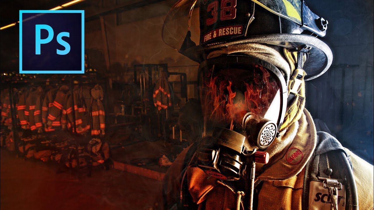
Fake the Light You Wish You Had: Color Gradient Enhancement in Photoshop

Fake the Light You Wish You Had: Color Gradient Enhancement in Photoshop

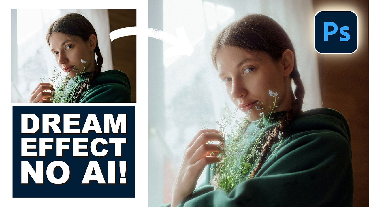
There’s a specific flavor of frustration that comes from shooting a solid portrait in flat, boring light and knowing the subject deserved better. The photo is technically fine. Exposure is good. Focus is sharp. And yet it looks like a LinkedIn headshot when it should look like a movie poster. I’ve been there more times than I care to admit, usually sitting in whatever coffee shop I’ve claimed as my office that week, staring at a Lightroom catalog full of “technically fine” images.
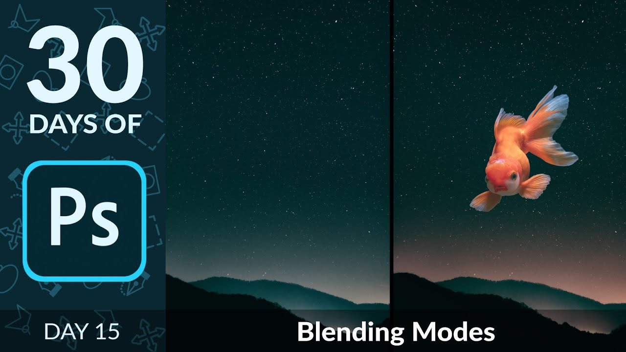
Blending Modes Demystified: How to Build a Composite in Minutes Without Masking

Blending Modes Demystified: How to Build a Composite in Minutes Without Masking

A few years back, I spent three days wrestling with a composite that a more experienced designer later rebuilt in about twenty minutes using a technique I’d completely overlooked. That technique was blending modes. I’d used Normal, maybe occasionally Multiply when I wanted to darken a shadow layer, but I’d never really understood the logic underneath them. They felt like magic spells you either knew or didn’t. Turns out the logic is pretty simple once someone breaks it down correctly.

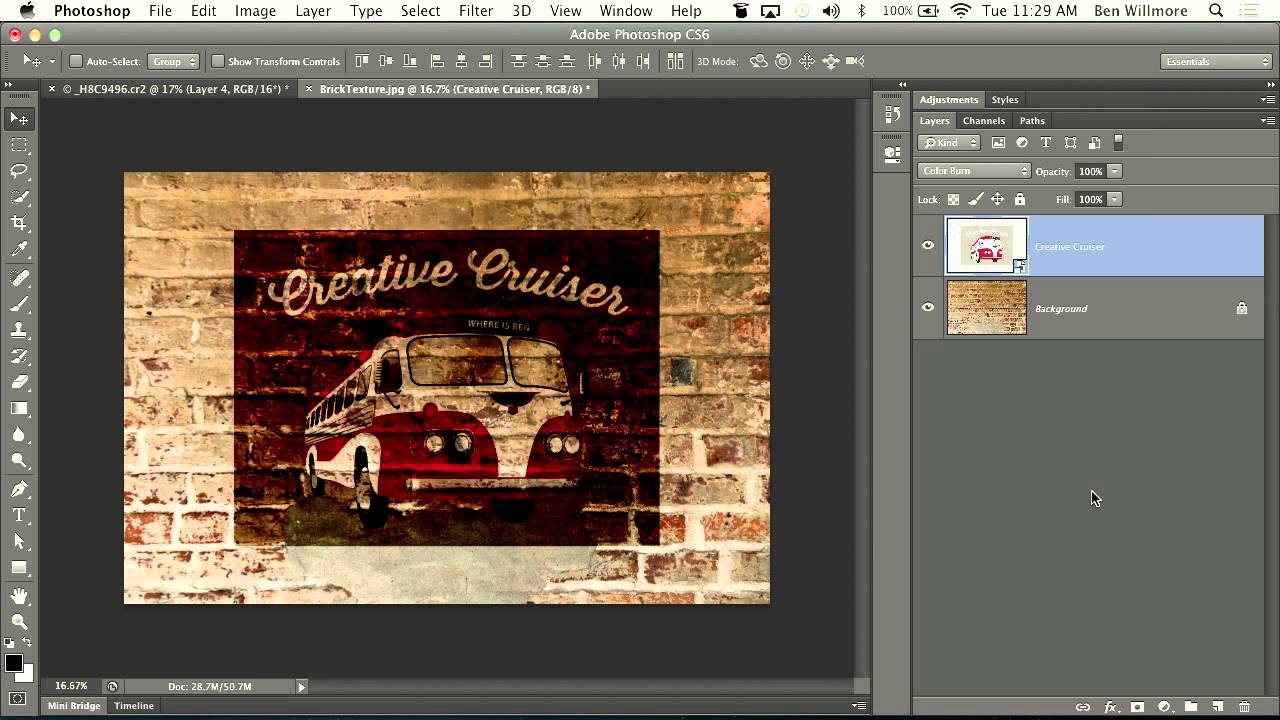
How to Make a Graphic Look Like a Faded Mural Using Blending Modes and Layer Sliders

How to Make a Graphic Look Like a Faded Mural Using Blending Modes and Layer Sliders

There’s a specific type of composite that clients love to request and that sounds deceptively simple: “make it look like it’s painted on the wall.” Sure, you can slap a layer on top, set it to Multiply, and call it a day. But that usually looks like exactly what it is: a layer slapped on top of a photo. Getting it to actually read as painted, weathered, worn into the surface over decades?

Why Your Photoshop Text Effects Look Cheap (And the Layer Stack Fixes That Actually Work)

Why Your Photoshop Text Effects Look Cheap (And the Layer Stack Fixes That Actually Work)

A client once sent me a logo file to “just punch up the text a little.” Simple job. Forty-five minutes, maybe. I opened it up and found a single flattened JPEG with the text baked directly into the background at 72 DPI. The “text layer” was just pixels. No editability, no flexibility, no hope. I spent two hours redrawing letters by hand before I finally handed it back, charged double, and wrote a very passive-aggressive note in my invoice about working with original files.

Stop Faking Glow Effects: Here's How to Build a Real Cinematic Light Bloom in Photoshop

Stop Faking Glow Effects: Here's How to Build a Real Cinematic Light Bloom in Photoshop

There’s a specific flavor of photo edit that I used to spend embarrassing amounts of time chasing. You’ve seen it. That soft, warm, almost-overexposed bloom around highlights that makes a photo look like it was shot on film that’s slightly too happy about itself. I kept trying to fake it by cranking up a Gaussian blur on a duplicated layer and hoping for the best. The result was always the same: muddy, flat, and sad.

Steal This Trick: How to Slap Textures onto Photos and Logos Without Making a Mess

Steal This Trick: How to Slap Textures onto Photos and Logos Without Making a Mess

Client work has a funny way of humbling you. I can’t count the number of times someone has handed me a logo or a portrait and said “make it feel more… gritty? Vintage? Lived-in?” and I’ve sat there staring at a flat layer like it owes me money. Adding texture sounds simple until you’re actually doing it and everything either looks like you rubbed sandpaper on a JPEG or the effect is so subtle it may as well not exist.

Why Your Text Effects Look Cheap (And the Layer Style Fixes That Actually Work)

Why Your Text Effects Look Cheap (And the Layer Style Fixes That Actually Work)

A client sent me a revision note last year that just said “can you make it pop more?” No context. No reference image. Just that. I’ve been doing this long enough to know that “pop” is designer-speak for “I feel like something is missing but I don’t know what.” Nine times out of ten, the problem isn’t the font choice or the color. It’s that the text is sitting on top of the image instead of feeling like it belongs in it.

Blending Modes Are Doing Half Your Compositing Work — You're Just Not Using Them

Blending Modes Are Doing Half Your Compositing Work — You're Just Not Using Them

A few years back, I spent the better part of three days building a composite that a photographer friend of mine looked at, sat down, and rebuilt in about twenty minutes using techniques I had genuinely never considered. That moment broke something loose in my brain. I had been doing things the hard way, masking and erasing and cutting, when blending modes were sitting right there in the Layers panel like a cheat code I’d never bothered to read.

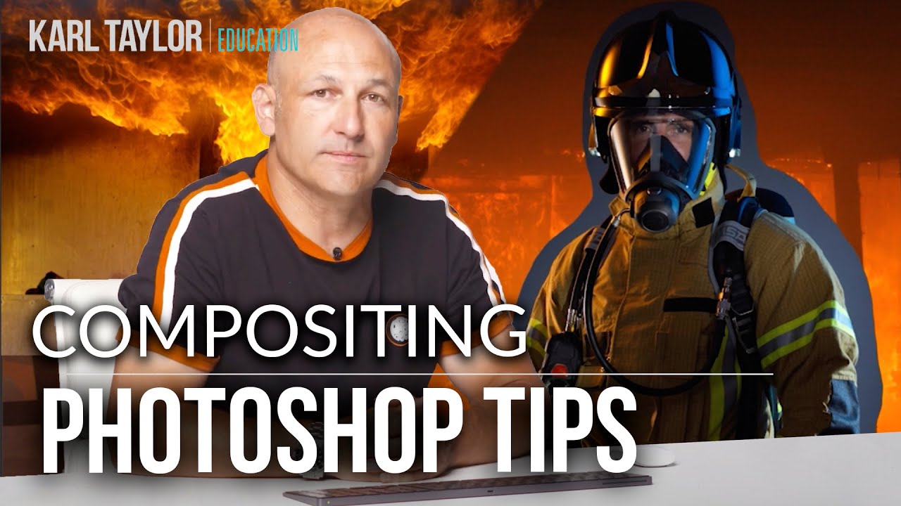
Photoshop Compositing Isn't Magic — It's Just Planning (Plus These Specific Techniques)

Photoshop Compositing Isn't Magic — It's Just Planning (Plus These Specific Techniques)

I spent three days on a composite once. Three full days, mostly at a coffee shop on South Congress, burning through oat milk lattes and my own patience. A friend looked at it, asked if I’d tried a specific blending technique, and rebuilt something better in about twenty minutes. I had not tried that technique. I did not know that technique existed. That experience basically rewired how I approach learning compositing — I now seek out people who clearly know things I don’t, and I pay close attention.

Why Your Photo Composites Look Fake (And the Luminosity Trick That Fixes Them)

Why Your Photo Composites Look Fake (And the Luminosity Trick That Fixes Them)

I spent three days on a composite last year. Three days. The brief was simple enough: put a model into a moody, overcast cityscape. I rebuilt the sky twice, ran probably forty iterations of color grading, and kept feeling like something was off in a way I couldn’t name. The edges were fine. The colors were close. But the model looked like a cardboard cutout someone had glued onto a postcard.

Stop Blending Modes, Start Using Channels: The Smarter Way to Overlay Graphics on Portraits

Stop Blending Modes, Start Using Channels: The Smarter Way to Overlay Graphics on Portraits

There’s a specific kind of Photoshop frustration that hits when you drop a graphic element onto a portrait, slap on Multiply or Screen, and think “okay, close enough.” It works, sort of, but the colors are off, the opacity feels wrong, and the whole thing looks like you gave up halfway through. I’ve shipped work like that. Not proud of it, but I’ve done it. The problem isn’t the blending mode itself.

Double Exposure in Photoshop: How to Blend Two Images Into Something That Looks Intentional

Double Exposure in Photoshop: How to Blend Two Images Into Something That Looks Intentional

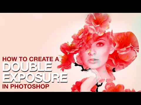
Client work has a funny way of pushing you toward techniques you’ve been lazily avoiding. For me, double exposures were exactly that. I’d seen them everywhere, assumed they were either done in-camera or required some wizardly process I hadn’t earned the right to know yet, and kept putting off learning them properly. Then a branding client asked for a portrait-meets-nature composite for a wellness campaign, and suddenly my procrastination had a deadline.