I spent three days on a composite once. Three full days, mostly at a coffee shop on South Congress, burning through oat milk lattes and my own patience. A friend looked at it, asked if I’d tried a specific blending technique, and rebuilt something better in about twenty minutes. I had not tried that technique. I did not know that technique existed. That experience basically rewired how I approach learning compositing — I now seek out people who clearly know things I don’t, and I pay close attention.
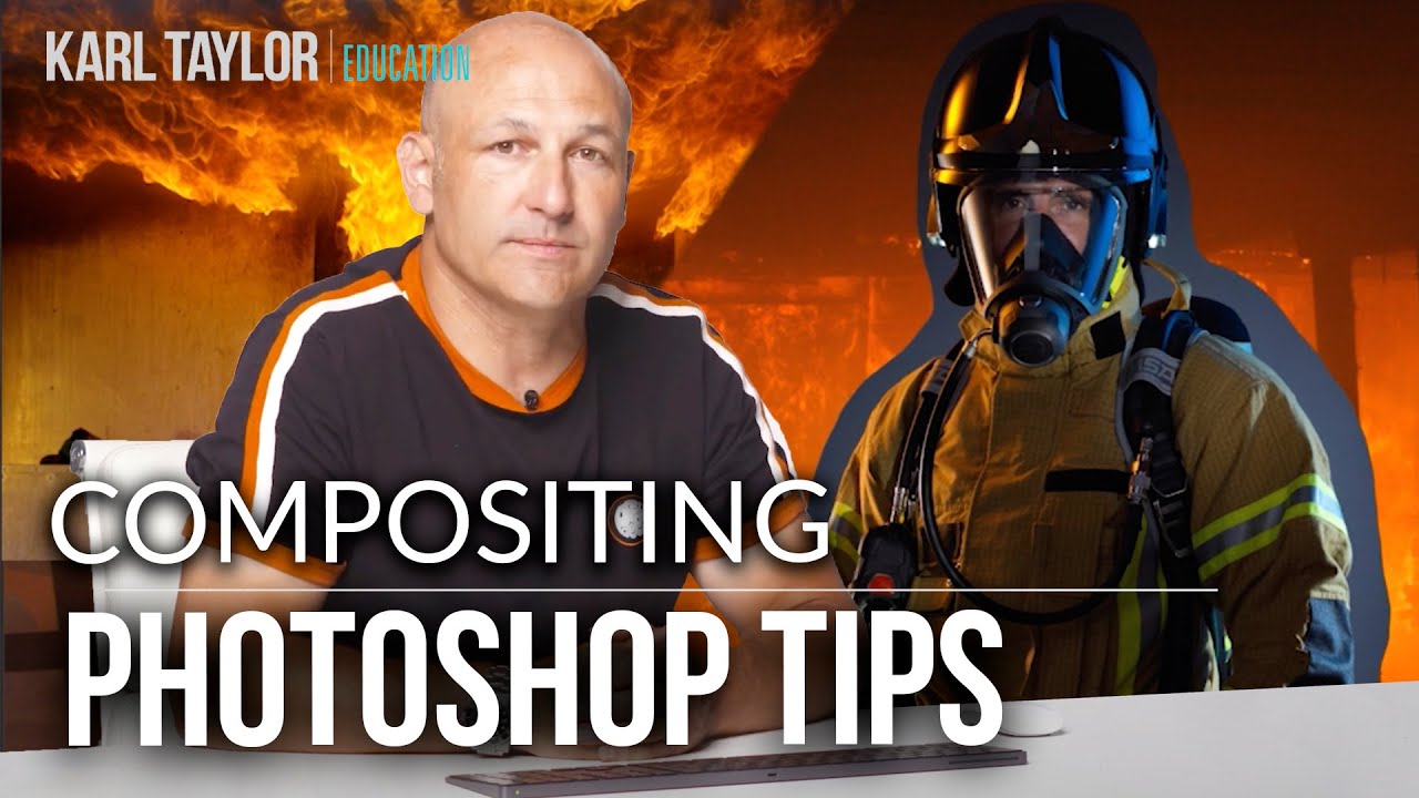
That’s exactly why the Visual Education tutorial on compositing and blending modes caught my attention. Watch the full tutorial on YouTube before or after reading this — either order works. The tutorial walks through a real-world composite project (a fireman in a burning building, built from a studio shot and stock photos), which means every tip is grounded in an actual production problem rather than abstract theory. That’s the kind of breakdown that actually changes how you work.
Compositing sounds deceptively simple when you define it — combine two or more images into one final image. The reality is that your brain is extremely good at detecting when something is wrong in a photo, even if the viewer can’t articulate why. Light hits wrong. Perspective doesn’t line up. The grain from one image doesn’t match another. Getting all of that to feel invisible is the actual job.
Step 1: Start With a Concrete Idea, Written Down
 Outline and planning notes for composite image phases
Before you open Photoshop, get your idea out of your head and onto something external. This sounds basic, and it is — but skipping it causes real problems later. Write out what you want the final image to look like, then list the individual elements you’ll need to build it. For each element, note any considerations: Does it need a specific camera angle? A particular light direction? Will you shoot it yourself or source it from stock?
Outline and planning notes for composite image phases
Before you open Photoshop, get your idea out of your head and onto something external. This sounds basic, and it is — but skipping it causes real problems later. Write out what you want the final image to look like, then list the individual elements you’ll need to build it. For each element, note any considerations: Does it need a specific camera angle? A particular light direction? Will you shoot it yourself or source it from stock?
Looking at other artists’ work is genuinely useful here, not as a shortcut but as a way to train your eye for what’s possible. The tutorial references visual artist Erik Johansson, who regularly shares behind-the-scenes footage of both his shoots and his planning process. Watching how a professional maps out a composite before touching a camera is one of the faster ways to level up your pre-production thinking.
Step 2: Source Your Images Strategically
 Stock photo websites listed as image sourcing options
Once your concept is locked, you need to gather your assets. You’ve got three realistic options: shoot everything yourself, pull from stock libraries, or generate elements using CGI or 3D modeling. Most working composites use some combination of the first two. The tutorial specifically calls out iStock, Shutterstock, Getty Images, Unsplash, and Pixabay as solid starting points.
Stock photo websites listed as image sourcing options
Once your concept is locked, you need to gather your assets. You’ve got three realistic options: shoot everything yourself, pull from stock libraries, or generate elements using CGI or 3D modeling. Most working composites use some combination of the first two. The tutorial specifically calls out iStock, Shutterstock, Getty Images, Unsplash, and Pixabay as solid starting points.
The key sourcing decision is less about which platform you use and more about how you’re planning to combine the images. If you’re mixing your own studio shots with stock backgrounds, think about whether the resolution and quality levels are even close to compatible. Mismatched quality is one of those things that looks fine at thumbnail size and falls apart when a client zooms in.
Step 3: Match Your Image Sizes and Quality Levels
 Image resolution and size comparison between photos
This step gets skipped constantly, and it always causes problems downstream. When you’re combining images from different sources — especially your own photos alongside stock — the resolution gap can be significant. You may need to scale one image up and another down to get them working in the same ballpark.
Image resolution and size comparison between photos
This step gets skipped constantly, and it always causes problems downstream. When you’re combining images from different sources — especially your own photos alongside stock — the resolution gap can be significant. You may need to scale one image up and another down to get them working in the same ballpark.
The useful technique demonstrated here is using Photoshop’s noise filter to help equalize image quality between sources. If you’ve reduced a higher-resolution image to match a lower-res one, adding a subtle noise layer can help the two images feel like they came from the same environment. It’s one of those small adjustments that most people don’t think about until a retoucher points it out.
Step 4: Get Your Light Direction Right Before Anything Else
 Flipping background image to match helmet lighting direction
Lighting is where most amateur composites break down. If your subject is lit from the left and your background is lit from the right, no amount of color grading will make that feel real. The brain catches it immediately, usually before the viewer can identify the specific problem.
Flipping background image to match helmet lighting direction
Lighting is where most amateur composites break down. If your subject is lit from the left and your background is lit from the right, no amount of color grading will make that feel real. The brain catches it immediately, usually before the viewer can identify the specific problem.
The practical fix demonstrated in the tutorial is refreshingly low-tech: flip the background image. In the fireman composite, flipping the stock background horizontally made the light falling on the helmet match the rest of the scene without any complex lighting work. The Transform tool handles this (Edit > Transform > Flip Horizontal), and it takes about four seconds. Always check light direction before you commit to a background — it’s much easier to flip it early than to paint in corrected lighting later.
Step 5: Use Adjustment Layers to Correct Color and Brightness
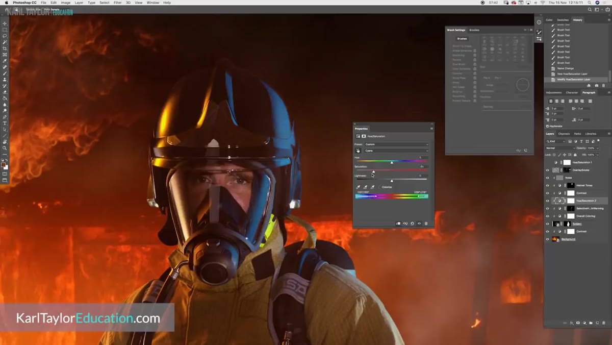 Adjustment layers panel open for brightness and color correction
Once your elements are roughly in place and your light direction is consistent, adjustment layers become your main tool for making everything feel like it was shot in the same space. Curves, Hue/Saturation, Color Balance, and Brightness/Contrast adjustment layers should all be clipped to their target layers rather than applied globally — that way you’re making targeted corrections rather than affecting the entire composition.
Adjustment layers panel open for brightness and color correction
Once your elements are roughly in place and your light direction is consistent, adjustment layers become your main tool for making everything feel like it was shot in the same space. Curves, Hue/Saturation, Color Balance, and Brightness/Contrast adjustment layers should all be clipped to their target layers rather than applied globally — that way you’re making targeted corrections rather than affecting the entire composition.
The thing about adjustment layers that took me embarrassingly long to appreciate is that they’re non-destructive by default. Nothing is baked in until you flatten. That means you can revisit color decisions at 2am when you realize the highlights are reading too warm, without rebuilding anything from scratch. Clip them, label them, and leave them editable.
Step 6: Use the Transform Tool to Fix Perspective Problems
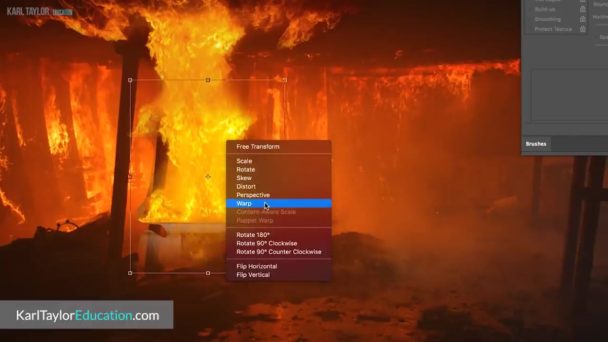 Transform tool options for warp, flip, and rotate adjustments
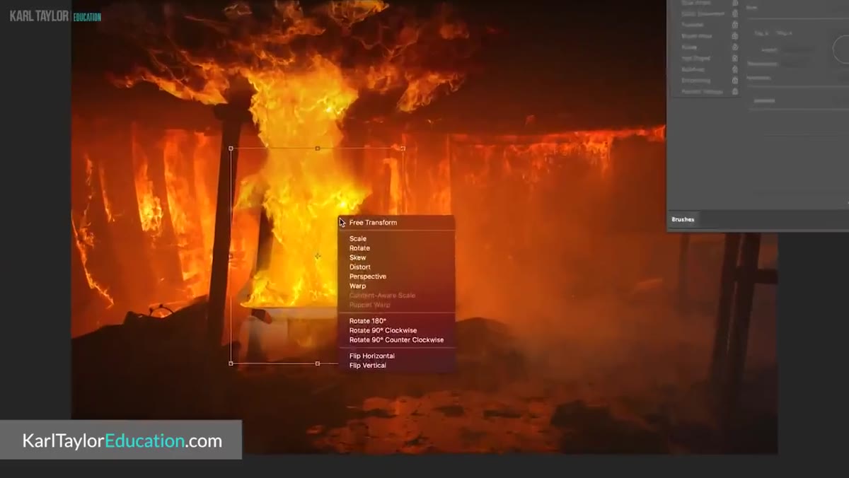
Perspective mismatches are the other major tell that a composite isn’t real. If your subject was shot at eye level and your background has a slight upward angle, the elements will never feel grounded in the same space. The Transform tool (Ctrl/Cmd + T, then right-click for extended options) gives you access to warp, skew, and perspective controls that can nudge elements into alignment.
Transform tool options for warp, flip, and rotate adjustments
Perspective mismatches are the other major tell that a composite isn’t real. If your subject was shot at eye level and your background has a slight upward angle, the elements will never feel grounded in the same space. The Transform tool (Ctrl/Cmd + T, then right-click for extended options) gives you access to warp, skew, and perspective controls that can nudge elements into alignment.
Use warp carefully. It’s powerful but easy to overdo, and subtle distortion on a recognizable object looks worse than a slight perspective mismatch. When in doubt, make smaller adjustments than you think you need, then step back and evaluate at full zoom-out.
What I’d Add From My Own Experience
No composite tutorial spends enough time on the value of walking away. I’ve caught perspective problems, mismatched grain, and wildly off lighting after coming back to a file the next morning that I completely missed after staring at it for six hours. Your eye adjusts to whatever you’re looking at. Fresh eyes — yours or someone else’s — catch things that familiarity hides.
Also: convert your layers to Smart Objects before you start transforming anything. I learned this the hard way after resizing a layer down, then needing it larger again, and watching it turn into a soft, useless mess. Smart Objects preserve the original data through scaling. It’s a habit that costs you nothing and saves you from at least one catastrophic mistake per project.
The single most important takeaway from this tutorial is that believable compositing is mostly a planning problem, not a Photoshop skill problem. If your light directions match, your perspectives are consistent, and your image quality levels are in the same range, Photoshop’s tools are more than capable of handling the rest. The technique gaps are usually smaller than the observation gaps.
Watch the full tutorial on YouTube to see the fireman composite built out step by step — the behind-the-scenes breakdown of how the stock photos and studio shot were combined is worth your time on its own.
Comments (5)
My workflow just got 10x faster. Not even kidding.
Clear and practical. No fluff. Appreciate that.
Couldn't agree more. I've seen this make a huge difference in retouching work specifically.
My workflow just got 10x faster. Not even kidding.
Excellent tutorial. I'd add that from a workflows standpoint, this technique is incredibly versatile.
Leave a Comment