
A few years back, I spent the better part of three days building a composite that a photographer friend of mine looked at, sat down, and rebuilt in about twenty minutes using techniques I had genuinely never considered. That moment broke something loose in my brain. I had been doing things the hard way, masking and erasing and cutting, when blending modes were sitting right there in the Layers panel like a cheat code I’d never bothered to read.
That’s exactly why this tutorial from Aaron Nace over at PHLEARN clicked so hard when I watched it. In the tutorial, Aaron takes five separate stock images and assembles a Halloween-themed composite that looks like a proper album cover, almost entirely through blending modes. No painstaking pen-tool selections. No multi-hour masking sessions. Just smart layer stacking and knowing which blending mode does what. Watch the full tutorial on YouTube if you want to follow along, because the visual payoff is genuinely satisfying.
The takeaway isn’t “blending modes are cool” (though they are). It’s that choosing the right blending mode can replace a ton of manual work, and that the Screen mode in particular is something every compositor should have hardwired into their muscle memory.
Step 1: Gather Your Assets and Get Organized Before You Touch a Single Blend
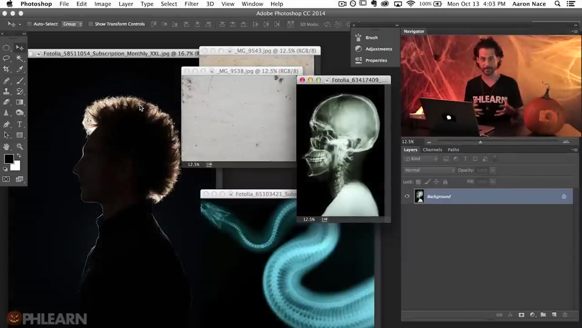 Five source images open side by side in Photoshop
Before any blending happens, Aaron spends real time sourcing quality images. He’s upfront that he put two hours into finding the right stock before even opening Photoshop. That’s not precious behavior, that’s professional behavior. Good composites start with compatible lighting, consistent resolution, and images that were shot with similar intent. Junk ingredients produce junk results, no matter how clever your layer stack is.
Five source images open side by side in Photoshop
Before any blending happens, Aaron spends real time sourcing quality images. He’s upfront that he put two hours into finding the right stock before even opening Photoshop. That’s not precious behavior, that’s professional behavior. Good composites start with compatible lighting, consistent resolution, and images that were shot with similar intent. Junk ingredients produce junk results, no matter how clever your layer stack is.
Once everything is open, hold Shift while dragging each image with the Move tool into your base document. Holding Shift centers the incoming layer automatically, which saves you a realignment step. After everything is in one document, close the originals and go full screen with F. Then group related layers immediately, using Cmd+G (Mac) or Ctrl+G (Windows), and name every group before you do anything else. Aaron names his groups “textures,” “snake,” “skull,” and “subject.” Future you will be grateful.
Step 2: Desaturate Problem Layers Before Applying a Blending Mode
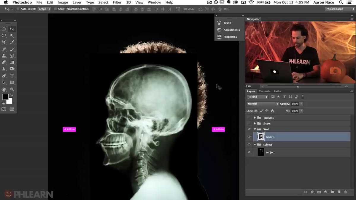 Skull layer desaturated, Hue/Saturation panel visible
The skull image Aaron uses has uneven coloring, some greenish tones, some yellow. Those color inconsistencies would show through any blending mode and look wrong against the subject underneath. The fix is simple: Shift+Cmd+U (Mac) or Shift+Ctrl+U (Windows) to desaturate the layer completely. Strip the color out first, then let the blending mode handle the luminosity relationship between layers.
Skull layer desaturated, Hue/Saturation panel visible
The skull image Aaron uses has uneven coloring, some greenish tones, some yellow. Those color inconsistencies would show through any blending mode and look wrong against the subject underneath. The fix is simple: Shift+Cmd+U (Mac) or Shift+Ctrl+U (Windows) to desaturate the layer completely. Strip the color out first, then let the blending mode handle the luminosity relationship between layers.
This is a principle worth keeping in your back pocket. Any time you’re blending a texture or overlay element and the colors feel “off,” desaturate it first. You can always reintroduce color later with a Hue/Saturation adjustment layer clipped to that layer.
Step 3: Use Screen Mode to Make Black Disappear
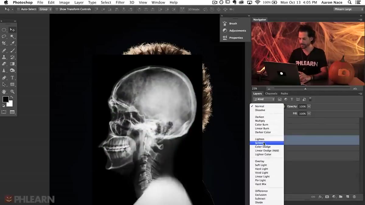 Skull layer set to Screen mode in Layers panel
This is the core technique of the whole tutorial and the one worth burning into memory. Set the skull layer’s blending mode to Screen. Screen mode mathematically ignores all black pixels and makes them fully transparent, while lighter pixels remain visible. The darker a pixel is, the more invisible it becomes.
Skull layer set to Screen mode in Layers panel
This is the core technique of the whole tutorial and the one worth burning into memory. Set the skull layer’s blending mode to Screen. Screen mode mathematically ignores all black pixels and makes them fully transparent, while lighter pixels remain visible. The darker a pixel is, the more invisible it becomes.
The practical upshot: if you have any element photographed or rendered against a black background, Screen mode blends it into your composite instantly with zero masking required. Skulls, smoke, fire, light leaks, lens flares, sparks – anything on black is a Screen mode candidate. It’s one of those things that sounds almost too simple until you realize how often it applies.
Step 4: Transform and Rough-Position the Layer First
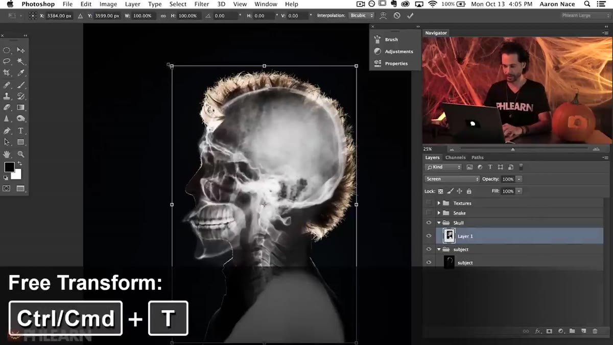 Free Transform handles visible around skull layer
Hit Cmd+T (or Ctrl+T on Windows) to enter Free Transform and scale the skull to roughly fit the subject underneath. At this stage you’re not going for perfection, you’re getting the proportions close enough that the next step actually makes sense. Aaron brings the skull’s height down slightly so it better matches the subject’s head shape.
Free Transform handles visible around skull layer
Hit Cmd+T (or Ctrl+T on Windows) to enter Free Transform and scale the skull to roughly fit the subject underneath. At this stage you’re not going for perfection, you’re getting the proportions close enough that the next step actually makes sense. Aaron brings the skull’s height down slightly so it better matches the subject’s head shape.
Hold Shift while dragging a corner handle to constrain proportions, or in newer versions of Photoshop, just drag the corner freely since proportional scaling is the default now. Don’t obsess over exact placement here. You’re about to warp it anyway.
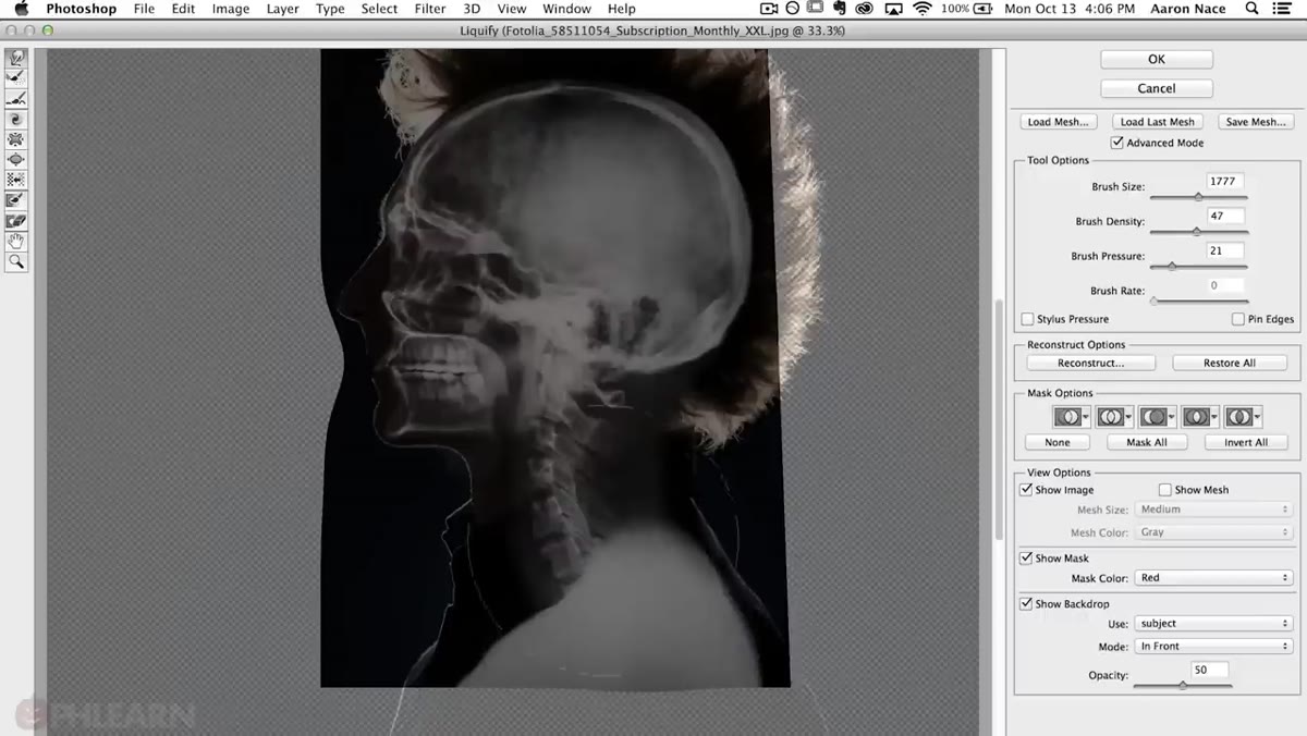
Step 5: Use Liquify With a Backdrop Reference to Fit the Skull to the Subject
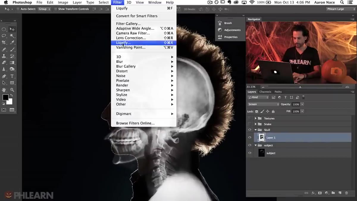 Liquify dialog open with Show Backdrop enabled, subject visible underneath
This is the step that elevates the composite from “two images stacked” to “one cohesive thing.” With the skull layer selected, go to Filter, then Liquify. Inside the Liquify dialog, check the “Show Backdrop” option and set the “Use” dropdown to your subject group. Now you can see the subject’s face showing through while you push and pull the skull with the Forward Warp tool.
Liquify dialog open with Show Backdrop enabled, subject visible underneath
This is the step that elevates the composite from “two images stacked” to “one cohesive thing.” With the skull layer selected, go to Filter, then Liquify. Inside the Liquify dialog, check the “Show Backdrop” option and set the “Use” dropdown to your subject group. Now you can see the subject’s face showing through while you push and pull the skull with the Forward Warp tool.
Use a large, soft brush and make gradual adjustments. The goal is to nudge the skull’s eye sockets, cheekbones, and jaw to roughly align with the subject’s facial structure underneath. You’re not going for anatomical accuracy, you’re going for visual believability. Small warp adjustments read as intentional. Big uneven stretches read as sloppy.
Step 6: Layer Textures Using Multiply or Overlay to Add Depth
 Texture group made visible with blending mode dropdown open
The texture layers Aaron included from his pack work on the opposite principle from Screen. Where Screen eliminates dark areas, Multiply eliminates light areas and lets the dark tones of one layer interact with the layer beneath. Overlay is the middle ground: it boosts contrast in both directions, darkening darks and lightening lights simultaneously.
Texture group made visible with blending mode dropdown open
The texture layers Aaron included from his pack work on the opposite principle from Screen. Where Screen eliminates dark areas, Multiply eliminates light areas and lets the dark tones of one layer interact with the layer beneath. Overlay is the middle ground: it boosts contrast in both directions, darkening darks and lightening lights simultaneously.
Toggle the texture group visible and cycle through Multiply, Overlay, and Soft Light to see which one serves the mood. Soft Light gives the most subtle result and is usually the safest starting point. Reduce layer opacity anywhere between 40-70% to keep the texture suggestive rather than overpowering.
What I’d Add: Group Blending Modes Are Different From Layer Blending Modes
One thing the tutorial doesn’t dig into, and that bit me for years, is that blending modes behave differently when applied to a group versus applied to an individual layer inside that group. If you set a group to Screen, it composites the entire group’s flattened result against what’s below it. If you set the individual layer inside to Screen and leave the group at Normal, it behaves the same way, but you have more flexibility to add adjustment layers inside the group that only affect that element.
My personal workflow: keep groups at Pass Through (the Photoshop default) so adjustments inside the group affect everything below them in the stack. Change it to Normal only when you want to isolate a group’s adjustments from the rest of the document. It’s a small distinction that saves a lot of head-scratching when your color grades start bleeding into places you didn’t expect.
The single most portable idea from this whole tutorial is that Screen mode is a masking shortcut for anything on black, and Multiply is a masking shortcut for anything on white. Between those two modes, you can composite textures, overlays, and graphic elements in a fraction of the time it takes to manually isolate them. Start there, and the rest of the Layers panel starts making a lot more sense.
Watch the full tutorial on YouTube to see the full Halloween composite come together, including the snake layer and final color grading steps that really sell the finished piece.
Comments (1)
Great breakdown. The step-by-step approach really helps.
Leave a Comment