I used to treat blending modes like a slot machine. Click through them until something looks cool, shrug, move on. If you’ve ever done the same, first of all, same. Second of all, it turns out there’s actual logic to how they’re organized, and once that clicks, the whole panel stops being intimidating. In this Aaron Nace (PHLEARN) tutorial, Watch the full tutorial on YouTube, he walks through every blending mode group with a practical compositing example, specifically placing a bird image inside a picture frame using nothing but the right blend mode. No masks, no clipping paths, no overcomplicated workflow.
I’ve been doing freelance design work long enough that I should have figured this stuff out years ago. And honestly? I mostly had. But there were whole clusters of blending modes I’d never touched because I didn’t know what problem they solved. This tutorial filled in those gaps in about 20 minutes, and I came out with a mental model I actually use now instead of just vibing my way through the modes panel.
Step 1: Set Up Your Layers
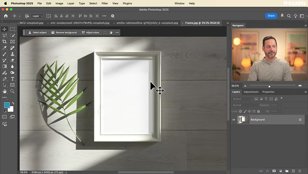 Empty picture frame background layer open in Photoshop
Start with your base image open as the background layer. In Aaron’s example, it’s a picture frame with an empty interior. Your second image, the one you want to blend, gets dragged directly into the document. Click and drag it from your file browser into the Photoshop window, then hit Enter to place it. At this point you have two layers: the background underneath, and the new image sitting on top in Normal blend mode. Nothing interesting is happening yet, which is exactly where you want to start.
Step 2: Understand How the Modes Are Grouped
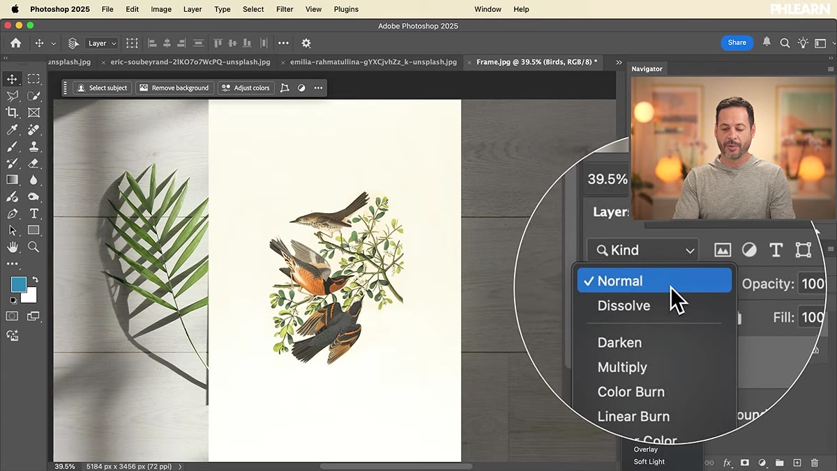 Full blending mode dropdown showing labeled groups
Before you touch anything, take a look at the blending modes dropdown. The list is long, but it’s divided into groups separated by thin lines, and those groups are the whole key. Aaron breaks them down cleanly: Normal at the top (and Dissolve, which almost nobody uses), then the Darken group, the Lighten group, the Overlay group, the Calculations group, and finally the Color group at the bottom. Each group controls a different aspect of how your top layer interacts with the layers beneath it. Once you see the groups instead of the individual names, the whole panel becomes manageable.
Step 3: Work With the Darken Group
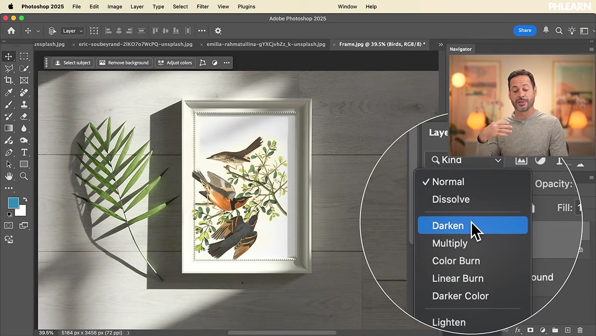 Birds layer with Multiply mode applied, dark areas visible
The Darken group, which includes Darken, Multiply, Color Burn, Linear Burn, and Darker Color, does exactly what it sounds like. Any mode in this group will make the dark pixels in your top layer visible while letting the lighter areas drop away. In Aaron’s bird example, the birds themselves are the dark element in the image, so switching to Multiply makes the birds appear while the lighter background of that layer disappears. Multiply is by far the most used mode in this group. It’s the one you reach for when you want to place a texture, drop in dark linework, or blend a shadow onto a surface.
Step 4: Understand the Lighten Group
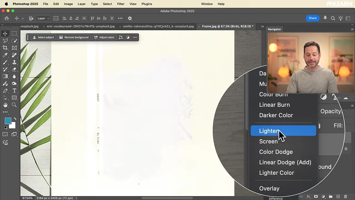 Lighten mode applied, birds disappear and bright areas show
The Lighten group works as the mirror image of the Darken group. Screen, Lighten, Color Dodge, Linear Dodge, and Lighter Color all make the bright pixels in your top layer visible while the dark areas become transparent. Switching the bird layer to Screen, for instance, makes the birds vanish because they’re the dark element, and only the lighter sky areas remain. This group is your best friend when you’re compositing things like smoke, light flares, fire, or anything captured on a black background. Screen mode is the workhorse here, the same way Multiply is for the Darken group.
Step 5: Try the Overlay Group for Color and Contrast Effects
 Overlay mode applied, showing contrast and color blend
The Overlay group, which covers Overlay, Soft Light, Hard Light, Vivid Light, Linear Light, Pin Light, and Hard Mix, operates differently from the first two groups. Instead of choosing either darks or lights, these modes blend both while also mixing in color. The result is increased contrast and color interaction between layers. Soft Light is the gentlest of the bunch and is commonly used for color grading, adding a warm or cool tone to an image by painting on a layer set to Soft Light. Hard Light is more aggressive. Overlay sits in the middle. If you’re doing any kind of color work, stylized grading, or texture overlays where you want to preserve some detail from the layer below, this is your group.
Step 6: Know When to Skip the Calculations Group
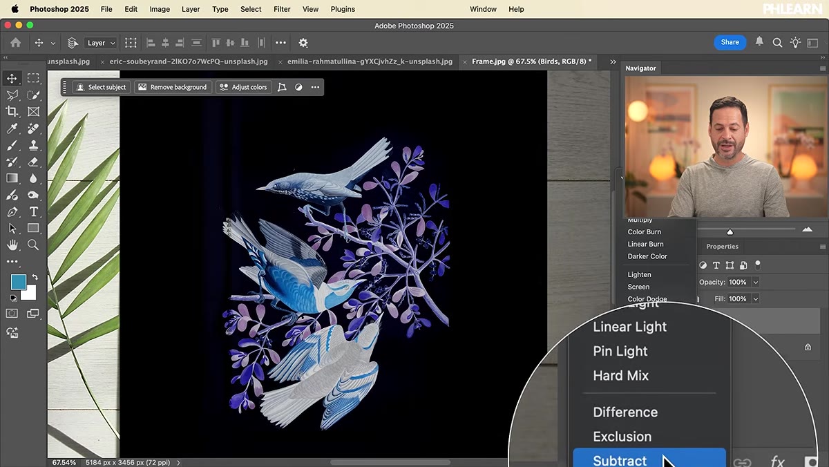 Difference mode applied, showing inverted color effect
The Calculations group, Difference, Exclusion, Subtract, and Divide, produces results that look genuinely strange. Difference inverts colors based on the difference in pixel values between layers. The outputs can look wild, almost psychedelic. These modes do have specialized uses, particularly for aligning layers or creating certain special effects workflows, but for general photo editing and compositing, you can mostly skip past this group. It’s good to know they exist so you’re not confused when you accidentally land on Difference and your image turns into a neon nightmare. Just keep scrolling.
Step 7: Use the Color Group for Targeted Adjustments
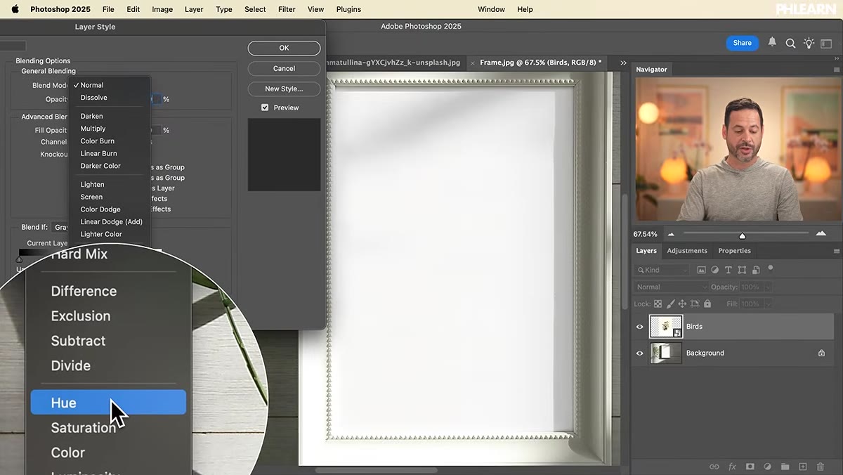 Color group modes shown in Layer Style panel
At the very bottom of the list you have Hue, Saturation, Color, and Luminosity. These are precise tools. Hue changes only the color itself without touching saturation or brightness. Saturation affects only the intensity of color. Color combines hue and saturation but leaves luminosity alone. Luminosity does the reverse, applying only the brightness values from the top layer while ignoring its color. These modes are especially useful when you’re doing targeted color corrections. Put a solid color fill layer set to Hue above a portrait and you can shift skin tones without blowing out brightness. It’s surgical in a way that the other groups aren’t.
One Thing I’d Add From Experience
Aaron’s example of using Multiply to drop an image into a frame is clean and clever, but the technique only works smoothly when your compositing image has a genuinely light background. If your image has a mid-tone or busy background, Multiply will blend those tones in too and you’ll get muddy results. In that case, I’ll often desaturate the layer first, or use a Levels adjustment clipped to the layer to push the background closer to pure white before applying Multiply. It takes 30 extra seconds and saves you from wondering why the blend looks dirty.
The single most important thing to take away here is that blending modes aren’t random, they’re organized by what they do to light. Dark areas, light areas, color, or some combination. Once you think of the panel as four or five logical categories instead of 27 mysterious options, you stop guessing and start making intentional choices. That shift is worth more than memorizing any individual mode.
Watch the full tutorial on YouTube to see Aaron walk through the frame composite and all the mode groups with live examples.
Comments (5)
I tried this on a client project yesterday and the results were way better than expected.
Applied this to my portfolio shots and the improvement is noticeable.
Wow, I had no idea you could do this. Mind blown.
Great breakdown. The step-by-step approach really helps.
Really solid breakdown. This pairs perfectly with the workflows work I've been writing about.
Leave a Comment