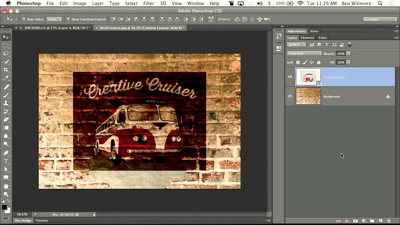
There’s a specific type of composite that clients love to request and that sounds deceptively simple: “make it look like it’s painted on the wall.” Sure, you can slap a layer on top, set it to Multiply, and call it a day. But that usually looks like exactly what it is: a layer slapped on top of a photo. Getting it to actually read as painted, weathered, worn into the surface over decades? That’s where most people get stuck, myself included, for longer than I’d like to admit.
Watch the full tutorial on YouTube
In this CreativeLive tutorial, Ben Willmore walks through a technique for making a graphic look like an old faded mural or advertisement on a brick wall. The workflow is elegant: convert your layers to a Smart Object, experiment with blending modes fast using a keyboard shortcut most people don’t know, and then use the Underlying Layer sliders in Blending Options to let the texture of the wall eat into the graphic. The result reads as genuinely aged rather than digitally composited. Let me walk you through the whole thing.
Step 1: Organize Your Graphic Layers Into a Smart Object
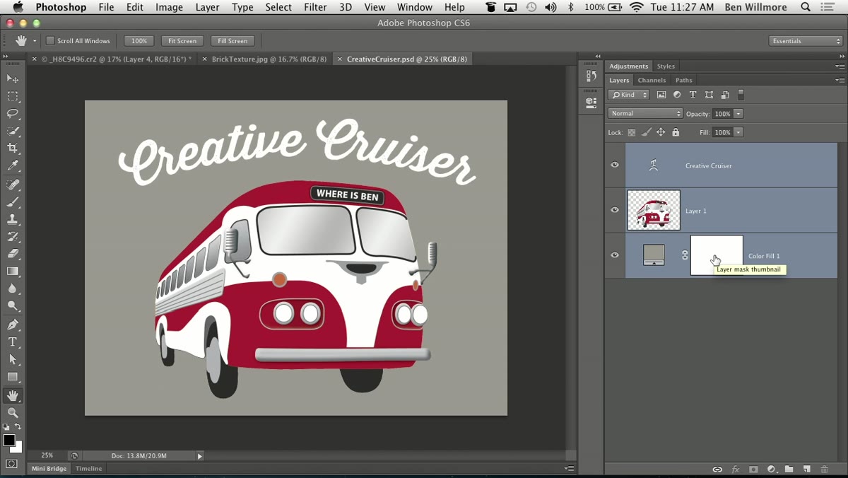 Multiple graphic layers selected in the Layers panel
If your graphic is made up of multiple layers, the blending tools in Photoshop operate on a per-layer basis. That means if you have five separate layers making up your design, the settings you apply won’t treat them as a unified image. The fix is to select all the layers that make up your graphic, right-click, and choose Convert to Smart Object. Now Photoshop sees everything as a single unit.
Multiple graphic layers selected in the Layers panel
If your graphic is made up of multiple layers, the blending tools in Photoshop operate on a per-layer basis. That means if you have five separate layers making up your design, the settings you apply won’t treat them as a unified image. The fix is to select all the layers that make up your graphic, right-click, and choose Convert to Smart Object. Now Photoshop sees everything as a single unit.
The Smart Object approach is specifically better than just merging the layers flat. You preserve full editability inside the object. Double-click the Smart Object thumbnail later and you can change the text, swap colors, adjust artwork, then save and close to see the updates reflected in your composite. Don’t flatten when you can nest.
Step 2: Move the Smart Object Into Your Background Document
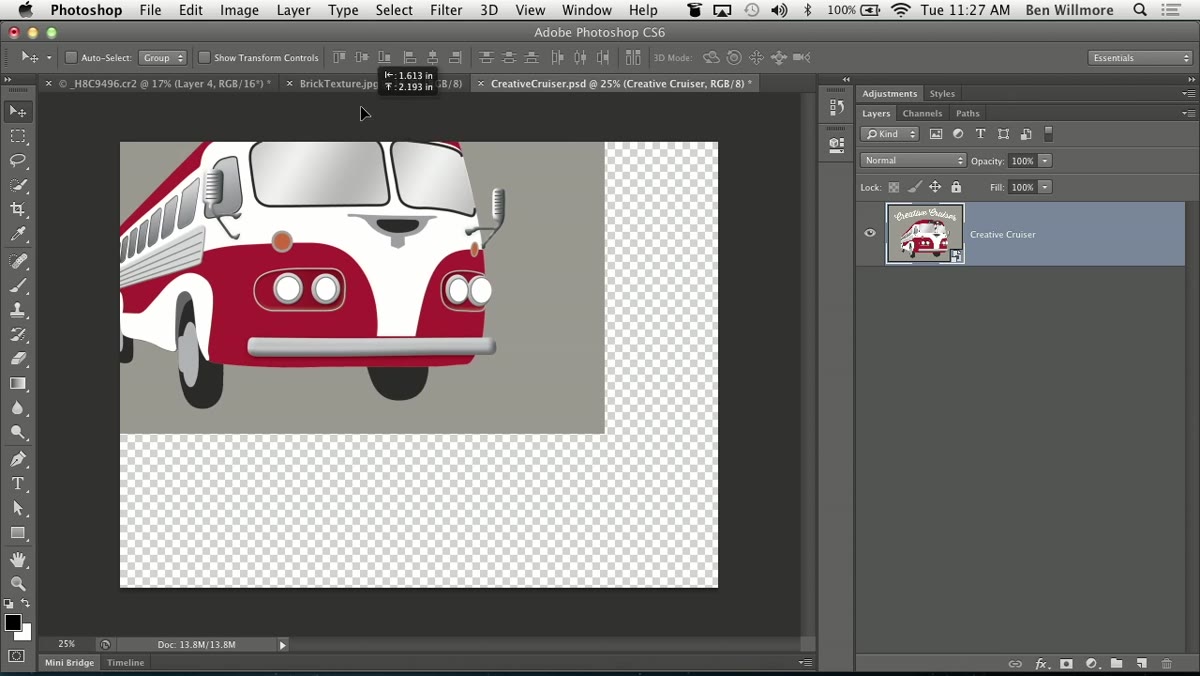 Smart object being dragged onto the wall photo tab
With your Smart Object ready, grab the Move tool and drag the layer up to the tab of your background document (the wall photo, in this case), hold until that document comes to the front, then drag down to drop the graphic into place. This keeps both documents intact rather than copy-pasting and losing track of where things live.
Smart object being dragged onto the wall photo tab
With your Smart Object ready, grab the Move tool and drag the layer up to the tab of your background document (the wall photo, in this case), hold until that document comes to the front, then drag down to drop the graphic into place. This keeps both documents intact rather than copy-pasting and losing track of where things live.
Position the graphic roughly where you want it on the wall. Don’t stress about perfection yet. You’re still in the experimental phase and things will shift visually once blending modes start interacting with the texture underneath.
Step 3: Cycle Through Blending Modes Using the Keyboard Shortcut
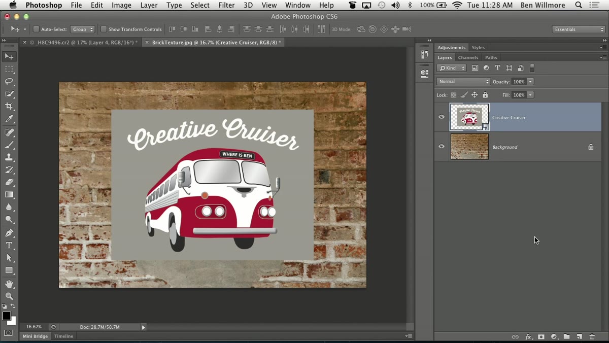 Blending mode dropdown highlighted at top of Layers panel
Here’s the shortcut that genuinely changed how I work with compositing. Most people click into the blending mode dropdown and scroll through options one by one. Instead, select the Move tool (this is critical – the shortcut only works when the Move tool is active, not a brush or anything else), then hold Shift and press the Plus key to step forward through blending modes, or Minus to step backward.
Blending mode dropdown highlighted at top of Layers panel
Here’s the shortcut that genuinely changed how I work with compositing. Most people click into the blending mode dropdown and scroll through options one by one. Instead, select the Move tool (this is critical – the shortcut only works when the Move tool is active, not a brush or anything else), then hold Shift and press the Plus key to step forward through blending modes, or Minus to step backward.
You don’t need to watch the dropdown. Just watch the canvas. When something looks interesting, glance at the Layers panel to see which mode you’ve landed on. Willmore tries a few modes in the tutorial and settles on Soft Light as a strong starting point for this kind of worn-paint effect. Multiply tends to go too dark, Normal too flat. The soft contrast modes – Overlay, Soft Light, Hard Light – are usually the territory worth exploring for this kind of effect.
Step 4: Open Blending Options to Access the Underlying Layer Sliders
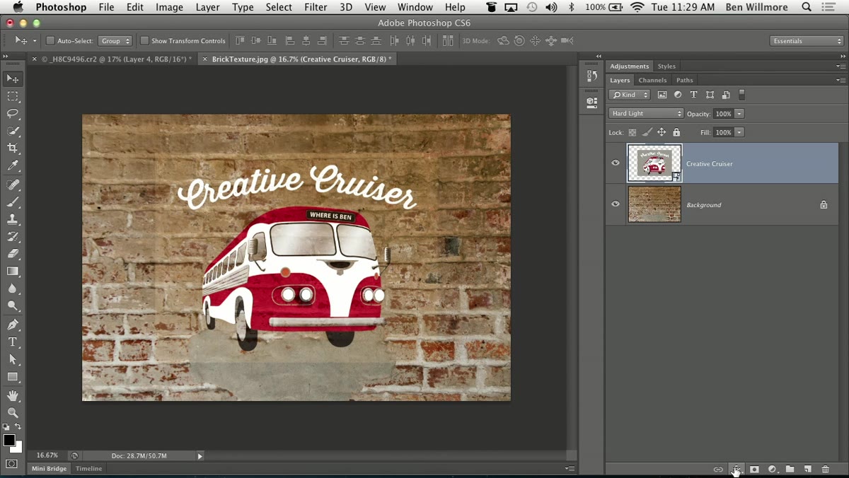 Layer Style dialog open, Blending Options panel visible
Once you have a blending mode you like, the graphic still looks too clean. Real murals don’t sit uniformly on top of brick. The texture of the wall breaks through, especially in the mortar lines and shadows. To simulate that, go to the bottom of the Layers panel and click the FX button, then select Blending Options. This opens the Layer Style dialog.
Layer Style dialog open, Blending Options panel visible
Once you have a blending mode you like, the graphic still looks too clean. Real murals don’t sit uniformly on top of brick. The texture of the wall breaks through, especially in the mortar lines and shadows. To simulate that, go to the bottom of the Layers panel and click the FX button, then select Blending Options. This opens the Layer Style dialog.
Look toward the bottom of that dialog for the “Blend If” section. There are two gradient sliders: one for the current layer, one for the Underlying Layer. The Underlying Layer slider is what you want here. It controls how the brightness values of the layer beneath affect the visibility of your graphic on top.
Step 5: Use the Underlying Layer Slider to Let the Wall Break Through
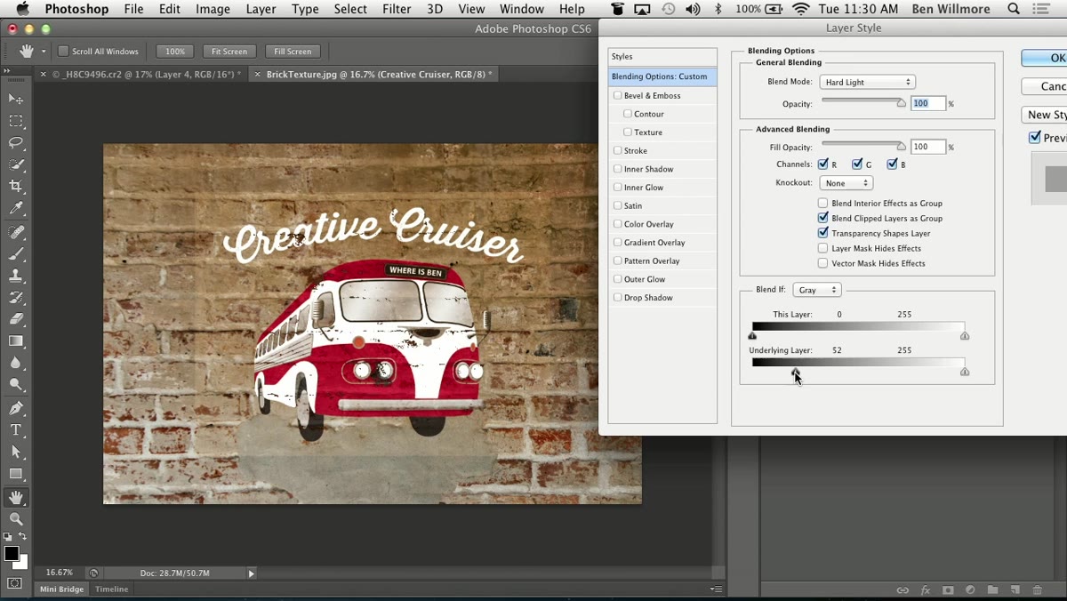 Underlying Layer slider being dragged inward in Blend If section
Drag the left (shadow) handle of the Underlying Layer slider inward from the left edge. As you pull it right, the darkest parts of the wall – the mortar lines, the deep brick shadows – will start masking out your graphic in those areas. It creates the illusion that the paint has worn away exactly where the surface is roughest and darkest.
Underlying Layer slider being dragged inward in Blend If section
Drag the left (shadow) handle of the Underlying Layer slider inward from the left edge. As you pull it right, the darkest parts of the wall – the mortar lines, the deep brick shadows – will start masking out your graphic in those areas. It creates the illusion that the paint has worn away exactly where the surface is roughest and darkest.
You can also bring in the right (highlight) handle from the opposite end to mask areas where the wall is brightest. Using both sides simultaneously gives you the most realistic wear pattern, as if the mural has been fading unevenly across the whole surface. Experiment with both ends and watch the canvas, not the sliders.
Step 6: Split the Sliders for a Softer Transition
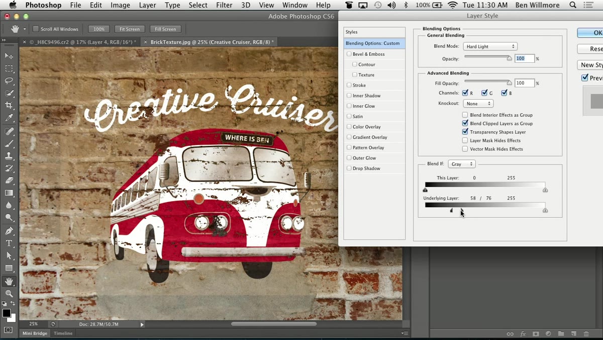 Option-clicking slider handle to split it into two halves
The default slider behavior creates a hard cutoff where your graphic either shows or it doesn’t. That edge looks digital and unconvincing. To fix it, hold Option (Alt on Windows) and click directly on a slider handle. It splits into two separate halves that you can drag apart. The gap between the two halves creates a gradual transition zone rather than a hard clip.
Option-clicking slider handle to split it into two halves
The default slider behavior creates a hard cutoff where your graphic either shows or it doesn’t. That edge looks digital and unconvincing. To fix it, hold Option (Alt on Windows) and click directly on a slider handle. It splits into two separate halves that you can drag apart. The gap between the two halves creates a gradual transition zone rather than a hard clip.
Drag the halves apart until the edges where your graphic fades into the wall look organic rather than sharp. This single sub-step is responsible for most of the realism in the final result. The Preview checkbox in the top-right of the dialog lets you toggle back and forth to see the before and after without closing anything.
A Note From My Own Experience
The Smart Object step is the one I used to skip, and I paid for it. Early in my freelance work I’d merge everything down to keep the file “clean,” then spend an hour trying to recreate artwork from scratch when a client wanted a change. Converting to Smart Objects before doing any compositing work is now the first thing I do, not the last. It costs you nothing at the start and saves you real time later when revisions come in, which they always do.
One extension worth trying: after you’ve set the blending sliders, duplicate the Smart Object and reduce its opacity slightly. Stack it on top of the original. You get a subtle double-exposure quality that pushes the faded-mural effect even further without touching any of your settings.
The biggest thing to take away from this tutorial is that Photoshop’s Blend If sliders are criminally underused. They’re not buried in some obscure menu. They’re sitting right there in Blending Options, and they give you texture-driven transparency that no layer mask can replicate as naturally. Combined with the Smart Object workflow, this technique is genuinely production-ready for advertising mockups, urban composite work, and anything else where you need a graphic to live inside a surface rather than float on top of it.
Watch the full tutorial on YouTube
Comments
Leave a Comment