How to Make a Graphic Look Like a Faded Mural Using Blending Modes and Layer Sliders

How to Make a Graphic Look Like a Faded Mural Using Blending Modes and Layer Sliders

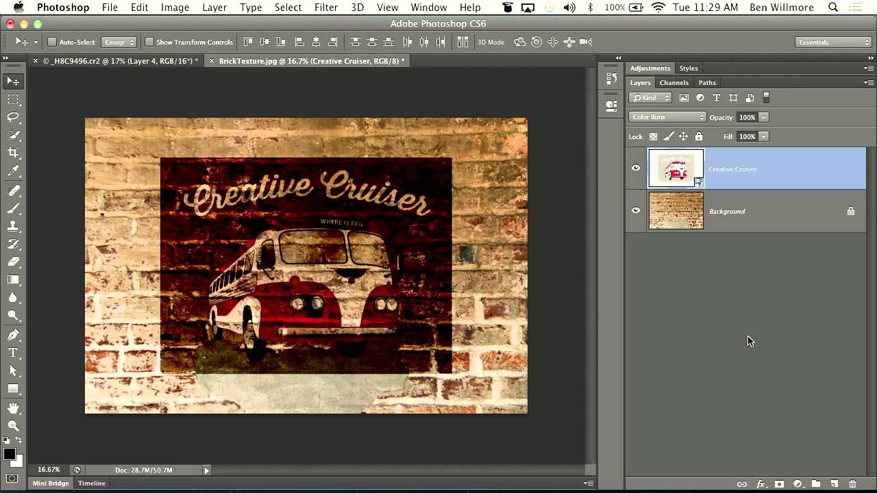
There’s a specific type of composite that clients love to request and that sounds deceptively simple: “make it look like it’s painted on the wall.” Sure, you can slap a layer on top, set it to Multiply, and call it a day. But that usually looks like exactly what it is: a layer slapped on top of a photo. Getting it to actually read as painted, weathered, worn into the surface over decades?
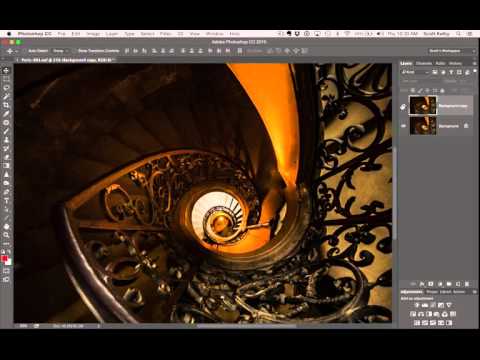

The 3-Step Photoshop Glow Trick That Makes Over-Sharp Images Actually Look Good

The 3-Step Photoshop Glow Trick That Makes Over-Sharp Images Actually Look Good

There’s a specific kind of problem that creeps up constantly in my work: an image that’s been edited to within an inch of its life, technically perfect, and somehow still feels a little… aggressive. Too crisp. Like it’s trying too hard. You’ve nailed the exposure, the colors are singing, and yet something about the final result looks like it was sharpened with a grudge. I used to just ship it anyway and chalk it up to the image being what it was.

Why Your Text Effects Look Flat (And the Layer Style Stacking Order That Fixes It)

Why Your Text Effects Look Flat (And the Layer Style Stacking Order That Fixes It)

I had a client last year who wanted a vintage stamped-ink logo treatment. Simple enough brief. I spent about two hours getting the texture right, the distressing looking natural, the letterforms feeling worn without looking broken. Sent it over. He came back with a screenshot of something he’d found on Pinterest and said, “Can you make it look more like this?” It was almost exactly what I’d made. Almost. The difference was this subtle inner shadow that made the letters feel pressed into the paper rather than printed on top of it.

How to Fake Graffiti on Any Surface in Photoshop (Without It Looking Fake)

How to Fake Graffiti on Any Surface in Photoshop (Without It Looking Fake)

There’s a specific kind of client request that used to make me sweat: “Can you put some text/logo/graphic on that surface?” Not floating beside it. Not stamped on flat. Actually on it, following the curves, matching the lighting, looking like it was always there. Early in my freelance life I’d just nudge the layer around until it looked “close enough” and hope nobody zoomed in. Spoiler: clients zoom in. This technique is the proper answer to that problem.

Blend If Is the Photoshop Feature I Wish I'd Found Three Years Earlier

Blend If Is the Photoshop Feature I Wish I'd Found Three Years Earlier

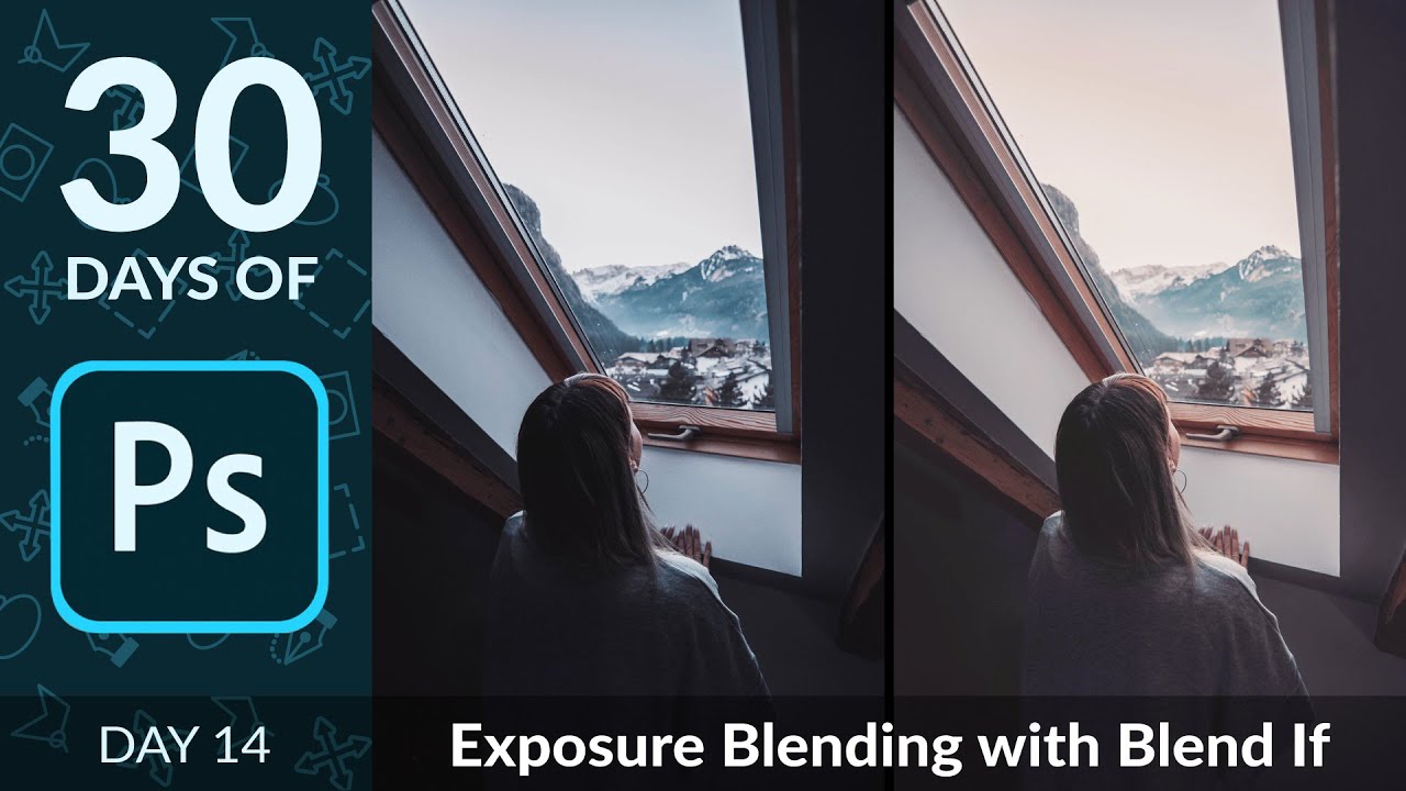
There’s a specific kind of frustration I know really well. You shoot a photo, or a client sends you one, and the sky is gorgeous but the foreground looks like it was taken inside a coal mine. Or the opposite: the subject is perfectly lit and the background is a blown-out white void. I spent an embarrassing amount of time masking around these problems by hand, painting on layer masks pixel by pixel like some kind of digital monk.

Paint Realistic Eye Makeup in Photoshop Using Actual Makeup Artist Principles

Paint Realistic Eye Makeup in Photoshop Using Actual Makeup Artist Principles

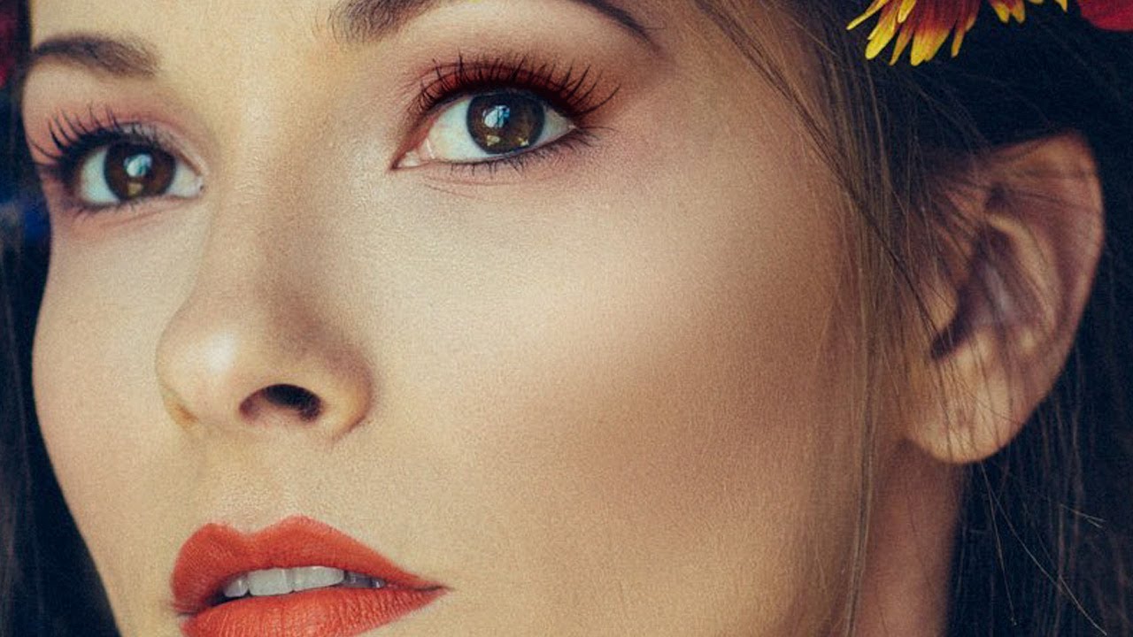
I do a lot of portrait retouching. Skin cleanup, dodging and burning, the occasional dramatic color grade. But for years, whenever a client asked me to “add some makeup” to a shot, I’d fumble around with a brush tool, slap some color on a normal layer, and wonder why it looked like I’d painted the model’s face with Microsoft Paint. Which, yes, I have experience with. It wasn’t pretty. The real problem wasn’t the tools.