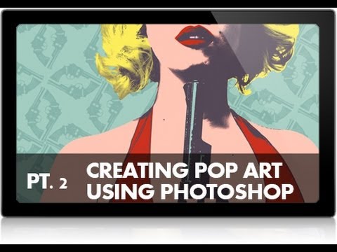
Client asks for something “fun and bold” and suddenly you’re staring at a blank canvas wondering if you should’ve stayed in bed. I’ve been there more times than I care to admit. Pop art styling - that flat, graphic, Warhol-esque treatment - is one of those looks that seems simple until you’re knee-deep in layers wondering why everything looks muddy. The good news: Aaron Nace over at PHLEARN has already figured it out, and his two-part series on creating a Marilyn Monroe-style pop art portrait is genuinely one of the cleaner breakdowns of this technique I’ve seen.
Watch the full tutorial on YouTube
This article covers Part 2, which is where the real Photoshop work happens - taking a black-and-white silhouette built in Part 1 and turning it into a fully colored pop art piece. If you’ve ever wondered how to apply color under a dark graphic layer without it turning into a mess, this is the tutorial that finally makes that click. Here’s how the whole thing breaks down.
Step 1: Organize Your Existing Layers Into a Group
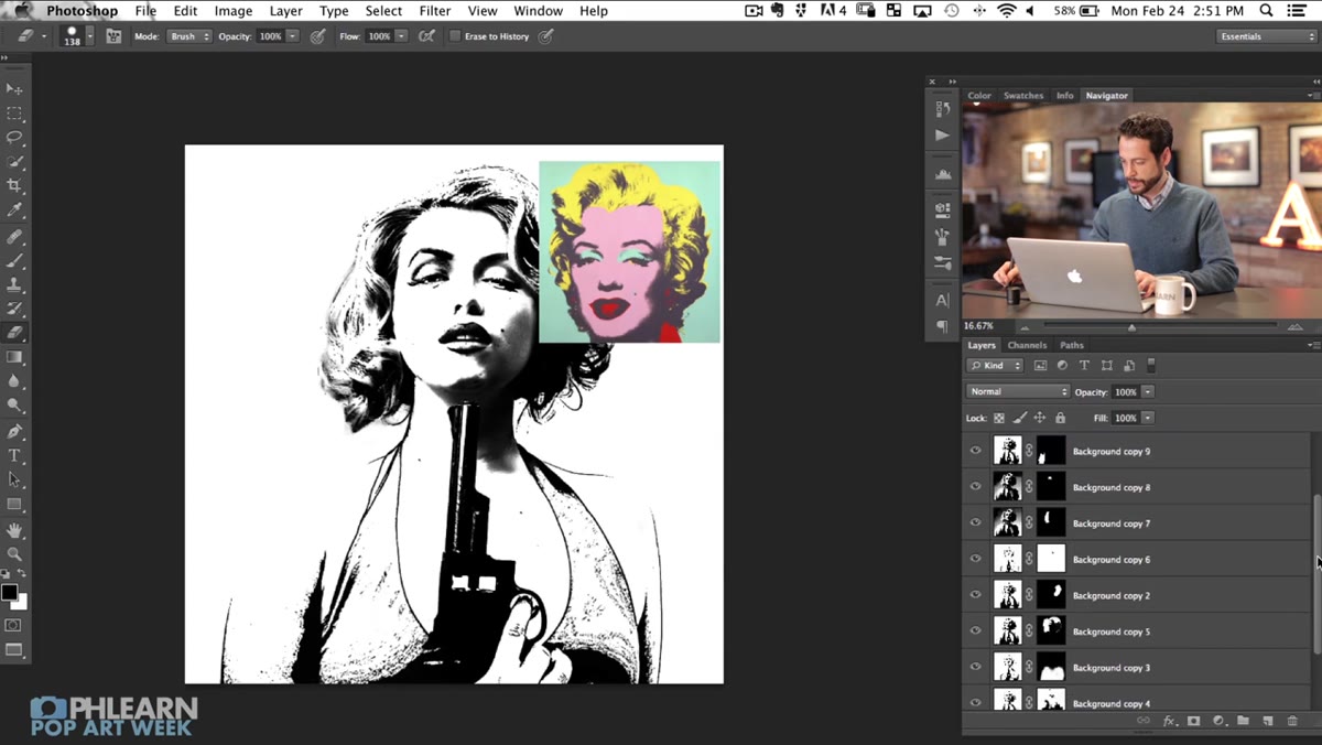 Multiple silhouette layers visible in Photoshop Layers panel
Before you touch a single color, get your house in order. Coming out of Part 1, you’ll have several layers that make up your silhouette - the dark outlines and shadow shapes that define the subject’s form. Shift-click to select all of them at once, then hit Command + G (Mac) or Ctrl + G (Windows) to group them.
Multiple silhouette layers visible in Photoshop Layers panel
Before you touch a single color, get your house in order. Coming out of Part 1, you’ll have several layers that make up your silhouette - the dark outlines and shadow shapes that define the subject’s form. Shift-click to select all of them at once, then hit Command + G (Mac) or Ctrl + G (Windows) to group them.
The important thing to notice here: every one of those layers should be set to Multiply blending mode. Multiply drops out the white and keeps the darks, which is exactly what gives you that clean graphic look. Grouping keeps everything tidy and, more importantly, lets you treat the whole silhouette as a single unit when you start dropping color underneath it.
Step 2: Use Color Range to Select Just the Dark Values
 Color Range dialog open with grayscale preview selected
Here’s the move that makes this whole technique work. Create a new blank layer, then go to Select > Color Range. In the dialog, change the preview dropdown to Grayscale - this makes it much easier to see exactly what you’re selecting. The white areas in the preview are what will be selected, and the black areas won’t be.
Color Range dialog open with grayscale preview selected
Here’s the move that makes this whole technique work. Create a new blank layer, then go to Select > Color Range. In the dialog, change the preview dropdown to Grayscale - this makes it much easier to see exactly what you’re selecting. The white areas in the preview are what will be selected, and the black areas won’t be.
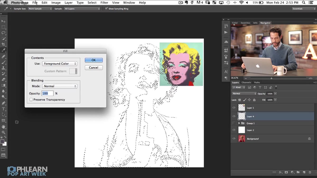
Click on a dark area of your image to sample the shadows. Crank the Fuzziness slider up to pull in more of the dark tones until your preview shows a solid selection of all the black and near-black areas. Don’t panic if it looks inverted at first - you can sort that out in a moment. What you’re building here is a precise selection of all the dark graphic elements, which you’ll use to paint them onto a clean transparent layer so the colors can live independently underneath.
Step 3: Fill the Selection on a New Transparent Layer
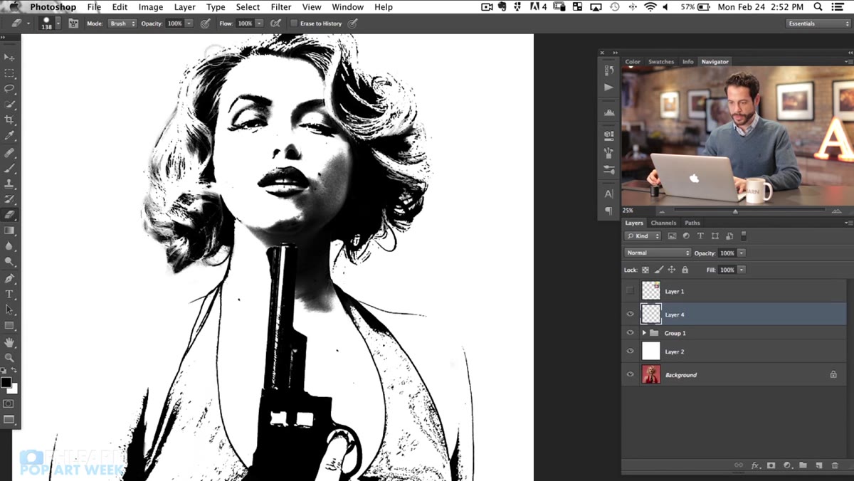
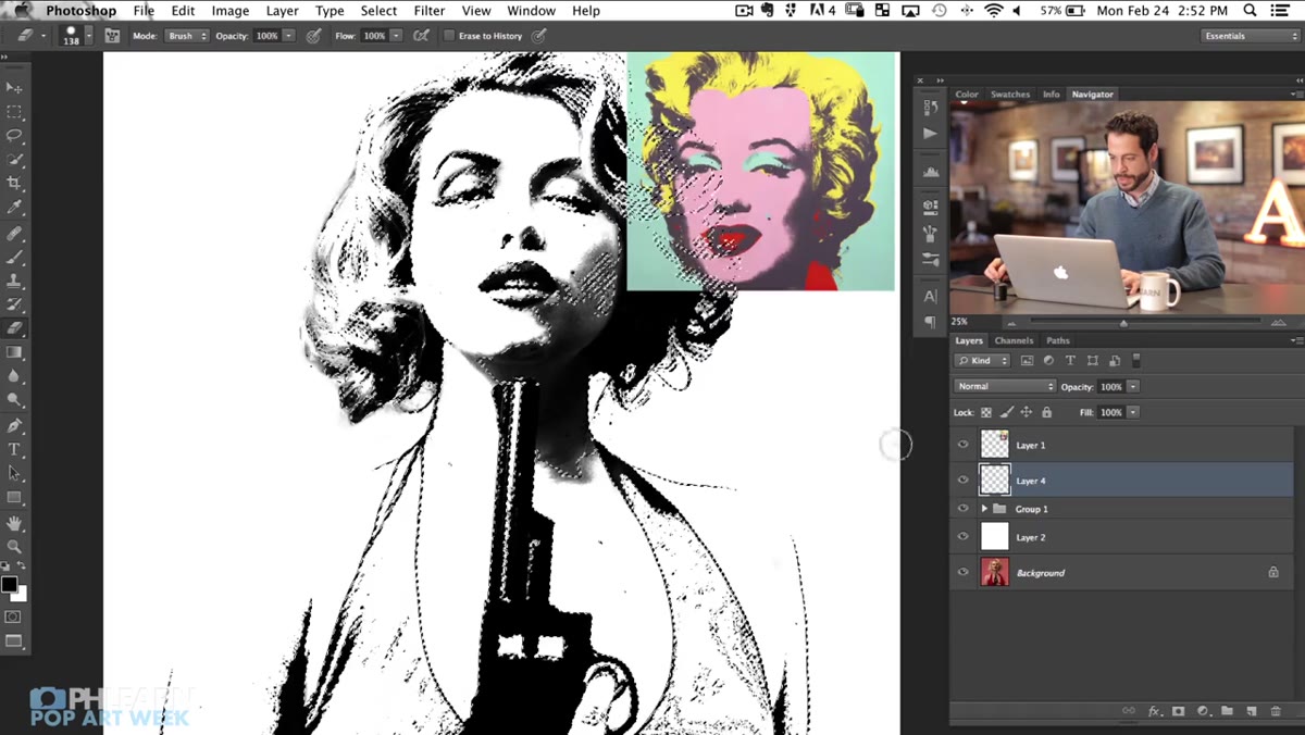 New layer created above background with dark values filled in
With your Color Range selection still active, make sure your new blank layer is selected in the Layers panel, then fill the selection with black. You can do this quickly with Edit > Fill and choose black, or use the keyboard shortcut Alt + Backspace (Mac: Option + Delete) to fill with your foreground color - just make sure black is set as your foreground first.
New layer created above background with dark values filled in
With your Color Range selection still active, make sure your new blank layer is selected in the Layers panel, then fill the selection with black. You can do this quickly with Edit > Fill and choose black, or use the keyboard shortcut Alt + Backspace (Mac: Option + Delete) to fill with your foreground color - just make sure black is set as your foreground first.
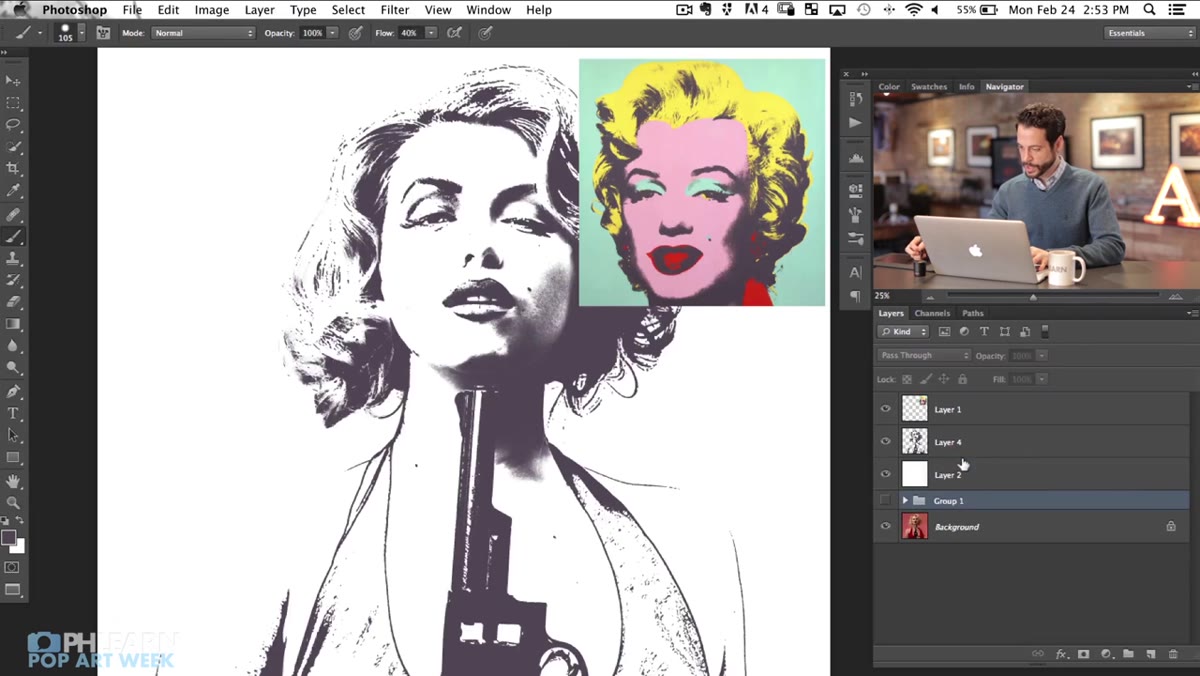
What you end up with is a single flat layer containing just the dark graphic elements of your portrait, sitting on a transparent background. This is the key structural move. Now your colors and your darks are completely separate, which means you can paint color freely underneath without any of it contaminating your outlines.
Step 4: Set That Layer to Multiply and Position It Correctly
 Dark layer set to Multiply blending mode in Layers panel
Set your new dark layer to Multiply blending mode. This makes the white areas of the layer invisible and lets anything underneath it show through, while keeping all your black graphic lines and shadows fully visible. Think of it like a piece of acetate with ink on it - the clear parts disappear, the ink stays.
Dark layer set to Multiply blending mode in Layers panel
Set your new dark layer to Multiply blending mode. This makes the white areas of the layer invisible and lets anything underneath it show through, while keeping all your black graphic lines and shadows fully visible. Think of it like a piece of acetate with ink on it - the clear parts disappear, the ink stays.
Position this layer near the top of your stack. Everything that comes after this - all your color work - will live below it. This layer is basically your ink plate in a screen printing setup. You’re building up from here.
Step 5: Add Color Layers Beneath the Dark Layer
 Solid color layers being placed beneath the dark silhouette layer
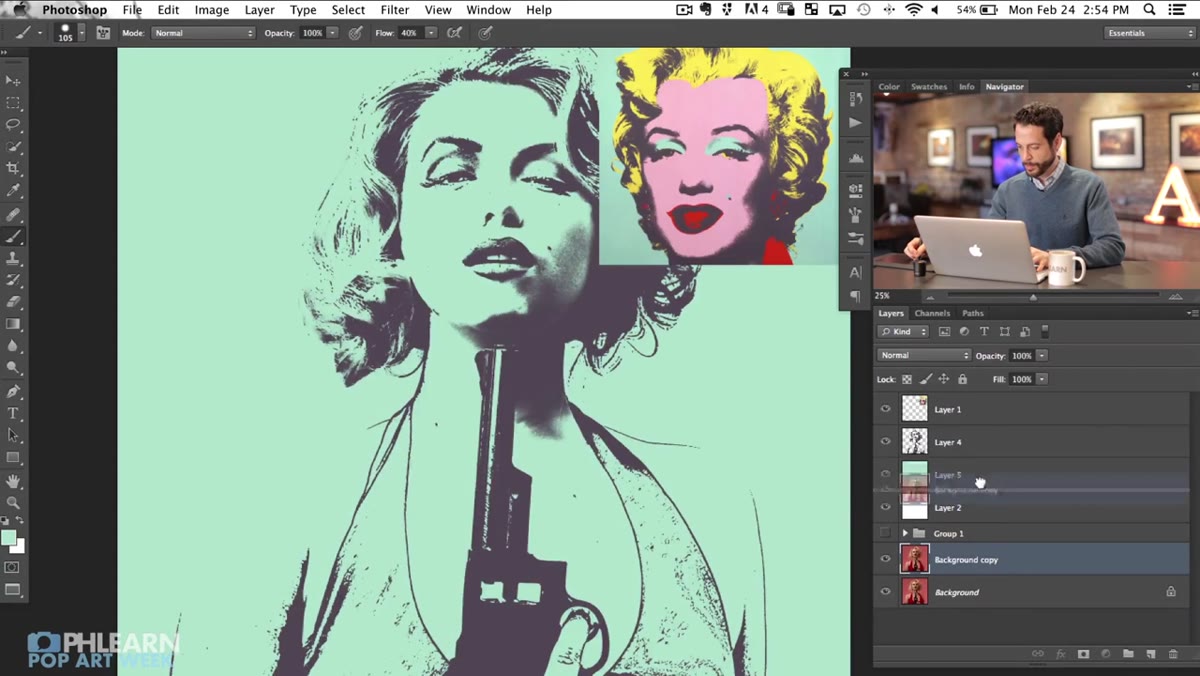
Now the fun part. Create new layers beneath your dark multiply layer and start filling regions with flat, saturated color. In a Warhol-style piece, you’re not going for realistic skin tones - you’re going for punchy, deliberate color choices. Think mint green skin, electric yellow hair, hot pink lips. Use the Brush tool with hard edges, or make rough selections with the Lasso tool and fill them.
Solid color layers being placed beneath the dark silhouette layer
Now the fun part. Create new layers beneath your dark multiply layer and start filling regions with flat, saturated color. In a Warhol-style piece, you’re not going for realistic skin tones - you’re going for punchy, deliberate color choices. Think mint green skin, electric yellow hair, hot pink lips. Use the Brush tool with hard edges, or make rough selections with the Lasso tool and fill them.
Each color can live on its own layer, which gives you full flexibility to swap hues without redoing any work. This is also where your lighting setup from the shoot pays off - the shadows baked into the silhouette add dimensionality even when the colors underneath are completely flat. The dark tones from the Multiply layer do all the heavy lifting in terms of making the face read as three-dimensional.
Step 6: Drop the Finished Portrait Into a Graphic Background
 Colored portrait placed against bold flat-color background
Once your coloring is locked in, it’s time to composite the whole thing into a background that matches the Warhol aesthetic - bold, flat, single-color blocks. Create a simple rectangle on a new layer beneath everything and fill it with a contrasting color. The pop art look relies on this high contrast between subject and background, so don’t be shy about putting a bright orange subject on a teal background or something equally aggressive.
Colored portrait placed against bold flat-color background
Once your coloring is locked in, it’s time to composite the whole thing into a background that matches the Warhol aesthetic - bold, flat, single-color blocks. Create a simple rectangle on a new layer beneath everything and fill it with a contrasting color. The pop art look relies on this high contrast between subject and background, so don’t be shy about putting a bright orange subject on a teal background or something equally aggressive.
If you want to get closer to the actual Warhol grid format, you can duplicate your finished composition several times and apply different color schemes to each copy - then tile them into a grid layout. That’s a slightly longer project, but the technique you’ve just built is exactly what you’d repeat for each panel.
What I’d Add: Save Your Color Layers as Comps
One thing the tutorial doesn’t dig into - and something I wish someone had told me earlier - is using Layer Comps (found under Window > Layer Comps) to save different color versions of the same piece. Once you’ve got your dark silhouette locked and your color layers built out, you can toggle different visibility combinations and save each one as a comp. Now you’ve got a whole grid of Warhol panels without duplicating a single layer. It’s cleaner, the file stays manageable, and swapping colors is as simple as changing a fill. For client work especially, being able to say “here are four colorway options” in one file is a genuinely useful thing.
The single biggest takeaway from this whole technique is the separation of darks and color onto independent layers. Once you understand that the Multiply blending mode is basically acting as your “ink only” layer, the whole pop art construction makes intuitive sense - and you can apply the same logic to other graphic styles well beyond Warhol. Getting the photo shoot right matters too, but that’s a conversation for Part 1.
Watch the full tutorial on YouTube and see Aaron walk through the whole thing - the behind-the-scenes lighting breakdown at the start is worth it even if you’re just curious about the photography side.
Comments
Leave a Comment