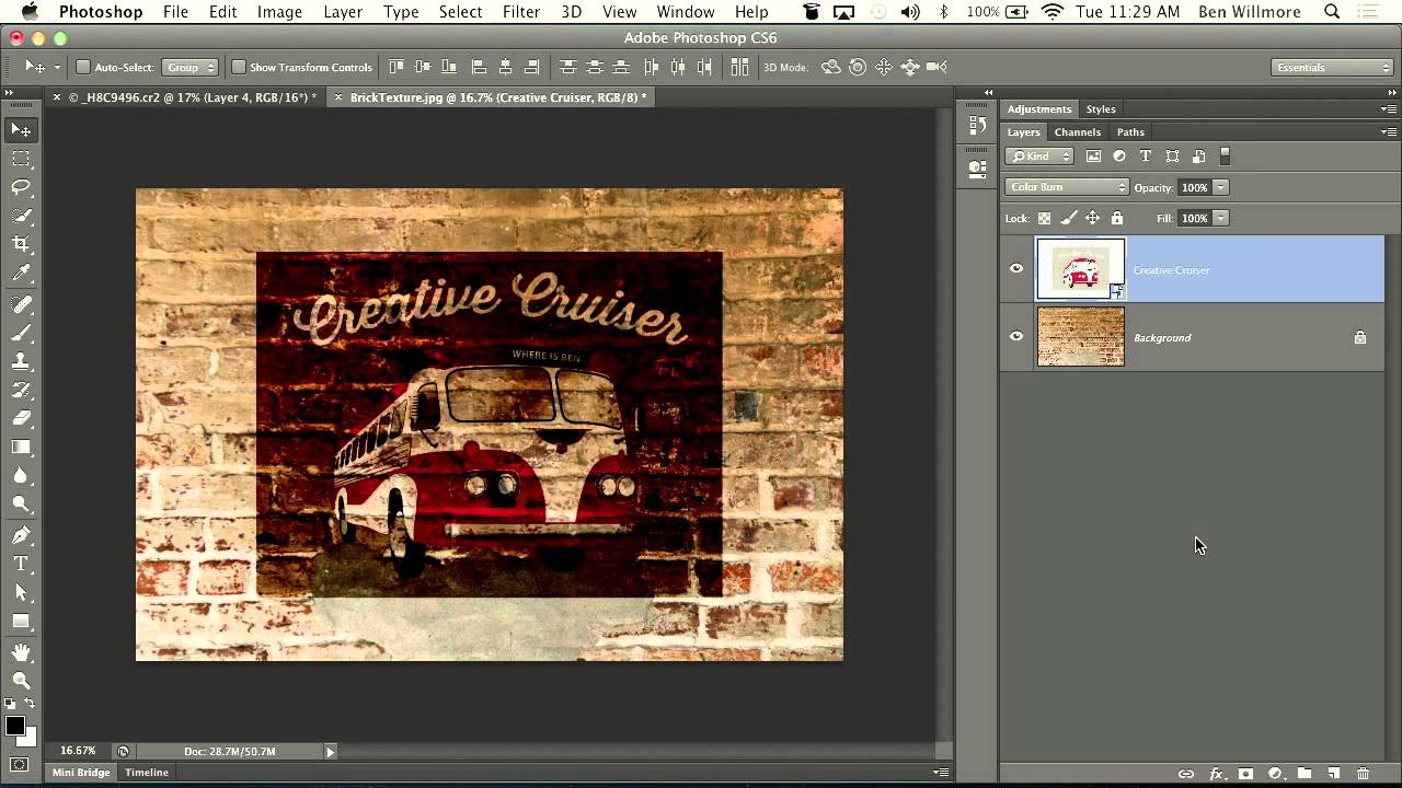
How to Make a Graphic Look Like a Faded Mural Using Blending Modes and Layer Sliders

How to Make a Graphic Look Like a Faded Mural Using Blending Modes and Layer Sliders

There’s a specific type of composite that clients love to request and that sounds deceptively simple: “make it look like it’s painted on the wall.” Sure, you can slap a layer on top, set it to Multiply, and call it a day. But that usually looks like exactly what it is: a layer slapped on top of a photo. Getting it to actually read as painted, weathered, worn into the surface over decades?
Stop Photoshop From Secretly Saving Your Files to the Cloud (And Fix Save As While You're At It)

Stop Photoshop From Secretly Saving Your Files to the Cloud (And Fix Save As While You're At It)

I’ve lost count of how many times I’ve saved a file, closed Photoshop, gone hunting for it in my project folder, and come up completely empty. For the longest time I blamed myself. Bad naming conventions, wrong folder, classic me. Then I started blaming the coffee shop WiFi, which honestly tracks. But the real culprit was a default setting Adobe quietly changed in 2022 that redirected my saves to Creative Cloud instead of my local drive, without ever making that particularly obvious.

Black & White in Photoshop: When to Use It, When to Ditch It, and How to Actually Do It Right

Black & White in Photoshop: When to Use It, When to Ditch It, and How to Actually Do It Right

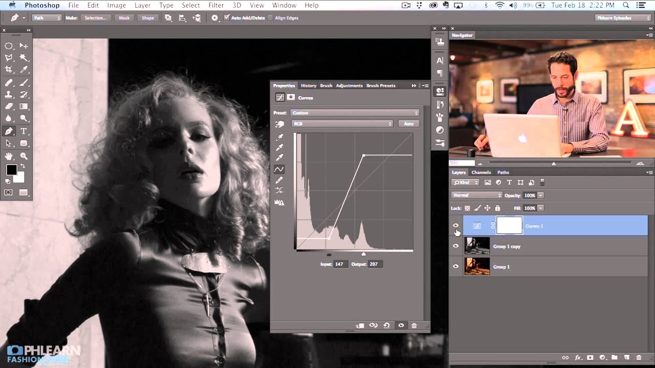
Client work has a funny way of forcing you to get good at things you’ve been half-assing for years. For me, black and white conversion was one of those things. I’d been hitting Shift+Command+U, calling it done, and moving on. Then I handed a moody portrait to a client who came back and said it looked “flat and kind of sad, but not in a good way.” Fair. I had no real control over the tonal relationships in the image.

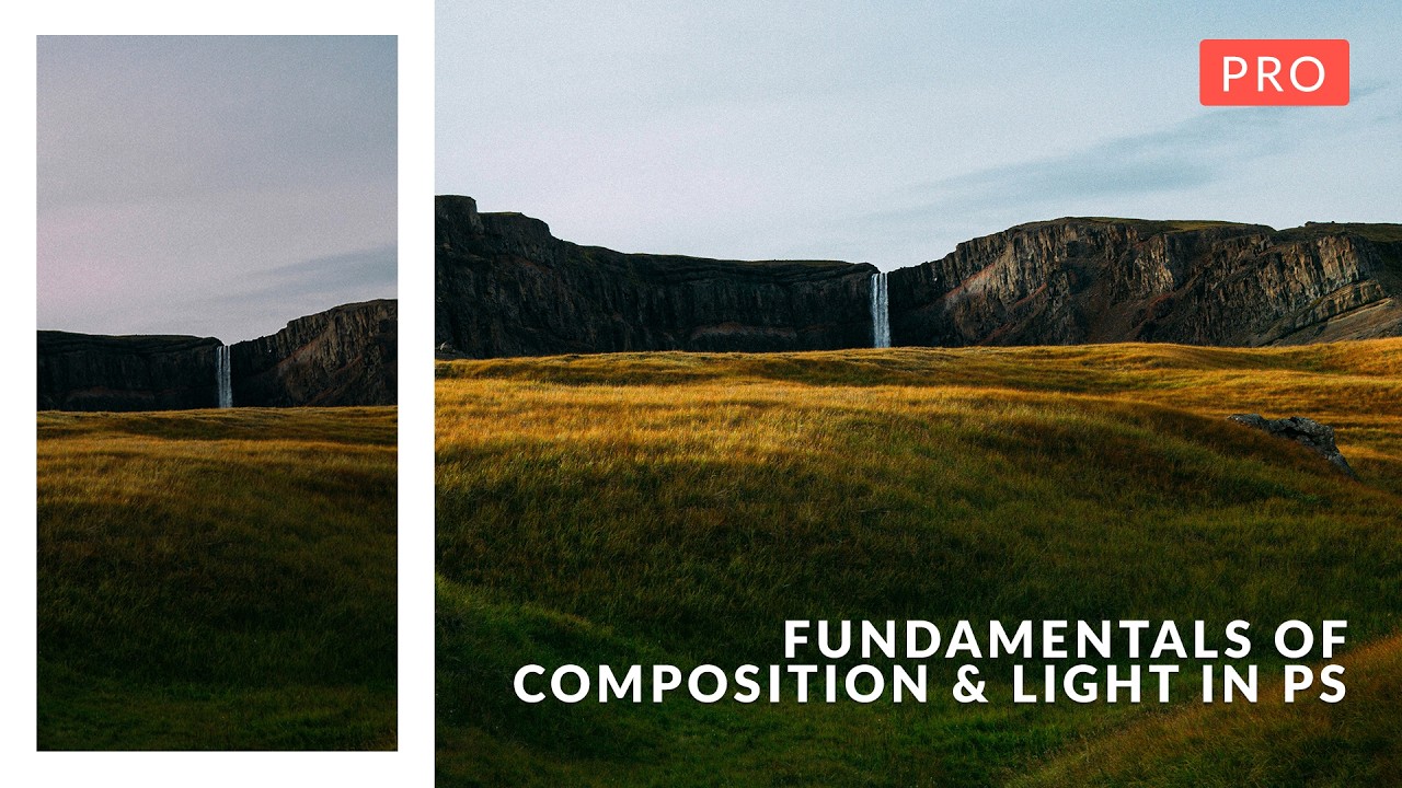
Why Your Landscape Photos Feel Flat (And How to Actually Fix It)

Why Your Landscape Photos Feel Flat (And How to Actually Fix It)

I’ve been doing design and photo editing long enough to know the difference between a technically correct image and one that actually works. For a while, I couldn’t articulate the gap. I’d open a landscape shot, push sliders around in Camera Raw until the histogram looked polite, and then sit back wondering why it still felt like a stock photo someone rejected. Turns out I was treating the symptoms instead of understanding the disease.

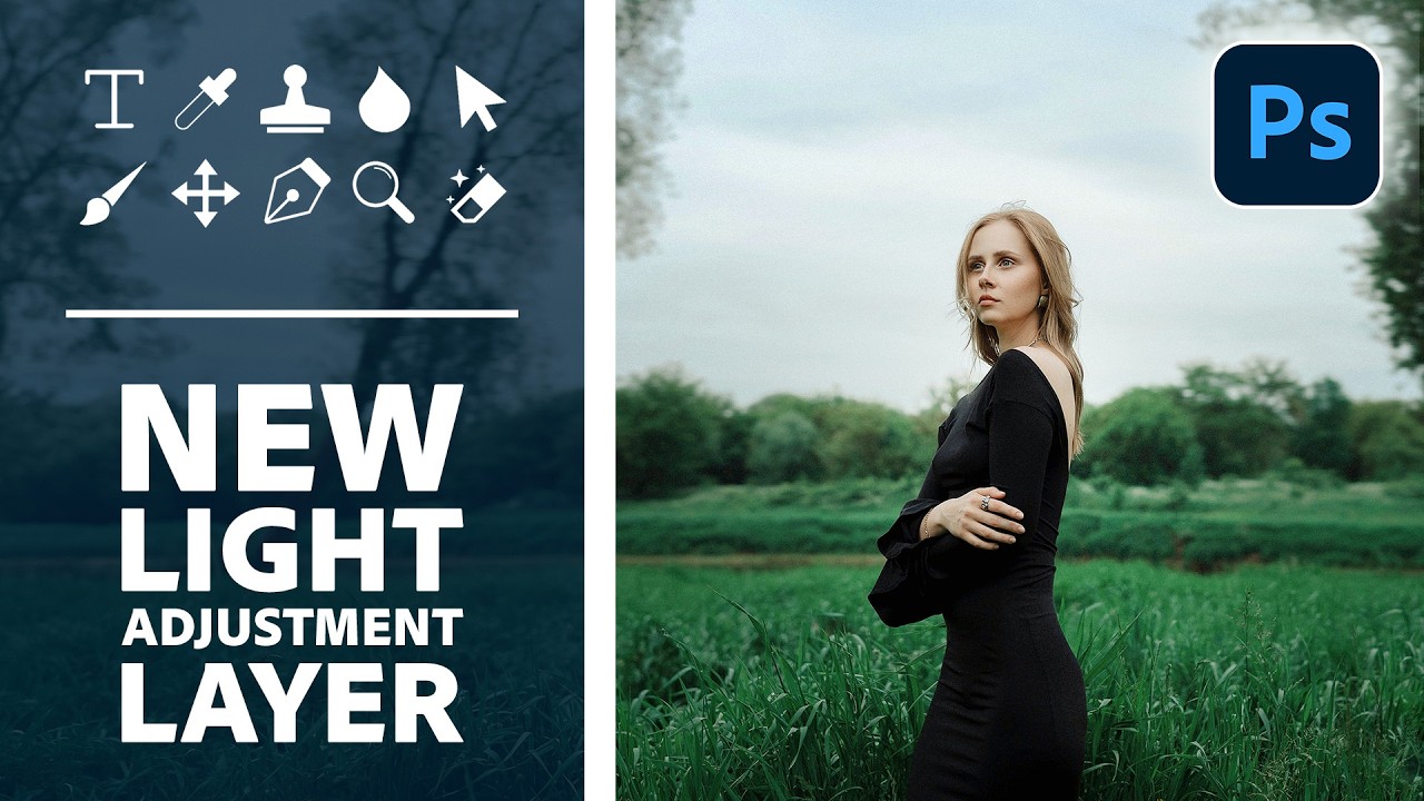
Photoshop's New Light Adjustment Layer Is Here to Replace Brightness/Contrast — Here's How to Actually Use It

Photoshop's New Light Adjustment Layer Is Here to Replace Brightness/Contrast — Here's How to Actually Use It

I’ll be honest — I never really used Brightness/Contrast. It always felt like the adjustment layer Adobe included just so the list didn’t look short. The algorithm was weak, the results were flat, and anyone doing serious work had already migrated to Curves or was living inside Camera Raw. So when Photoshop 27.10 quietly swapped it out for a brand new tool called the Light adjustment layer, my reaction was less “how dare they” and more “finally.

Time Blending vs. Long Exposure: Why Photographers Are Ditching the Single-Shot Approach

Time Blending vs. Long Exposure: Why Photographers Are Ditching the Single-Shot Approach

The Long Exposure Problem Nobody Talks About I’ve spent enough nights shooting traffic on dark roads to know the truth: getting a perfect light trail capture in a single long exposure is like winning the lottery. Sure, it looks simple in theory. Point, shoot, pray. But in reality, you’re battling sensor noise, motion blur that goes haywire, and those awkward gaps where no cars passed through your frame at the exact right moment.

How to Use SVG Files from Adobe's Creative Cloud Market (Without Losing Your Mind)

How to Use SVG Files from Adobe's Creative Cloud Market (Without Losing Your Mind)

There’s a specific kind of frustration that hits when you’re 45 minutes into a project and you realize the asset you need would take you another two hours to build from scratch. Buttons, icons, tool illustrations – the kind of stuff that looks deceptively simple but eats your whole afternoon. For the longest time I was either building these manually or paying for stock assets I’d use once and forget. Then I actually started poking around the Creative Cloud Market properly, and I felt like someone had been hiding a snack drawer from me this whole time.

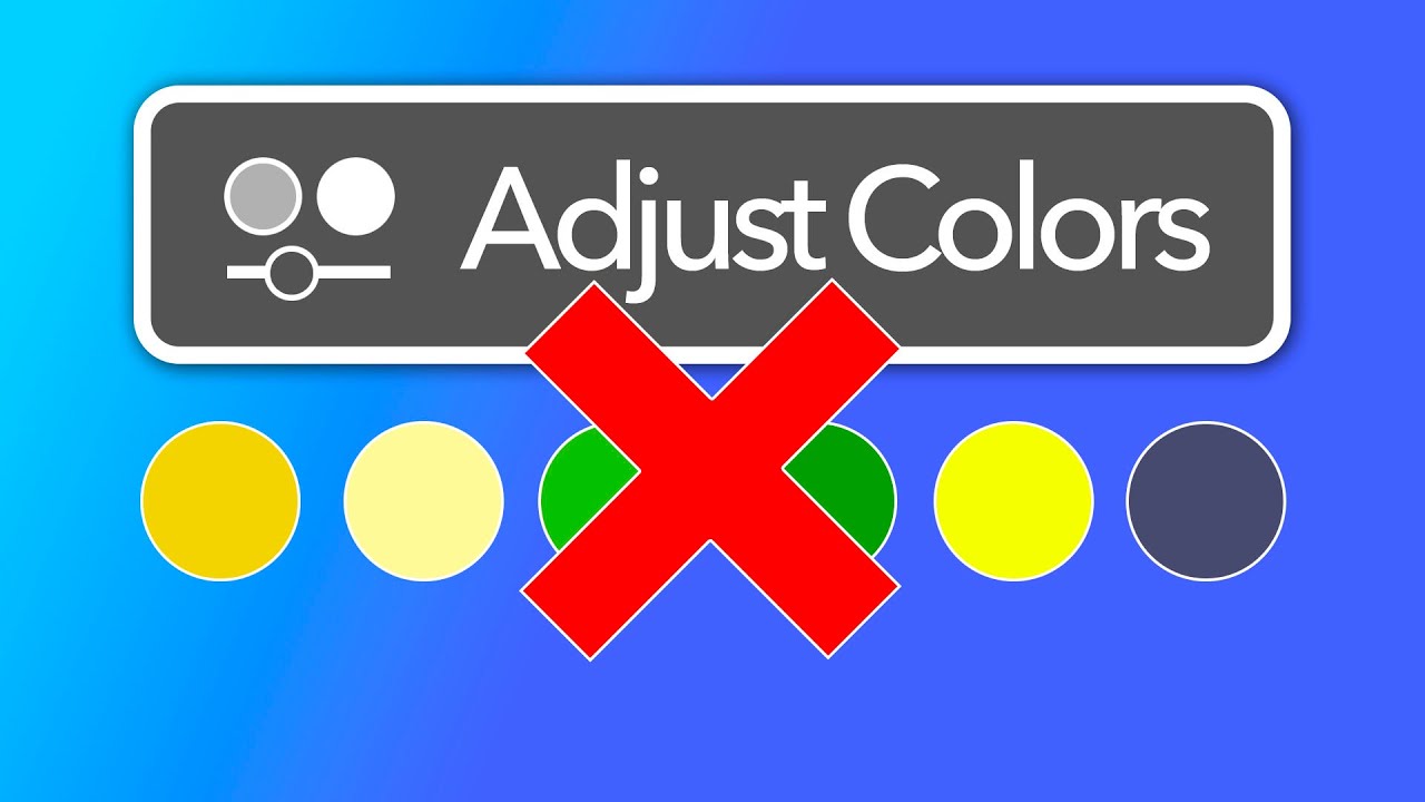
Photoshop's Adjust Colors Tool: Slick Interface, Wrong Tool for Photographers

Photoshop's Adjust Colors Tool: Slick Interface, Wrong Tool for Photographers

If you shoot and edit photos for a living, or even just as a serious hobby, you’ve probably felt the creeping anxiety of Adobe adding new tools to Photoshop and wondering if you’ve been doing everything wrong. New button appears, gets some buzz, and suddenly you’re questioning your entire workflow before you’ve even clicked on the thing. That’s exactly where I found myself when Photoshop’s contextual taskbar started showing a button called “Adjust Colors,” and people in every Facebook group and Reddit thread started treating it like some kind of revelation.

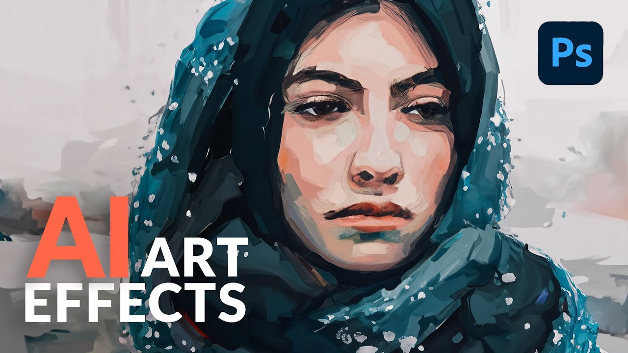
Turn Any Photo Into a Painting in Photoshop Using This Weird AI Trick

Turn Any Photo Into a Painting in Photoshop Using This Weird AI Trick

Client work slows down in summer. That’s when I do my best experimenting, usually with a cold brew at my corner table at the coffee shop, headphones on, burning through tutorials I’ve been bookmarking for months. I’ve tried a lot of AI techniques in Photoshop that promised “artistic effects” and delivered something that looked like a stock photo got into a fight with a Instagram filter. So when I stumbled on this one from Aaron Nace over at PHLEARN, I almost scrolled past it.

Your Photoshop Workspace Is Slowing You Down (Here's How I Fixed Mine)

Your Photoshop Workspace Is Slowing You Down (Here's How I Fixed Mine)

I work almost exclusively from coffee shops. Not because I’m trying to look interesting, but because something about ambient noise and a flat white keeps me locked in. The problem is that screen real estate in a coffee shop is whatever your laptop gives you, and on a 13-inch MacBook Pro, the default Photoshop workspace is basically a panel explosion with a tiny canvas somewhere in the middle. For the first two years of freelancing, I just… lived with it.

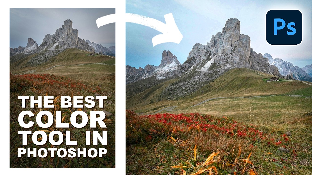
Point Color in Photoshop's Camera Raw Is the Color Tool I Wish I'd Found Years Ago

Point Color in Photoshop's Camera Raw Is the Color Tool I Wish I'd Found Years Ago

Client work has a way of exposing every gap in your toolkit. I spent an embarrassing chunk of my early freelance career doing color adjustments the hard way — HSL sliders, selective color adjustment layers, hand-painted masks — all to target a single stubborn orange in a landscape or a specific blue in a sky. It worked, sort of. But it was slow, fiddly, and every time the client wanted a tweak, I was rebuilding the whole thing.

How to Shoot and Composite a Clean Product Shot Using a Black Background in Photoshop

How to Shoot and Composite a Clean Product Shot Using a Black Background in Photoshop

Product shots are one of those things that separate the designers who can charge real money from the ones still quoting $50 for a full brand package. I know because I spent an embarrassingly long time in the second camp, faking studio-quality results with flat, lifeless images that screamed “photographed on a kitchen table.” When a client hands you a physical product and says “make it look good,” you need a repeatable system, not a prayer.