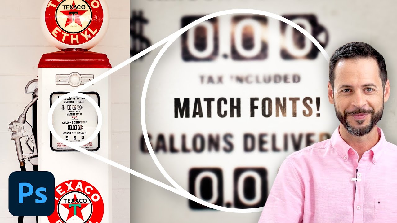
Stop Guessing Fonts: How Photoshop's Match Font Tool Does the Detective Work for You

Stop Guessing Fonts: How Photoshop's Match Font Tool Does the Detective Work for You

There’s a specific flavor of frustration that comes from staring at a photo and knowing you need to match the font in it. Maybe it’s a client’s old logo, a vintage poster, a product label. You squint at it. You scroll through font menus like a maniac. You Google “retro bold serif with rounded corners” and get approximately nothing useful. I’ve burned embarrassing amounts of time on this exact problem, and for a while my solution was just guessing until something looked close enough to pass.


Displacement Maps in Photoshop: Make Text and Logos Look Like They Actually Belong There

Displacement Maps in Photoshop: Make Text and Logos Look Like They Actually Belong There

There’s a specific kind of bad composite that haunts me. You’ve seen it. A logo slapped onto a t-shirt or a hat, sitting perfectly flat and perfectly lit, glowing like a digital sticker that has absolutely no relationship with the fabric underneath it. I’ve made that mistake more times than I want to admit, usually under deadline pressure, usually when a client wanted something “quick.” The result always looked cheap, and I knew it.

Why Your Photoshop Text Effects Look Cheap (And the Layer Stack Fixes That Actually Work)

Why Your Photoshop Text Effects Look Cheap (And the Layer Stack Fixes That Actually Work)

A client once sent me a logo file to “just punch up the text a little.” Simple job. Forty-five minutes, maybe. I opened it up and found a single flattened JPEG with the text baked directly into the background at 72 DPI. The “text layer” was just pixels. No editability, no flexibility, no hope. I spent two hours redrawing letters by hand before I finally handed it back, charged double, and wrote a very passive-aggressive note in my invoice about working with original files.

Why Your Text Effects Look Cheap (And the Layer Style Fixes That Actually Work)

Why Your Text Effects Look Cheap (And the Layer Style Fixes That Actually Work)

A client sent me a revision note last year that just said “can you make it pop more?” No context. No reference image. Just that. I’ve been doing this long enough to know that “pop” is designer-speak for “I feel like something is missing but I don’t know what.” Nine times out of ten, the problem isn’t the font choice or the color. It’s that the text is sitting on top of the image instead of feeling like it belongs in it.

Why Your Photoshop Text Effects Look Cheap (And the Layer Style Habits That Fix Them)

Why Your Photoshop Text Effects Look Cheap (And the Layer Style Habits That Fix Them)

I spent the first two years of my freelance career absolutely torturing text in Photoshop. Drop shadows on everything. Bevels so thick they looked like the letters were crawling off the screen. I once handed a client a logo treatment where the text had a glow, a stroke, an inner shadow, AND a color overlay all stacked on top of each other. The client loved it. I look back on it now and feel a kind of physical pain.

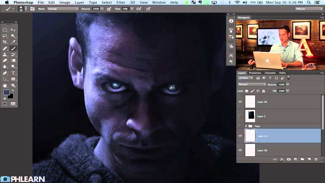
How to Paint Glowing Sci-Fi Eyes and Nail Movie Poster Text in Photoshop

How to Paint Glowing Sci-Fi Eyes and Nail Movie Poster Text in Photoshop

There’s a specific kind of panic that sets in when a client asks you to “make it look cinematic.” They don’t mean anything precise by that. They just mean it should look like it costs more than it does. After years of freelancing, I’ve figured out that about 80% of “cinematic” comes down to two things: eyes that feel alive and type that feels intentional. Get those right and suddenly everything else reads as professional.

Why Your Text Effects Look Flat (And the Layer Style Stacking Order That Fixes It)

Why Your Text Effects Look Flat (And the Layer Style Stacking Order That Fixes It)

I had a client last year who wanted a vintage stamped-ink logo treatment. Simple enough brief. I spent about two hours getting the texture right, the distressing looking natural, the letterforms feeling worn without looking broken. Sent it over. He came back with a screenshot of something he’d found on Pinterest and said, “Can you make it look more like this?” It was almost exactly what I’d made. Almost. The difference was this subtle inner shadow that made the letters feel pressed into the paper rather than printed on top of it.

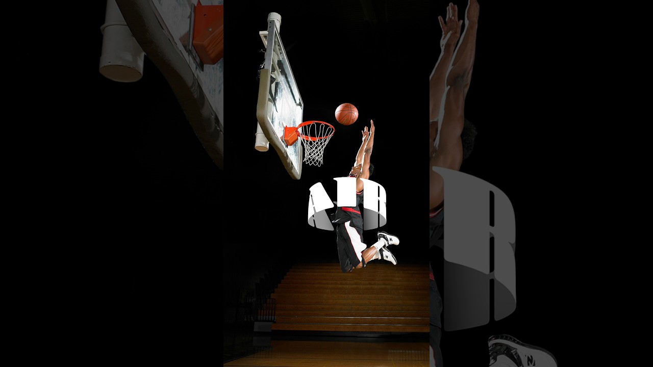
How to Fake 3D Text in Photoshop Without Touching a Single AI Button

How to Fake 3D Text in Photoshop Without Touching a Single AI Button

Every few months I stumble across a technique that makes me feel like I’ve been doing things the hard way for no reason. This was one of those moments. I was working on a poster comp where the client wanted text that felt like it was physically wrapped around the subject, that kind of old-school carnival or vintage sports graphic energy. My first instinct was to reach for something complicated. Maybe export to a 3D program, maybe mess around with displacement maps, maybe just charge the client more and hope they forgot about it.

Why Your Photoshop Text Effects Look Cheap (And the Layer Stack That Fixes Them)

Why Your Photoshop Text Effects Look Cheap (And the Layer Stack That Fixes Them)

A client sent me a logo file once asking me to “make the text pop a little more.” The text was white. On a white background. I took a long sip of my coffee, charged a rush fee, and got to work. But the real problem wasn’t the contrast. It was that whoever built the file had used a single flat layer with zero depth. No shadow, no highlight, no texture interaction.

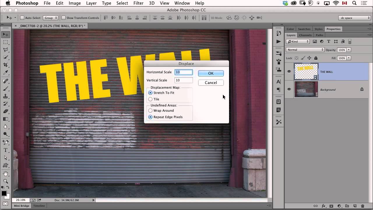
Make Text Look Painted on a Wall Using Photoshop's Displace Filter

Make Text Look Painted on a Wall Using Photoshop's Displace Filter

There’s a specific kind of client request that used to make me quietly panic: “Can you make the logo look like it’s actually on the wall? Like painted there, not just slapped on top?” Sure, no problem. And then I’d spend an hour fiddling with blend modes, drop shadows, and layer opacity, and it would still look exactly like a logo slapped on top of a photo. Flat. Fake. Wrong. The displacement map technique I picked up from this CreativeLive tutorial is the thing that finally cracked that problem for me.

Why Your Text Effects Look Cheap (And the Layer Style Settings That Fix It)

Why Your Text Effects Look Cheap (And the Layer Style Settings That Fix It)

I had a client once who sent me a logo comp they’d made themselves “just to show the direction.” The text had a drop shadow with a Distance of 47px, a Spread of 0%, and an Opacity of 75%. It looked like the word was floating three inches off the page and casting a shadow onto the moon. They were proud of it. I had to fix it without making them feel bad, which is honestly harder than the actual Photoshop work.

Stop Making Your Text Look Like a Bad 90s Website: A Practical Guide to Text Effects in Photoshop

Stop Making Your Text Look Like a Bad 90s Website: A Practical Guide to Text Effects in Photoshop

Stop Making Your Text Look Like a Bad 90s Website: A Practical Guide to Text Effects in Photoshop Look, I’m going to be honest with you. Most text effects in Photoshop are terrible. That glowing neon sign effect? Terrible. The rainbow gradient with drop shadow? Also terrible. But before you close this tab thinking I’m about to tell you to never use effects, hear me out—there are actually some legitimately useful text effects that can elevate your work instead of making it look like it belongs in a time capsule.