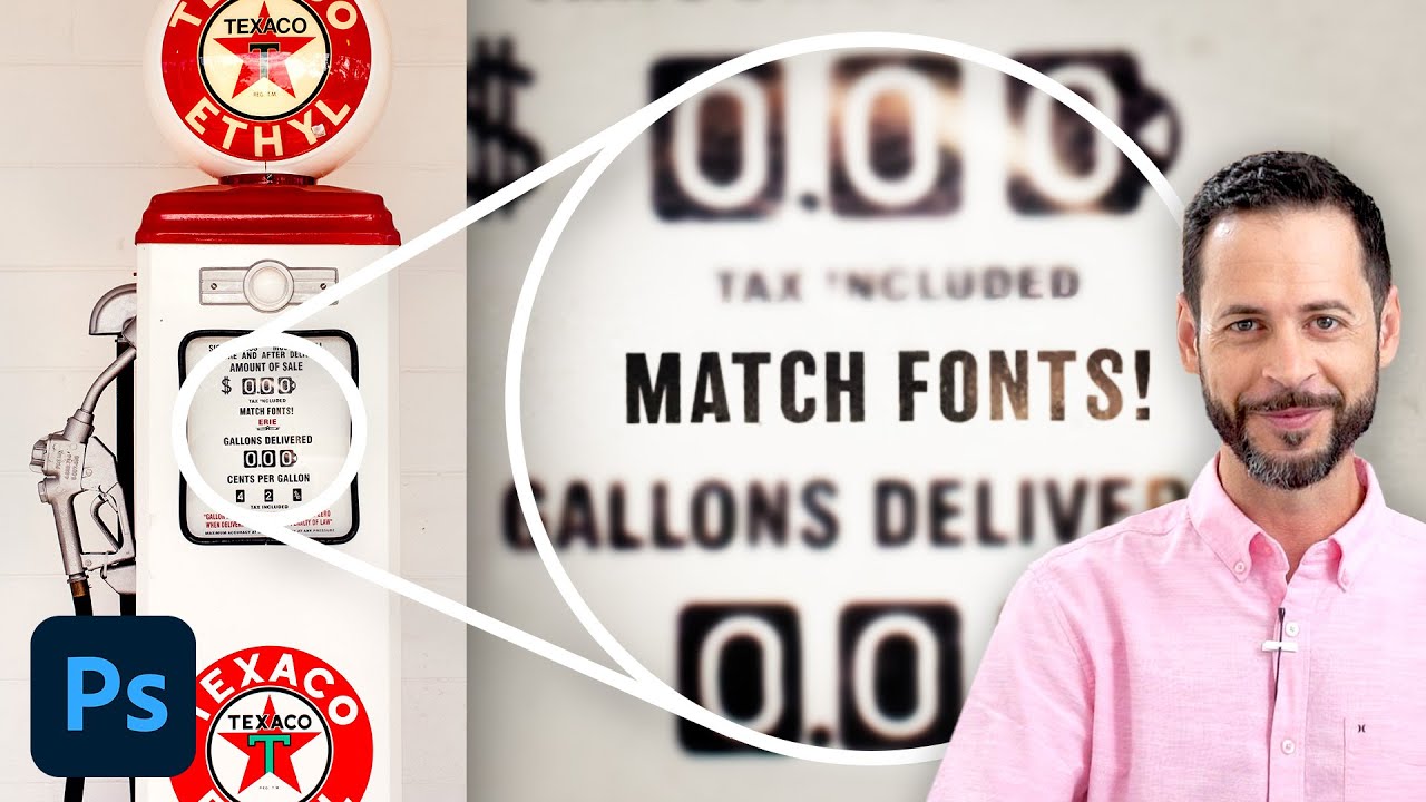
There’s a specific flavor of frustration that comes from staring at a photo and knowing you need to match the font in it. Maybe it’s a client’s old logo, a vintage poster, a product label. You squint at it. You scroll through font menus like a maniac. You Google “retro bold serif with rounded corners” and get approximately nothing useful. I’ve burned embarrassing amounts of time on this exact problem, and for a while my solution was just guessing until something looked close enough to pass. Not great.
Turns out Photoshop has had a tool for this built right in, and I only found it because of a tutorial by Aaron Nace over at PHLEARN. In this Watch the full tutorial on YouTube, Aaron walks through the Match Font feature using an old gas pump photo with some great vintage lettering. The whole thing is under five minutes and it genuinely changed how I approach any project that involves matching existing type.
What I want to do here is break the process down so you can follow along without needing to pause and rewind constantly. Let’s get into it.
Step 1: Select Your Background Layer
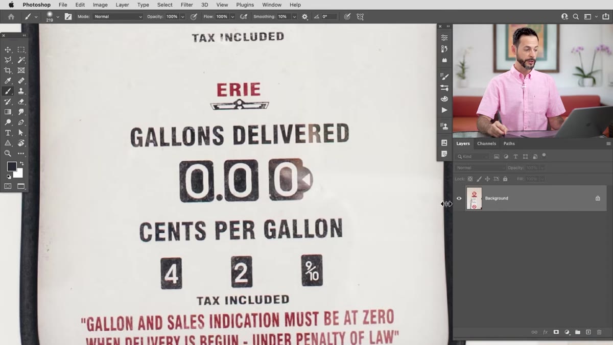 Background layer selected in Layers panel, Match Font menu option highlighted
Before you do anything else, click on the background layer in your Layers panel. Match Font analyzes the actual pixel content of your image, so you need to be on the layer that contains the text you want to identify. If you’re working on a flat image, this is automatic. If you’ve got a multi-layer document, just double-check you’re not sitting on an empty or adjustment layer, because the tool will either error out or give you garbage results.
Background layer selected in Layers panel, Match Font menu option highlighted
Before you do anything else, click on the background layer in your Layers panel. Match Font analyzes the actual pixel content of your image, so you need to be on the layer that contains the text you want to identify. If you’re working on a flat image, this is automatic. If you’ve got a multi-layer document, just double-check you’re not sitting on an empty or adjustment layer, because the tool will either error out or give you garbage results.
This is one of those small things that seems obvious but will absolutely trip you up at 11pm when you’re rushing. Click the layer first. Then move on.
Step 2: Open the Match Font Dialog
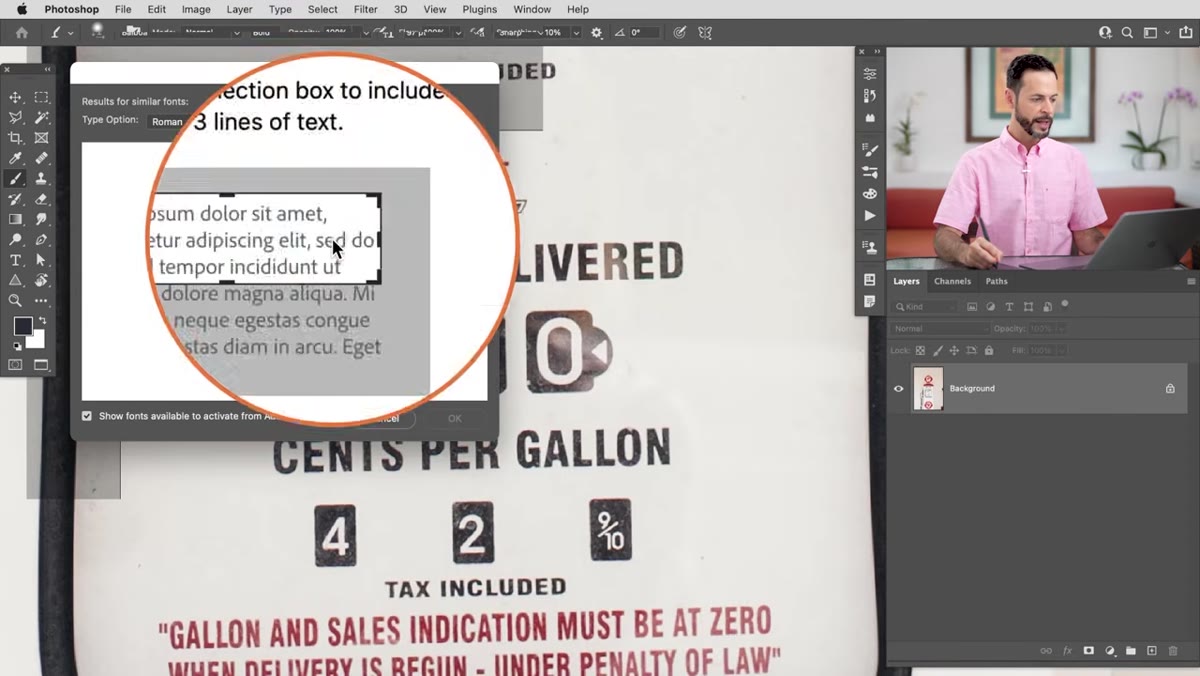 Type menu open with Match Font option visible
Navigate to the top menu bar and go to Type > Match Font. The moment you click it, Photoshop drops a selection box onto your canvas. Think of it like a crop tool but specifically for font detection. You’ll see the marching ants appear around a region of your image, and that region is what Photoshop is going to analyze.
Type menu open with Match Font option visible
Navigate to the top menu bar and go to Type > Match Font. The moment you click it, Photoshop drops a selection box onto your canvas. Think of it like a crop tool but specifically for font detection. You’ll see the marching ants appear around a region of your image, and that region is what Photoshop is going to analyze.
The selection might land somewhere random or cover your whole image by default. Don’t panic. You’re going to resize it manually in the next step.
Step 3: Resize the Selection Around Your Target Text
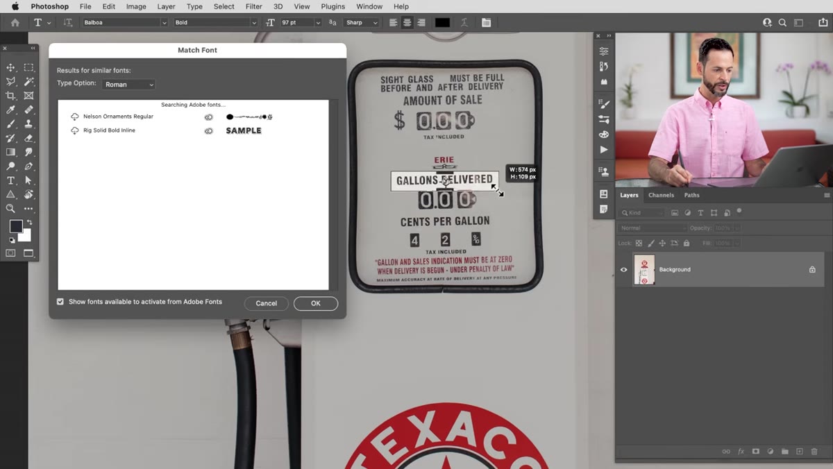 Selection box being resized tightly around a single line of text on the gas pump
Drag the handles of the selection box so it fits tightly around the text you want to match. Tighter is better here. You want to include one clean line of characters without pulling in any surrounding graphics, textures, or other type that might confuse the algorithm.
Selection box being resized tightly around a single line of text on the gas pump
Drag the handles of the selection box so it fits tightly around the text you want to match. Tighter is better here. You want to include one clean line of characters without pulling in any surrounding graphics, textures, or other type that might confuse the algorithm.
If your image has multiple different fonts, focus on one at a time. The more isolated your selection, the more confident Photoshop’s matching will be. Aaron zooms in before making his final adjustments to the box, which is a good habit, since precision matters more than speed at this stage.
Step 4: Review the Suggested Fonts
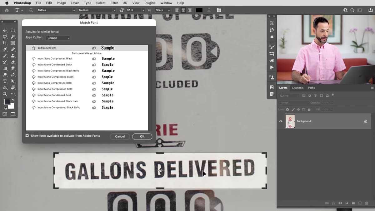 Match Font results panel showing a list of suggested font matches
Once your selection is dialed in, Photoshop generates a list of fonts it thinks are a match. The results are ranked, with the closest matches at the top. What’s genuinely useful here is that the list pulls from both fonts installed on your system AND fonts available through Adobe Fonts, which Creative Cloud subscribers can access directly.
Match Font results panel showing a list of suggested font matches
Once your selection is dialed in, Photoshop generates a list of fonts it thinks are a match. The results are ranked, with the closest matches at the top. What’s genuinely useful here is that the list pulls from both fonts installed on your system AND fonts available through Adobe Fonts, which Creative Cloud subscribers can access directly.
You’ll see a cloud icon next to any font that isn’t installed locally. Don’t skip past those. Some of the best matches might be Adobe Fonts that you just haven’t downloaded yet. Take a screenshot or jot down a few of the top suggestions before you start clicking, because the list disappears once you close the dialog. Aaron specifically calls out that tip and it’s a small thing that saves real time.
Step 5: Download the Fonts Directly from the Dialog
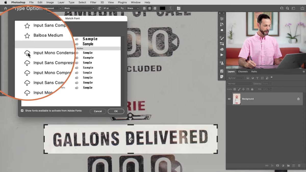 Cloud download icon being clicked next to a font in the Match Font results panel
Here’s where it gets satisfying. For any Adobe Font in the list, you can click the cloud/download icon right there inside the Match Font dialog. Photoshop adds it to your Creative Cloud library without you ever leaving the application. Download a few of the top suggestions, not just the top one. Fonts that look similar in a preview sometimes feel completely different once you’re actually setting type.
Cloud download icon being clicked next to a font in the Match Font results panel
Here’s where it gets satisfying. For any Adobe Font in the list, you can click the cloud/download icon right there inside the Match Font dialog. Photoshop adds it to your Creative Cloud library without you ever leaving the application. Download a few of the top suggestions, not just the top one. Fonts that look similar in a preview sometimes feel completely different once you’re actually setting type.
Aaron downloaded three options including Balboa Medium and Input Mono Compressed. Having a shortlist to compare against is smarter than committing to the first result and hoping for the best.
Step 6: Create a New Layer and Start Setting Type
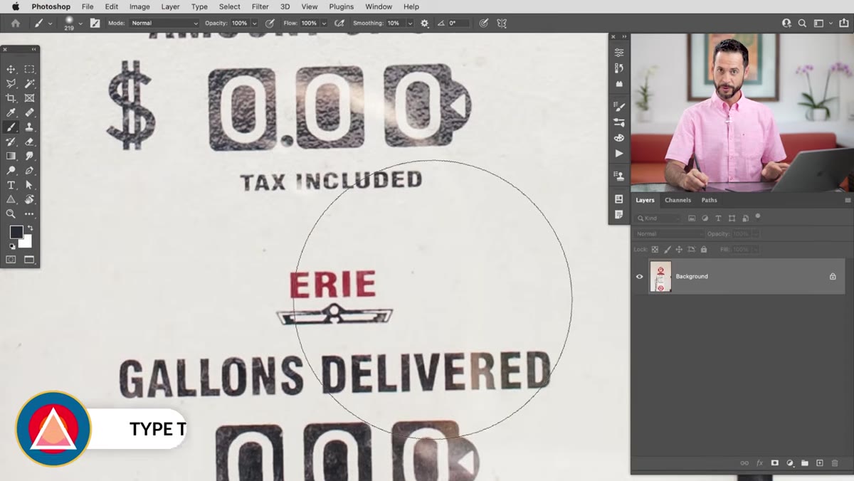 Type tool active, new text layer being created with the matched font already selected
Hit OK in the Match Font dialog. Then create a new layer, press T to grab the Type tool, and start typing. Here’s the part that still feels like a small magic trick to me: Photoshop automatically switches your active font to the one it matched. Open the Character panel (Window > Character) and you’ll see the matched font already loaded and ready. You didn’t have to go find it manually in the font dropdown.
Type tool active, new text layer being created with the matched font already selected
Hit OK in the Match Font dialog. Then create a new layer, press T to grab the Type tool, and start typing. Here’s the part that still feels like a small magic trick to me: Photoshop automatically switches your active font to the one it matched. Open the Character panel (Window > Character) and you’ll see the matched font already loaded and ready. You didn’t have to go find it manually in the font dropdown.
From here, work through the weight and style options. Bold, Medium, Black. These can shift the feel dramatically even within the same font family. Aaron compared a Bold version against a Black version of Balboa and the thickness difference was meaningful for how well it matched the original lettering.
Step 7: Compare and Refine
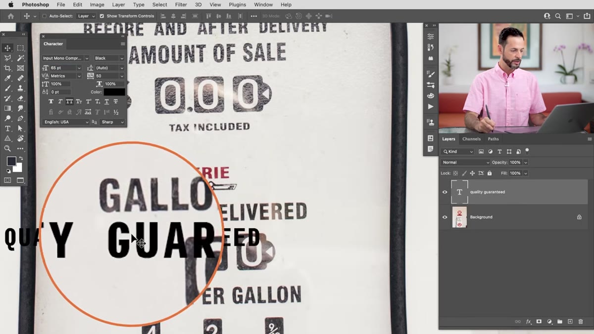 Two text layers side by side showing different font options against the original gas pump text
Duplicate your type layer (Ctrl/Cmd + J) and test the other fonts from your shortlist by simply switching the font name in the Character panel. Stack the versions so you can toggle visibility on and off and do a real side-by-side comparison. Look at specific letterforms rather than the overall impression. Find a character like G, O, or R that has distinctive features in the original, and use that as your benchmark.
Two text layers side by side showing different font options against the original gas pump text
Duplicate your type layer (Ctrl/Cmd + J) and test the other fonts from your shortlist by simply switching the font name in the Character panel. Stack the versions so you can toggle visibility on and off and do a real side-by-side comparison. Look at specific letterforms rather than the overall impression. Find a character like G, O, or R that has distinctive features in the original, and use that as your benchmark.
No algorithm gets it perfect every time. Match Font narrows the field from thousands of options down to a handful of realistic candidates. Your eye makes the final call.
One Thing I’d Add: Check the Tracking and Spacing Too
The font itself is only part of the match. Once you’ve got the right typeface and weight, spend a minute adjusting tracking (letter spacing) and maybe the vertical scale in the Character panel. Vintage and retro fonts especially tend to be set with tighter or wider spacing than the default. Getting the spacing wrong when everything else is right is like wearing the right outfit with the wrong shoes. Close, but noticeably off to anyone paying attention.
I’ve found that reducing tracking by somewhere between -10 and -30 units often brings a matched font closer to the feel of old print or signage text. It’s not a formula, just somewhere to start experimenting.
The single most important thing this technique does is get you off the guessing treadmill. Match Font doesn’t promise perfection, but it gets you close enough fast enough that you can spend your energy on the actual design instead of the font archaeology. That’s the trade worth making.
Watch the full tutorial on YouTube and see Aaron walk through the whole process with the gas pump image. It’s five minutes well spent.
Comments (1)
Just subscribed. If the rest of your content is this good, I'm in.
Leave a Comment