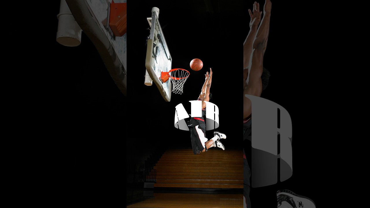
Every few months I stumble across a technique that makes me feel like I’ve been doing things the hard way for no reason. This was one of those moments. I was working on a poster comp where the client wanted text that felt like it was physically wrapped around the subject, that kind of old-school carnival or vintage sports graphic energy. My first instinct was to reach for something complicated. Maybe export to a 3D program, maybe mess around with displacement maps, maybe just charge the client more and hope they forgot about it.
Then I watched Aaron Nace’s one-minute tutorial over on PHLEARN and immediately felt both relieved and slightly embarrassed. The whole technique takes maybe ten minutes, uses tools that have been in Photoshop for years, and produces something that genuinely looks like the text is hugging the subject in three-dimensional space. No generative AI fill, no third-party plugins, no subscription to some tool that charges you per render. Just Photoshop doing what Photoshop does. Watch the full tutorial on YouTube if you want to see it in motion, but here’s the full breakdown so you can follow along without leaving this tab.
The core insight is deceptively simple: the illusion of 3D depth comes from splitting your text into two warped halves and sandwiching your subject between them. That’s it. The top half curves up, the bottom half curves down, and the subject sits in the middle like it belongs there. Once I understood the logic, I could see it everywhere, on album covers, on sports apparel graphics, on vintage movie posters. It’s one of those techniques that’s been hiding in plain sight.
Step 1: Type Your Text Using a Heavy Font
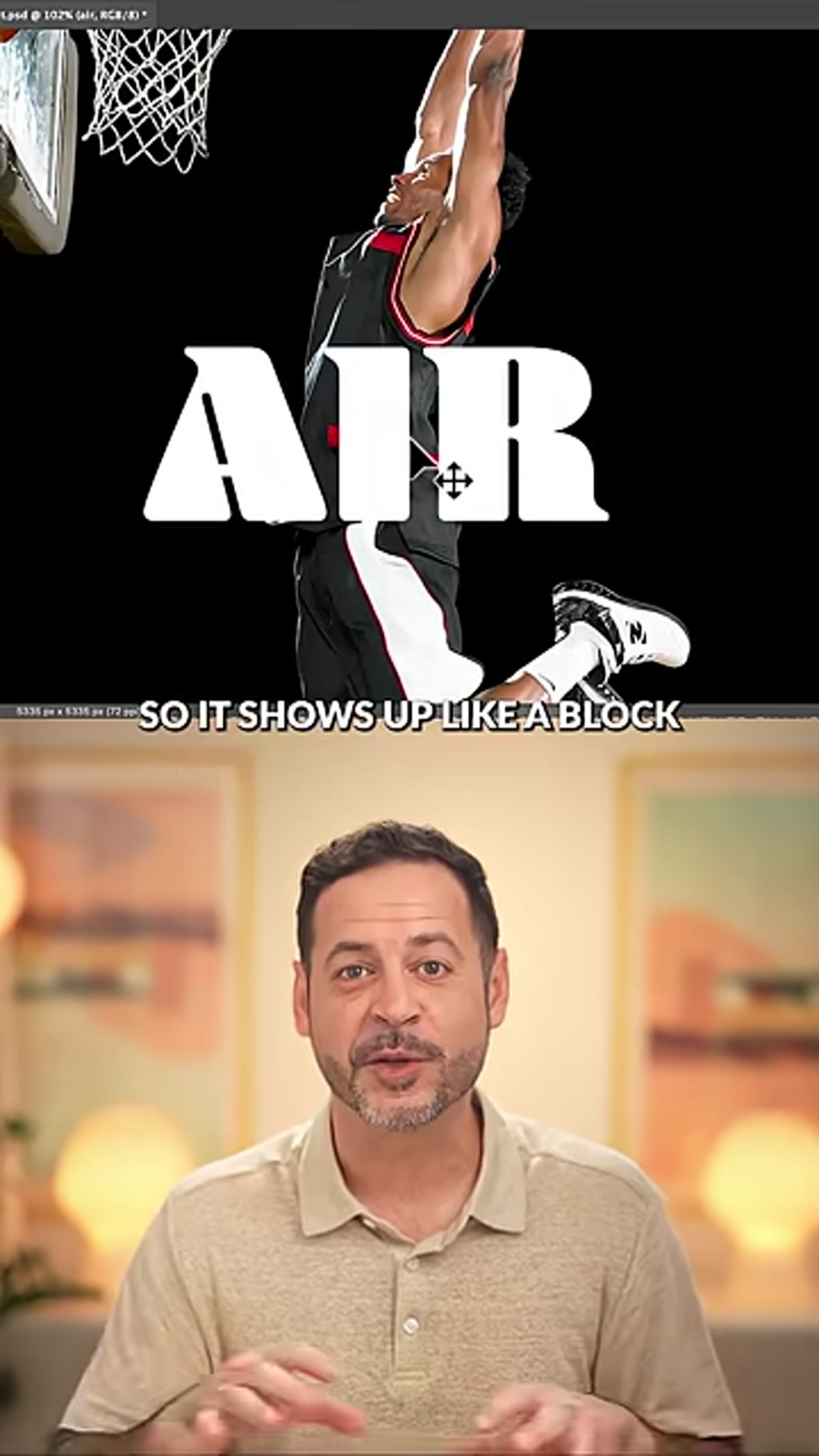 Bold block text typed out in Photoshop canvas
Start with a Type layer and pick a font with some real weight to it. A condensed bold or a slab serif works great here because the thick letterforms hold up once you apply the warp. Thin script fonts will just look wobbly and sad. Set your text big enough that it’ll span the width of your subject, you want it to feel like a banner wrapping around something, not a caption floating near it.
Bold block text typed out in Photoshop canvas
Start with a Type layer and pick a font with some real weight to it. A condensed bold or a slab serif works great here because the thick letterforms hold up once you apply the warp. Thin script fonts will just look wobbly and sad. Set your text big enough that it’ll span the width of your subject, you want it to feel like a banner wrapping around something, not a caption floating near it.
Position the text roughly centered over your subject. The exact placement matters less at this stage because you’ll be adjusting it after the warp is applied.
Step 2: Apply a Cylinder Warp to the Top Text Layer
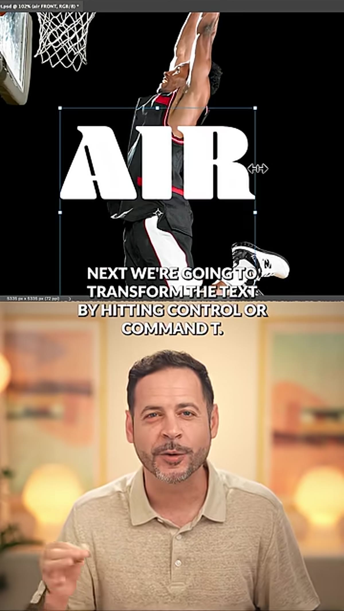 Transform warp options bar with cylinder selected
With your text layer selected, hit Control+T (Command+T on Mac) to enter Free Transform mode. Up in the options bar at the top of the screen, you’ll see a small warp icon that looks like a curved grid. Click that. In the warp dropdown that appears, select “Cylinder.” This is where the magic starts.
Transform warp options bar with cylinder selected
With your text layer selected, hit Control+T (Command+T on Mac) to enter Free Transform mode. Up in the options bar at the top of the screen, you’ll see a small warp icon that looks like a curved grid. Click that. In the warp dropdown that appears, select “Cylinder.” This is where the magic starts.
Once the cylinder warp is active, click and drag upward on the mesh to push the text into a curve that bows toward the top of the canvas. You’re simulating the top half of text wrapping around a cylindrical surface, like letters on the upper arc of a badge or emblem. Commit the transform when the curve looks natural. The exact amount of bend will depend on your subject, but a moderate curve tends to read more realistically than something extreme.
Step 3: Duplicate the Text Layer and Warp It Downward
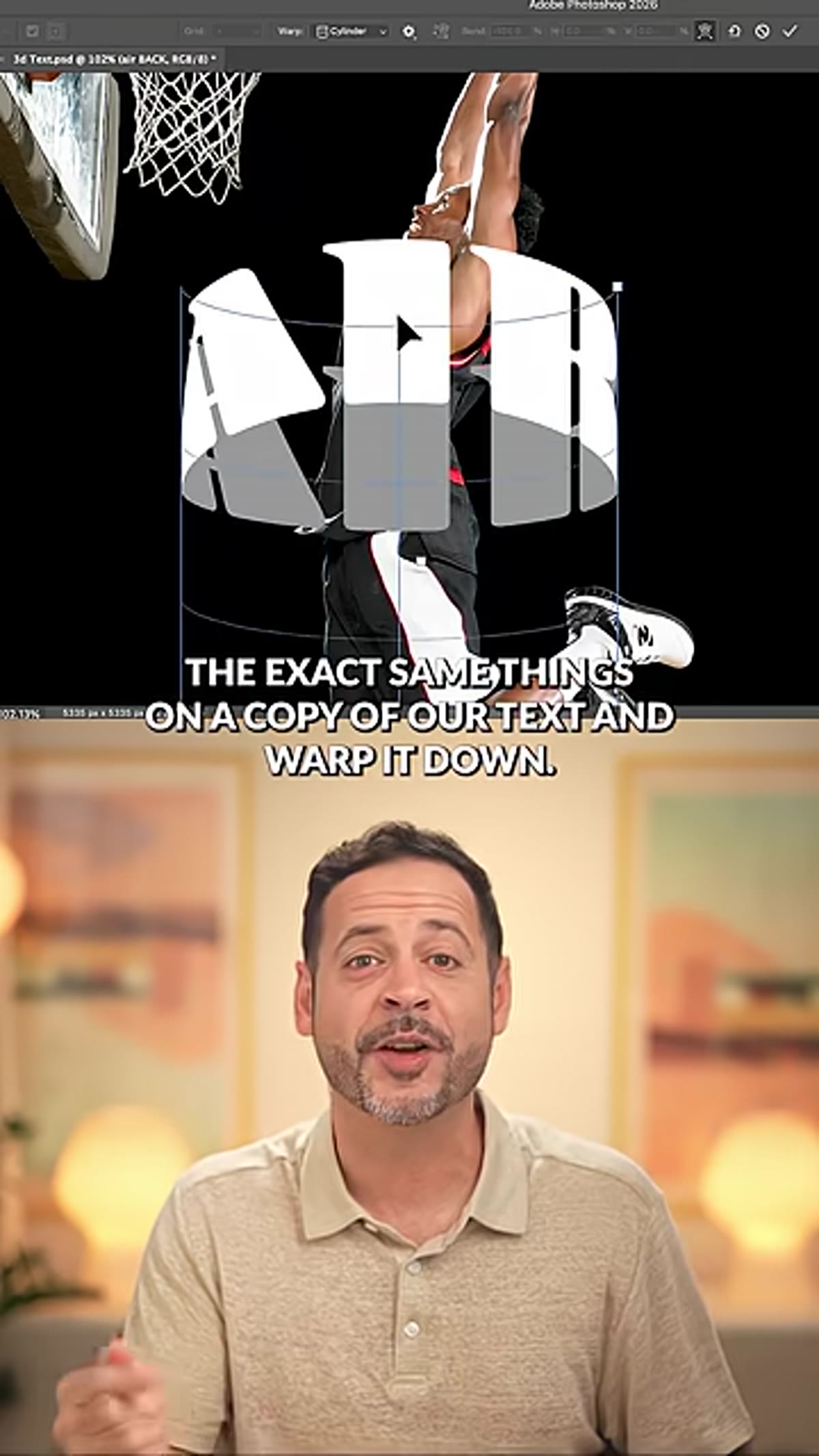 Second text layer warped downward below subject
Duplicate your warped text layer and then go back into Free Transform and the warp controls on the copy. This time, drag the cylinder warp downward so the text curves in the opposite direction, bowing toward the bottom of the canvas. This second layer represents the lower arc of your wrapped text.
Second text layer warped downward below subject
Duplicate your warped text layer and then go back into Free Transform and the warp controls on the copy. This time, drag the cylinder warp downward so the text curves in the opposite direction, bowing toward the bottom of the canvas. This second layer represents the lower arc of your wrapped text.
What you now have is two text layers that mirror each other’s curvature. Together, they create the top and bottom of what looks like text following the contour of a three-dimensional object. The visual trick is in the contrast between those two opposing curves.
Step 4: Select Your Subject and Duplicate It to a New Layer
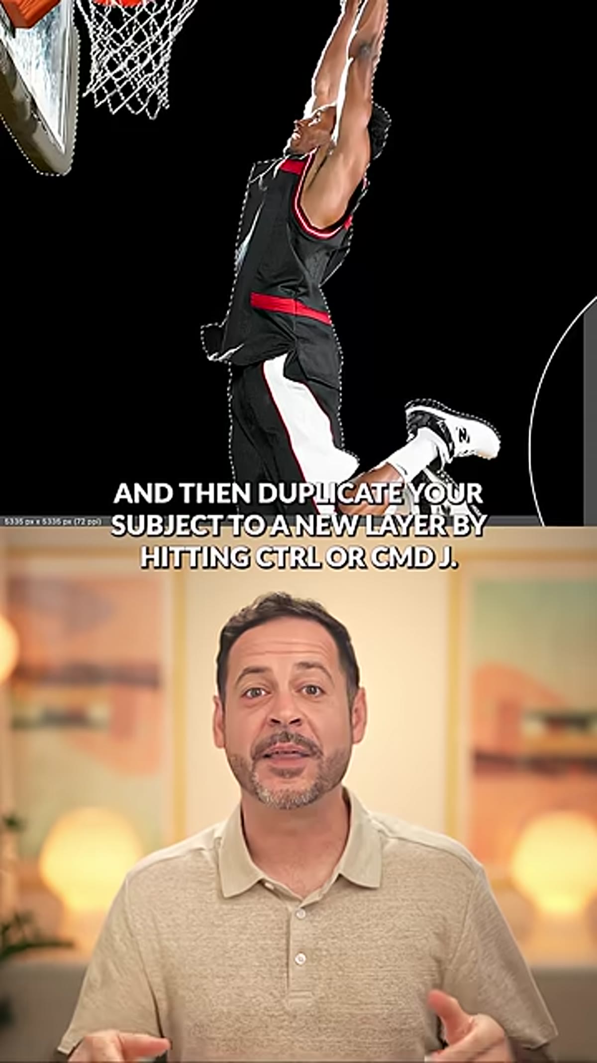 Select Subject active on background layer in Layers panel
Go to your background layer (your photo) and use Select Subject. In Photoshop 2024 and later, this works well enough on clean photos that you can often use it straight out of the box. If your edges need cleanup, refine them in Select and Mask. Once you’re happy with the selection, duplicate just the subject to a new layer with Control+J (Command+J).
Select Subject active on background layer in Layers panel
Go to your background layer (your photo) and use Select Subject. In Photoshop 2024 and later, this works well enough on clean photos that you can often use it straight out of the box. If your edges need cleanup, refine them in Select and Mask. Once you’re happy with the selection, duplicate just the subject to a new layer with Control+J (Command+J).
You should now have your original background layer, two warped text layers, and a clean cutout of your subject all sitting in the Layers panel.
Step 5: Sandwich the Subject Between the Two Text Layers
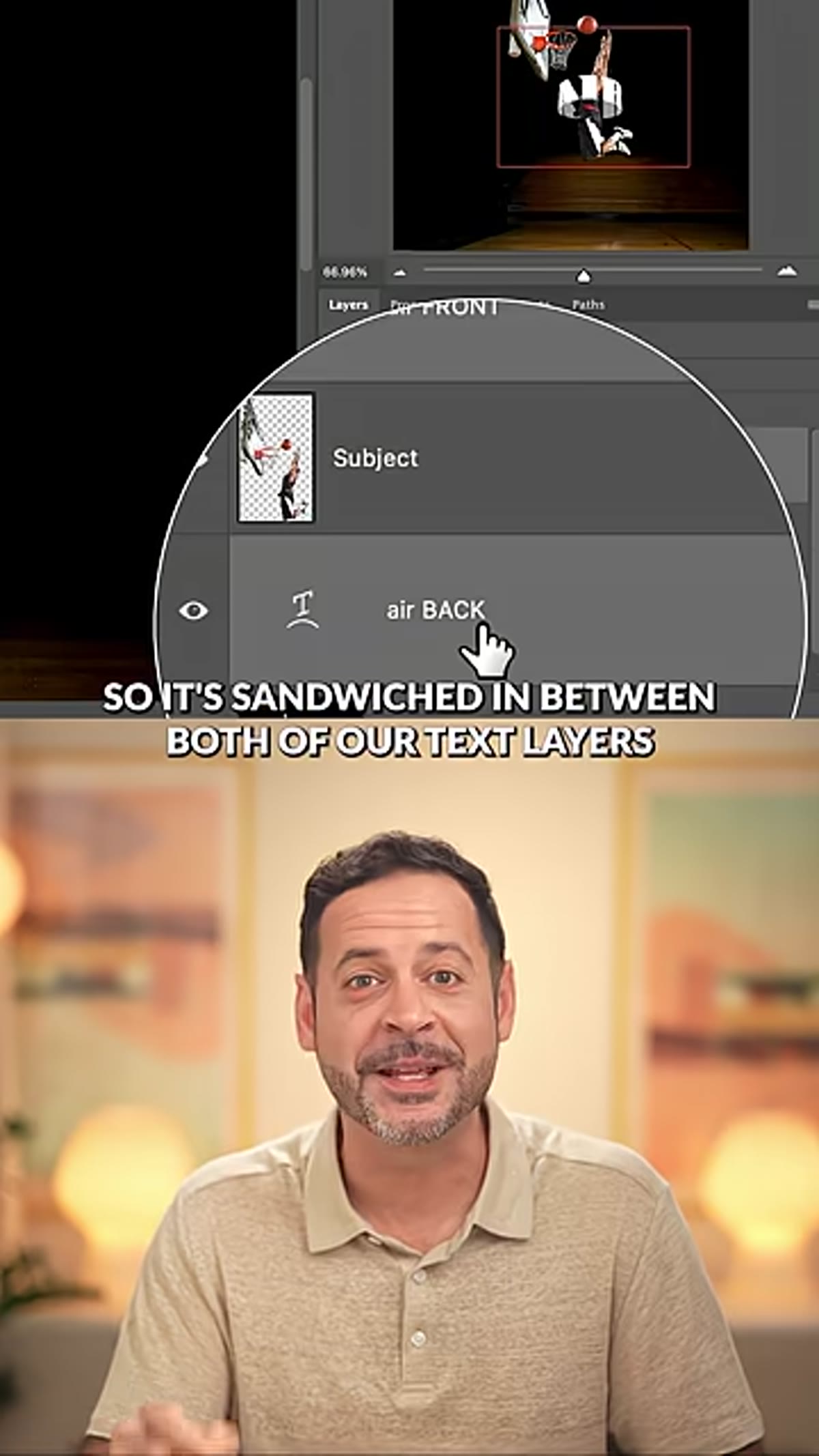 Subject layer positioned between top and bottom text layers
This is the step where the illusion clicks into place. In your Layers panel, drag the subject cutout so it sits between the two text layers. The top text layer should be above the subject, and the bottom text layer should be below it.
Subject layer positioned between top and bottom text layers
This is the step where the illusion clicks into place. In your Layers panel, drag the subject cutout so it sits between the two text layers. The top text layer should be above the subject, and the bottom text layer should be below it.
When you look at the canvas now, the upper text will appear to pass in front of the subject while the lower text tucks behind it. That overlap is what sells the 3D effect. The subject looks like it’s actually occupying space between two bands of text rather than sitting flat on top of them.
Step 6: Add a Shadow and Clip It to the Text
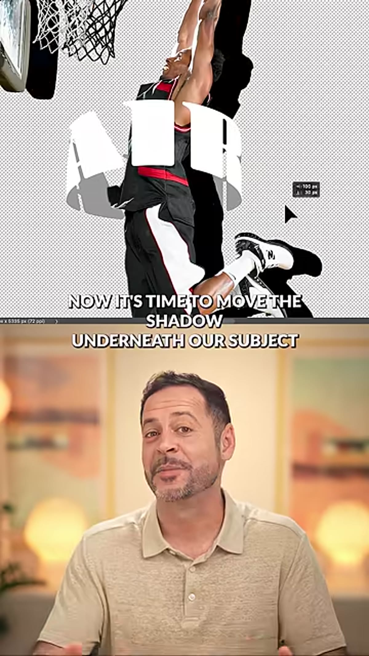 Black filled shadow layer clipped to text below subject
To push the realism further, you need a shadow that shows the subject is blocking light from the text below it. Go back to your subject selection, create a new empty layer just above the lower text layer, and fill the selection with solid black. This gives you a shadow shape in the exact silhouette of your subject.
Black filled shadow layer clipped to text below subject
To push the realism further, you need a shadow that shows the subject is blocking light from the text below it. Go back to your subject selection, create a new empty layer just above the lower text layer, and fill the selection with solid black. This gives you a shadow shape in the exact silhouette of your subject.
Now clip this shadow layer to the text layer beneath it by holding Alt (Option on Mac) and clicking between the two layers in the panel. Clipping the shadow means it only shows up where the text exists, not across the whole canvas. Apply a Gaussian blur to soften it, somewhere between 5 and 15 pixels depending on your image scale, and drop the opacity until it feels like a natural cast shadow rather than a solid black shape. Nudge the shadow layer slightly downward so it offsets from the subject just enough to imply depth.
What I’d Do Differently After Playing With This
The technique as described is genuinely solid out of the box, but I’ve found it sings even more when you also add a subtle shadow from the upper text casting down onto the subject. You can repeat the same clipping shadow method, this time clipping to the subject layer itself, to imply that the top band of text is also casting a slight shadow onto whatever it’s wrapping around. It takes an extra two minutes and bumps the realism up a noticeable amount, especially if you’re working with dramatic lighting in the original photo.
I’ve also started converting both text layers to Smart Objects before applying the warp. That way the warp is non-destructive and I can go back and change the font, the wording, or the bend amount without starting over. I learned to love Smart Objects the hard way after a certain incident involving a client project and my complete failure to account for a last-minute font change. Do yourself the favor.
The single most useful thing this technique taught me is that 3D depth in a 2D composition is mostly about layering and occlusion. You don’t need actual three-dimensional geometry. You just need something in front and something behind, and a shadow to connect them. Aaron Nace packs a genuinely complete workflow into under 90 seconds here, and the full-length version goes even deeper into the specifics. Watch the full tutorial on YouTube and then go wrap some text around something.
Comments
Leave a Comment