There’s a specific kind of client request that used to make me quietly panic: “Can you make the logo look like it’s actually on the wall? Like painted there, not just slapped on top?” Sure, no problem. And then I’d spend an hour fiddling with blend modes, drop shadows, and layer opacity, and it would still look exactly like a logo slapped on top of a photo. Flat. Fake. Wrong. The displacement map technique I picked up from this CreativeLive tutorial is the thing that finally cracked that problem for me. Watch the full tutorial on YouTube
The Displace filter has been in Photoshop forever, but it’s one of those tools I avoided for years because it felt like a gamble. You type a number into a box, you hope for the best, and if it’s wrong you undo and start over. That cycle gets old fast. The real unlock here is combining Displace with Smart Filters, which turns the whole thing into something you can actually iterate on without wanting to throw your laptop across the coffee shop. Here’s exactly how to pull it off.
Step 1: Set Up Your Main Document
 Smart Filters panel with background layer visible in Photoshop
Start with the photo you want to add text or a logo to. Before you do anything else, convert your background layer to a Smart Object. Right-click the layer in the Layers panel and choose “Convert to Smart Object.” This single step is what makes the whole workflow non-destructive. Any filter you apply later will be editable, meaning you can go back and change the displacement values without redoing everything from scratch.
Smart Filters panel with background layer visible in Photoshop
Start with the photo you want to add text or a logo to. Before you do anything else, convert your background layer to a Smart Object. Right-click the layer in the Layers panel and choose “Convert to Smart Object.” This single step is what makes the whole workflow non-destructive. Any filter you apply later will be editable, meaning you can go back and change the displacement values without redoing everything from scratch.
Step 2: Duplicate the Background as a New PSD for Your Displacement Map
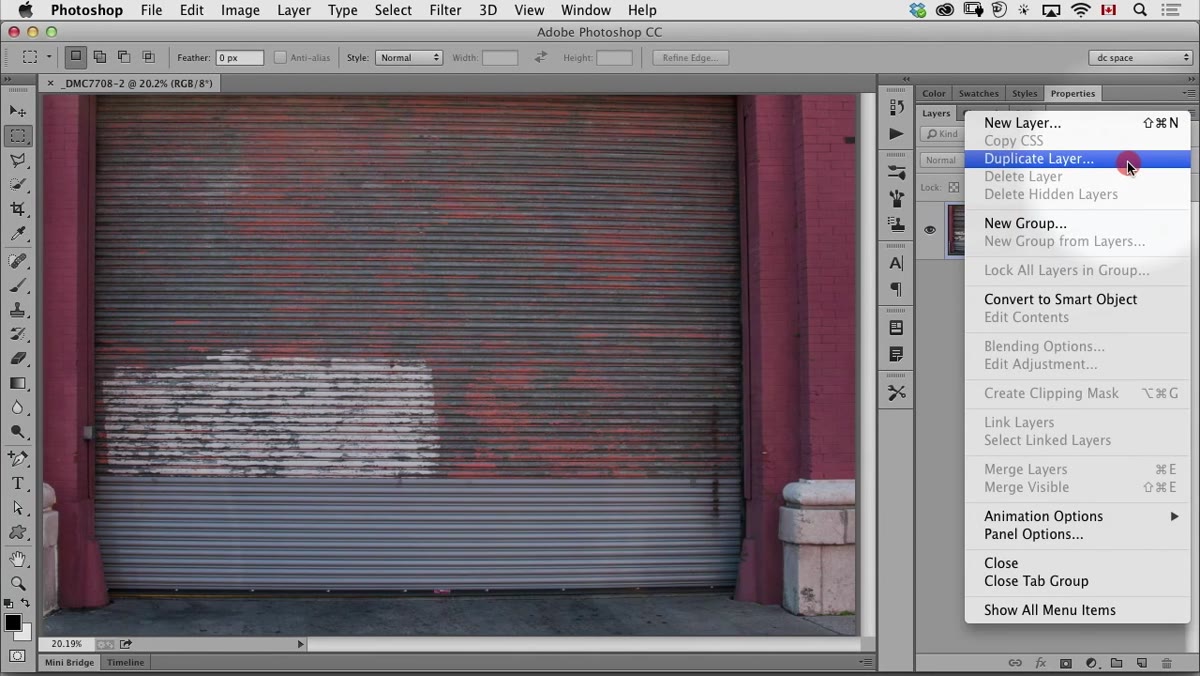 Duplicate layer dialog box with “New Document” option selected
Here’s the step most tutorials skip over or explain badly. The Displace filter doesn’t just warp your image randomly. It reads a separate file called a displacement map and uses the light and dark values in that file to decide how to bend your overlay. So you need to create that map file first. Duplicate your background layer into a brand new document: go to Layer > Duplicate Layer, and in the Destination dropdown, choose “New.” Click OK, and a copy of your photo opens as a fresh document. This file needs to be saved as a PSD, and it needs to be the same pixel dimensions as your working document. That’s non-negotiable for Displace to work correctly.
Duplicate layer dialog box with “New Document” option selected
Here’s the step most tutorials skip over or explain badly. The Displace filter doesn’t just warp your image randomly. It reads a separate file called a displacement map and uses the light and dark values in that file to decide how to bend your overlay. So you need to create that map file first. Duplicate your background layer into a brand new document: go to Layer > Duplicate Layer, and in the Destination dropdown, choose “New.” Click OK, and a copy of your photo opens as a fresh document. This file needs to be saved as a PSD, and it needs to be the same pixel dimensions as your working document. That’s non-negotiable for Displace to work correctly.
Step 3: Apply De-Speckle to Soften the Displacement Map
 Filter menu open with De-Speckle option highlighted
If your background photo has heavy texture, like a rough brick wall or heavily weathered paint, the displacement map can become so noisy that any text you overlay ends up looking chaotic rather than naturally embedded. To dial this back, go to Filter > Noise > De-Speckle. This filter has no settings dialog, it just runs. What it does is smooth out fine surface detail while keeping the broader contours and edges intact. Think of it as keeping the shape of the wall without every little chip and crack fighting against your lettering.
Filter menu open with De-Speckle option highlighted
If your background photo has heavy texture, like a rough brick wall or heavily weathered paint, the displacement map can become so noisy that any text you overlay ends up looking chaotic rather than naturally embedded. To dial this back, go to Filter > Noise > De-Speckle. This filter has no settings dialog, it just runs. What it does is smooth out fine surface detail while keeping the broader contours and edges intact. Think of it as keeping the shape of the wall without every little chip and crack fighting against your lettering.
Run it twice. There’s a keyboard shortcut that makes this painless: Cmd+F (or Ctrl+F on Windows) repeats the last filter you used. Two passes of De-Speckle usually hits the sweet spot between smoothed and over-blurred. You still want the wall to feel like a wall.
Step 4: Save the Displacement Map File as a PSD
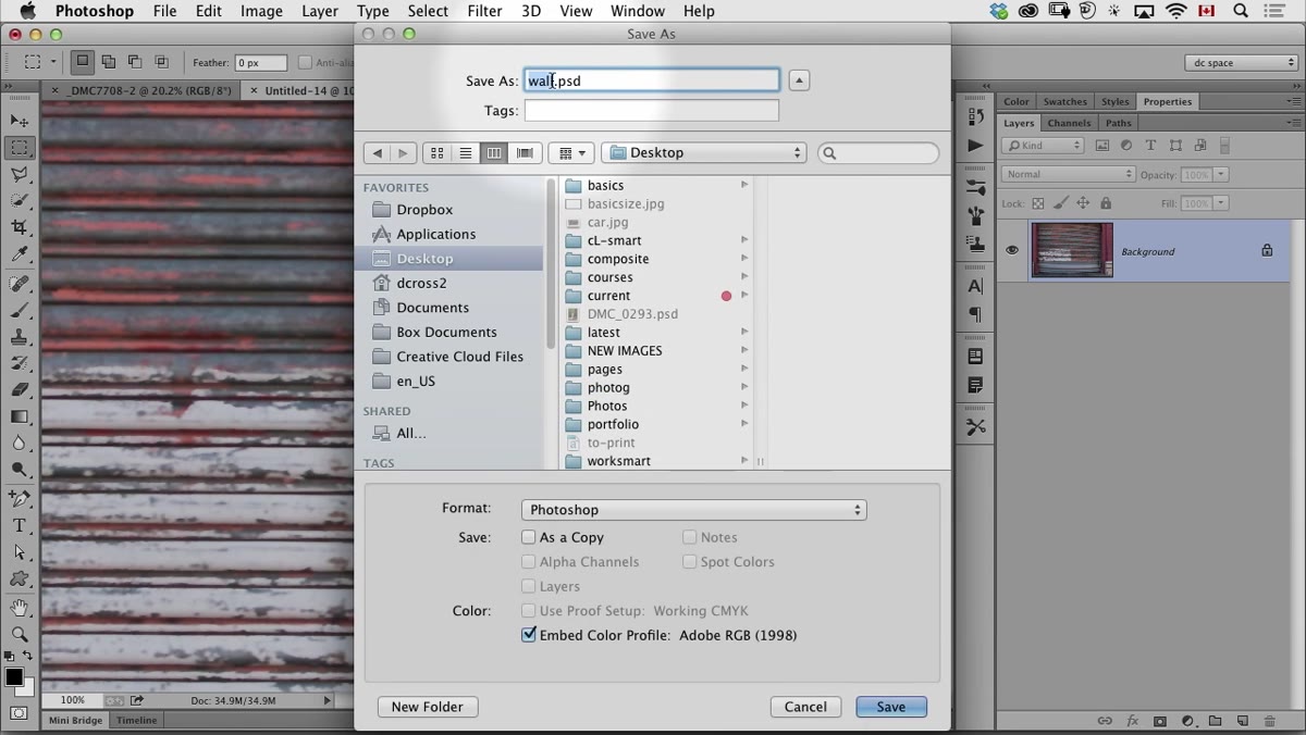 Save As dialog with PSD format selected and “map” in filename
Save this duplicate document as a PSD. Not a JPEG, not a PNG. It has to be a PSD or the Displace filter won’t accept it. Name it something that makes it obvious what it is. Adding the word “map” somewhere in the filename is a practical habit so you don’t accidentally grab the wrong file when Photoshop asks you to locate it later. Once it’s saved, you’re done with this document. It has served its purpose. Close it and go back to your main working file.
Save As dialog with PSD format selected and “map” in filename
Save this duplicate document as a PSD. Not a JPEG, not a PNG. It has to be a PSD or the Displace filter won’t accept it. Name it something that makes it obvious what it is. Adding the word “map” somewhere in the filename is a practical habit so you don’t accidentally grab the wrong file when Photoshop asks you to locate it later. Once it’s saved, you’re done with this document. It has served its purpose. Close it and go back to your main working file.
Step 5: Add Your Text or Graphic
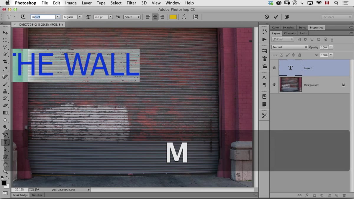
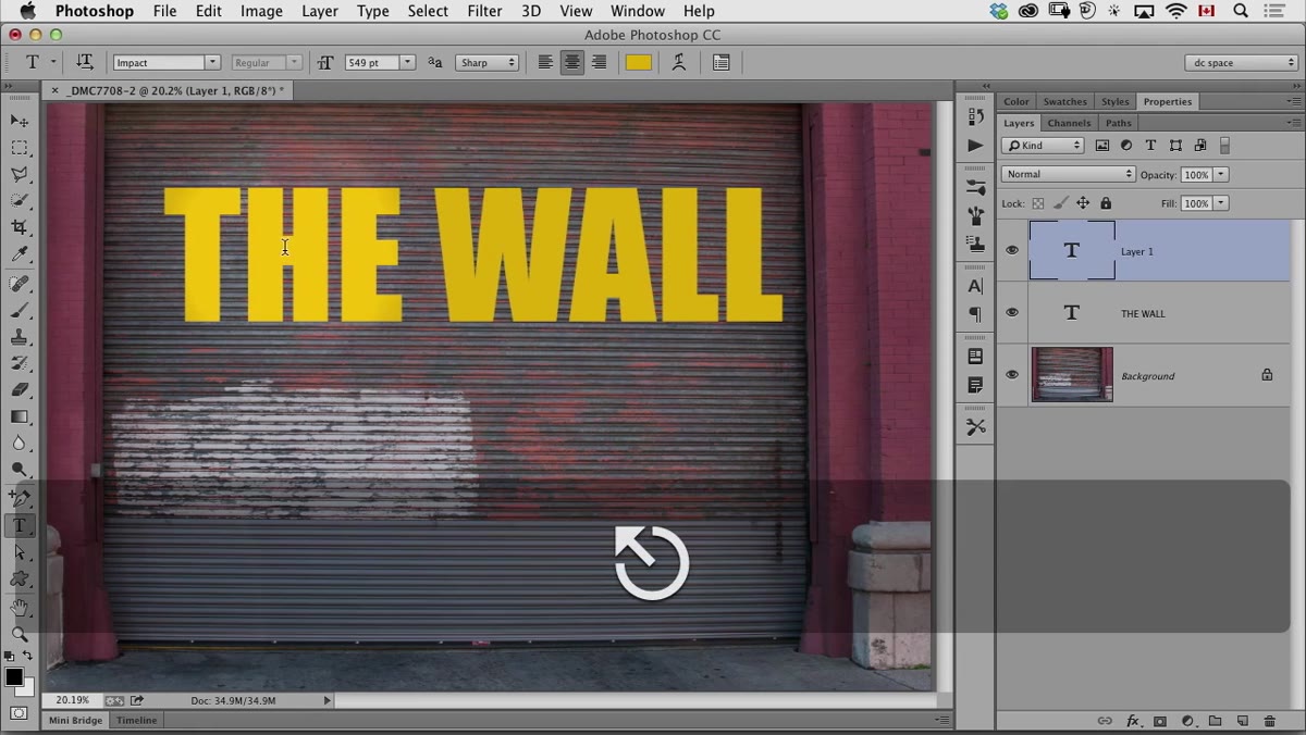
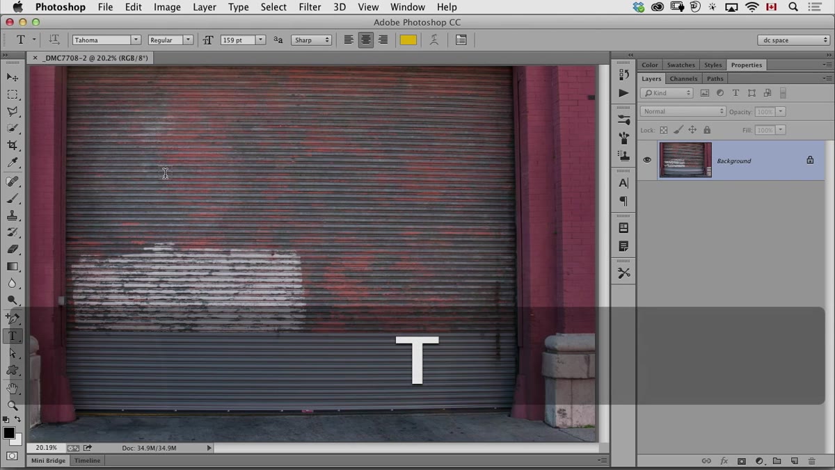 Large bold text typed over photo in Photoshop canvas
Grab the Type tool and add your text. Choose a bold, chunky font if you want the effect to read clearly. The bigger and heavier the letterforms, the more the displacement will visibly bend and conform to the surface beneath. Size it up so it covers a meaningful portion of the photo. The goal here is to make this look like paint that’s been on the wall long enough to settle into the texture, so oversized and imperfect is actually better than neat and small.
Large bold text typed over photo in Photoshop canvas
Grab the Type tool and add your text. Choose a bold, chunky font if you want the effect to read clearly. The bigger and heavier the letterforms, the more the displacement will visibly bend and conform to the surface beneath. Size it up so it covers a meaningful portion of the photo. The goal here is to make this look like paint that’s been on the wall long enough to settle into the texture, so oversized and imperfect is actually better than neat and small.
Once your text looks right, rasterize it and convert it to a Smart Object too. This keeps the Displace filter editable on the text layer, which matters when you inevitably want to tweak the values after you see the first result.
Step 6: Apply the Displace Filter Using Your Map
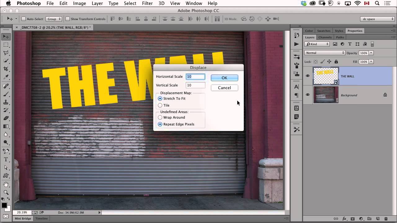
 Displace filter dialog with horizontal and vertical scale values shown
With your text layer selected, go to Filter > Distort > Displace. A dialog box appears asking for horizontal and vertical scale values. These control how dramatically the text bends to follow the surface. Start conservative, something in the range of 5 to 15 for both values, especially for the first attempt. Because you’re using a Smart Filter, getting the number wrong isn’t a disaster. You can double-click the filter in the Layers panel and adjust it instantly.
Displace filter dialog with horizontal and vertical scale values shown
With your text layer selected, go to Filter > Distort > Displace. A dialog box appears asking for horizontal and vertical scale values. These control how dramatically the text bends to follow the surface. Start conservative, something in the range of 5 to 15 for both values, especially for the first attempt. Because you’re using a Smart Filter, getting the number wrong isn’t a disaster. You can double-click the filter in the Layers panel and adjust it instantly.
After you click OK, Photoshop immediately asks you to locate a file to use as the displacement map. Navigate to the PSD you saved in Step 4 and select it. Photoshop reads the light and dark tones in that file and uses them to push the text pixels around, making the lettering appear to wrap and flex with the actual contours of the surface.
Step 7: Blend the Text into the Photo
 Layers panel showing text layer with blend mode dropdown open
The displacement alone makes the text follow the surface geometry, but it won’t look painted yet. Set the text layer’s blend mode to something that lets the underlying texture show through. Multiply is the classic choice for this. It drops out the lighter areas of your text layer and lets the photo’s grain, shadow, and color variation read through the letterforms. Depending on your image, Overlay or Soft Light might give you a different character, more of a faded or aged look. Drop the layer opacity to somewhere between 70% and 90% so it reads as something that’s been weathered rather than freshly sprayed.
Layers panel showing text layer with blend mode dropdown open
The displacement alone makes the text follow the surface geometry, but it won’t look painted yet. Set the text layer’s blend mode to something that lets the underlying texture show through. Multiply is the classic choice for this. It drops out the lighter areas of your text layer and lets the photo’s grain, shadow, and color variation read through the letterforms. Depending on your image, Overlay or Soft Light might give you a different character, more of a faded or aged look. Drop the layer opacity to somewhere between 70% and 90% so it reads as something that’s been weathered rather than freshly sprayed.
One Thing I’d Add: Test With a Blurrier Map Before Committing
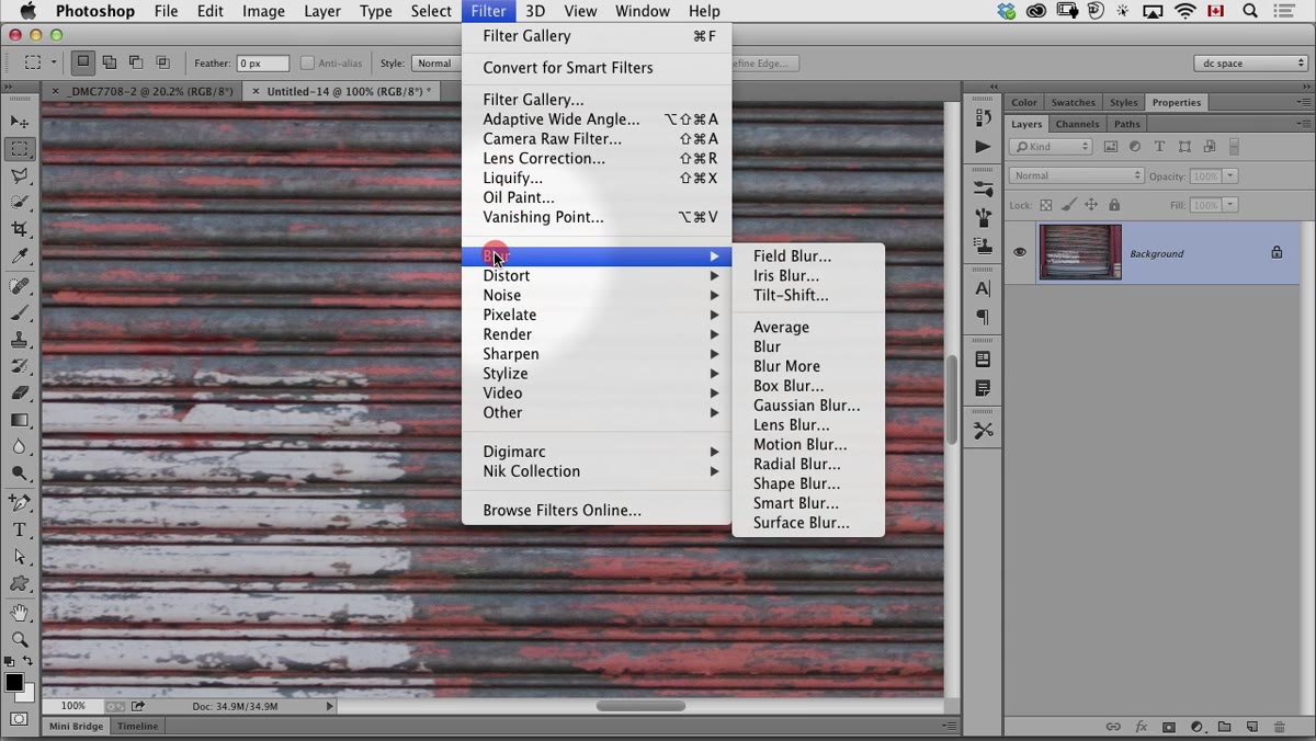
The De-Speckle approach works well for moderately textured surfaces. But if you’re working with something really gnarly, like peeling paint or heavily embossed concrete, I’ve found it worth making two versions of the displacement map at different blur levels and seeing which one produces cleaner results. You can apply a Gaussian Blur directly to the map document (Go to Filter > Blur > Gaussian Blur, try a radius of 2 to 5 pixels) before saving it. Swap in the alternate map file by double-clicking the Displace smart filter, re-run it, and point it to the blurrier version. The contrast with what you had before makes it obvious which one actually serves the image.
The single most important thing this technique taught me is that Smart Filters aren’t just a safety net. They’re what make experimental filters like Displace actually usable in a real production context. Committing to a number you can’t change later is the reason most people give up on tools like this. Make it editable and the whole calculation changes.
Watch the full tutorial on YouTube to see the CreativeLive instructor walk through the full process with a live example.
Comments (1)
Simple but effective. Sometimes that's all you need.
Leave a Comment