Why Your Photoshop Text Effects Look Cheap (And the Layer Stack That Fixes Them)

Why Your Photoshop Text Effects Look Cheap (And the Layer Stack That Fixes Them)

A client sent me a logo file once asking me to “make the text pop a little more.” The text was white. On a white background. I took a long sip of my coffee, charged a rush fee, and got to work. But the real problem wasn’t the contrast. It was that whoever built the file had used a single flat layer with zero depth. No shadow, no highlight, no texture interaction.

Cutting Out Cowboys and Making Composites Actually Look Real in Photoshop

Cutting Out Cowboys and Making Composites Actually Look Real in Photoshop

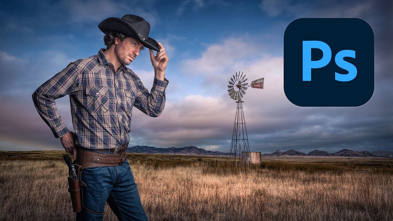
There’s a specific kind of embarrassment reserved for the moment a friend watches you work in Photoshop and says, “wait, why are you doing it that way?” I know this feeling intimately. I once spent three days on a composite, obsessing over edge detail and color matching, only to have someone show me a cleaner approach in about twenty minutes. The culprit both times: I was rushing the foundational stuff. Bad selection, no smart objects, baked-in adjustments I couldn’t undo.

Stop Blowing Out Your Skies: How to Blend Exposures in Photoshop Like a Landscape Pro

Stop Blowing Out Your Skies: How to Blend Exposures in Photoshop Like a Landscape Pro

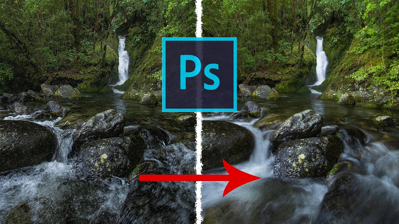
There’s a specific kind of frustration that comes with shooting a waterfall. You either get the water looking like liquid silk with a slow shutter speed, and your rocks and leaves turn into a motion-blurred mess, or you freeze everything sharp and the water looks like it’s made of plastic. For the longest time I thought the only fix was “get better at picking one.” Turns out the real fix is about five minutes of Photoshop work, and I’d been ignoring it because “exposure blending” sounded more complicated than it is.

How to Add Cinematic Light Blur Effects to Portraits Without Destroying Your Original Image

How to Add Cinematic Light Blur Effects to Portraits Without Destroying Your Original Image

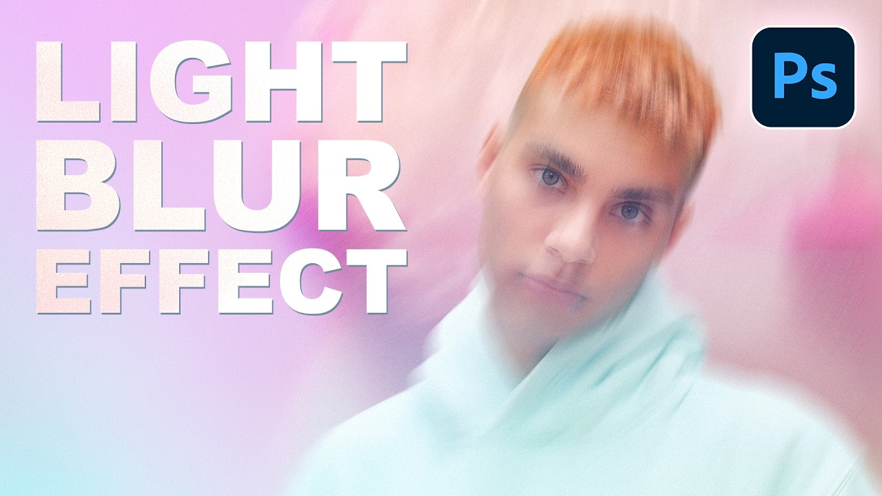
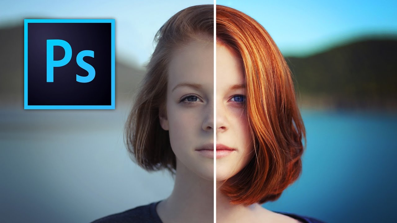
There’s a specific kind of composite that shows up constantly in editorial photography, album covers, and high-end portrait work. The subject is sharp, the background is this gorgeous smear of color and light, and the whole thing feels cinematic without trying too hard. For a long time I was faking that look with Gaussian Blur and hoping nobody noticed. It always looked a little flat, a little lazy. Then I watched this PHLEARN tutorial and realized I’d been ignoring one of Photoshop’s most underrated tools.

Stop Making Your Text Look Like a Bad 90s Website: A Practical Guide to Text Effects in Photoshop

Stop Making Your Text Look Like a Bad 90s Website: A Practical Guide to Text Effects in Photoshop

Stop Making Your Text Look Like a Bad 90s Website: A Practical Guide to Text Effects in Photoshop Look, I’m going to be honest with you. Most text effects in Photoshop are terrible. That glowing neon sign effect? Terrible. The rainbow gradient with drop shadow? Also terrible. But before you close this tab thinking I’m about to tell you to never use effects, hear me out—there are actually some legitimately useful text effects that can elevate your work instead of making it look like it belongs in a time capsule.

Text Effects in Photoshop That Don't Look Like a Geocities Website

Text Effects in Photoshop That Don't Look Like a Geocities Website

Text Effects in Photoshop That Don’t Look Like a Geocities Website Look, I get it. Text effects are fun. A little drop shadow here, some beveling there, maybe throw a lens flare on top because why not? Before you know it, your design looks like it should be accompanied by MIDI music and animated GIFs of dancing babies. But here’s the thing: text effects can actually be useful when you’re not treating Photoshop like a effect slot machine.

Stop Compromising on Sunrise Shots: My Go-To HDR Technique for Impossible Lighting

Stop Compromising on Sunrise Shots: My Go-To HDR Technique for Impossible Lighting

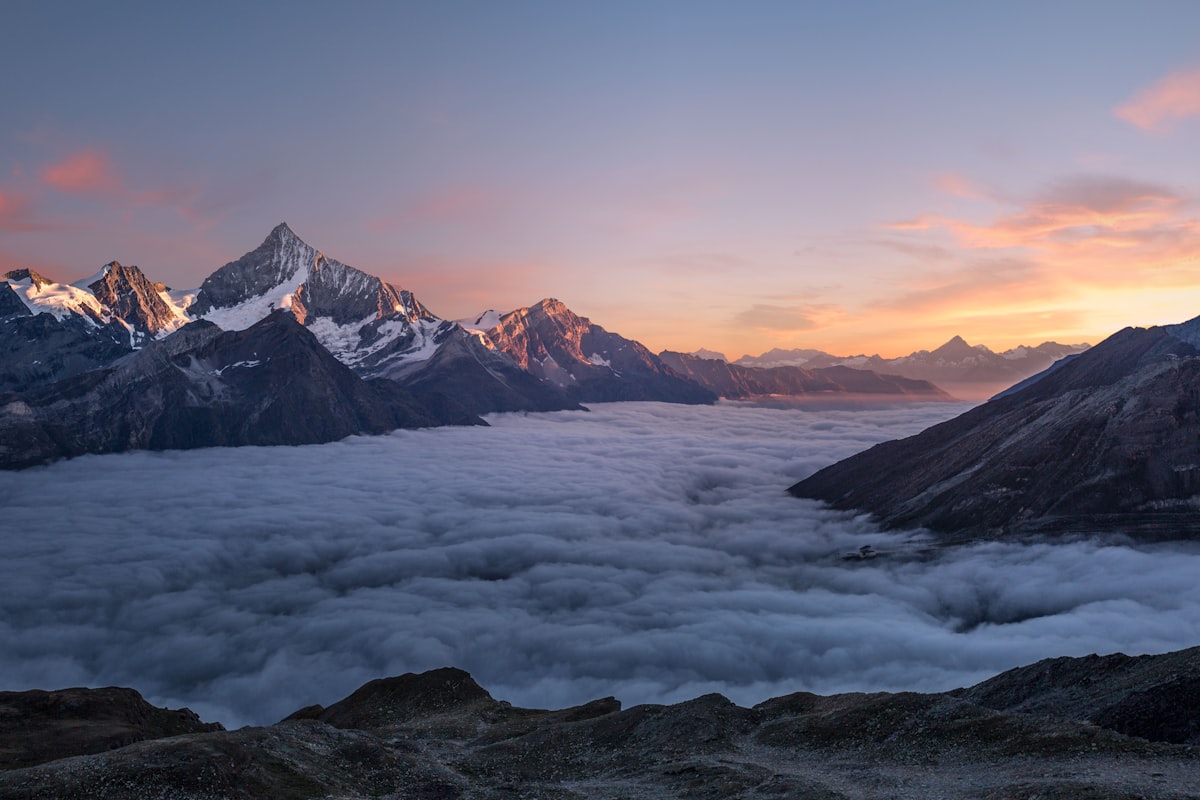
The Problem Nobody Talks About Here’s the dirty truth: your camera’s sensor, no matter how fancy or expensive, will choke on a dramatic sunrise over the ocean. That gorgeous golden light hitting the water while the sky transitions from deep purple to pink? Yeah, your camera sees that and essentially throws up its hands in defeat. You’ve got three lousy options: accept crushed black shadows that look like voids, blow out the sky into a blown-out white mess, or slap a graduated ND filter on your lens and hope for the best.

Stop Boring Photos: The Ultimate Guide to Making Colors Pop in Photoshop

Stop Boring Photos: The Ultimate Guide to Making Colors Pop in Photoshop

There’s a specific kind of client photo that fills me with quiet dread. You know the one. Shot on a decent camera, decent light, decent composition, but the colors look like they were run through a beige filter. Nothing is technically wrong with it, but nothing pops either. It just sits there, looking fine. Fine doesn’t close clients. Fine doesn’t get shared. Fine is the enemy. I’ve spent more time than I’d like to admit trying to fix these kinds of photos with increasingly complicated methods, stacking adjustment layers like I’m building a sandwich, wondering why the result still looks flat.

Blend Modes Demystified: Stop Guessing and Start Blending Like a Pro

Blend Modes Demystified: Stop Guessing and Start Blending Like a Pro

Blend Modes Demystified: Stop Guessing and Start Blending Like a Pro Let me be honest: I spent three years clicking through blend modes like a slot machine, hoping something would look cool. Then I actually learned what they do, and my work improved dramatically. So here’s what I wish someone had told me straight up. Why You Should Care About Blend Modes Blend modes determine how a layer interacts with the layers below it.