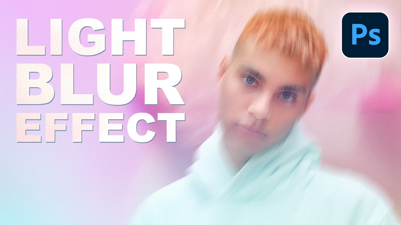
There’s a specific kind of composite that shows up constantly in editorial photography, album covers, and high-end portrait work. The subject is sharp, the background is this gorgeous smear of color and light, and the whole thing feels cinematic without trying too hard. For a long time I was faking that look with Gaussian Blur and hoping nobody noticed. It always looked a little flat, a little lazy. Then I watched this PHLEARN tutorial and realized I’d been ignoring one of Photoshop’s most underrated tools. Watch the full tutorial on YouTube
The technique is built around Path Blur, which lives inside the Blur Gallery. I’d opened that menu before, used Iris Blur once or twice for a tilt-shift joke, and then closed it. Path Blur just sat there, completely ignored. What the PHLEARN tutorial makes clear is that Path Blur doesn’t just soften a background. It gives you directional, streak-style blur that you can bend and curve, which is what actually creates that feeling of light moving through a frame. Gaussian Blur cannot do that.
The other thing this workflow gets right is the Smart Object setup. I learned the value of Smart Objects the uncomfortable way, back when I flattened a client’s composite and then they asked for changes. Not a great afternoon. Working non-destructively here means you can go back and tweak the blur path, the speed, all of it, without starting over. Worth building that habit every time.
Step 1: Cut Out Your Subject
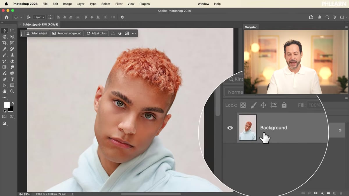 Clicking Remove Background on the subject layer
Start by isolating your subject from whatever background it came in on. In Photoshop, select your background layer in the Layers panel and click the “Remove Background” button, which you’ll find in the Properties panel when a regular pixel layer is selected. Photoshop’s AI-powered selection does the heavy lifting here and honestly it’s gotten very good. This works whether your subject is on white, a busy street scene, or anything else. You’ll end up with a layer mask attached to your subject layer.
Clicking Remove Background on the subject layer
Start by isolating your subject from whatever background it came in on. In Photoshop, select your background layer in the Layers panel and click the “Remove Background” button, which you’ll find in the Properties panel when a regular pixel layer is selected. Photoshop’s AI-powered selection does the heavy lifting here and honestly it’s gotten very good. This works whether your subject is on white, a busy street scene, or anything else. You’ll end up with a layer mask attached to your subject layer.
Step 2: Place Your New Background Image
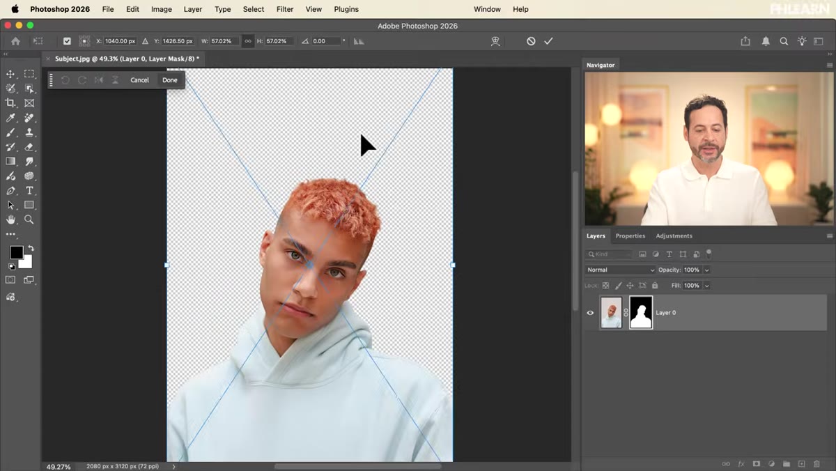 Dragging the flower image below the subject layer
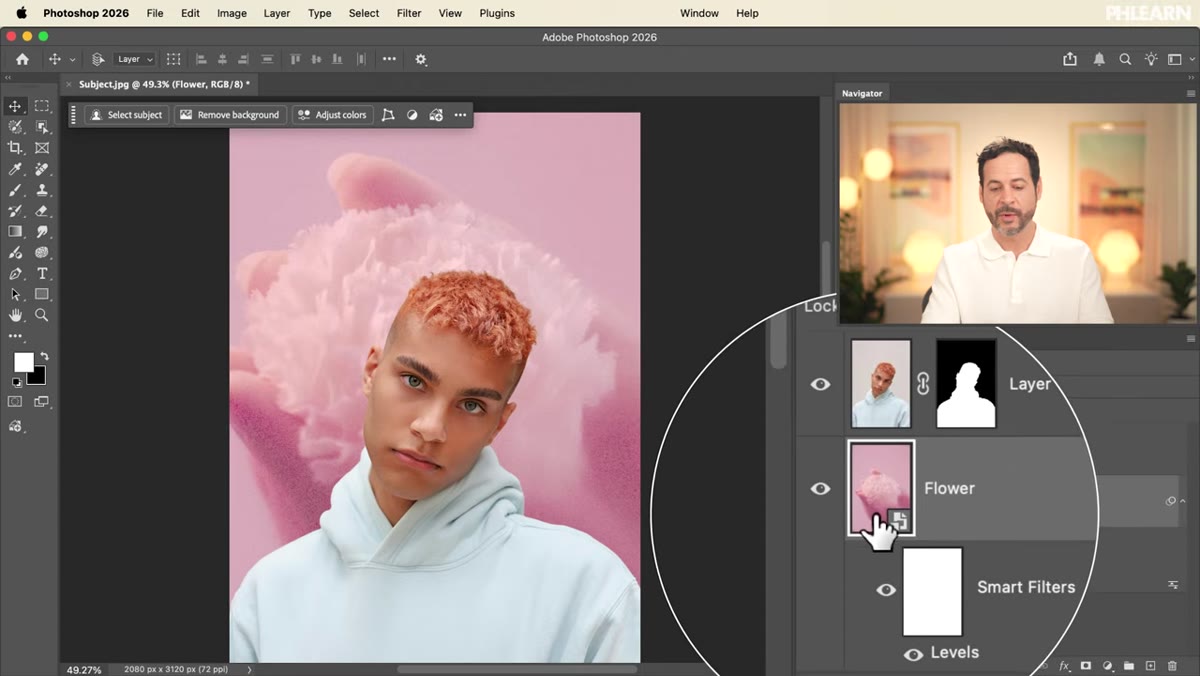
Open or import the image you want to use as your background. In the tutorial they use a close-up flower shot, which works brilliantly because the organic shapes and warm tones become pure abstract color once blurred. Drag the new image into your document and position it below your subject layer in the stack. Clicking and dragging a file directly onto your canvas from Finder or Explorer will automatically place it as a Smart Object, which is exactly what you want here. Don’t convert it, don’t rasterize it.
Dragging the flower image below the subject layer
Open or import the image you want to use as your background. In the tutorial they use a close-up flower shot, which works brilliantly because the organic shapes and warm tones become pure abstract color once blurred. Drag the new image into your document and position it below your subject layer in the stack. Clicking and dragging a file directly onto your canvas from Finder or Explorer will automatically place it as a Smart Object, which is exactly what you want here. Don’t convert it, don’t rasterize it.
Step 3: Match the Brightness of the Original Background
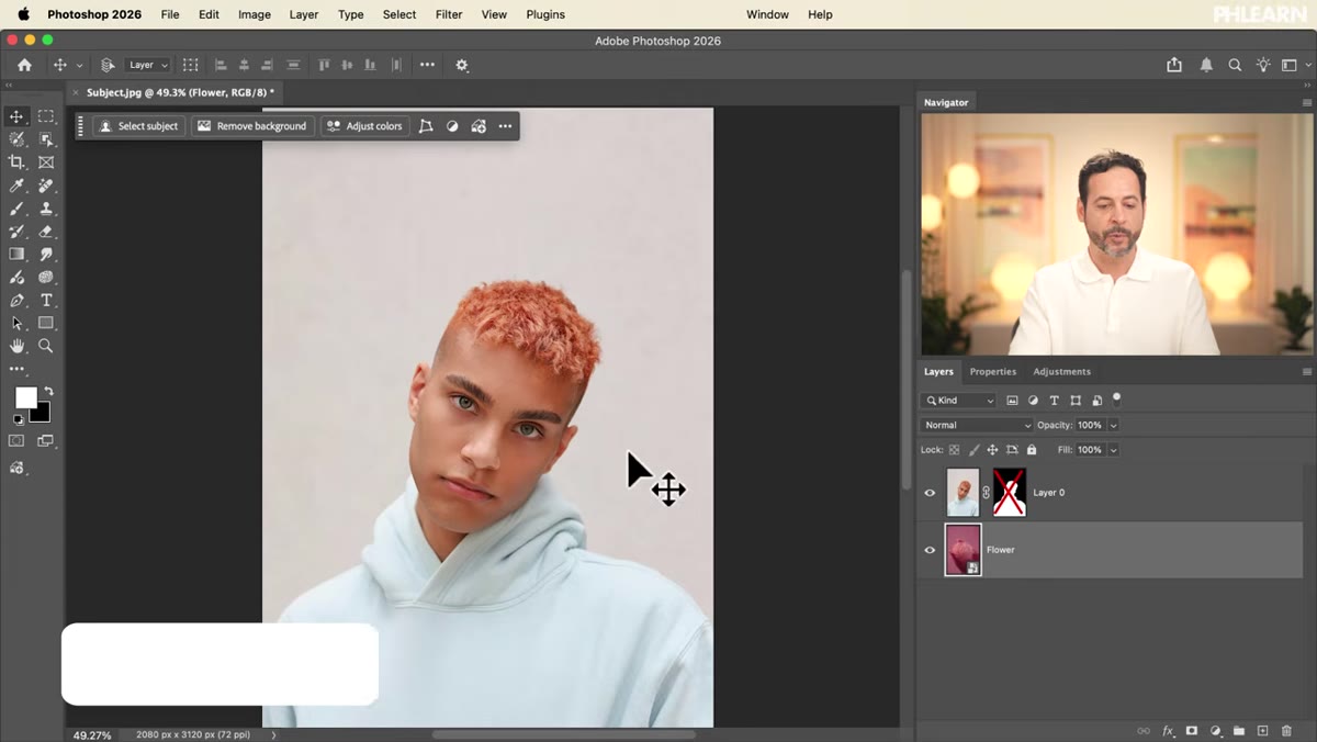 Shift-clicking the layer mask to reveal the original background
Here’s a step that’s easy to skip and will make your composite look wrong if you do. Hold Shift and click the layer mask thumbnail on your subject layer. This temporarily disables the mask so you can see what the original background actually looked like in terms of brightness and tone. Take a mental note, then Shift-click again to re-enable it. Now select your new background layer and hit Cmd+L (Mac) or Ctrl+L (Windows) to open Levels. Drag the midpoint slider (the gray one in the center) left to brighten or right to darken until the background roughly matches the lighting conditions your subject was originally shot in. Hit OK. This one adjustment makes the composite feel cohesive instead of pasted-together.
Shift-clicking the layer mask to reveal the original background
Here’s a step that’s easy to skip and will make your composite look wrong if you do. Hold Shift and click the layer mask thumbnail on your subject layer. This temporarily disables the mask so you can see what the original background actually looked like in terms of brightness and tone. Take a mental note, then Shift-click again to re-enable it. Now select your new background layer and hit Cmd+L (Mac) or Ctrl+L (Windows) to open Levels. Drag the midpoint slider (the gray one in the center) left to brighten or right to darken until the background roughly matches the lighting conditions your subject was originally shot in. Hit OK. This one adjustment makes the composite feel cohesive instead of pasted-together.
Step 4: Scale the Background to Fill the Frame
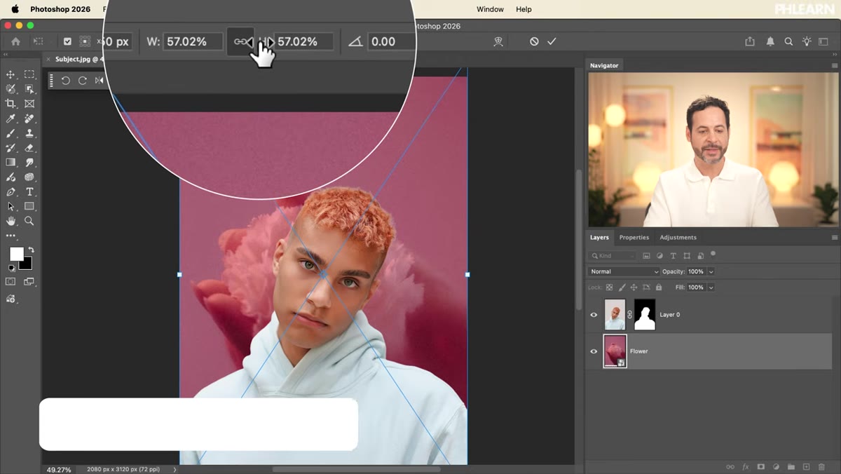 Using Free Transform to scale up the flower image
With your background layer still selected, hit Cmd+T or Ctrl+T to enter Free Transform. You may find the image doesn’t quite cover the full canvas, especially if the proportions don’t match. Click into the height or width field in the options bar at the top and scale the image up until it fills the frame. Hold Shift to constrain proportions if you’re on an older version of Photoshop, though newer versions do this automatically. Hit Enter to commit. You don’t need the background to be perfect here because the blur is going to dissolve most of the detail anyway.
Using Free Transform to scale up the flower image
With your background layer still selected, hit Cmd+T or Ctrl+T to enter Free Transform. You may find the image doesn’t quite cover the full canvas, especially if the proportions don’t match. Click into the height or width field in the options bar at the top and scale the image up until it fills the frame. Hold Shift to constrain proportions if you’re on an older version of Photoshop, though newer versions do this automatically. Hit Enter to commit. You don’t need the background to be perfect here because the blur is going to dissolve most of the detail anyway.
Step 5: Apply Path Blur Through the Blur Gallery
 Filter menu open showing Blur Gallery and Path Blur option
This is where the magic actually happens. With your background Smart Object selected, go to Filter, then Blur Gallery, then Path Blur. You’ll drop into the Blur Gallery workspace, which shows your subject as a preview behind the background layer so you can judge the effect in context. Photoshop puts a default straight blur path on the canvas. You’ll see three control points: the start, a midpoint, and the end. Click the midpoint and drag it to create a curve. Pull the start and end points out wide so the blur path sweeps dramatically across most of the image.
Filter menu open showing Blur Gallery and Path Blur option
This is where the magic actually happens. With your background Smart Object selected, go to Filter, then Blur Gallery, then Path Blur. You’ll drop into the Blur Gallery workspace, which shows your subject as a preview behind the background layer so you can judge the effect in context. Photoshop puts a default straight blur path on the canvas. You’ll see three control points: the start, a midpoint, and the end. Click the midpoint and drag it to create a curve. Pull the start and end points out wide so the blur path sweeps dramatically across most of the image.
Step 6: Dial in the Speed and Commit the Blur
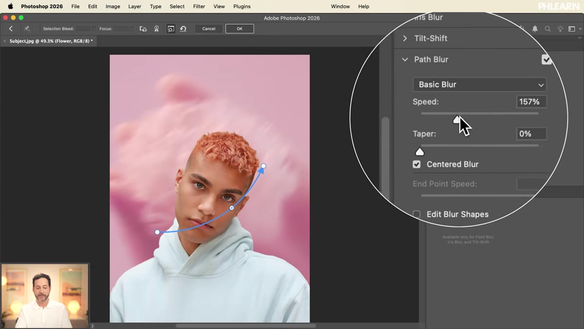 Path Blur panel showing the Speed slider being adjusted
On the right side of the Blur Gallery workspace, you’ll see the Path Blur options panel with a Speed slider. This controls how intense the streak effect is. Drag it up slowly and watch the preview update in real time. Somewhere in the range of 50-150% tends to hit that sweet spot between “this is clearly blurred” and “this looks like a smear of vaseline.” The curved path you created will define the direction the blur streaks travel, so if it’s not reading right, go back and adjust the curve. When you’re happy, click OK. Because this is a Smart Object, the blur applies as a Smart Filter. You can double-click it in the Layers panel any time to go back in and change it.
Path Blur panel showing the Speed slider being adjusted
On the right side of the Blur Gallery workspace, you’ll see the Path Blur options panel with a Speed slider. This controls how intense the streak effect is. Drag it up slowly and watch the preview update in real time. Somewhere in the range of 50-150% tends to hit that sweet spot between “this is clearly blurred” and “this looks like a smear of vaseline.” The curved path you created will define the direction the blur streaks travel, so if it’s not reading right, go back and adjust the curve. When you’re happy, click OK. Because this is a Smart Object, the blur applies as a Smart Filter. You can double-click it in the Layers panel any time to go back in and change it.
One Thing I’d Add: Layer Blend Modes on the Background
Once you have the path blur looking good, try changing the blend mode of your background layer from Normal to Screen or Soft Light. This is something the tutorial doesn’t cover but it’s been part of my standard workflow on portrait composites ever since I started doing this. Screen mode especially pushes the background toward pure light and color, and the blurred streaks start to genuinely look like lens flare or bokeh rather than a photo with a filter on it. Stack a subtle Hue/Saturation adjustment clipped to the background layer and you can push the color in any direction without touching the subject. It takes an extra two minutes and it consistently gets the “wait, how did you do that?” reaction from clients.
The single most important thing this workflow teaches is that blur direction matters as much as blur amount. A radial or curved path blur creates energy and movement. A plain Gaussian blur just creates softness. Those are different things, and now that I can’t unsee the difference, it’s hard to go back. If you want to see the full technique with the original images, Watch the full tutorial on YouTube from PHLEARN. They also offer the sample PSD and source images as a free download in the video description, which is worth grabbing if you want to follow along on the exact same files.
Comments (1)
Shared this with my photography group. Everyone loved it.
Leave a Comment