There’s a specific kind of embarrassment reserved for the moment a friend watches you work in Photoshop and says, “wait, why are you doing it that way?” I know this feeling intimately. I once spent three days on a composite, obsessing over edge detail and color matching, only to have someone show me a cleaner approach in about twenty minutes. The culprit both times: I was rushing the foundational stuff. Bad selection, no smart objects, baked-in adjustments I couldn’t undo. The whole thing was a house built on sand.
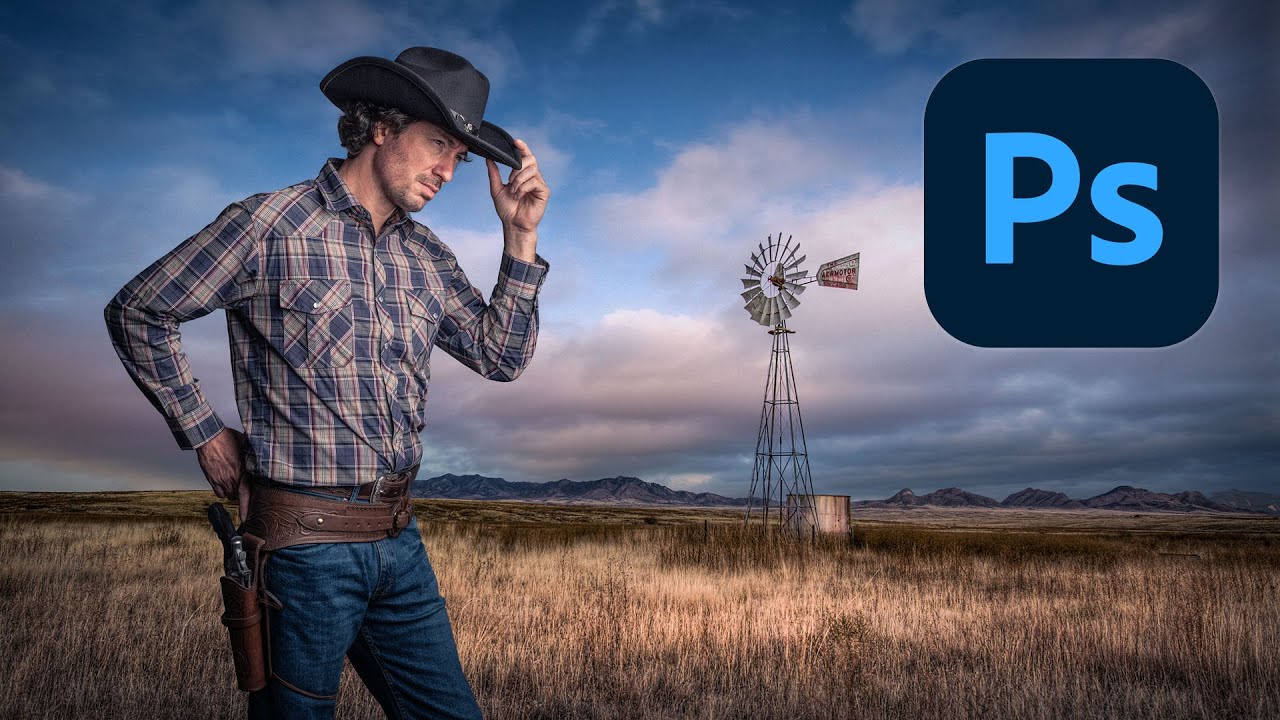
That’s why this tutorial from Kelvin Designs caught my attention. In it, Kelvin walks through building a composite from scratch by placing a photo of himself as a cowboy into a landscape background. On the surface it sounds simple. But the way he approaches it, starting with non-destructive workflow and a painstaking manual selection rather than a one-click auto tool, is exactly the kind of disciplined foundation that separates composites that look finished from ones that look like a school project. Watch the full tutorial on YouTube and follow along with the downloaded assets Kelvin provides in the description.
Here’s my breakdown of the technique, with the settings and reasoning filled in so you can work through it without constantly pausing the video.
Step 1: Open Your Raw File as a Smart Object
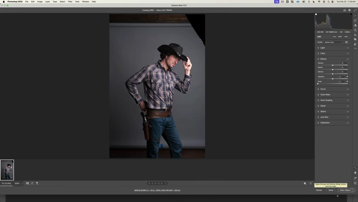 Camera Raw open with “Open Object” button visible
When you open a RAW file in Photoshop, it routes through Camera Raw first. By default, the button at the bottom says “Open Image,” which flattens everything and throws away the raw data. Kelvin’s first move is to change that. Click the underlined file specification text at the bottom of the Camera Raw window, find the checkbox that says “Open in Photoshop as Smart Object,” check it, and hit OK. Now the button reads “Open Object” instead.
Camera Raw open with “Open Object” button visible
When you open a RAW file in Photoshop, it routes through Camera Raw first. By default, the button at the bottom says “Open Image,” which flattens everything and throws away the raw data. Kelvin’s first move is to change that. Click the underlined file specification text at the bottom of the Camera Raw window, find the checkbox that says “Open in Photoshop as Smart Object,” check it, and hit OK. Now the button reads “Open Object” instead.
This is not optional if you care about your work. Smart objects let you go back into Camera Raw at any point and tweak exposure, white balance, or tone without degrading the file. I learned the value of this the hard way after a client asked me to revisit a composite where I’d already flattened everything. Don’t be me. Check the box.
Step 2: Zoom In Before You Even Think About Selecting
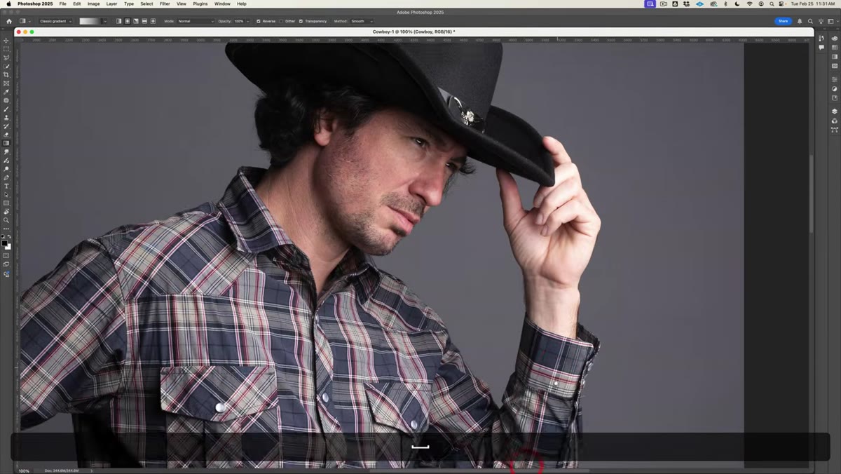 Photoshop canvas zoomed to 300% on cowboy image
Once the image opens in Photoshop, zoom to around 300% before starting your selection. Kelvin is working with a high-resolution image, and he’s explicit about why he doesn’t trust automatic selection tools here: the edge detail is too fine and too important to hand off to an algorithm. Quick Select and Select Subject are useful for low-stakes work, but for a hero composite where you’re going to be staring at the edges on a big monitor, you want to do this yourself.
Photoshop canvas zoomed to 300% on cowboy image
Once the image opens in Photoshop, zoom to around 300% before starting your selection. Kelvin is working with a high-resolution image, and he’s explicit about why he doesn’t trust automatic selection tools here: the edge detail is too fine and too important to hand off to an algorithm. Quick Select and Select Subject are useful for low-stakes work, but for a hero composite where you’re going to be staring at the edges on a big monitor, you want to do this yourself.
Zooming in this far feels uncomfortable at first, like you’ve lost the forest for the trees. But it forces accuracy. You can see exactly where the subject ends and the background begins, which means your selection will actually follow that line instead of approximating it.
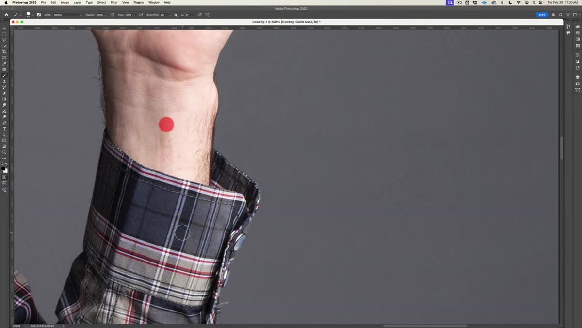
Step 3: Set Up Quick Mask Mode
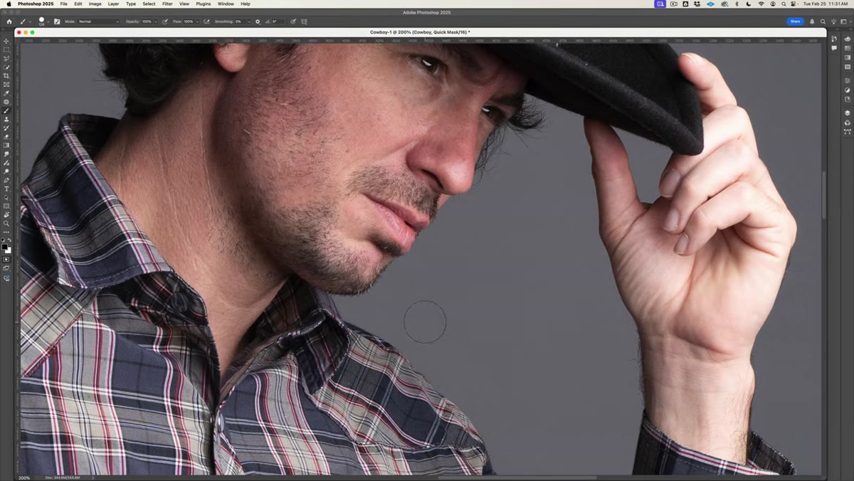
 Quick Mask mode activated, red overlay visible on canvas
Hit Q to enter Quick Mask mode. Nothing dramatic happens visually right away, but you’re now in a mode where painting with your brush defines your selection. Before you paint anything, right-click in the canvas area to bring up the Quick Mask options and make sure it’s set to “Selected Areas” rather than “Masked Areas.” Kelvin flags this specifically because Photoshop ships with it set the other way, which means painting shows what’s excluded rather than what’s included. That inversion will absolutely mess with your head if you don’t catch it.
Quick Mask mode activated, red overlay visible on canvas
Hit Q to enter Quick Mask mode. Nothing dramatic happens visually right away, but you’re now in a mode where painting with your brush defines your selection. Before you paint anything, right-click in the canvas area to bring up the Quick Mask options and make sure it’s set to “Selected Areas” rather than “Masked Areas.” Kelvin flags this specifically because Photoshop ships with it set the other way, which means painting shows what’s excluded rather than what’s included. That inversion will absolutely mess with your head if you don’t catch it.
Switch your foreground color to white and you’re ready to paint.
Step 4: Configure Your Brush for Edge Work
 Brush settings panel showing 45px size and 85% hardness
Kelvin’s brush settings for this kind of selection work are specific: 45 pixels, 85% hardness, opacity at 100%, flow at 100%. The slight softness from 85% hardness (rather than a full 100%) gives you a little bit of feathering at the edge, which you can refine later. A perfectly hard brush tends to look cut-out and artificial, especially around hair, fabric texture, or anything with slight translucency.
Brush settings panel showing 45px size and 85% hardness
Kelvin’s brush settings for this kind of selection work are specific: 45 pixels, 85% hardness, opacity at 100%, flow at 100%. The slight softness from 85% hardness (rather than a full 100%) gives you a little bit of feathering at the edge, which you can refine later. A perfectly hard brush tends to look cut-out and artificial, especially around hair, fabric texture, or anything with slight translucency.
Keep your brush size relatively small while working near edges. You can bump it up when painting broad interior areas of the subject where precision doesn’t matter as much.
Step 5: Use Click-Shift-Click to Build the Selection in Straight Lines
 Brush making straight-line selection segments along subject edge
Here’s the technique that makes the manual selection actually manageable. Instead of trying to trace the subject’s outline in one continuous freehand stroke (your hand will shake, it will look terrible), Kelvin uses a click-then-Shift-click method. You click once to set a point, then hold Shift and click the next point. Photoshop draws a straight line between them. Repeat around the perimeter of the subject.
Brush making straight-line selection segments along subject edge
Here’s the technique that makes the manual selection actually manageable. Instead of trying to trace the subject’s outline in one continuous freehand stroke (your hand will shake, it will look terrible), Kelvin uses a click-then-Shift-click method. You click once to set a point, then hold Shift and click the next point. Photoshop draws a straight line between them. Repeat around the perimeter of the subject.
This sounds tedious, and it is, but it’s significantly faster than freehand and far more accurate. The key is placing your points close enough together that the straight lines approximate the actual curve of the subject’s outline. Around complex shapes like shoulders, hats, and boots, you’ll click more frequently. Along a straight jacket sleeve, you might need only two or three points.
Step 6: Exit Quick Mask and Refine the Selection
 Quick Mask exited, marching ants selection visible around subject
When you’ve painted all the way around your subject, hit Q again to exit Quick Mask mode. You’ll see the marching ants appear around the area you painted, indicating your active selection. At this point, zoom back out and do a critical pass. Look for areas where the selection bit into the subject or left a visible halo of background. You can re-enter Quick Mask and paint corrections with white (to add to the selection) or black (to subtract from it).
Quick Mask exited, marching ants selection visible around subject
When you’ve painted all the way around your subject, hit Q again to exit Quick Mask mode. You’ll see the marching ants appear around the area you painted, indicating your active selection. At this point, zoom back out and do a critical pass. Look for areas where the selection bit into the subject or left a visible halo of background. You can re-enter Quick Mask and paint corrections with white (to add to the selection) or black (to subtract from it).
This refinement step is the difference between a selection that holds up at full resolution and one that only looks okay when you’re zoomed out.
What I’d Add: Do a Duplicate Check Before You Commit
One thing I always do that Kelvin doesn’t explicitly cover here: before I mask anything, I duplicate the smart object layer and hide the copy. It’s a thirty-second habit that has saved me hours. If the selection turns out wrong after masking, I still have the original layer intact underneath, and I’m not scrambling to reconstruct work.
Smart objects protect your raw data, but they don’t protect you from a mask you painted yourself. Keep a backup copy stashed in a locked layer group. Call it “DO NOT TOUCH” if that helps. Future you will understand.
The biggest thing this tutorial reinforced for me is that compositing quality is set in the first five minutes. The selection is the foundation. Shortcuts at the selection stage show up everywhere downstream, in color matching, in edge blending, in every adjustment you make. Kelvin’s approach of slowing down, zooming in, and working the Quick Mask manually is the right call, even when it feels like the slow one.
Watch the full tutorial on YouTube and grab the practice files from the description so you can work through it in real time.
Comments (8)
Wow, I had no idea you could do this. Mind blown.
This should be required reading for anyone starting out.
Just used this on a wedding shoot edit. Client was thrilled.
The before and after really sells it. Incredible difference.
Shared this with my photography group. Everyone loved it.
I've watched a dozen tutorials on this and yours is the clearest by far.
Would love to see a follow-up going deeper into this topic.
This is exactly what I needed today. Been struggling with this for weeks.
Leave a Comment