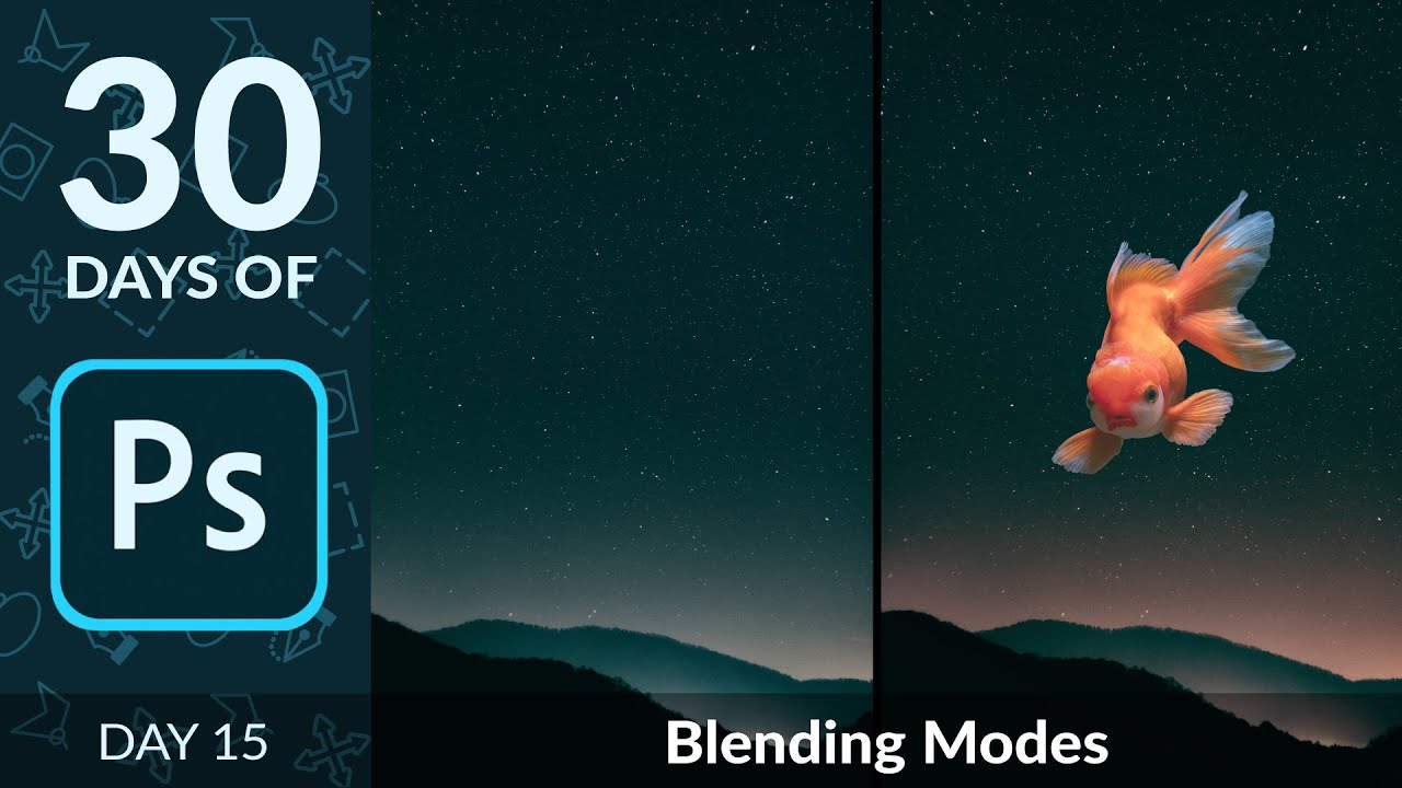
Blending Modes Demystified: How to Build a Composite in Minutes Without Masking

Blending Modes Demystified: How to Build a Composite in Minutes Without Masking

A few years back, I spent three days wrestling with a composite that a more experienced designer later rebuilt in about twenty minutes using a technique I’d completely overlooked. That technique was blending modes. I’d used Normal, maybe occasionally Multiply when I wanted to darken a shadow layer, but I’d never really understood the logic underneath them. They felt like magic spells you either knew or didn’t. Turns out the logic is pretty simple once someone breaks it down correctly.
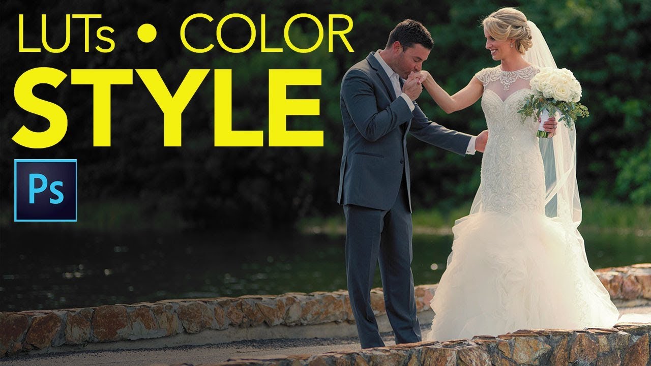
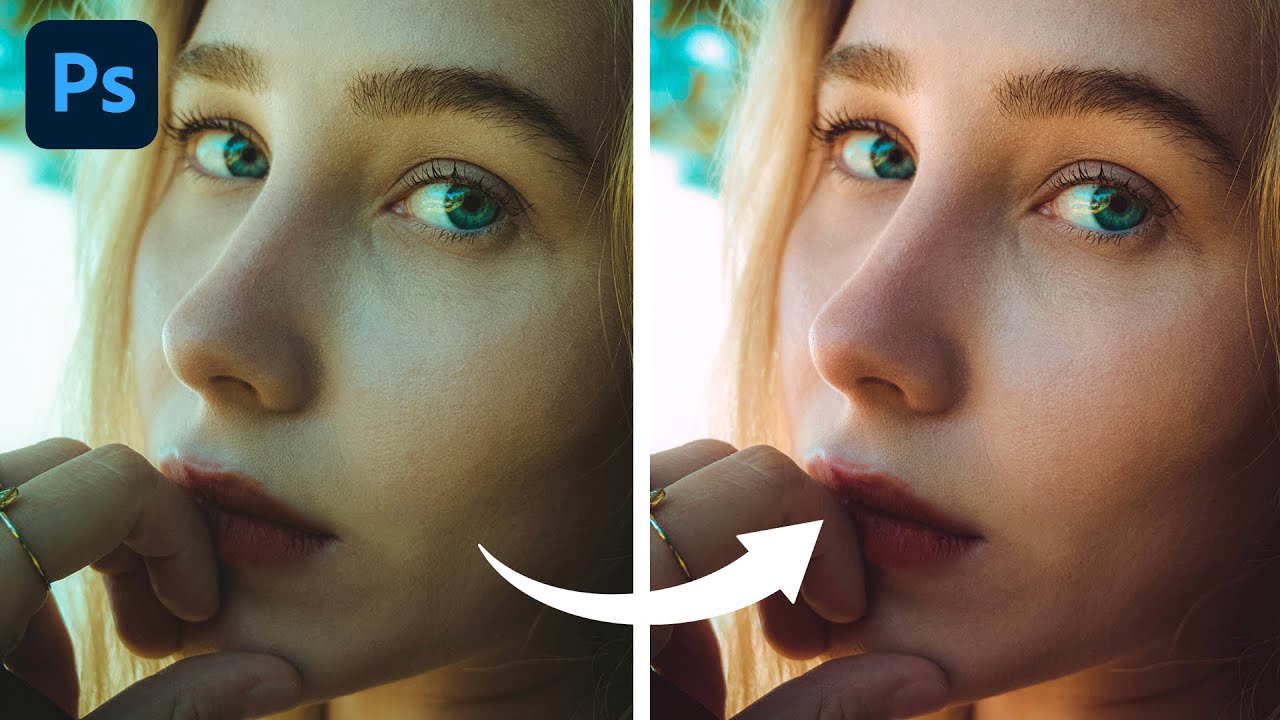
Stop Letting Color Lookup Tables Wreck Your Highlights (Use This Blend Mode Instead)

Stop Letting Color Lookup Tables Wreck Your Highlights (Use This Blend Mode Instead)

There’s a specific kind of frustration that hits when you find a color effect you love, apply it to a photo, and watch the highlights completely blow out. The vibe you wanted is there, buried under a contrast spike that makes your image look like it was shot through a car windshield at noon. I’ve been there more times than I want to admit, usually sitting in a coffee shop trying to color grade a batch of photos while my third Americano goes cold.

Stop Guessing With Color: How to Fix Portrait Color Casts in Photoshop Using Color Balance

Stop Guessing With Color: How to Fix Portrait Color Casts in Photoshop Using Color Balance

There’s a particular kind of frustration that comes from delivering a portrait to a client and having them come back with “something looks a little off with the skin tones.” You squint at it. You zoom in. You compare it to the original. And then you see it: a subtle green cast, or a magenta tint, or some muddy yellow lurking in the shadows that’s making your subject look vaguely unwell.

Light Adjustment Layer: Why Adobe's Latest Photoshop Feature Is a Game-Changer

Light Adjustment Layer: Why Adobe's Latest Photoshop Feature Is a Game-Changer

Adobe’s Latest Gift to Photoshop Users Adobe’s been on a mission lately, and I’m here for it. They’ve started migrating some of Lightroom and Camera Raw’s most beloved features straight into Photoshop, and honestly? It’s making my workflow significantly smoother. The headliner in this round of updates is the new Light Adjustment layer, and it’s exactly the kind of feature that makes you wonder why it took this long to arrive.

Stack Sports Photos Like a Pro: The Lightroom + Photoshop Sequence Composite Technique

Stack Sports Photos Like a Pro: The Lightroom + Photoshop Sequence Composite Technique

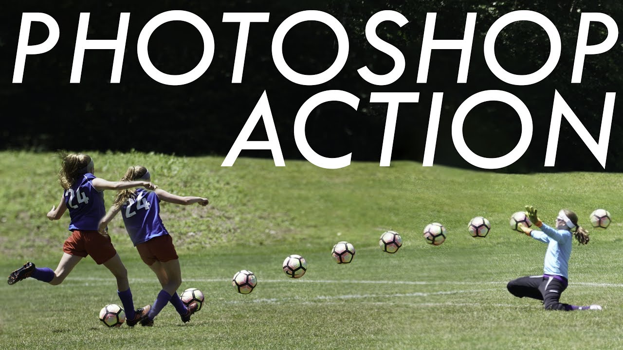
There’s a specific kind of frustration that comes from shooting a perfect moment in sports and realizing no single frame tells the full story. You’ve got thirty shots of a soccer player driving toward goal, and individually they’re fine. But none of them capture the kick and the ball and the net at the same time. That’s just physics. A single frame can only freeze one instant. The fix, it turns out, is something I’d seen in sports photography magazines my whole life without ever stopping to think about how it was made: the multi-exposure sequence composite.

Stop Letting Photoshop's Junk Drawer Slow You Down

Stop Letting Photoshop's Junk Drawer Slow You Down

I got my start making garbage memes in MS Paint, which means by the time I actually sat down with Photoshop, I thought having more tools meant more power. I was wrong. What it actually meant was twenty minutes of clicking the wrong thing, panicking, and Googling “why does the rectangle tool keep doing that.” Photoshop has a legacy problem. Half the toolbar exists because someone needed it in 1998, and Adobe never had the heart to pull it out back.

Stop Cranking Saturation on Portraits (Use This Instead)

Stop Cranking Saturation on Portraits (Use This Instead)

Every working designer has done it. You’ve got a portrait that feels a little flat, so you drag Saturation up and suddenly your subject looks like they’ve been marinaded in Hawaiian Punch. You dial it back, feel vaguely guilty, and move on. I did this for longer than I care to admit before I finally took the time to understand what Vibrance actually does differently, and why it’s almost always the better choice when people are in the frame.

You're Editing Photos One at a Time Like It's 2009 — Here's How to Fix That

You're Editing Photos One at a Time Like It's 2009 — Here's How to Fix That

Last month I had a client send me 340 product photos that all needed the same treatment: resize to 1200x1200px, sharpen slightly, convert to sRGB, export as JPEG at 85% quality. I know, thrilling stuff. The old version of me would have cracked my knuckles, opened the first image, and started manually grinding through them like some kind of artisanal photo monk. The new version of me had it done before my second coffee arrived.

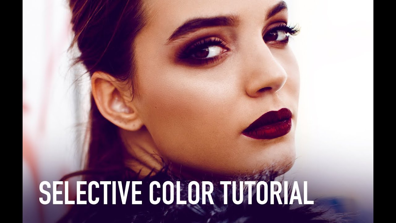
Selective Color in Photoshop: The Adjustment Layer That Actually Changes How Your Photos Feel

Selective Color in Photoshop: The Adjustment Layer That Actually Changes How Your Photos Feel

There’s a specific kind of frustration that hits when you’ve finished retouching a photo and it looks technically correct but somehow emotionally flat. The exposure is fine. The skin tones are clean. But the image has no mood, no atmosphere, nothing pulling you in. For years I was reaching for Hue/Saturation or Curves to fix this, and while those tools are great, they’re blunt instruments when what you actually need is a scalpel.

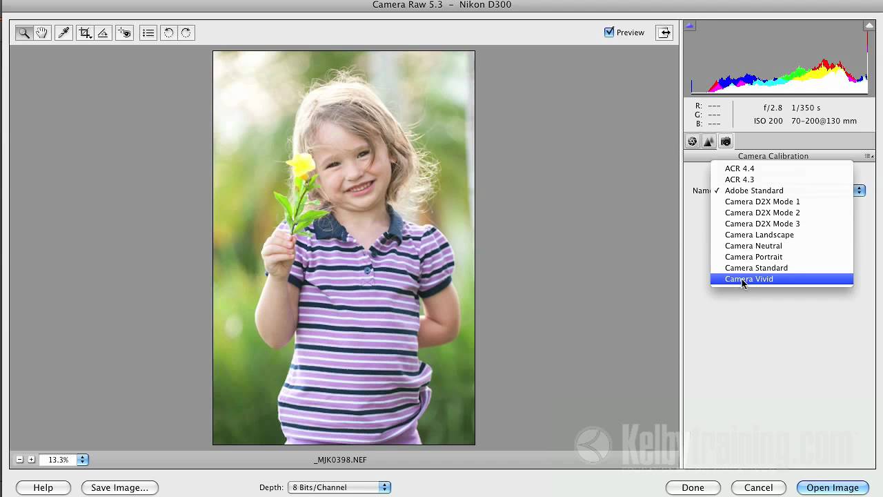
Stop Wondering Why Your Raw Photos Look Worse Than Your Camera Screen

Stop Wondering Why Your Raw Photos Look Worse Than Your Camera Screen

There’s a specific kind of frustration that hits when you’re out shooting, you glance at the back of your camera, and the photo looks genuinely great. Rich colors, solid contrast, punchy details. Then you get home, open it in Photoshop Elements, and it looks like a completely different photo. Flat. Dull. Kind of sad. If you shoot in raw mode and you’ve felt this, you’re not imagining things and you’re not doing anything wrong.

Build a Pixel-Perfect iOS 8 App Icon in Photoshop (Without Guessing at the Settings)

Build a Pixel-Perfect iOS 8 App Icon in Photoshop (Without Guessing at the Settings)

Client work has a funny way of expanding scope. You’re hired to do one thing, and three emails later you’re being asked if you can “quickly throw together an app icon too.” I’ve been in that exact spot, and my first instinct was to fake confidence while quietly panicking about whether Photoshop could even do this properly. Turns out, it absolutely can, and the process is more systematic than you’d think once someone walks you through it.

Stop Ignoring Blend Modes: The Photoshop Feature That Changed How I Work

Stop Ignoring Blend Modes: The Photoshop Feature That Changed How I Work

The Friend Who Wrecked My Confidence in 20 Minutes A few years back, I spent three days on a composite. Three full days, multiple coffee shop sessions, probably a combined 18 hours of masking and color grading. I was proud of it. Sent it to a designer friend for feedback and he came back with, “cool, took me about 20 minutes to do something similar.” He’d used a workflow built almost entirely around blend modes that I had never seriously explored.