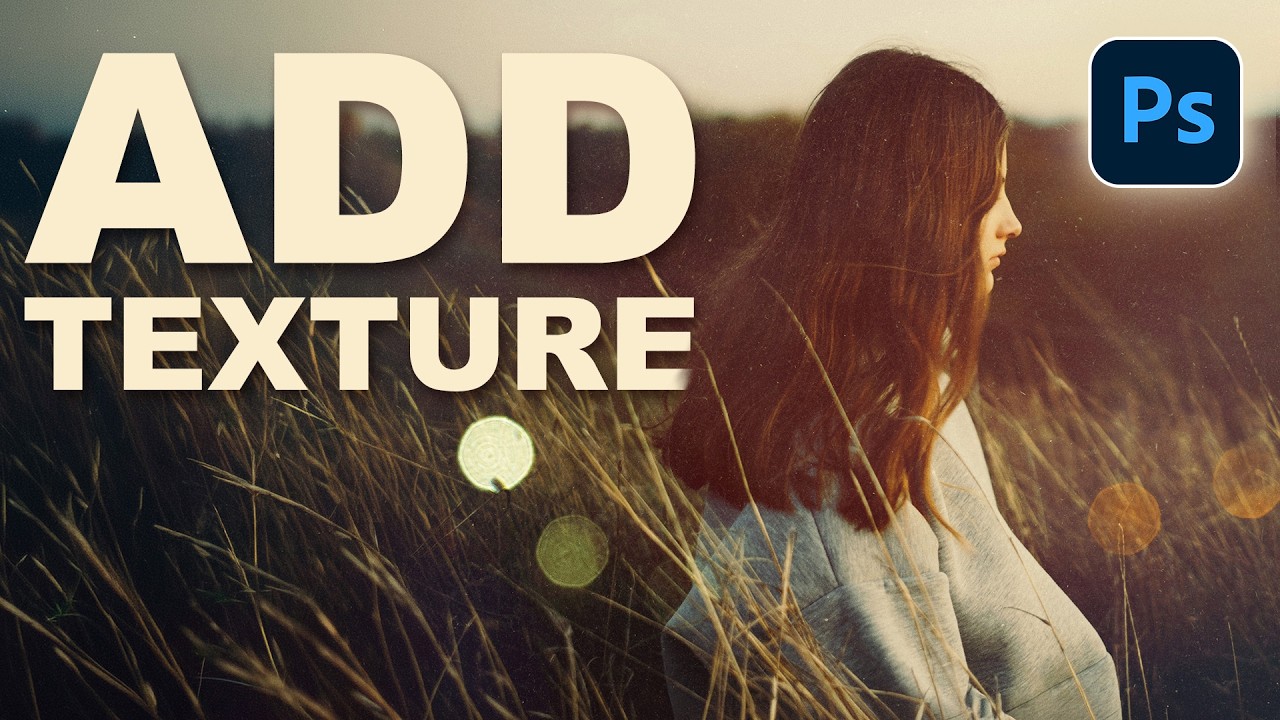
There’s a specific kind of flatness that happens when a photo is technically correct but visually boring. Good exposure, decent composition, and somehow it still looks like a stock image nobody bought. I ran into this constantly early in my freelance work, spending way too long adding drama in the wrong places, like overcooked contrast or aggressive vignettes, when the real fix was sitting one layer above the photo the whole time. Textures.
In this PHLEARN tutorial, Aaron walks through a clean, repeatable method for adding texture to any photograph in Photoshop. Watch the full tutorial on YouTube if you want to follow along directly, but everything below is written so you can work through it step by step without switching tabs every thirty seconds. The technique uses two texture layers, blend modes, opacity adjustments, and a quick invert trick that I wish someone had shown me years earlier.
What makes this approach worth learning isn’t just the end result. It’s that the whole thing is non-destructive and flexible. You can swap textures, dial the intensity up or down, and completely change the color feel of a shot without touching the original image. That kind of flexibility matters when a client asks you to “make it feel warmer” at 10pm and you’d rather not rebuild the whole thing from scratch.
Step 1: Open Your Photo and Import Your First Texture
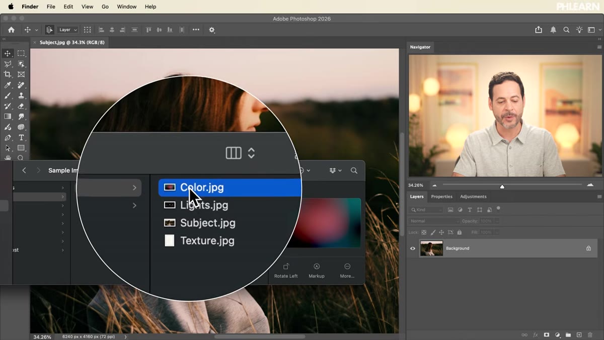 Color texture JPEG being dragged into Photoshop canvas
Start with your photograph open in Photoshop. Drag your first texture file directly onto the canvas. Photoshop will place it as a Smart Object, which is exactly what you want. Once it’s on the canvas, you’ll need to scale it up to cover the entire image. Click the W field in the toolbar at the top, then click and drag right to increase the width. Do the same for height, or hold Shift while dragging a corner handle to scale proportionally. Get it big enough that it covers every edge of your photo, then press Enter to commit the transform.
Color texture JPEG being dragged into Photoshop canvas
Start with your photograph open in Photoshop. Drag your first texture file directly onto the canvas. Photoshop will place it as a Smart Object, which is exactly what you want. Once it’s on the canvas, you’ll need to scale it up to cover the entire image. Click the W field in the toolbar at the top, then click and drag right to increase the width. Do the same for height, or hold Shift while dragging a corner handle to scale proportionally. Get it big enough that it covers every edge of your photo, then press Enter to commit the transform.
The goal here is full coverage with no gaps. If your texture doesn’t quite reach the edges, just scale it up a bit more. You can always reposition later.
Step 2: Change the Blend Mode to Lighten
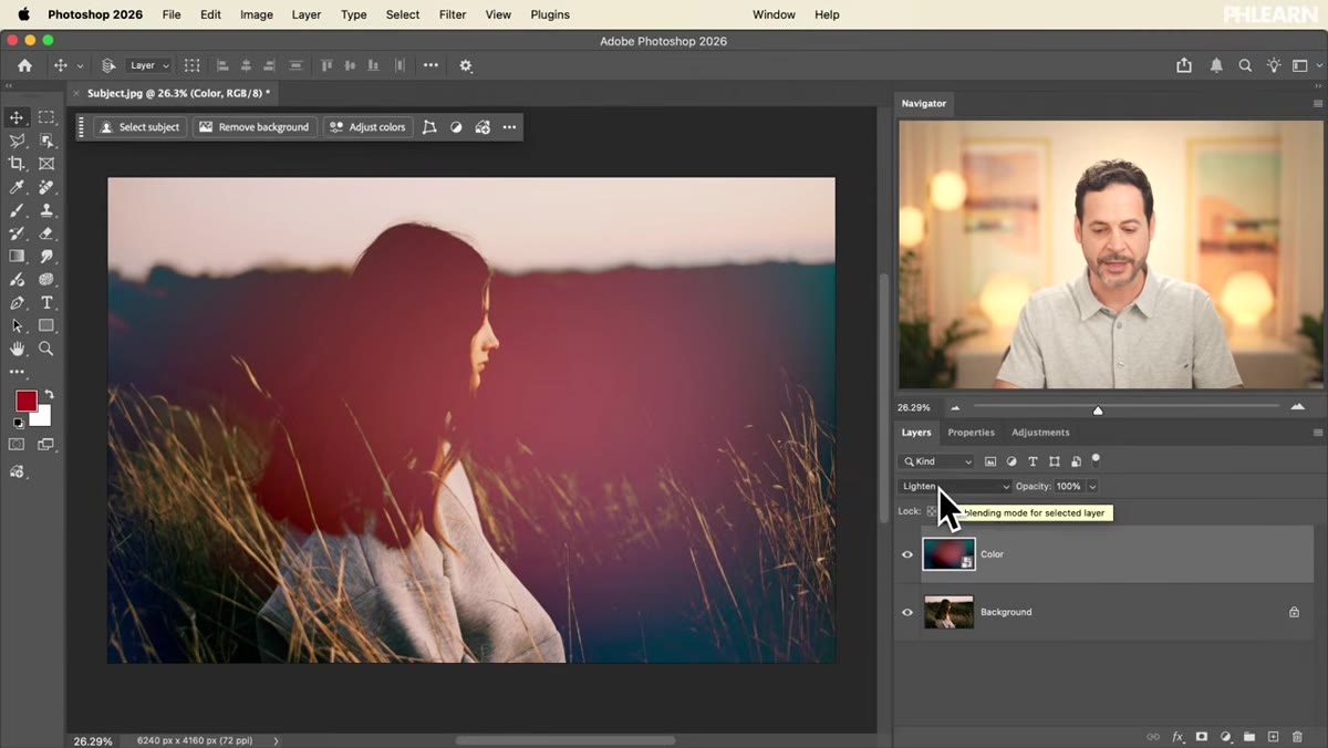 Blend mode dropdown open with Lighten selected
With the texture layer selected in the Layers panel, click the blend mode dropdown at the top left of the panel. It defaults to Normal. You can click through options manually or, once the dropdown is active, use the up and down arrow keys to cycle through modes and preview them in real time on the canvas. That arrow key trick is one of those things that sounds minor until you realize how much time it saves.
Blend mode dropdown open with Lighten selected
With the texture layer selected in the Layers panel, click the blend mode dropdown at the top left of the panel. It defaults to Normal. You can click through options manually or, once the dropdown is active, use the up and down arrow keys to cycle through modes and preview them in real time on the canvas. That arrow key trick is one of those things that sounds minor until you realize how much time it saves.
For a color texture, Lighten works well. It only affects pixels where the texture is brighter than the underlying photo, which keeps the shadows intact and adds color and tone in the midtones and highlights. Linear Dodge is worth trying too if you want something punchier.
Step 3: Dial Back the Opacity
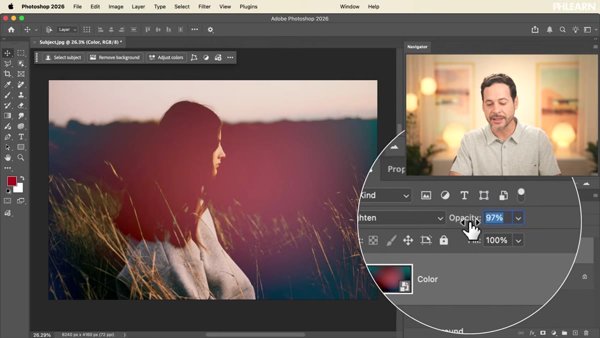 Opacity slider being dragged left on texture layer
Straight out of the blend mode change, the effect is usually too strong. The texture competes with the subject instead of supporting it. Click directly on the word “Opacity” in the Layers panel and drag left to reduce it. You’re looking for the point where the texture feels like it belongs to the image rather than sitting on top of it. Somewhere in the 30 to 60 percent range is usually a good starting point, but your eye is the real guide here.
Opacity slider being dragged left on texture layer
Straight out of the blend mode change, the effect is usually too strong. The texture competes with the subject instead of supporting it. Click directly on the word “Opacity” in the Layers panel and drag left to reduce it. You’re looking for the point where the texture feels like it belongs to the image rather than sitting on top of it. Somewhere in the 30 to 60 percent range is usually a good starting point, but your eye is the real guide here.
This is one of those adjustments that benefits from toggling the layer visibility on and off a few times. It recalibrates your eye and helps you avoid going too subtle, which is its own problem.
Step 4: Adjust the Hue and Saturation of the Color Texture
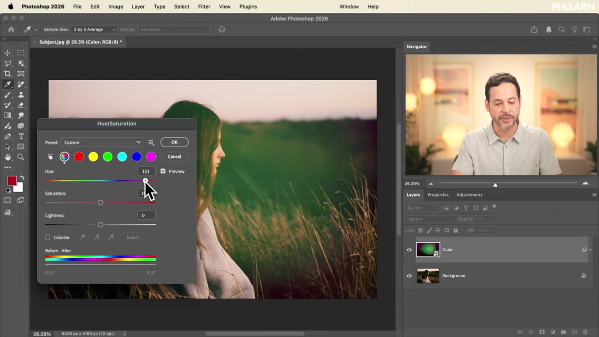 Hue/Saturation dialog open with Hue slider being moved
If the texture color isn’t working with your image, you don’t need to find a different texture. Press Command+U (Mac) or Ctrl+U (Windows) to open the Hue/Saturation dialog directly on the texture layer. Move the Hue slider left or right to cycle through different color relationships. Shift the Saturation down if the color feels too aggressive, or bump Lightness slightly if the texture is muddying the midtones.
Hue/Saturation dialog open with Hue slider being moved
If the texture color isn’t working with your image, you don’t need to find a different texture. Press Command+U (Mac) or Ctrl+U (Windows) to open the Hue/Saturation dialog directly on the texture layer. Move the Hue slider left or right to cycle through different color relationships. Shift the Saturation down if the color feels too aggressive, or bump Lightness slightly if the texture is muddying the midtones.
One thing worth knowing: this applies a direct adjustment to the Smart Object, not a separate adjustment layer. If you want more flexibility, consider adding a Hue/Saturation adjustment layer above the texture with a clipping mask instead. Either works, but the clipping mask approach keeps things easier to revise.
Step 5: Add a Second Texture Layer for Surface Detail
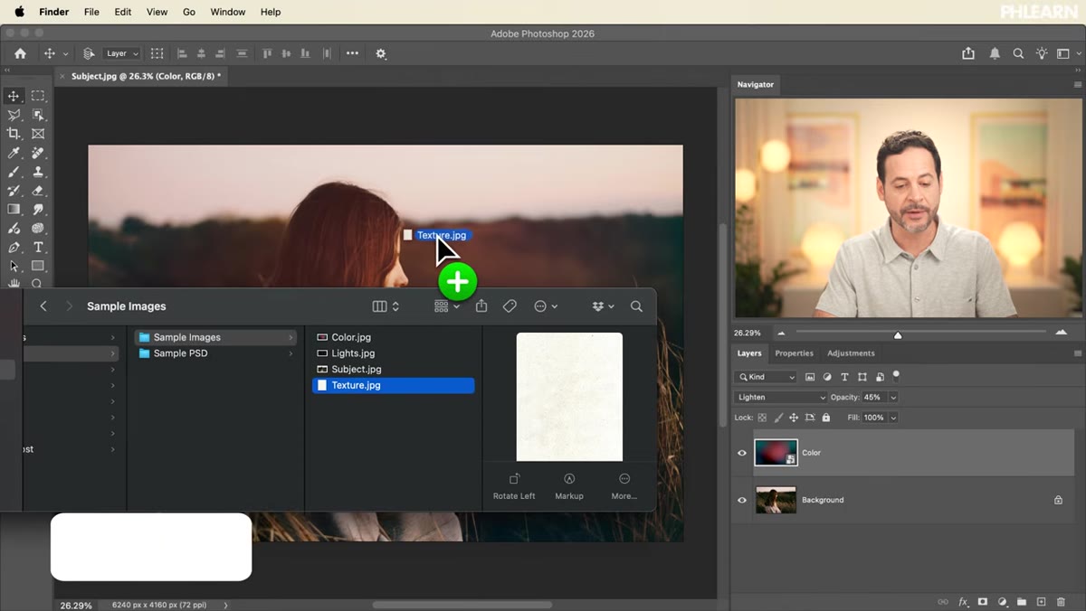 Second texture JPEG dragged onto canvas and rotated
Drag a second texture onto the canvas. This one is for surface detail rather than color, think grain, paper, film, or organic noise. Once it’s placed, you can rotate it by hovering near a corner handle until you see the curved double arrow, then clicking and dragging. Holding Shift while rotating snaps to 15-degree increments, which is useful if you want a subtle diagonal without eyeballing it. Scale it up to full coverage and press Enter.
Second texture JPEG dragged onto canvas and rotated
Drag a second texture onto the canvas. This one is for surface detail rather than color, think grain, paper, film, or organic noise. Once it’s placed, you can rotate it by hovering near a corner handle until you see the curved double arrow, then clicking and dragging. Holding Shift while rotating snaps to 15-degree increments, which is useful if you want a subtle diagonal without eyeballing it. Scale it up to full coverage and press Enter.
Layering two different textures, one for color mood and one for surface feel, gives the final result a lot more depth than a single texture ever could. It mimics the way physical prints actually look.
Step 6: Use Multiply or Invert for Dark vs. Light Texture Effects
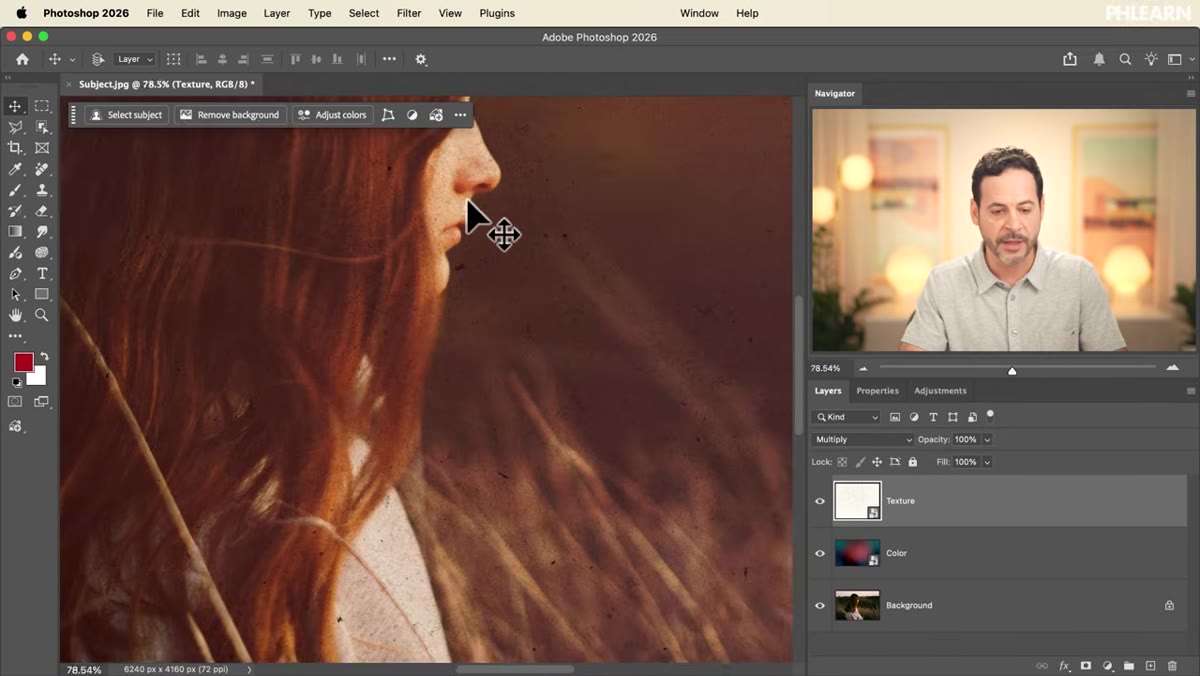 Multiply blend mode applied to second texture layer
For this detail texture, you have two good options depending on the look you want. Setting the blend mode to Multiply overlays the darker elements of the texture onto the photo, adding grain and grit without affecting the light areas much. This works well for aged or worn looks.
Multiply blend mode applied to second texture layer
For this detail texture, you have two good options depending on the look you want. Setting the blend mode to Multiply overlays the darker elements of the texture onto the photo, adding grain and grit without affecting the light areas much. This works well for aged or worn looks.
If you want the opposite effect, light marks on a dark background, keep the layer in Normal mode and press Command+I (or Ctrl+I) to invert the texture. This flips the tones so the detail reads as light rather than dark. Then switch to a blend mode like Screen or Lighten to let only those bright elements show through. It’s a small change that completely flips the character of the texture.
A Note From My Own Workflow
I’ll add one thing PHLEARN doesn’t cover in this particular video: masks. Once your textures are in place, add a layer mask to each one and paint black over your subject’s face or any area where the texture is competing with important detail. A soft brush at low opacity gives you surgical control without nuking the whole effect. I started doing this after a client pointed out that a portrait looked like their face was made of crumpled paper. Fair feedback.
Blend modes and opacity get you most of the way there. Masking gets you the rest.
The single most useful habit this tutorial reinforced for me is reaching for blend modes before reaching for anything else when I want to integrate a new layer. Normal mode is almost never the answer. Textures work because they interact with what’s underneath, and Photoshop’s blend modes are the tool that makes that interaction happen. Get comfortable cycling through them quickly and your compositing work will look more intentional across the board.
Watch the full tutorial on YouTube to see the full walkthrough and grab the free PSD and sample files that PHLEARN includes with the video.
Comments (6)
This saved me so much time on my last edit. Wish I'd found this sooner.
I keep coming back to this article. It's that useful.
Couldn't agree more. I've seen this make a huge difference in photography work specifically.
Never thought of approaching it this way. Really creative.
Wow, I had no idea you could do this. Mind blown.
I keep coming back to this article. It's that useful.
Leave a Comment