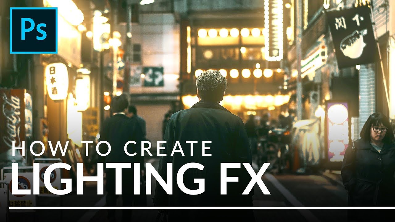
Steal Light From Your Own Image: Aaron Nace's Channel-Based Lighting Trick

Steal Light From Your Own Image: Aaron Nace's Channel-Based Lighting Trick

There’s a specific kind of frustration that comes from staring at a photo that’s almost great. The composition is solid, the subject is sharp, but the light feels flat and lifeless, like the scene was lit by a dentist’s office. I’ve been there more times than I’d like to admit, and my usual fix was to slap a Color Balance adjustment layer on it and hope for the best. Spoiler: it never looked great.
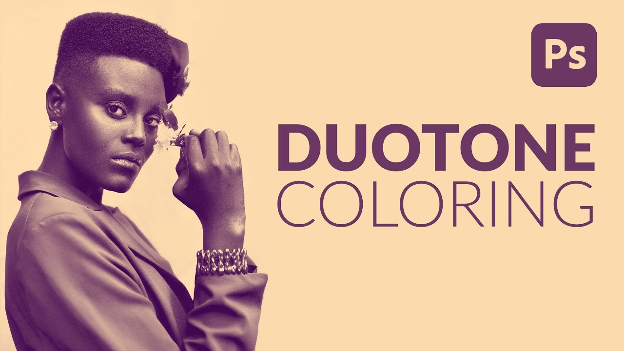
The Laziest (and Best) Way to Add Duotone Color to Any Photo in Photoshop

The Laziest (and Best) Way to Add Duotone Color to Any Photo in Photoshop

I have a complicated relationship with duotones. They look incredible, clients love them, and every time someone asks me to make one I’ve historically spent way too long fumbling through Hue/Saturation layers and gradient maps wondering why the result looks muddy instead of cinematic. I knew roughly what a duotone was supposed to do: split highlights and shadows into two distinct colors. But translating that concept into something clean and repeatable?

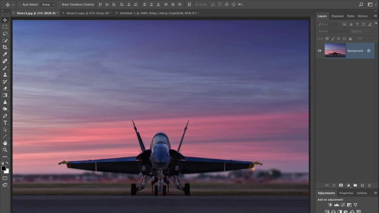
Stop Ruining Your Black and White Conversions: The Photoshop Calculations Method Nobody Talks About

Stop Ruining Your Black and White Conversions: The Photoshop Calculations Method Nobody Talks About

There’s a specific kind of embarrassment that comes from spending an hour trying to make a black and white conversion look cinematic, only to realize you’ve been using the worst possible method the whole time. I’ve been designing professionally long enough that I should know better, but I kept defaulting to Image > Mode > Grayscale like some kind of rookie. The result? Flat, lifeless, gray soup. Every single time. I’d then spend way too long pushing Curves and Levels trying to rescue it, from a terrible starting point.