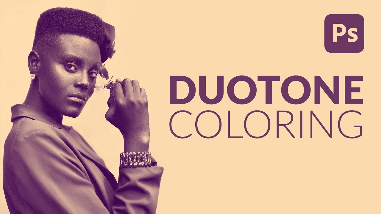
I have a complicated relationship with duotones. They look incredible, clients love them, and every time someone asks me to make one I’ve historically spent way too long fumbling through Hue/Saturation layers and gradient maps wondering why the result looks muddy instead of cinematic. I knew roughly what a duotone was supposed to do: split highlights and shadows into two distinct colors. But translating that concept into something clean and repeatable? That part always took me longer than I wanted to admit.
Then I came across Watch the full tutorial on YouTube from Aaron Nace over at PHLEARN, and I genuinely felt a little embarrassed by how simple this is. Not in a bad way. In the way where you think, “I’ve been carrying groceries up three flights of stairs and the elevator was there the whole time.” This method takes under five minutes, it’s fully non-destructive, and once you learn it you’ll use it constantly.
The core idea is this: instead of manually painting highlights and shadows or wrestling with complex masks, you use Photoshop’s color channels to do the heavy lifting for you. The channels already contain a luminosity-based map of your image. You load one of them as a selection, use it to mask a Solid Color fill layer, drop another Solid Color fill layer underneath it, and you’re done. Two layers. No painting. No guessing.
Step 1: Open the Channels Panel
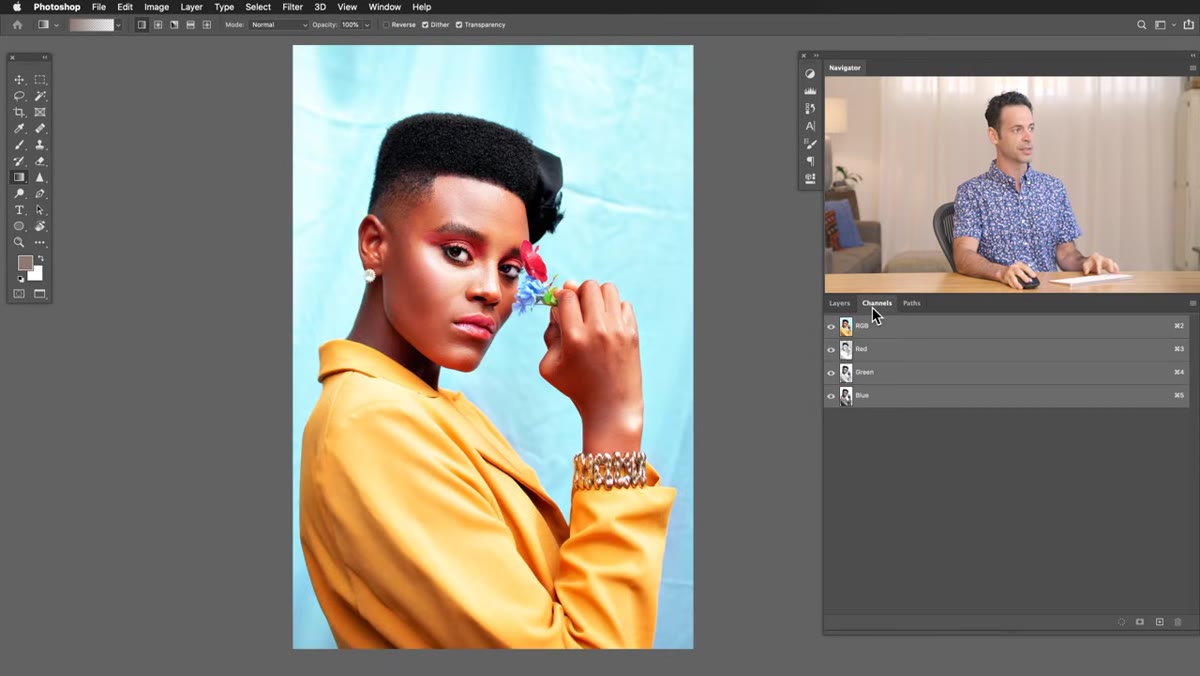 Channels panel open showing Red, Green, and Blue channels
Head to Window in the top menu bar and select Channels. You’ll see your composite RGB channel at the top, and below it the individual Red, Green, and Blue channels. Click through each one and look at them as grayscale images. You’re not looking for something specific so much as you’re previewing how your final duotone will look, because each channel’s contrast structure becomes the foundation of your highlight-shadow split.
Channels panel open showing Red, Green, and Blue channels
Head to Window in the top menu bar and select Channels. You’ll see your composite RGB channel at the top, and below it the individual Red, Green, and Blue channels. Click through each one and look at them as grayscale images. You’re not looking for something specific so much as you’re previewing how your final duotone will look, because each channel’s contrast structure becomes the foundation of your highlight-shadow split.
This is where a little subjectivity comes in, and that’s fine. For a lot of portraits, the Green channel tends to give you solid contrast and clean skin tones. For high-key shots with a lot of sky or light backgrounds, the Blue channel might give you a more dramatic result. The Red channel tends to look a bit flat on faces but can work great for certain landscapes or product shots. Click around and trust your eyes.
Step 2: Load the Channel as a Selection
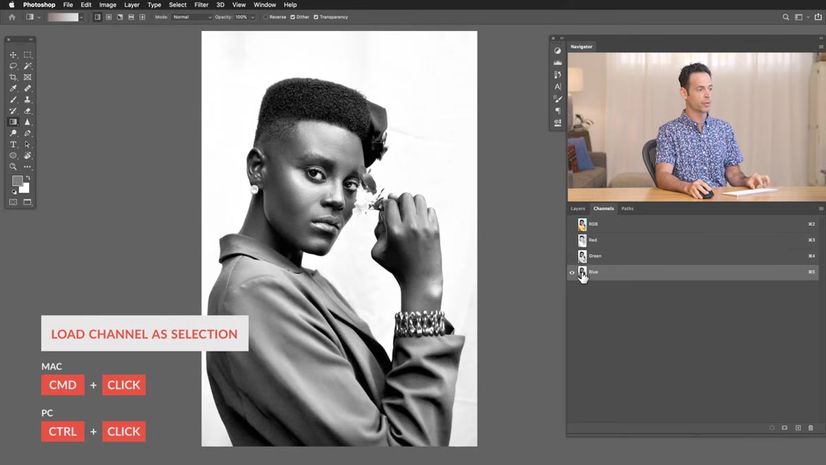 Ctrl-clicking channel thumbnail to load it as a selection
Once you’ve chosen the channel you want to work with, hold Ctrl (Windows) or Command (Mac) and click directly on that channel’s thumbnail in the panel. You’ll see the marching ants appear on your canvas, which means Photoshop has turned the channel’s luminosity data into an active selection. Brighter areas are more selected, darker areas less so. This is your highlight map.
Ctrl-clicking channel thumbnail to load it as a selection
Once you’ve chosen the channel you want to work with, hold Ctrl (Windows) or Command (Mac) and click directly on that channel’s thumbnail in the panel. You’ll see the marching ants appear on your canvas, which means Photoshop has turned the channel’s luminosity data into an active selection. Brighter areas are more selected, darker areas less so. This is your highlight map.
Alternatively, there’s a small “Load channel as selection” icon at the bottom of the Channels panel, which looks like a dotted circle. Either method does the same thing. I default to Ctrl/Command-clicking because keyboard shortcuts are basically a religion for me at this point.
Step 3: Add a Solid Color Fill Layer for Your Highlights
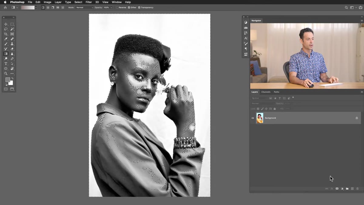 Solid Color fill layer being added with active selection as mask
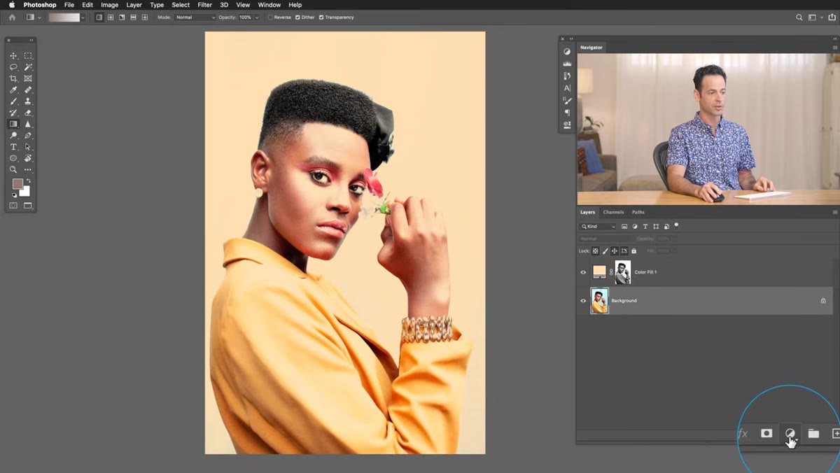
With your selection still active, switch back to your Layers panel. Click the adjustment layer icon at the bottom of the panel (it looks like a half-filled circle) and choose Solid Color. Here’s where the magic happens: Photoshop automatically loads your active selection as the layer mask for that fill layer. You don’t have to do anything extra.
Solid Color fill layer being added with active selection as mask
With your selection still active, switch back to your Layers panel. Click the adjustment layer icon at the bottom of the panel (it looks like a half-filled circle) and choose Solid Color. Here’s where the magic happens: Photoshop automatically loads your active selection as the layer mask for that fill layer. You don’t have to do anything extra.
The color picker will open immediately. For this first layer, you’re choosing the highlight color, so lean toward lighter, warmer tones. Think golden yellows, soft creams, pale pinks or light teals. The exact color depends on the mood you’re after, but remember that you can change it at any time by double-clicking the color swatch on the layer thumbnail. Pick something and move on. You can dial it in later.
Step 4: Add a Solid Color Fill Layer for Your Shadows
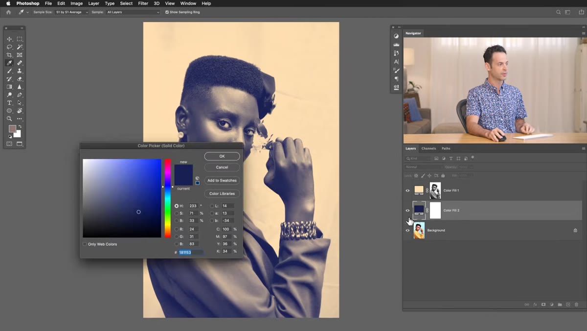
 Second Solid Color layer added below the first with no mask
Click on your Background layer (or whatever your base image layer is) to make sure you’re not adding the next layer above your masked highlight layer. Then go back to the adjustment layer icon and add another Solid Color fill layer. This one needs no mask at all. It sits below the highlight layer and fills everything the highlight layer doesn’t cover, which is your shadow and midtone regions.
Second Solid Color layer added below the first with no mask
Click on your Background layer (or whatever your base image layer is) to make sure you’re not adding the next layer above your masked highlight layer. Then go back to the adjustment layer icon and add another Solid Color fill layer. This one needs no mask at all. It sits below the highlight layer and fills everything the highlight layer doesn’t cover, which is your shadow and midtone regions.
For this layer, go darker and cooler. Deep blues, forest greens, rich purples. The contrast between a warm highlight color and a cool shadow color is the classic duotone formula, and it works because it mimics the way film stocks and dark room processes used to behave. That said, nothing is stopping you from doing warm-on-warm or cool-on-cool if you want something more subtle or weird.
Step 5: Refine and Experiment With Your Colors
 Double-clicking fill layer thumbnail to reopen color picker
This is the part where the non-destructive nature of the method really pays off. Double-click either fill layer’s color swatch to reopen the color picker, and just drag around. Because neither layer touches your original image, you can cycle through dozens of color combinations in seconds without any quality loss or undo anxiety. Try cycling through a few complementary pairs quickly before settling on one. It forces you to see options you wouldn’t have landed on by overthinking it.
Double-clicking fill layer thumbnail to reopen color picker
This is the part where the non-destructive nature of the method really pays off. Double-click either fill layer’s color swatch to reopen the color picker, and just drag around. Because neither layer touches your original image, you can cycle through dozens of color combinations in seconds without any quality loss or undo anxiety. Try cycling through a few complementary pairs quickly before settling on one. It forces you to see options you wouldn’t have landed on by overthinking it.
You can also toggle each layer on and off with the eye icon to compare your before and after, or to see how each layer is contributing individually.
One Thing I’d Add: Blend Mode Adjustments for Subtlety
Aaron’s technique gives you a strong, graphic duotone right out of the gate, which is exactly what you want most of the time. But if a client needs something more photographic and less poster-like, there’s an easy way to soften the effect without rebuilding anything. Change the blend mode of one or both Solid Color fill layers from Normal to something like Multiply (for the shadow layer) or Screen (for the highlight layer). This lets the original photo’s detail show through more and makes the color feel like it’s part of the image rather than sitting on top of it.
You can also lower the opacity of either layer independently. I’ve found that dropping the highlight layer to around 80% opacity often gives the most natural-looking result when I’m working on portrait work for clients who are initially excited about duotones but then get nervous when they actually see one applied to their face.
The single biggest lesson from this tutorial isn’t about duotones specifically. It’s about using the data that’s already inside your image instead of building from scratch. Photoshop’s channels are a complete luminosity map of your photo, just sitting there, and most people never touch them. Once you start using channels as a selection tool, you’ll start seeing applications everywhere: luminosity masks, targeted sharpening, complex compositing. The duotone method is a great entry point.
Go watch Aaron walk through it himself, including the live color experimentation that’s hard to fully capture in text: Watch the full tutorial on YouTube. It really does take under five minutes, and it’ll change how you think about color grading in Photoshop.
Comments (2)
Great breakdown. The step-by-step approach really helps.
Love how you break down complex stuff into manageable steps.
Leave a Comment