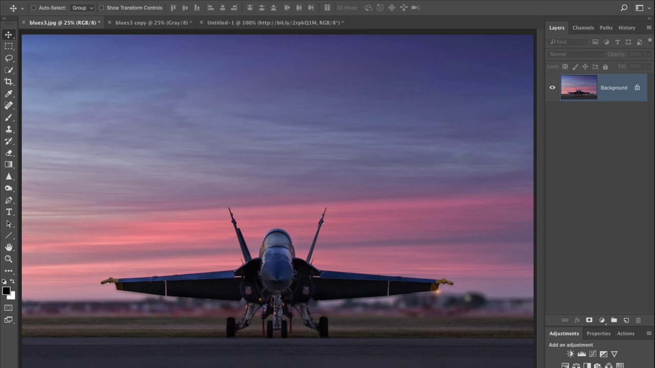
There’s a specific kind of embarrassment that comes from spending an hour trying to make a black and white conversion look cinematic, only to realize you’ve been using the worst possible method the whole time. I’ve been designing professionally long enough that I should know better, but I kept defaulting to Image > Mode > Grayscale like some kind of rookie. The result? Flat, lifeless, gray soup. Every single time. I’d then spend way too long pushing Curves and Levels trying to rescue it, from a terrible starting point.
That changed when I watched Scott Kelby’s quick tutorial on a lesser-known Photoshop feature called Calculations. Watch the full tutorial on YouTube – it’s under four minutes and it genuinely rewired how I think about grayscale. In this KelbyOne tutorial, Kelby pulls back the curtain on one of Photoshop’s genuinely useful buried features, a dialog most people have either never clicked or immediately closed because it looked intimidating. It’s not. And the difference in output quality is embarrassing once you see it side by side.
The core idea is this: instead of letting Photoshop flatten your color data into a uniform gray mush, Calculations lets you blend individual color channels together using blend modes and opacity, giving you real control over tone and contrast before you ever commit to grayscale. Here’s how to actually do it.
Step 1: See How Bad the Default Method Really Is
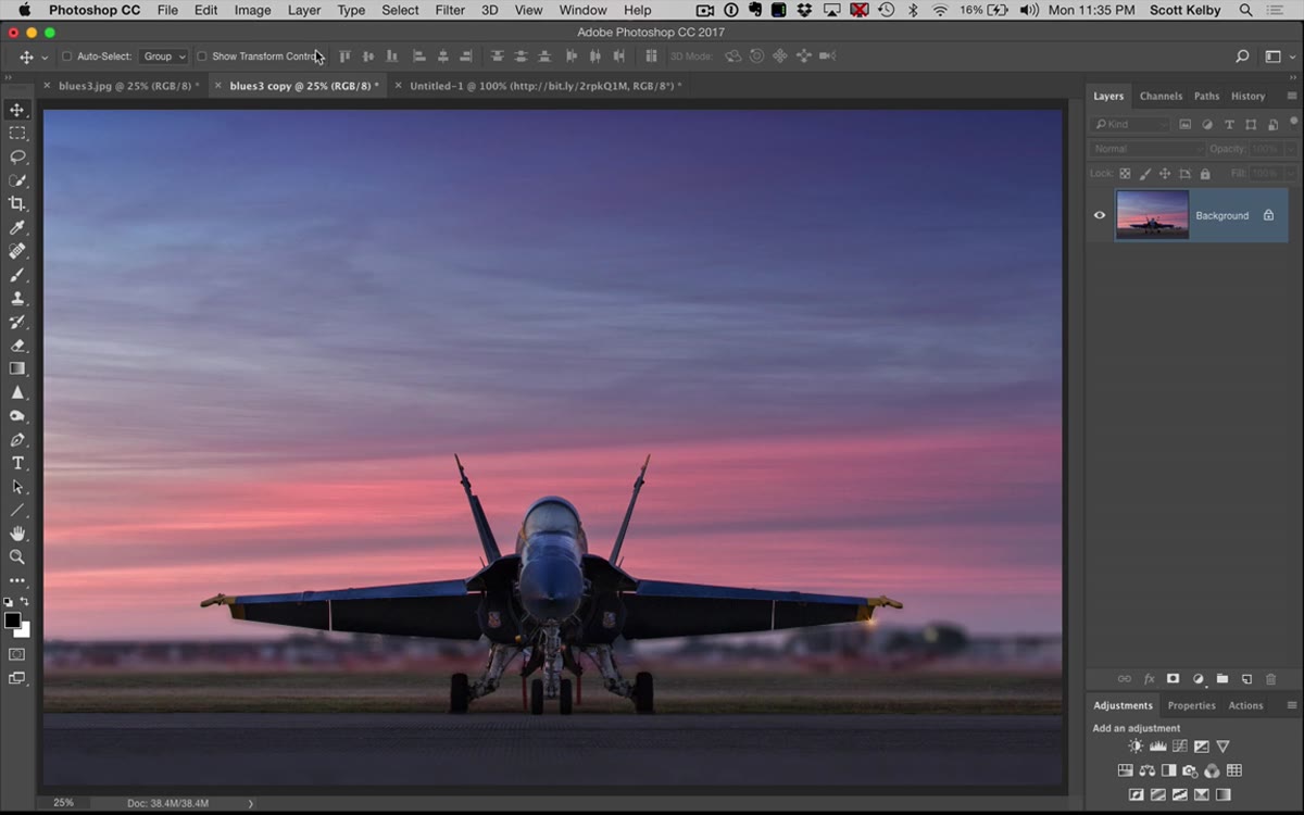 Default grayscale conversion showing flat, low-contrast result
Open your color image in Photoshop. Before we fix anything, it’s worth doing this once so the improvement actually registers. Go to Image > Mode > Grayscale. Photoshop will ask if you want to discard color information. Say yes. What you get is a conversion that treats every channel equally, which sounds fair until you see the result. Flat. Dull. No depth. Now undo everything and get your color image back, because we’re doing this properly.
Default grayscale conversion showing flat, low-contrast result
Open your color image in Photoshop. Before we fix anything, it’s worth doing this once so the improvement actually registers. Go to Image > Mode > Grayscale. Photoshop will ask if you want to discard color information. Say yes. What you get is a conversion that treats every channel equally, which sounds fair until you see the result. Flat. Dull. No depth. Now undo everything and get your color image back, because we’re doing this properly.
Step 2: Open the Calculations Dialog
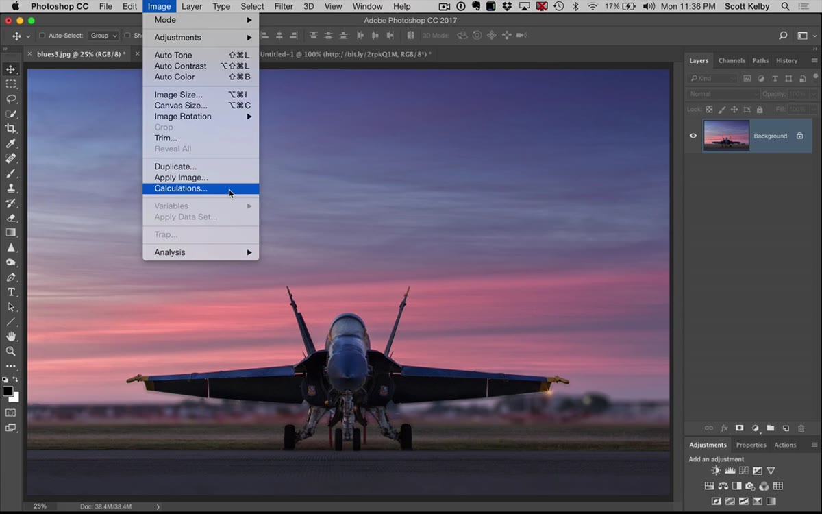 Image menu open with Calculations option highlighted
With your color image open, go to Image > Calculations. The dialog that appears looks a bit like it was designed by someone who hates you, but stick with it. You’ll see two source inputs, each with options for the layer and channel, plus a Blending section with blend mode and opacity controls. The default settings Photoshop drops you into are not good. Kelby is upfront about this: it usually looks bad immediately. Don’t panic and close it.
Image menu open with Calculations option highlighted
With your color image open, go to Image > Calculations. The dialog that appears looks a bit like it was designed by someone who hates you, but stick with it. You’ll see two source inputs, each with options for the layer and channel, plus a Blending section with blend mode and opacity controls. The default settings Photoshop drops you into are not good. Kelby is upfront about this: it usually looks bad immediately. Don’t panic and close it.
Step 3: Choose a Useful Blend Mode
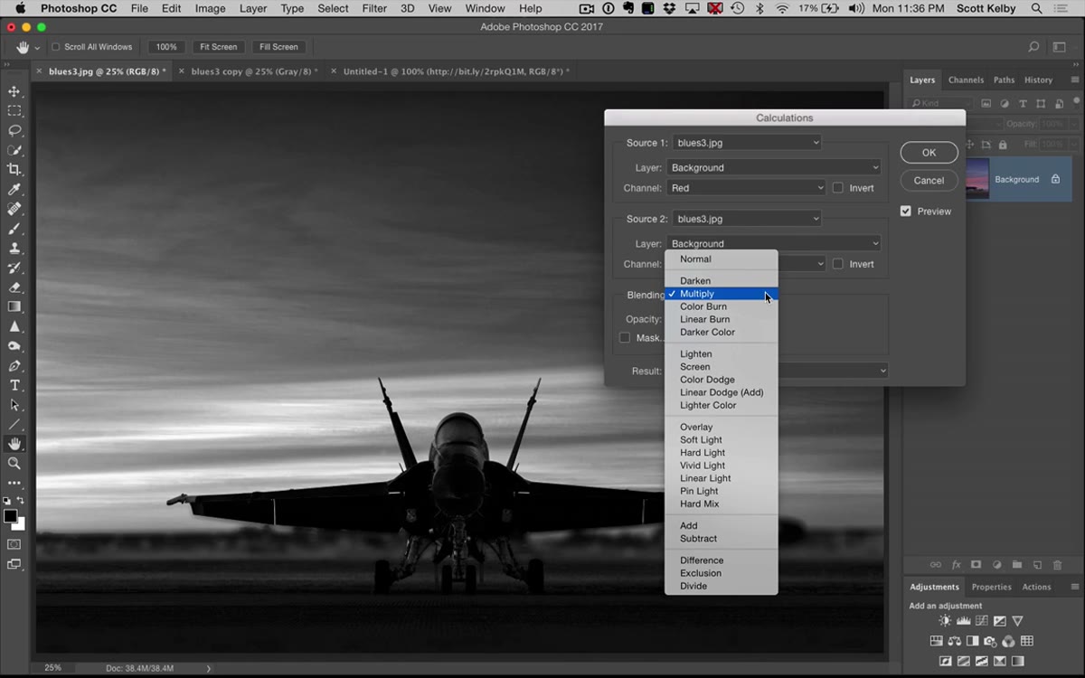 Calculations dialog open with Blending mode dropdown being accessed
The first thing to fix is the blend mode. In the Blending dropdown, ignore Normal and Multiply for this purpose. The four modes that tend to produce usable results for B&W conversions are Lighten, Screen, Overlay, and Soft Light. Each has a different personality. Soft Light gives you nice midtone contrast without going nuclear on the highlights or shadows, which makes it a solid starting point. Overlay is punchy but can go dark fast. Screen blows things out quickly. Lighten is gentle and often underrated. Start with Soft Light and see where it takes you.
Calculations dialog open with Blending mode dropdown being accessed
The first thing to fix is the blend mode. In the Blending dropdown, ignore Normal and Multiply for this purpose. The four modes that tend to produce usable results for B&W conversions are Lighten, Screen, Overlay, and Soft Light. Each has a different personality. Soft Light gives you nice midtone contrast without going nuclear on the highlights or shadows, which makes it a solid starting point. Overlay is punchy but can go dark fast. Screen blows things out quickly. Lighten is gentle and often underrated. Start with Soft Light and see where it takes you.
Step 4: Experiment With Channel Combinations
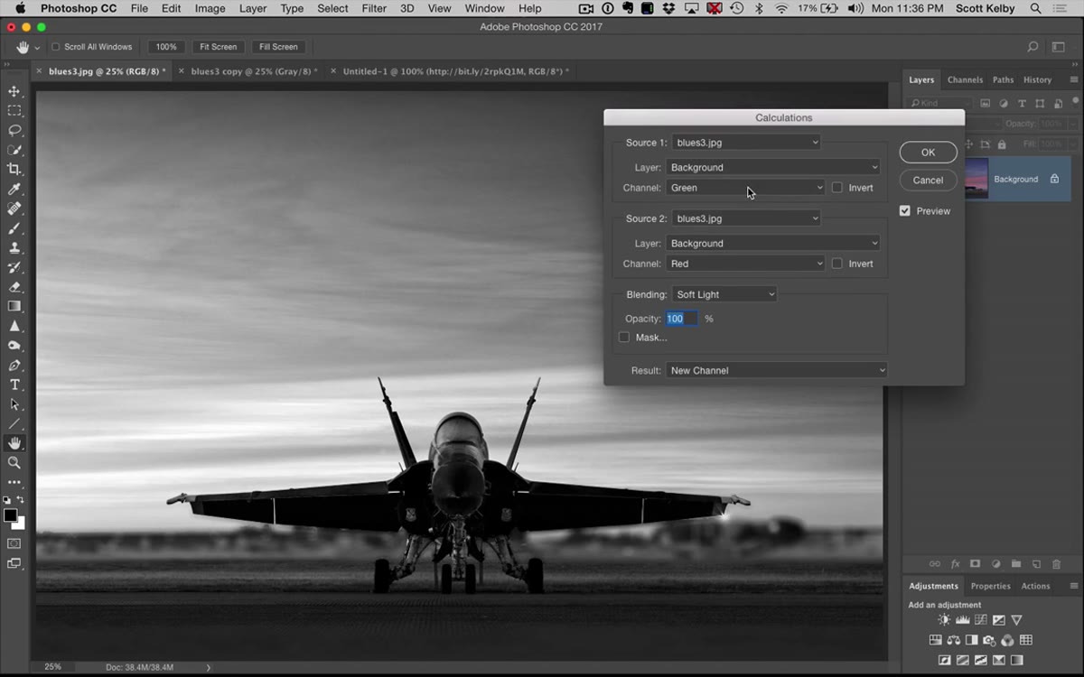 Channel dropdowns being changed in Calculations dialog, showing real-time preview
This is where the magic actually happens. Each of the two source inputs has a Channel dropdown where you can choose Red, Green, or Blue. These are your raw color channels, and they each carry very different tonal information. The Green channel usually holds the most luminosity detail. The Blue channel tends to add contrast and can give skin tones a nice quality. The Red channel is often the brightest but can blow out depending on your image.
Channel dropdowns being changed in Calculations dialog, showing real-time preview
This is where the magic actually happens. Each of the two source inputs has a Channel dropdown where you can choose Red, Green, or Blue. These are your raw color channels, and they each carry very different tonal information. The Green channel usually holds the most luminosity detail. The Blue channel tends to add contrast and can give skin tones a nice quality. The Red channel is often the brightest but can blow out depending on your image.
Try different combinations and watch the canvas update in real time. Green + Blue is often a strong pairing. Blue + Blue sounds redundant but can work surprisingly well. Kelby finds a Blue + Red combination he likes mid-video, and it genuinely looks great on his example image. There’s no universal correct answer here. The whole point is that you’re working with the actual data in your specific photograph, not a generic algorithm.
Step 5: Dial In the Opacity
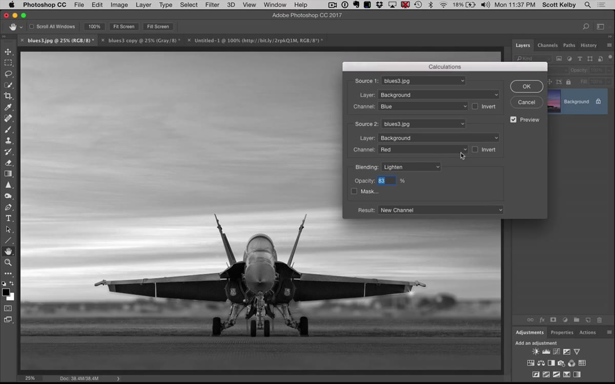 Opacity slider being adjusted in Calculations dialog
Once you find a channel combination and blend mode you like, use the Opacity slider in the Calculations dialog to back off the intensity if things are getting too contrasty or too bright. Think of it exactly like layer opacity. You’re blending the effect against itself at a reduced strength. Even dropping to 80 or 85 percent can smooth out harsh results while keeping the tonal depth you’ve built. Small adjustments here make a real difference.
Opacity slider being adjusted in Calculations dialog
Once you find a channel combination and blend mode you like, use the Opacity slider in the Calculations dialog to back off the intensity if things are getting too contrasty or too bright. Think of it exactly like layer opacity. You’re blending the effect against itself at a reduced strength. Even dropping to 80 or 85 percent can smooth out harsh results while keeping the tonal depth you’ve built. Small adjustments here make a real difference.
Step 6: Confirm and Convert to Grayscale
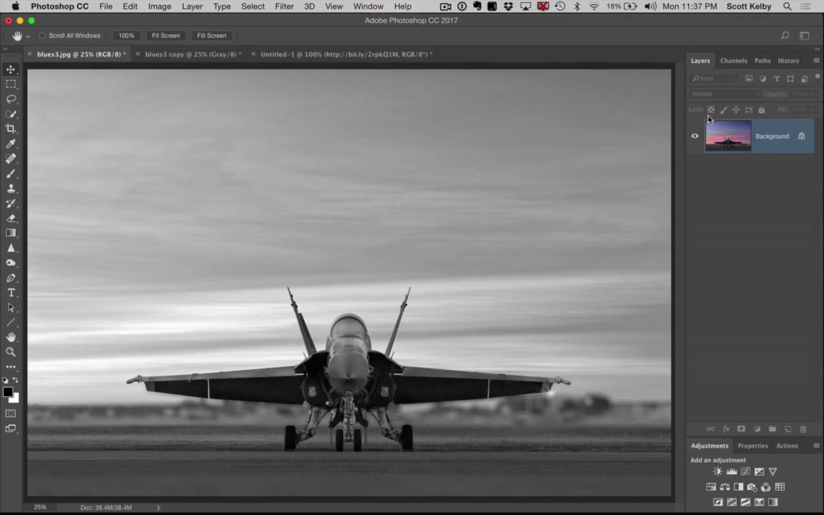 Clicking OK in Calculations dialog, then switching to RGB channel in Channels panel
When you’re happy with the preview, click OK. Here’s the catch Kelby flags that’s easy to miss: Calculations works on channels, so Photoshop will drop you into a single channel view. Go to your Channels panel and click on RGB to get back to the composite view. Now you can actually see your result properly. Once you’ve confirmed it looks the way you want, go to Image > Mode > Grayscale and discard the other channels. Photoshop will preserve the conversion you built rather than overriding it with its own flat version.
Clicking OK in Calculations dialog, then switching to RGB channel in Channels panel
When you’re happy with the preview, click OK. Here’s the catch Kelby flags that’s easy to miss: Calculations works on channels, so Photoshop will drop you into a single channel view. Go to your Channels panel and click on RGB to get back to the composite view. Now you can actually see your result properly. Once you’ve confirmed it looks the way you want, go to Image > Mode > Grayscale and discard the other channels. Photoshop will preserve the conversion you built rather than overriding it with its own flat version.
What I’d Add From My Own Workflow
One thing the tutorial doesn’t cover, but that I’ve started doing regularly: running Calculations as part of a comparison workflow before I commit. I’ll duplicate the image two or three times, run Calculations with different channel combinations on each copy, then line them up and compare at 100 percent zoom. Especially for portrait work, the difference between a Green + Blue and a Red + Blue conversion can completely change how skin reads in the final image. It takes an extra two minutes and has saved me from settling for mediocre results more times than I’d like to admit. Also worth knowing: if you’re working on a layered document, Calculations will let you pick specific layers as sources too, not just the merged composite. That opens up some interesting possibilities if your file has multiple exposures or adjustment states stacked up.
The single most important thing I took from this tutorial is that Photoshop’s default grayscale conversion is genuinely one of its worst tools, and there’s a better option sitting two clicks away in the Image menu that most people have never tried. Calculations isn’t complicated once you’re actually inside it. It’s just channel blending with a slightly intimidating UI. Give it fifteen minutes and it’ll replace your old method permanently.
Watch the full tutorial on YouTube and see the side-by-side comparison Kelby does at the end. The difference between the default conversion and the Calculations version is the kind of thing you can’t unsee.
Comments (1)
This should be required reading for anyone starting out.
Leave a Comment