
There’s a specific kind of frustration that comes from staring at a photo that’s almost great. The composition is solid, the subject is sharp, but the light feels flat and lifeless, like the scene was lit by a dentist’s office. I’ve been there more times than I’d like to admit, and my usual fix was to slap a Color Balance adjustment layer on it and hope for the best. Spoiler: it never looked great. What I actually needed was a way to isolate the existing light sources and enhance them without blowing up everything else in the frame.
That’s exactly what this technique from Aaron Nace over at PHLEARN delivers. Watch the full tutorial on YouTube before or after reading through these steps. The core idea is clever: instead of painting light in by hand or using a filter, you let the image itself tell you where the light already lives, then you amplify it. The whole workflow is built around channels and layer masks, two tools that a lot of people know exist but avoid because they sound scarier than they are. They’re not. Follow along and you’ll see.
Step 1: Open the Channels Panel and Evaluate Each Channel
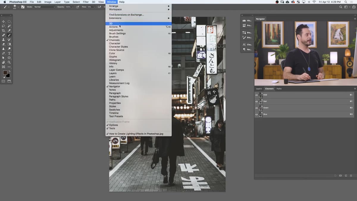 Red, green, and blue channels visible in Channels panel
Your first move is to open the Channels panel. If you don’t see it, go to Window and check Channels. Once it’s open, click through your Red, Green, and Blue channels one at a time. You’re not looking for color here, you’re looking for contrast. Specifically, you want the channel where your light sources appear brightest against the darkest possible background.
Red, green, and blue channels visible in Channels panel
Your first move is to open the Channels panel. If you don’t see it, go to Window and check Channels. Once it’s open, click through your Red, Green, and Blue channels one at a time. You’re not looking for color here, you’re looking for contrast. Specifically, you want the channel where your light sources appear brightest against the darkest possible background.
In most night or indoor shots with warm practical lights, the Blue channel tends to do this job well. The lights pop as near-white areas while the surrounding environment stays deep gray or black. That high contrast is the whole ballgame for the next step, so take the time to actually compare all three channels before committing.
Step 2: Load the Channel as a Selection
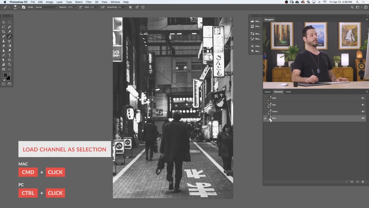 Ctrl-clicking blue channel thumbnail to create selection
Once you’ve identified the best channel, hold Ctrl (Windows) or Command (Mac) and click directly on that channel’s thumbnail. Photoshop will generate a luminosity-based selection from it, meaning the brightest pixels in the channel become fully selected, darker pixels are partially selected, and the darkest areas are left out entirely.
Ctrl-clicking blue channel thumbnail to create selection
Once you’ve identified the best channel, hold Ctrl (Windows) or Command (Mac) and click directly on that channel’s thumbnail. Photoshop will generate a luminosity-based selection from it, meaning the brightest pixels in the channel become fully selected, darker pixels are partially selected, and the darkest areas are left out entirely.
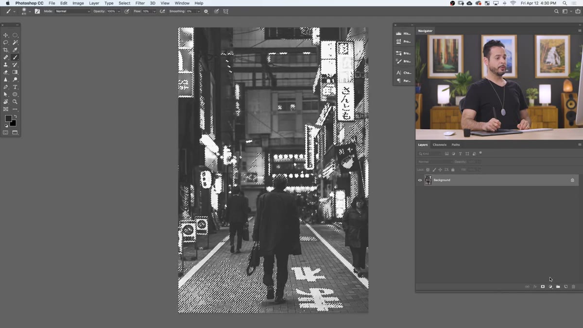
You’ll see the marching ants appear across your image. Don’t worry if the selection looks a bit odd or scattered, that’s expected. This selection isn’t meant to look like a clean cutout. It’s a map of your light intensity, and it’s about to drive a layer mask that does something much more precise than a regular selection ever could.
Step 3: Create a Solid Color Fill Layer With the Selection Active
 New solid color fill layer dialog appearing over image
With your selection still active, go to Layer, New Fill Layer, and choose Solid Color. Because you had a selection when you created the layer, Photoshop automatically converts that selection into a layer mask for the new fill layer. You don’t have to do anything extra. The mask is just there.
New solid color fill layer dialog appearing over image
With your selection still active, go to Layer, New Fill Layer, and choose Solid Color. Because you had a selection when you created the layer, Photoshop automatically converts that selection into a layer mask for the new fill layer. You don’t have to do anything extra. The mask is just there.
When the color picker opens, try a warm amber or orange to start. Something in the range of a soft golden tone works well for giving existing lights a warmer, more cinematic quality. Hit OK and you’ll immediately see the color appear in the brighter regions of the image. It already looks like something, which is a good sign.
Step 4: Refine the Layer Mask With Levels
 Levels dialog open on layer mask, black point slider moving right
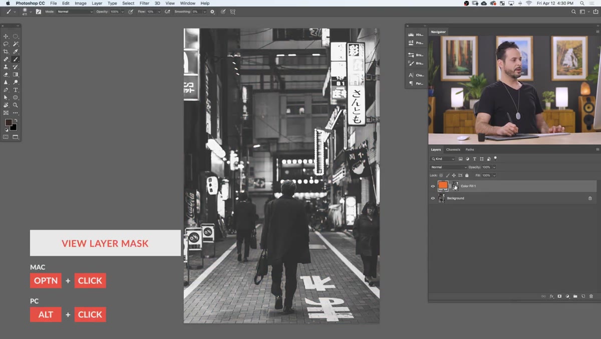
The mask at this point is functional but sloppy. It’s pulling in some midtone areas that shouldn’t have color on them. To tighten it up, Alt-click (Option on Mac) on the layer mask thumbnail. This switches your view to the mask itself so you can see exactly what’s happening. Then hit Ctrl+L (Command+L) to open a Levels adjustment directly on the mask.
Levels dialog open on layer mask, black point slider moving right
The mask at this point is functional but sloppy. It’s pulling in some midtone areas that shouldn’t have color on them. To tighten it up, Alt-click (Option on Mac) on the layer mask thumbnail. This switches your view to the mask itself so you can see exactly what’s happening. Then hit Ctrl+L (Command+L) to open a Levels adjustment directly on the mask.
Drag the black point slider to the right. This pushes more of the mask toward pure black, which means those midtone areas that were picking up your color get cut out. The light sources, being the brightest points in the mask, hold their white values longer, so they stay visible. Aim for a result where only the actual bulbs and glow zones are clearly white or light gray. Hit OK, then Alt-click the mask thumbnail again to return to the normal image view.
Step 5: Paint Out Any Problem Areas on the Mask
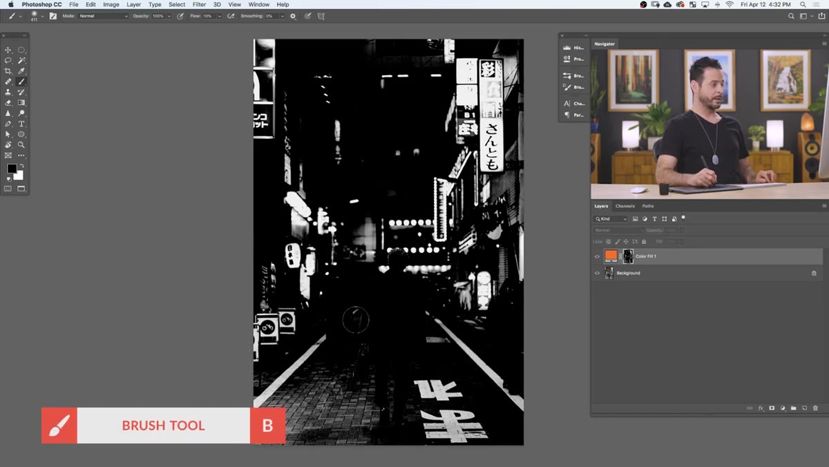 Brush tool painting black over floor area on layer mask
Even after running Levels, there will probably be a few spots where the color is landing somewhere it shouldn’t, like reflective floors, signage, or any surface that happened to be bright in your channel. Still viewing the image normally, grab your Brush tool (B), set your foreground color to black, and paint directly over those areas.
Brush tool painting black over floor area on layer mask
Even after running Levels, there will probably be a few spots where the color is landing somewhere it shouldn’t, like reflective floors, signage, or any surface that happened to be bright in your channel. Still viewing the image normally, grab your Brush tool (B), set your foreground color to black, and paint directly over those areas.
You’re painting on the mask, so make sure the mask thumbnail is selected in the Layers panel rather than the color swatch. A soft, low-hardness brush gives you better control at the edges. The goal isn’t perfection. If a faint trace of the color color bleeds into a nearby surface, it can actually look natural. What you’re eliminating is the obvious stuff that clearly breaks the illusion.
My Two Cents: This Works Even Better With Multiple Color Layers
The tutorial wraps up with one warm color light layer, and that result already looks legitimately good. But in my own workflow, I’ve started stacking two or three of these fill layers with different colors and different blend modes. Run the same channel selection process, create a second fill layer in a cooler blue-white tone, and set it to Screen or Soft Light. Then drop the opacity way down. You end up with light that has more color complexity, the kind of warm-to-cool shift that makes a scene feel like it was actually lit by a real photographer rather than corrected in post.
I also keep a black brush on standby to paint into individual masks independently. That way the warm layer might cover the lamp in the corner while the cool layer handles a window on the opposite side. The whole thing stays non-destructive, and you can go back and adjust any color at any point without starting over.
The single most important thing to take away here is that Photoshop already contains the information you need to isolate light, it’s just stored in the channels. Learning to read channels, not just as a technical feature but as a creative tool, changes how you approach almost every composite or color grading job. It’s one of those skills that quietly makes everything else you do look more polished.
Watch the full tutorial on YouTube to see Aaron walk through the whole thing in real time. His pacing is clear, and he shows a few additional brush edits that are worth watching even if you’ve got the core steps locked in.
Comments
Leave a Comment