
I shoot a lot of product and portrait work on whatever camera is available, which sometimes means a phone, sometimes means a borrowed DSLR set to completely wrong settings, and occasionally means something that was technically fine but came out looking like a passport photo. The background is sharp. The subject is sharp. Everything is equally, brutally sharp. It looks like a surveillance photo, not a portfolio piece. Blurring that background in post is one of those techniques I kept putting off learning properly because I assumed it would look fake. Turns out it doesn’t have to, and Aaron Nace from PHLEARN has a tutorial that walks you through the whole thing start to finish.
Watch the full tutorial on YouTube
The core idea is simple: isolate your subject from the background with a precise selection, then blur the background independently. The devil is entirely in the selection quality. A sloppy cutout will make your blur look like you ran a photo through a bad mobile app from 2011. A clean one will make people ask what lens you used. Aaron demonstrates this on a portrait where the subject’s colors and the background colors are close enough in tone that the eye doesn’t naturally separate them. It’s a good test case because it’s exactly the kind of image where the technique earns its keep.
Step 1: Assess the Image and Understand the Goal
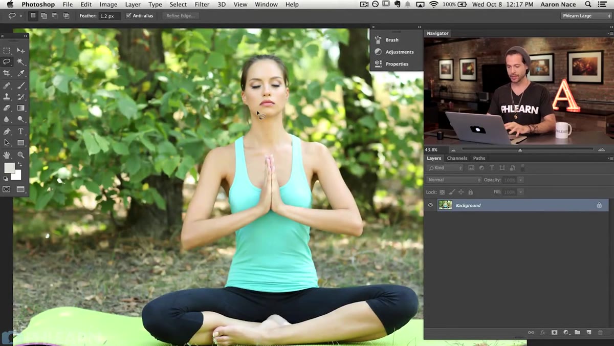 Portrait image open in Photoshop with similar foreground and background tones
Before touching a single tool, spend thirty seconds actually looking at your image. Aaron points out something useful here: the problem isn’t just that the background is in focus, it’s that the background and subject share similar colors. That tonal closeness is what makes the image feel flat. The blur will solve two things at once. It will literally defocus the background, and it will create contrast between the sharp subject and the soft surroundings, which is how your eye decides what matters in a frame. Know what you’re trying to fix before you start clicking.
Portrait image open in Photoshop with similar foreground and background tones
Before touching a single tool, spend thirty seconds actually looking at your image. Aaron points out something useful here: the problem isn’t just that the background is in focus, it’s that the background and subject share similar colors. That tonal closeness is what makes the image feel flat. The blur will solve two things at once. It will literally defocus the background, and it will create contrast between the sharp subject and the soft surroundings, which is how your eye decides what matters in a frame. Know what you’re trying to fix before you start clicking.
Step 2: Choose Your Selection Tool (and Know Why)
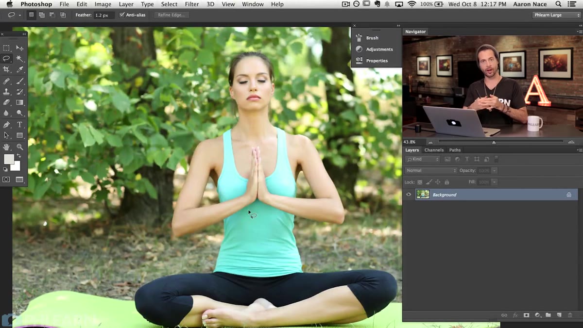
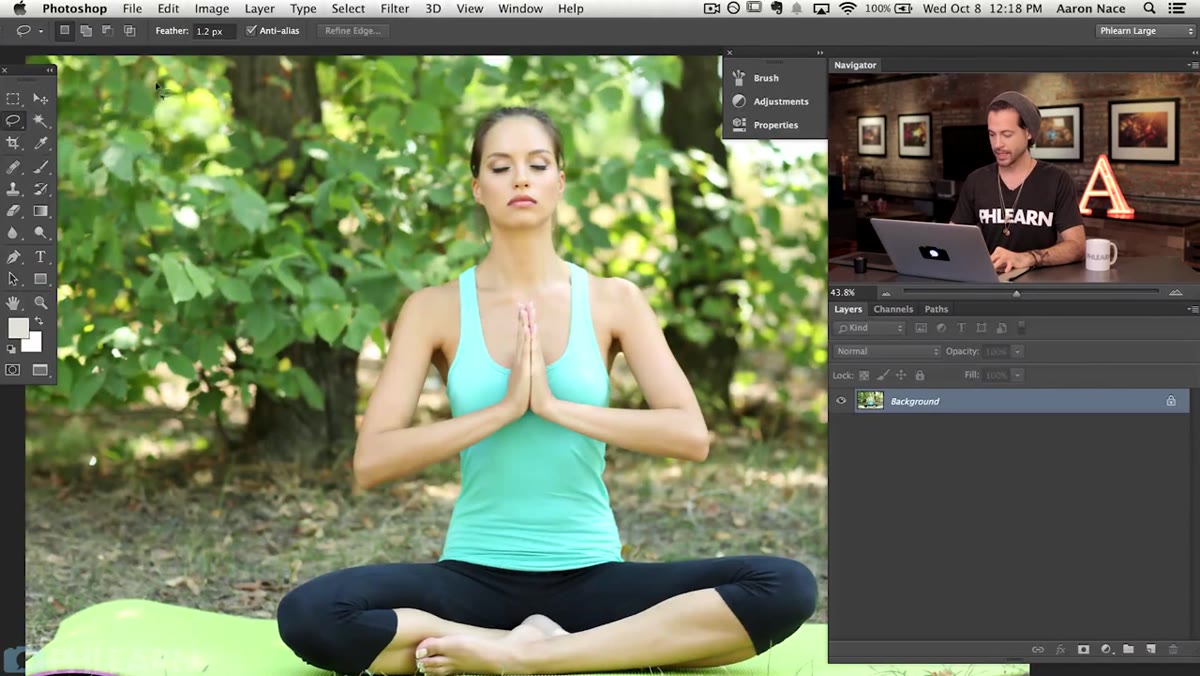 Lasso tool active in Photoshop toolbar with subject visible
Aaron runs through the selection tool options and is refreshingly honest about the tradeoffs. The standard Lasso tool is fast but hard to control precisely, especially with a mouse. If you’re drawing freehand with a mouse, you’re fighting the tool. The Magnetic Lasso is a better middle-ground option. It auto-detects edges as you trace along them, which means you don’t have to follow the contour pixel-perfectly. Click to start, drag around the subject, and the tool snaps to the edges it detects. If it slips up, hitting Backspace removes the last anchor point so you can back up and retry. For most people who haven’t drilled the Pen tool, the Magnetic Lasso will get you a usable selection without a lot of frustration.
Lasso tool active in Photoshop toolbar with subject visible
Aaron runs through the selection tool options and is refreshingly honest about the tradeoffs. The standard Lasso tool is fast but hard to control precisely, especially with a mouse. If you’re drawing freehand with a mouse, you’re fighting the tool. The Magnetic Lasso is a better middle-ground option. It auto-detects edges as you trace along them, which means you don’t have to follow the contour pixel-perfectly. Click to start, drag around the subject, and the tool snaps to the edges it detects. If it slips up, hitting Backspace removes the last anchor point so you can back up and retry. For most people who haven’t drilled the Pen tool, the Magnetic Lasso will get you a usable selection without a lot of frustration.
Step 3: Use the Pen Tool for a Precise Cutout
 Pen tool path being drawn around subject’s edge
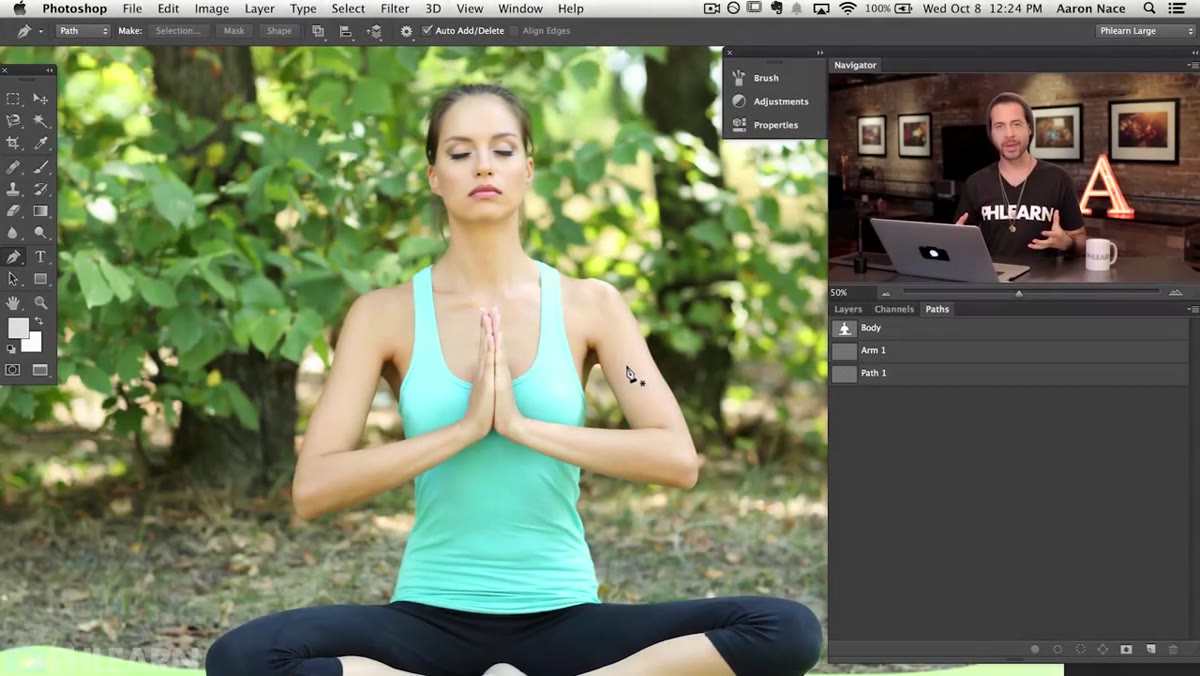
Aaron’s actual recommendation, and mine too, is the Pen tool. It takes longer to learn but it gives you hard vector paths that you control completely. Click to place anchor points around the edge of your subject, curve handles to match curves in the silhouette, and you end up with a path that doesn’t drift or guess. For a portrait with arms, hair, or anything else that overlaps or creates gaps, this is where the Pen tool pays off. Aaron actually creates three separate paths for this image: one for the main body outline, and one each for the small gaps between the subject’s hands where the background shows through. Those small negative spaces matter. Ignoring them means the background blur will stop at the hands but still bleed through the gaps, which immediately looks wrong.
Pen tool path being drawn around subject’s edge
Aaron’s actual recommendation, and mine too, is the Pen tool. It takes longer to learn but it gives you hard vector paths that you control completely. Click to place anchor points around the edge of your subject, curve handles to match curves in the silhouette, and you end up with a path that doesn’t drift or guess. For a portrait with arms, hair, or anything else that overlaps or creates gaps, this is where the Pen tool pays off. Aaron actually creates three separate paths for this image: one for the main body outline, and one each for the small gaps between the subject’s hands where the background shows through. Those small negative spaces matter. Ignoring them means the background blur will stop at the hands but still bleed through the gaps, which immediately looks wrong.
Step 4: Convert Your Paths to a Selection
 Paths panel open showing multiple path outlines ready to convert
Once your paths are drawn, open the Paths panel and convert them to a selection. You can do this by Ctrl-clicking (Cmd-click on Mac) the path thumbnail, or by using the “Make Selection” option from the panel menu. If you have multiple paths like Aaron does here, you’ll need to add them together so the full shape, including those gap cutouts, is included in the selection. Those inner paths for the hand gaps should be subtracted from the main selection so they register as holes, not solid areas. Get this logic right and your selection will accurately reflect the real shape of your subject, including the parts that aren’t solid.
Paths panel open showing multiple path outlines ready to convert
Once your paths are drawn, open the Paths panel and convert them to a selection. You can do this by Ctrl-clicking (Cmd-click on Mac) the path thumbnail, or by using the “Make Selection” option from the panel menu. If you have multiple paths like Aaron does here, you’ll need to add them together so the full shape, including those gap cutouts, is included in the selection. Those inner paths for the hand gaps should be subtracted from the main selection so they register as holes, not solid areas. Get this logic right and your selection will accurately reflect the real shape of your subject, including the parts that aren’t solid.
Step 5: Duplicate the Background and Create Your Layers
 Layers panel showing duplicate background layer structure
With your selection active, you’ll want to separate the subject from the background into distinct layers. The cleanest approach is to duplicate the base layer twice. One copy becomes your isolated subject (apply the selection as a mask), and another stays as your background to receive the blur. Working with layer masks rather than deleting pixels is the move here. Non-destructive. You can always go back and refine the mask edge if the selection wasn’t quite right on the first pass. If you ever deleted pixels directly and then realized the edge needed work, you know exactly how much that costs you in time.
Layers panel showing duplicate background layer structure
With your selection active, you’ll want to separate the subject from the background into distinct layers. The cleanest approach is to duplicate the base layer twice. One copy becomes your isolated subject (apply the selection as a mask), and another stays as your background to receive the blur. Working with layer masks rather than deleting pixels is the move here. Non-destructive. You can always go back and refine the mask edge if the selection wasn’t quite right on the first pass. If you ever deleted pixels directly and then realized the edge needed work, you know exactly how much that costs you in time.
Step 6: Apply the Blur to the Background Layer
 Background layer selected with blur being applied in Photoshop
With your background layer selected and your subject safely masked on a layer above it, apply a Gaussian Blur or the Lens Blur filter. Gaussian Blur is faster and works well for most purposes. Lens Blur is slower but produces a more optically realistic result with a bokeh-like quality. The blur radius you choose depends on the image, but start around 15-25 pixels and adjust from there. The goal is to push the background into soft abstraction without making it look like a smeared watercolor. You want shapes and colors still hinting through, just out of focus, the way a real shallow depth of field background looks.
Background layer selected with blur being applied in Photoshop
With your background layer selected and your subject safely masked on a layer above it, apply a Gaussian Blur or the Lens Blur filter. Gaussian Blur is faster and works well for most purposes. Lens Blur is slower but produces a more optically realistic result with a bokeh-like quality. The blur radius you choose depends on the image, but start around 15-25 pixels and adjust from there. The goal is to push the background into soft abstraction without making it look like a smeared watercolor. You want shapes and colors still hinting through, just out of focus, the way a real shallow depth of field background looks.
One Thing I’d Add: Check Your Mask Edges Before Blurring
The step that trips people up isn’t the blur, it’s the mask edge. If your mask cuts off too hard, you’ll see a sharp halo around your subject where the background abruptly disappears. Go to Select and Mask (or Refine Edge in older versions) and add a small amount of feathering, usually 0.5 to 1.5 pixels, to soften the transition. For hair or fine detail, use the Refine Edge brush to pull in the edge detection. The extra two minutes here is the difference between a composite that looks real and one that looks like a sticker on a blurry wall.
The single most important thing this technique taught me is that a selection is only as good as the time you put into it. The blur is easy. Photoshop does the blur. What you’re actually doing when you spend time with the Pen tool is giving yourself a foundation that holds up at any zoom level. Fake depth of field works when the cutout is honest. Cut corners there and no amount of blur settings will save it.
Watch the full tutorial on YouTube and follow along with Aaron’s full walkthrough, especially if you want to see the Pen tool path creation in real time. That part is worth watching at half speed.
Comments
Leave a Comment