I’ll be honest with you. For most of my freelance career, my composite shadows were embarrassing. Not “client noticed” embarrassing, but “I know it’s wrong and I can’t unsee it” embarrassing. Flat, uniform, pasted-on. The kind of shadow that screams “I used the drop shadow dialog and called it a day.” It wasn’t until a client asked me to revise a product composite three times, specifically the shadow, that I finally sat down and figured out what I was actually missing.
The fix turned out to be simpler than I deserved.
Why Shadows Are the Thing That Breaks Most Composites
The reason bad shadows are so obvious is physics. In real life, a shadow is sharpest and darkest right at the base of an object, where it’s closest to the surface. The further that shadow stretches away from the subject, the softer and lighter it gets. It’s not a hard edge. It’s not a uniform smear. It’s a gradient, literally and optically.
Most Photoshop beginners (and a lot of intermediates) apply one blur value to the whole shadow and call it realistic. It isn’t. Your brain knows it isn’t, even if it can’t articulate why. That mismatch is what makes composites look fake.
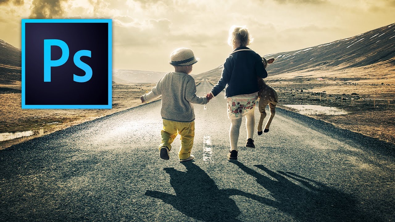
In this Kelvin Designs tutorial on creating shadows in Photoshop, Kelvin walks through exactly how to solve this, using tools that are already in your panel but probably not in your workflow.
The Core Technique: Building a Shadow That Actually Behaves Like One
Here’s how the process works, step by step.
Start with your subject already isolated on its own layer above your background. Duplicate that subject layer. On the duplicate, fill the content with black using a Color Overlay layer style set to black at 100% opacity, or use Image > Adjustments > Hue/Saturation with Colorize on and drag the lightness all the way down. This black silhouette becomes your shadow base.
Next, use Edit > Transform to manipulate the shadow. Perspective transform or Skew is your friend here. You want to flatten the silhouette and angle it away from the subject, mimicking the direction of your light source. Squish it down vertically, stretch it out horizontally, lean it in the direction the light is coming from. This is where you make the positional decision, so take your time.
Now here’s the part that changes everything: the Field Blur. Go to Filter > Blur Gallery > Field Blur. What Field Blur lets you do that a regular Gaussian Blur doesn’t is apply variable blur amounts at different points on the same layer. Drop a pin near the base of the shadow and set it to a low blur value, something around 3-5 pixels. Drop another pin near the far edge and crank it up to 20-40 pixels depending on your image size. Photoshop interpolates the blur across the distance between those pins. Sharp near the subject, soft at the edges, exactly like a real shadow.
After applying the blur, drop the layer’s opacity. Real shadows are rarely solid black. Somewhere between 60% and 80% is a reasonable starting point, though this depends heavily on the lighting in your background plate. A bright, overcast scene needs a lighter shadow. Harsh midday sun pushes you darker. Trust your eye over any specific number.
The Gradient Mask Is Doing More Work Than You Think
The Field Blur handles the blur graduation, but Kelvin also uses a layer mask with a gradient to fade the shadow out naturally at the far end. This is the step that separates a good result from a great one.
Add a layer mask to your shadow layer. Select the Gradient Tool, set it to a black-to-white linear gradient, and drag from the far edge of the shadow toward the subject. Black on the mask hides, white reveals, so you’re fading the shadow into transparency as it gets further from the subject. Combined with the Field Blur, you get both the softness graduation and the opacity fade working together. It feels redundant until you see the difference it makes.
Where This Technique Has Limits (and What I’d Do Differently)
This approach is excellent for ground shadows on relatively flat surfaces. Where it starts to strain is when your subject is interacting with uneven terrain, curved objects, or multiple light sources. I ran into this doing a composite where a person was standing on a rocky path. The shadow needed to bend over and wrap around the rocks, and a simple flat shadow shape wasn’t going to cut it.
For situations like that, I’ve started using a combination of this technique for the primary shadow plus smaller, hand-painted shadow accents using a soft brush set to Multiply blend mode at low opacity. You build up the contact shadow in layers rather than relying on one shape to do everything. It takes longer, but the result holds up better at high resolution and in print.
For the vast majority of product composites, headshots against new backgrounds, and marketing visuals, though? The Kelvin Designs method is fast, clean, and convincing.
The One Thing Worth Remembering
If you take nothing else from this: a shadow is not a uniform shape. It is sharpest and darkest at the point of contact, and it gets softer and lighter the further it travels. Build that behavior into your workflow, and your composites will immediately look more grounded.
Watch the full Kelvin Designs tutorial for the visual walkthrough. Seeing the Field Blur pins get placed in real time is worth ten minutes of your afternoon.
Comments
Leave a Comment