I lost a client last year over a shadow. Not literally, but practically. I handed over a composite and the first thing they said was “why does it look like he’s floating?” The subject was sharp, the color grading was tight, the masking was clean. The shadow looked like I’d just slapped a dark ellipse under the guy and called it a day. Because I had.
Shadows are one of those things I kept pushing to “good enough” because the rest of the work felt more interesting. That approach will humble you eventually.
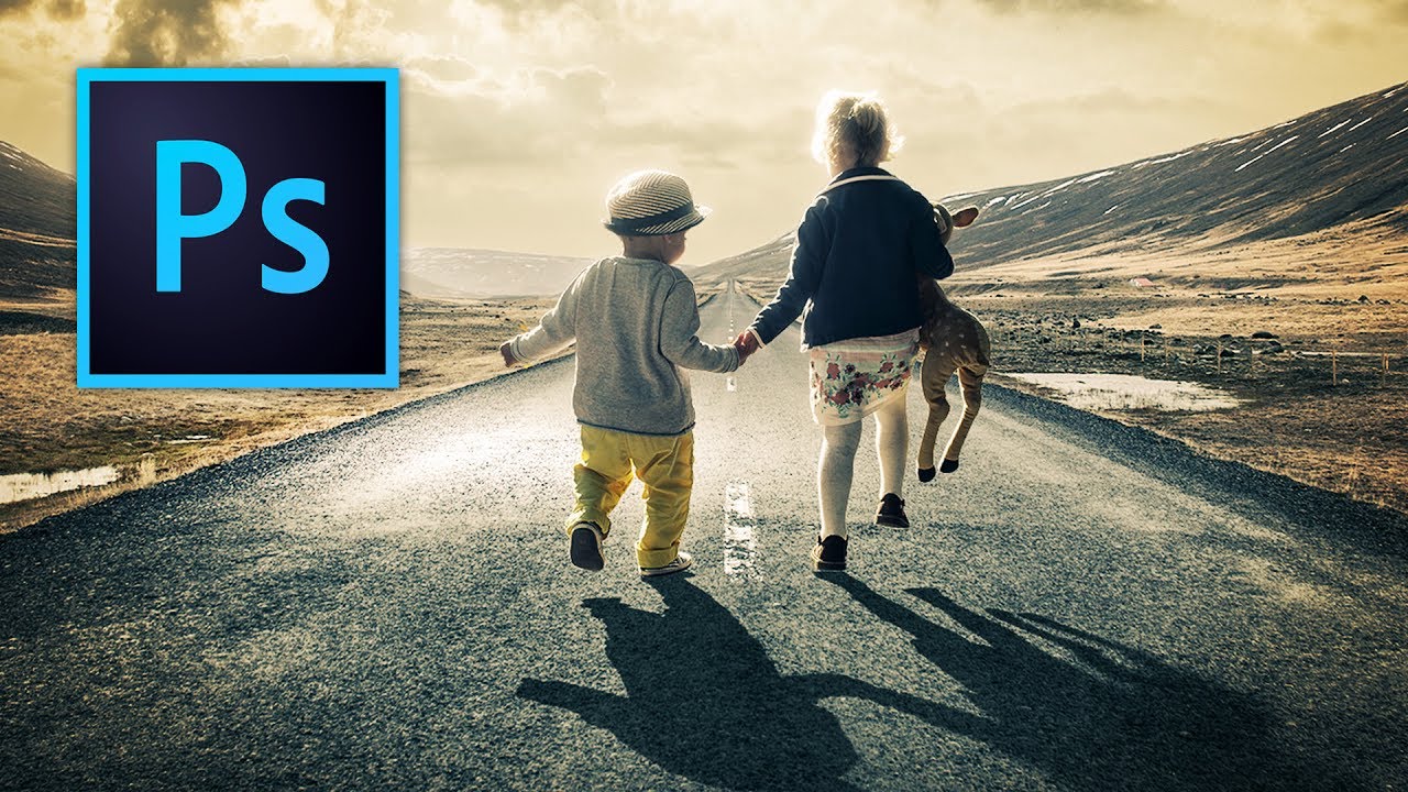
So when I came across this Kelvin Designs tutorial on creating realistic shadows in Photoshop, I watched it twice. Not because it’s complicated. Because it’s the kind of technique that’s almost insultingly simple once you see it done right, and that always makes me want to understand exactly why it works.
Why Most Drop Shadows Fall Apart
The built-in Drop Shadow layer style in Photoshop is fine for UI mockups and social graphics. It’s not fine for compositing a person or object into a photograph. The problem is uniformity. Real shadows aren’t uniform. They’re sharp and dark where they originate at the base of the subject, and they get progressively softer and lighter the further they stretch from that contact point. A Drop Shadow effect applies the same blur and opacity to the entire shadow. That’s not how light behaves, and your eye knows it immediately, even if your brain can’t name why.
Building the Shadow From Scratch
The workflow Kelvin walks through starts with creating the shadow shape itself on a new layer beneath your subject. You’re essentially painting or transforming a dark shape that represents where the shadow would fall, based on your imagined or actual light source. Getting the angle and perspective right here matters, so take your time with the Transform tool before you touch any filters.
Once the shape is in place, the real work happens with the Field Blur filter, found under Filter > Blur Gallery > Field Blur. This is where the technique separates itself from anything you’d get with a standard Gaussian Blur. Field Blur lets you apply variable blur amounts across a single layer using control points. You place a point near the base of the subject and set the blur low, around 0 to 5 pixels. Then you place a second point at the far edge of the shadow and crank the blur up significantly, somewhere in the range of 30 to 60 pixels depending on the scale of your image. Photoshop interpolates the blur between those two points, and suddenly your shadow behaves like a shadow instead of a smear.
Using a Gradient Mask to Control Opacity
Blur alone doesn’t finish the job. Real shadows also fade in density as they extend outward, so after applying the Field Blur, you add a layer mask to the shadow layer. Then you grab the Gradient Tool, set it to a black-to-white linear gradient, and drag from the far edge of the shadow back toward the subject. This makes the distant end of the shadow progressively more transparent while keeping the area near the subject solid and dark.
The combination of variable blur and gradient-driven opacity is what makes this method work. You’re replicating two things that happen simultaneously in real light: the shadow gets softer AND lighter as it moves away. One without the other still looks off.
You also want to pull the overall layer opacity down from 100 percent. Kelvin’s approach suggests somewhere between 60 and 80 percent for most scenarios, though you’ll adjust this based on how bright your scene is and how hard the light source is meant to be. Bright midday sun casts darker, harder shadows. Overcast light produces soft, low-opacity ones. Match the shadow to the logic of the image.
Where I’d Push This Further
This method works beautifully on flat or near-flat surfaces, a floor, pavement, a table. Where I’ve found it needs some adaptation is when the shadow has to travel across an uneven surface or climb a wall. In those cases, I’ll typically split the shadow into two or three separate layers, each warped and transformed to follow the geometry of the surface, then blend them together with matching masks. It’s more work but the same core logic applies: sharp and dark at the contact point, soft and light at the edges.
The one thing I’d add to Kelvin’s workflow is running the shadow layer through a very slight Color Balance or Hue/Saturation adjustment. Real shadows pick up a hint of the ambient color in a scene, usually a subtle cool blue outdoors or warm orange indoors. A pure neutral gray shadow in a golden-hour photo will still look slightly synthetic. Just a touch of color keeps it honest.
The Principle That Ties It All Together
If you take nothing else from this technique, take this: a shadow isn’t one thing. It’s a gradient of intensity and sharpness, and any tool that treats it as uniform will produce something that looks fake. Field Blur and gradient masks give you the control to make it variable, which is all you actually need.
Watch the full Kelvin Designs tutorial for the visual walkthrough. Seeing the Field Blur control points get placed in real time makes the logic click faster than any written explanation can.
Comments
Leave a Comment