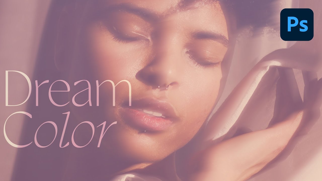
Client work has a way of humbling you. I spent the better part of an afternoon once trying to manually paint a warm, hazy color grade onto a portrait, layer by layer, brush stroke by brush stroke, and the result looked like someone had smeared margarine on the screen. The color was there, technically, but it had no life. No cohesion. What I actually needed was already sitting in another photo on my desktop, and I had no idea I could just… take it.
That’s the core move in this Aaron Nace (PHLEARN) tutorial on creating a dreamlike color effect in Photoshop. Watch the full tutorial on YouTube. The idea is beautifully simple: find an image whose colors you love, blend it over your subject using Screen mode and a heavy Gaussian blur, then push the effect further with a Gradient Map adjustment layer. The whole thing takes maybe ten minutes once you know the steps, and the result is one of those effects that makes people ask “what preset is that?” and you get to say it’s not a preset at all.
It’s also a technique that leans hard on Smart Objects, which, if you’ve ever applied a destructive filter and immediately regretted it (I have, repeatedly, sometimes on client files), you’ll appreciate immediately. Let’s walk through it.
Step 1: Place Your Color-Donor Image Over Your Subject
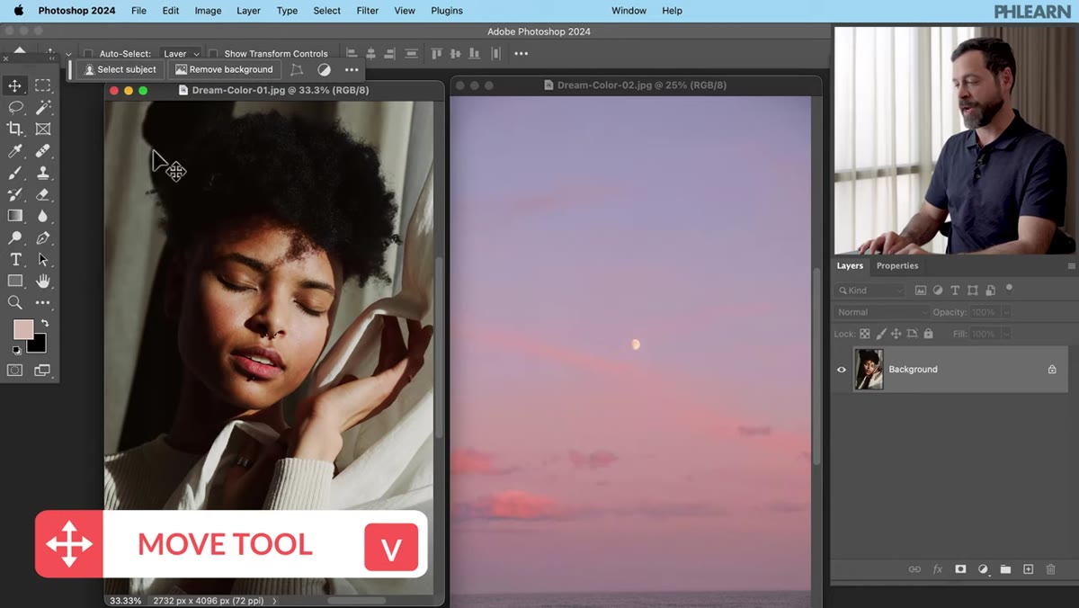 Moving a second image onto the subject photo with the Move tool
Open both images in Photoshop. Grab the Move tool (V, top of the toolbar), then click and drag from your color-donor image directly onto your subject photo. Once it’s there, hit F to enter full-screen mode so you have room to position it. You want the donor image to cover the subject more or less completely. Don’t stress about perfect alignment here because you’re about to blur the life out of it anyway.
Moving a second image onto the subject photo with the Move tool
Open both images in Photoshop. Grab the Move tool (V, top of the toolbar), then click and drag from your color-donor image directly onto your subject photo. Once it’s there, hit F to enter full-screen mode so you have room to position it. You want the donor image to cover the subject more or less completely. Don’t stress about perfect alignment here because you’re about to blur the life out of it anyway.
Step 2: Switch the Blend Mode to Screen
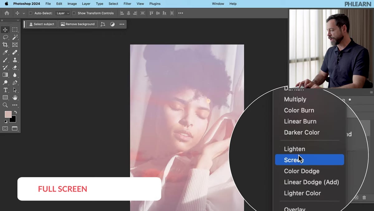 Layer blend mode dropdown changed from Normal to Screen
With your donor image layer selected, go to the blend mode dropdown in the Layers panel (it says “Normal” by default) and switch it to Screen. You’ll immediately see the colors from the donor image start to wash over your subject. It’ll look a bit chaotic at first, especially if the donor image has strong details like clouds or a bright sun, but that’s expected. Screen mode ignores dark pixels and lets light and color bleed through, which is exactly what we want.
Layer blend mode dropdown changed from Normal to Screen
With your donor image layer selected, go to the blend mode dropdown in the Layers panel (it says “Normal” by default) and switch it to Screen. You’ll immediately see the colors from the donor image start to wash over your subject. It’ll look a bit chaotic at first, especially if the donor image has strong details like clouds or a bright sun, but that’s expected. Screen mode ignores dark pixels and lets light and color bleed through, which is exactly what we want.
Step 3: Convert to Smart Object Before Blurring
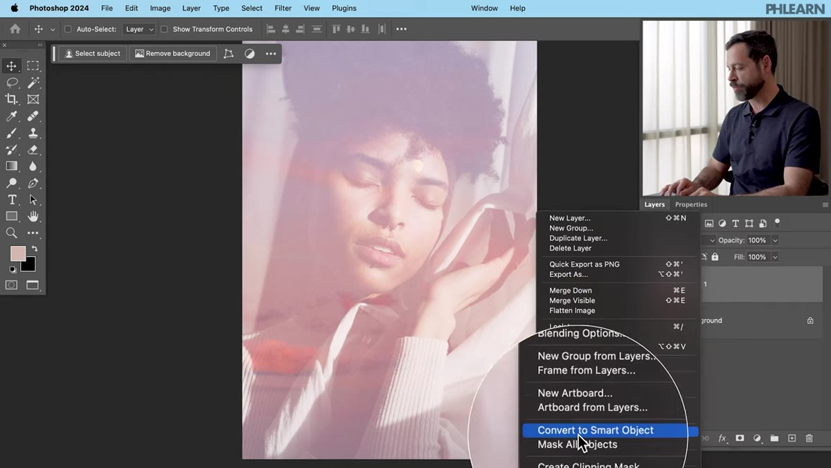 Right-click context menu showing Convert to Smart Object option
Here’s the step that separates a workflow you can iterate on from one you’re stuck with. Right-click on the donor image layer in the Layers panel and select “Convert to Smart Object.” This wraps the layer so that any filter you apply becomes editable and non-destructive. I cannot stress this enough. Smart Objects let you go back and change your blur radius later without starting over. I learned this lesson the hard way on a project where I applied a Gaussian blur directly to a pixel layer, flattened without thinking, and had to rebuild the whole thing from scratch. Do yourself the favor.
Right-click context menu showing Convert to Smart Object option
Here’s the step that separates a workflow you can iterate on from one you’re stuck with. Right-click on the donor image layer in the Layers panel and select “Convert to Smart Object.” This wraps the layer so that any filter you apply becomes editable and non-destructive. I cannot stress this enough. Smart Objects let you go back and change your blur radius later without starting over. I learned this lesson the hard way on a project where I applied a Gaussian blur directly to a pixel layer, flattened without thinking, and had to rebuild the whole thing from scratch. Do yourself the favor.
Step 4: Apply a Gaussian Blur to Kill the Detail, Keep the Color
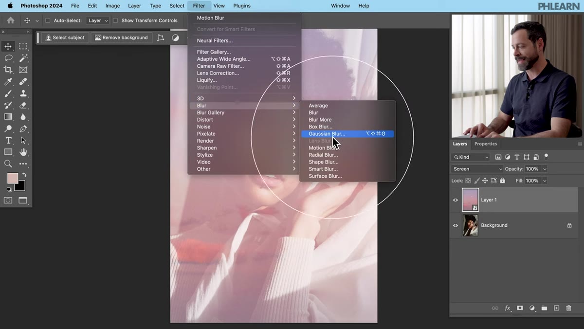 Gaussian Blur dialog box with radius slider being adjusted
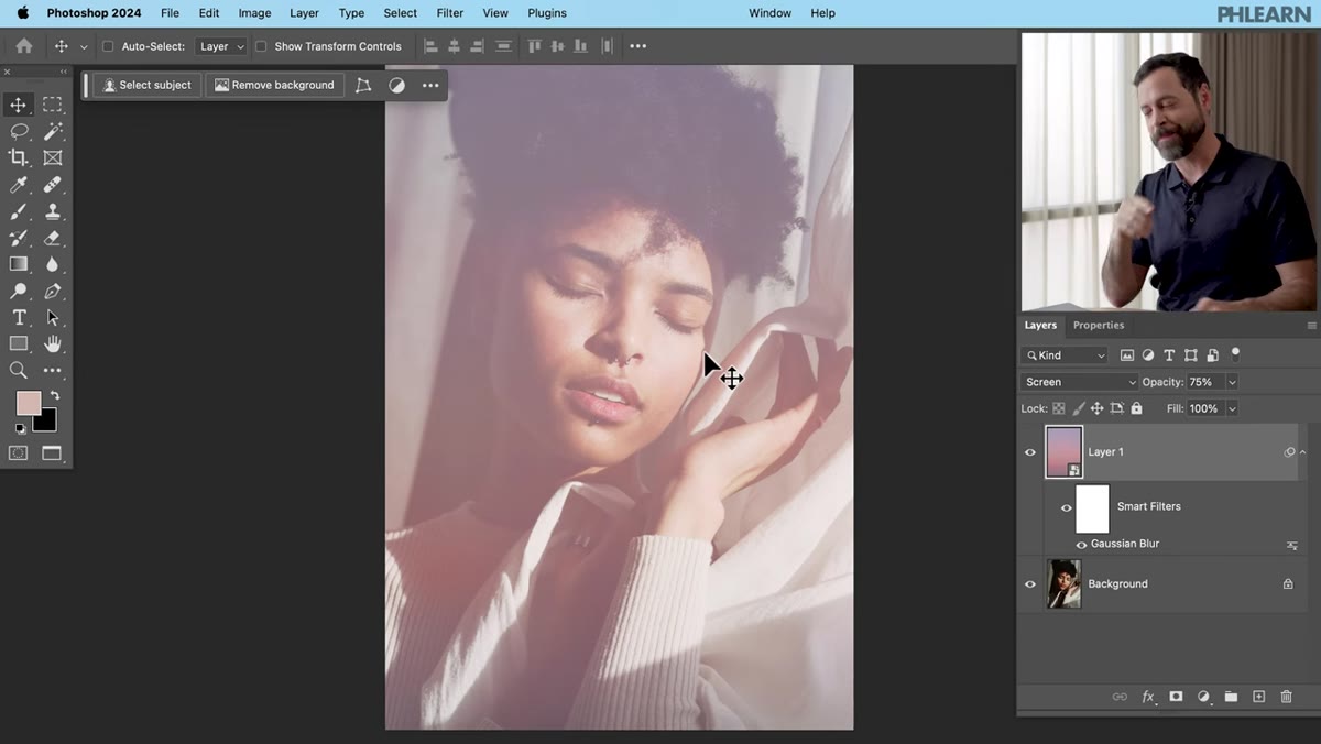
Go to Filter, then Blur, then Gaussian Blur. Drag the radius slider up until you can no longer make out recognizable details from the donor image. You want the colors to bleed smoothly across the subject without any clouds, sun, or textures showing through as distinct shapes. The exact value depends on your image resolution, but you’re looking for a soft, even wash of color. Hit OK. Toggle the layer on and off to see the before and after. Then pull the layer opacity down to taste, somewhere in the 50-75% range is a good starting point, until the color feels integrated rather than pasted on.
Gaussian Blur dialog box with radius slider being adjusted
Go to Filter, then Blur, then Gaussian Blur. Drag the radius slider up until you can no longer make out recognizable details from the donor image. You want the colors to bleed smoothly across the subject without any clouds, sun, or textures showing through as distinct shapes. The exact value depends on your image resolution, but you’re looking for a soft, even wash of color. Hit OK. Toggle the layer on and off to see the before and after. Then pull the layer opacity down to taste, somewhere in the 50-75% range is a good starting point, until the color feels integrated rather than pasted on.
Step 5: Add a Gradient Map Adjustment Layer
 Gradient Map adjustment layer being added via Layer menu
Turn off the donor image layer temporarily so you can see the Gradient Map effect clearly on its own. Click on your background layer to select it, then go to Layer, New Adjustment Layer, Gradient Map. In the Properties panel, open the gradient dropdown. Aaron goes with a purple from the Blues section. Choose something that complements your image’s mood. Once you’ve picked a gradient, check the “Reverse” checkbox in the Properties panel. By default, Gradient Maps apply the darker end of the gradient to the shadows, and depending on which gradient you chose, reversing it will often look far more natural on a portrait.
Gradient Map adjustment layer being added via Layer menu
Turn off the donor image layer temporarily so you can see the Gradient Map effect clearly on its own. Click on your background layer to select it, then go to Layer, New Adjustment Layer, Gradient Map. In the Properties panel, open the gradient dropdown. Aaron goes with a purple from the Blues section. Choose something that complements your image’s mood. Once you’ve picked a gradient, check the “Reverse” checkbox in the Properties panel. By default, Gradient Maps apply the darker end of the gradient to the shadows, and depending on which gradient you chose, reversing it will often look far more natural on a portrait.
Step 6: Stack the Two Effects and Balance the Opacities
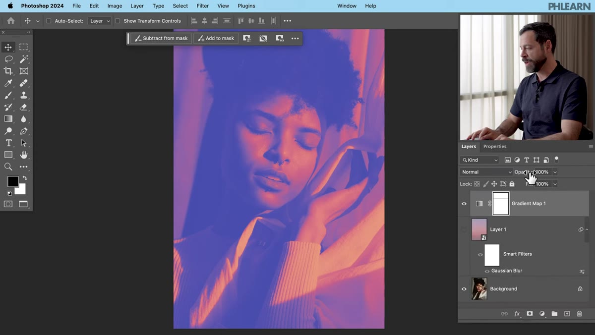 Layers panel showing Gradient Map on top and blurred color layer below
Move your Gradient Map adjustment layer to the top of the layer stack. Now you have the Gradient Map pushing a tonal color shift across the whole image, and the blurred donor image underneath adding its own color contribution via Screen mode. Adjust the opacity of each layer independently. This is where you actually dial in the look. The Gradient Map controls the overall color cast and tonal feel, while the blurred layer adds warmth, haze, or whatever color story your donor image brings. Small opacity tweaks here make a big difference, so go slow.
Layers panel showing Gradient Map on top and blurred color layer below
Move your Gradient Map adjustment layer to the top of the layer stack. Now you have the Gradient Map pushing a tonal color shift across the whole image, and the blurred donor image underneath adding its own color contribution via Screen mode. Adjust the opacity of each layer independently. This is where you actually dial in the look. The Gradient Map controls the overall color cast and tonal feel, while the blurred layer adds warmth, haze, or whatever color story your donor image brings. Small opacity tweaks here make a big difference, so go slow.
Step 7: Duplicate the Background and Add a Motion Blur for Highlight Glow
 Background layer being duplicated with Ctrl/Cmd+J
For that final dreamy, soft-focus quality, select the background layer and hit Ctrl+J (Windows) or Cmd+J (Mac) to duplicate it. Right-click on the duplicate and convert it to a Smart Object again. Then apply a Motion Blur (Filter, Blur, Motion Blur) to it. The goal is to blur the highlights specifically so they bleed softly into the image, simulating the way overexposed film or a lensbaby lens renders bright areas. You’ll use a layer mask and blend mode on this layer to make sure the blur only affects the lighter parts of the image, but even at this stage you can see the effect starting to take shape.
Background layer being duplicated with Ctrl/Cmd+J
For that final dreamy, soft-focus quality, select the background layer and hit Ctrl+J (Windows) or Cmd+J (Mac) to duplicate it. Right-click on the duplicate and convert it to a Smart Object again. Then apply a Motion Blur (Filter, Blur, Motion Blur) to it. The goal is to blur the highlights specifically so they bleed softly into the image, simulating the way overexposed film or a lensbaby lens renders bright areas. You’ll use a layer mask and blend mode on this layer to make sure the blur only affects the lighter parts of the image, but even at this stage you can see the effect starting to take shape.
One Thing I’d Do Differently
The gradient choice Aaron makes is a purple, which works beautifully with a warm sunset donor image. But I’ve found that before you even pick a gradient, it’s worth spending thirty seconds looking at the hue wheel and identifying the two or three dominant colors already in your subject photo. Pick a gradient that has at least one anchor in that range and the whole effect feels intentional rather than like a filter you dragged in from a preset pack. I keep a small folder of screenshots of color palettes from films I like (a habit I picked up from spending too much time on coffee shop wifi watching cinematography breakdowns) and I’ll sometimes match my gradient to those instead of pulling from Photoshop’s built-in library. It sounds fussy, but it’s a five-second decision that makes the final image feel more considered.
The real insight in this technique is that the best color grade for your photo might already exist somewhere else. Instead of building it from scratch with curves and hue sliders, you can borrow it from any image that has the feeling you’re after, blur away the details, and let the color do the work. Smart Objects keep everything flexible, and the Gradient Map gives you a second layer of control over the tonal mood.
Watch the full tutorial on YouTube and see Aaron walk through the whole thing in real time. Well worth ten minutes.
Comments
Leave a Comment