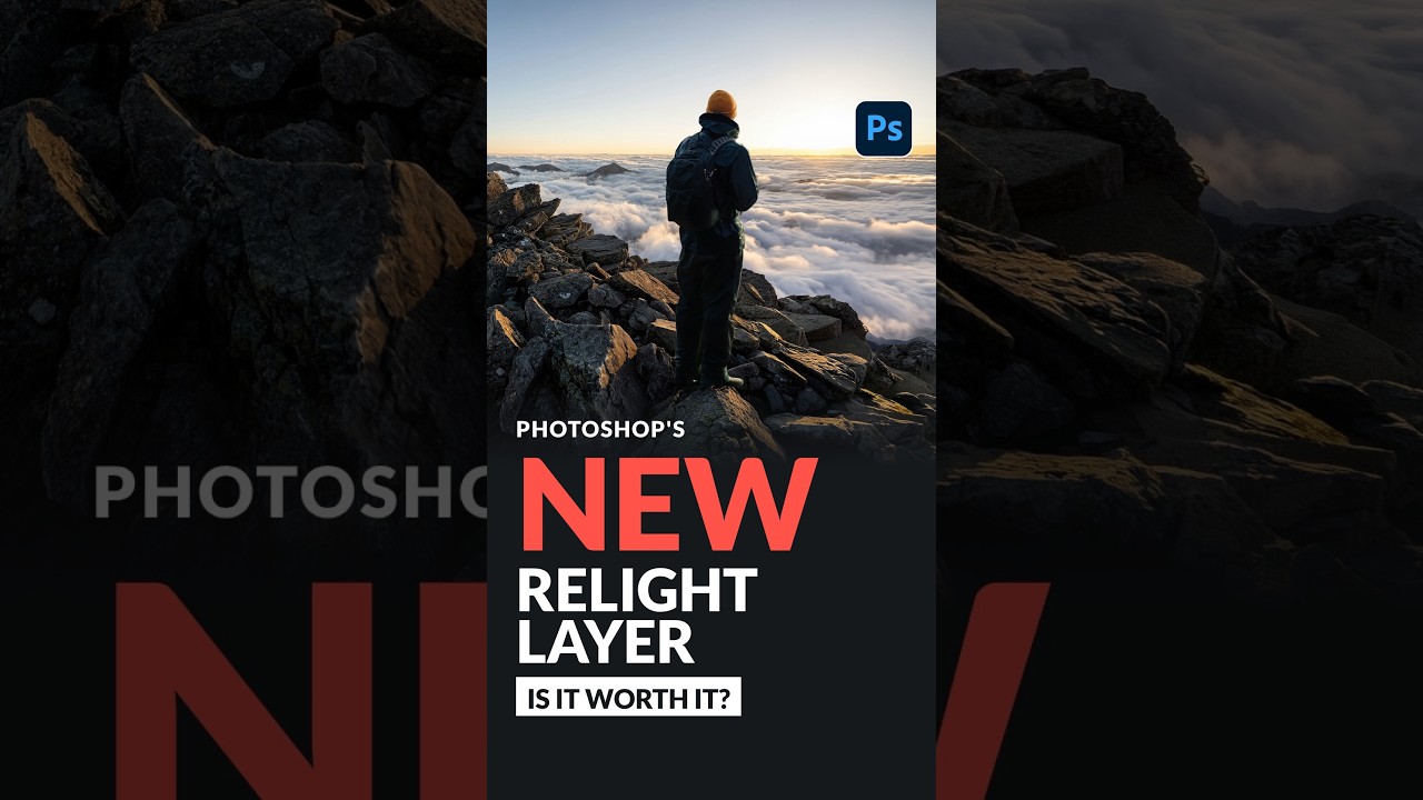
Compositing has always had one brutal problem: you can cut a subject out perfectly, place them into a gorgeous background, and still have the whole thing look completely wrong because the light doesn’t match. The direction is off. The warmth is off. The whole image screams “I made this in Photoshop” in a way that isn’t a compliment. I’ve spent embarrassing amounts of time manually painting in light effects, duplicating layers, messing with blend modes, and praying that nobody zooms in. It works, kind of, but it’s slow and it’s guesswork.
So when I came across this Watch the full tutorial on YouTube from Aaron Nace over at PHLEARN, I stopped what I was doing mid-coffee-shop session and watched it three times. Aaron walks through Photoshop’s brand new Relight Layer feature - currently only available in Photoshop Beta - in seven clean steps, and honestly it solves a problem I didn’t think would get a proper tool for years. The short version: Photoshop can now simulate a light source on your subject after the photo has already been taken. You just tell it where the light is coming from, dial in some settings, and it does the heavy lifting.
There’s a credit cost involved, which we’ll get into, and the output quality has a caveat worth knowing upfront. But Aaron’s pro tip at the end is the kind of thing that makes you feel like you got the real answer, not just the official one. Here’s the full walkthrough.
Step 1: Start on Your Subject Layer
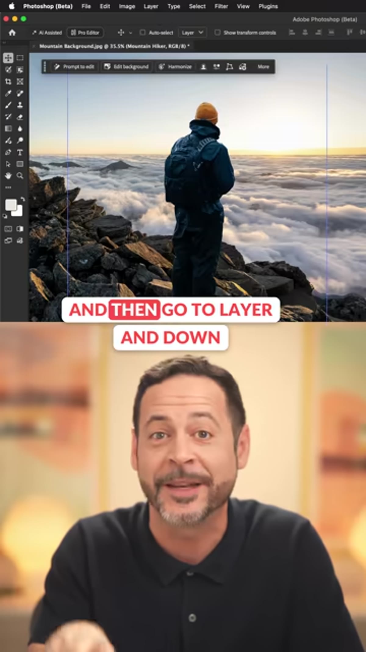 Subject layer selected in the Photoshop layers panel
Before you do anything, make sure you have your subject isolated on its own layer. This tool works on that layer specifically - it’s not a global adjustment. Once you’ve got the right layer selected, go to Layer in the top menu and look for New Relight Layer. That’s your entry point.
This placement in the menu is a little unintuitive if you’re expecting it to live under Filter or somewhere in the adjustments panel, so don’t go hunting for it in the wrong place. Layer menu, New Relight Layer. Bookmark that.
Step 2: Drag the Light to Match Your Background Source
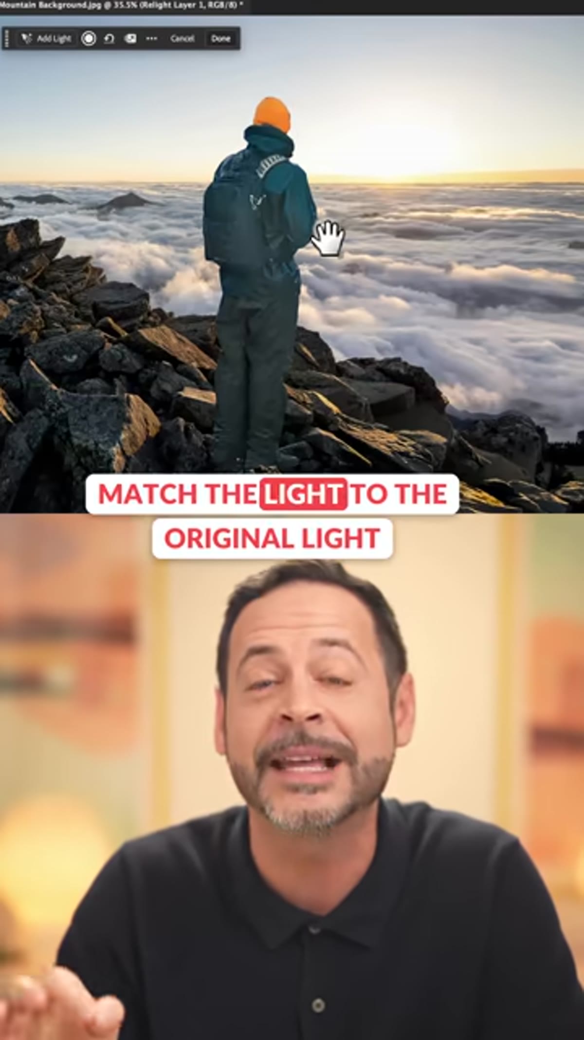 Dragging the light indicator to match the sun’s position
Once the Relight Layer is created, you’ll see a light indicator you can click and drag around the canvas. The idea is to position it to match wherever the real light source is in your background image. In Aaron’s example, he’s working on a composite where the background has a sunset, so he drags the light to line up with the sun’s position.
This is the step that makes the whole thing feel like actual magic. You’re not painting anything. You’re just telling Photoshop “the light is coming from over there” and it recalculates the shading on your subject accordingly. Get this position right and everything downstream gets easier.
Step 3: Open Light Properties and Set Distance
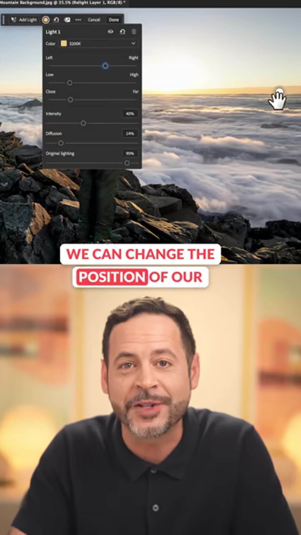 Light properties panel open, Close to Far slider visible
With the light positioned, open the Light Properties panel. One of the first sliders you’ll see controls the distance of the light source - it runs from Close to Far. For most composites involving a subject outdoors under sunlight, you want to push this all the way to Far.
The reason is physics, kind of. A nearby light source creates a more dramatic falloff across a subject - think of a single lamp in a dark room. The sun, by contrast, is so far away that its light hits everything at almost the same angle. Pushing to Far mimics that behavior and keeps the lighting from looking like your subject is standing next to a flashlight.
Step 4: Raise Intensity and Add Diffusion
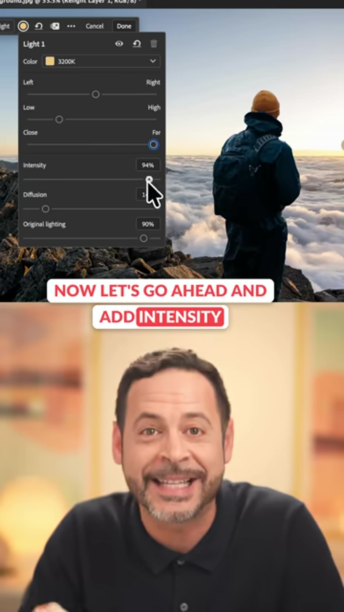 Intensity and Diffusion sliders being adjusted in Light Properties
Intensity controls how bright the simulated light appears on your subject. Bring this up until it feels like it’s actually contributing to the scene - you’ll know it’s too low if the subject still looks like they were photographed in different conditions than the background.
Diffusion is the slider that does a lot of the believability work. A sharp, undiffused light source looks harsh and artificial. Adding diffusion softens the light’s edge, which is more consistent with how natural light actually behaves, especially in golden hour or overcast conditions. Aaron adds both here, and the result starts looking like the subject actually belongs in that background.
Step 5: Set the Color Temperature
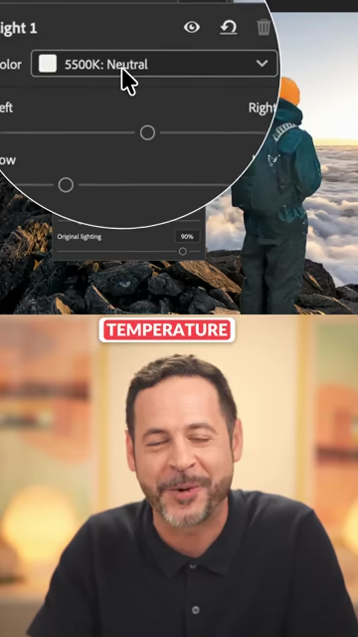 Color temperature slider set to approximately 3200K
This one is easy to overlook and painful when you do. Color temperature controls the warmth or coolness of the simulated light. If your background is a warm sunset and your subject’s lighting is neutral white, they’ll never really look like they inhabit the same moment.
Aaron sets his to around 3200K to match the warm amber tone of the sunset in his background. For reference, daylight sits around 5500-6500K, so 3200K is noticeably warmer - think candlelight territory. Match this to whatever your background light source is doing and it pulls the whole composite together.
Step 6: Click Done - But Know It Costs 30 Credits
 Done button highlighted before generating the Relight result
Here’s the part that matters for your Creative Cloud budget. Everything you’ve done up to this point - positioning the light, adjusting properties, setting temperature - is completely free. You can tweak and preview all day. The moment you click Done, Photoshop uses 30 generative credits to actually render the result.
In the current Beta, that credit system is worth paying attention to. If you’re the type to click Done, decide it’s not quite right, tweak one slider, and click Done again repeatedly, those credits disappear fast. Get your settings where you want them before you commit.
Step 7: Change the Blend Mode to Lighten
 Blend mode dropdown set to Lighten on the Relight layer
This is Aaron’s big tip, and it’s genuinely useful. When you zoom in on the generated Relight Layer output, the quality doesn’t match the resolution of your original photograph. It’s good, but it’s not a pixel-for-pixel match, and at 100% zoom it can look a bit soft or slightly off.
The fix: change the Relight Layer’s blend mode to Lighten. This means the layer only contributes where it’s brighter than what’s underneath it - so it adds the highlights from the simulated light while your original, sharp, full-quality photograph shows through everywhere else. You get the lighting effect without sacrificing image quality. That’s the kind of tip that saves a composite.
A Note on Where This Fits Into a Real Workflow
I’ll be honest - my first instinct was to lean on this as a complete solution. It isn’t quite that yet. The Relight Layer is excellent for rough compositing and client mockups where you need things to read correctly at a glance, and Aaron’s blend mode trick gets it most of the way to production-ready. But for high-end work where someone’s zooming into every pixel, I’d treat it as a starting point and refine from there with manual dodging and burning on a separate layer.
What it does eliminate is the biggest time sink in compositing: the early stage where you’re trying to establish whether a light match is even possible. Now you can answer that question in about two minutes instead of twenty.
The single most important thing to take away here is Aaron’s blend mode trick at the end. The Relight Layer on its own has a quality ceiling - set it to Lighten and your original image does the heavy lifting underneath. That’s what makes this tool usable in real work right now, not just in demos.
Watch the full tutorial on YouTube - Aaron also has a full-length version on the PHLEARN site with sample images, the PSD, and a PDF guide you can download free with an account.
Comments
Leave a Comment