
Compositing is where the job gets humbling fast. You spend an hour cutting out a subject, carefully placing them into a new background, and then you zoom out and realize the lighting is completely wrong. Your subject is flat and cloudy-day soft, but the background is bathed in warm golden-hour sun. The whole thing looks pasted together, because it is. Fixing that mismatch used to mean either a lot of manual dodge and burn work or a series of careful blend-mode hacks that you’d have to rebuild every time the client asked for a revision.
That’s exactly the problem Adobe is swinging at with the new Relight layer, currently sitting in Photoshop beta. In this Aaron Nace (PHLEARN) tutorial, he walks through the full Relight workflow using a real composite, a hiker on a flat overcast day being dropped into a dramatic mountain scene, and tests every available control to see what the tool can actually do. He also tackles the uncomfortable math: Relight costs 30 generative credits per use. Harmonize, by comparison, costs 5. So is Relight three times better, or is Adobe just hoping you won’t notice? Watch the full tutorial on YouTube and then follow along below.
Step 1: Get Photoshop Beta and Set Up Your Composite
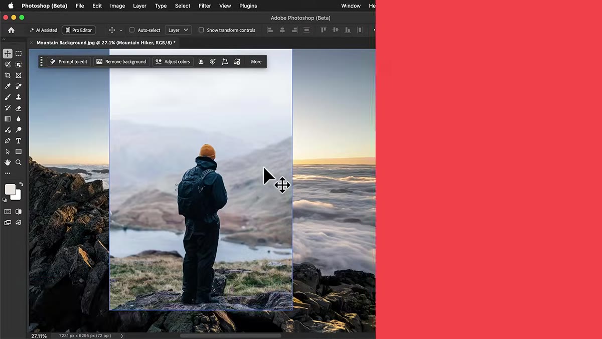 Composite with hiker on new mountain background open in Photoshop
Before you can touch Relight, you need Photoshop beta, not the stable release. Open the Creative Cloud desktop app, find Photoshop in the app list, and look for the beta option. Install it, launch it, and make sure you’re on the latest beta build. Relight is not in the regular Photoshop release as of this writing, so if you don’t see it, this is why.
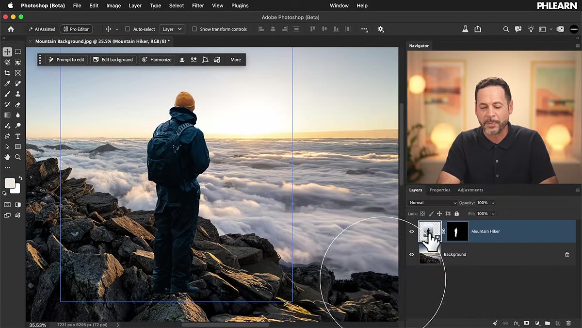
Once you’re in, have your composite ready. In Aaron’s example, the hiker is already cut out and sitting above the mountain background as a separate layer. The subject’s background has been removed, and he’s been positioned on a rock in the scene. You need that same setup: your subject isolated on its own layer, placed above your background. Relight works layer by layer, not on the whole document, so layer organization matters here.
Step 2: Convert the Subject Layer to a Relight Layer
 Layer menu open with New Relight Layer option highlighted
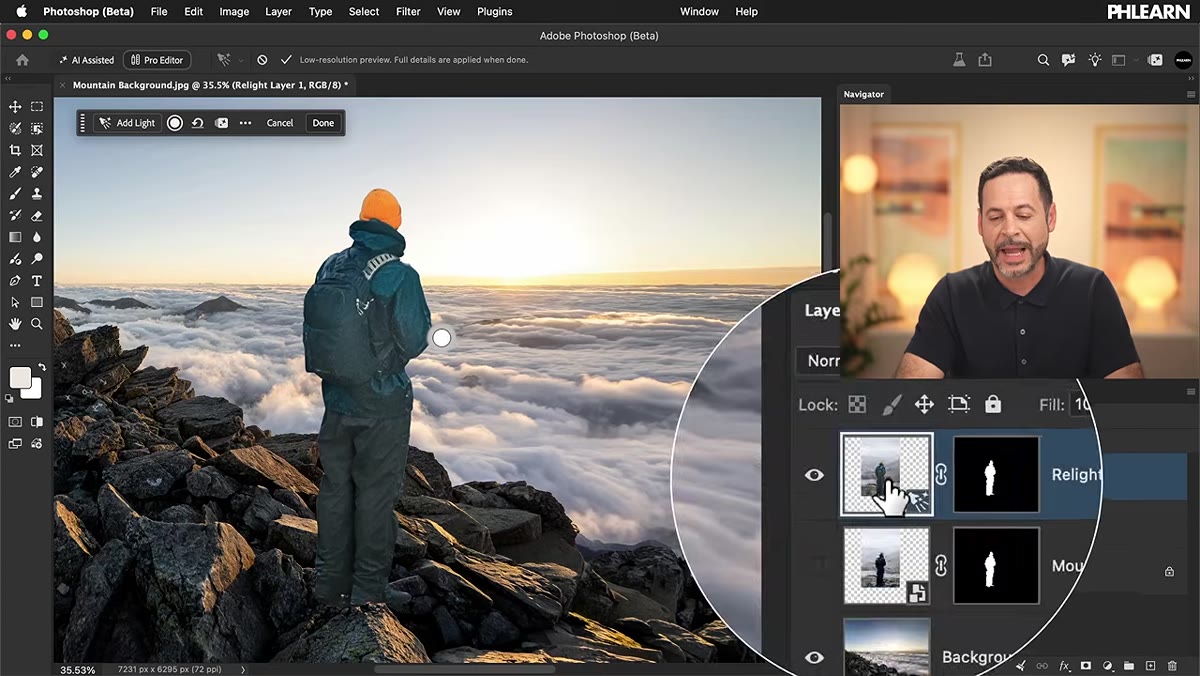
With your subject layer selected in the Layers panel, go to Layer in the top menu bar and choose New Relight Layer. Photoshop will take a moment to prepare the lighting preview. What it’s actually doing is duplicating your selected layer and converting that duplicate into a Relight layer. Your original layer stays intact underneath, which is a nice safety net.
You’ll see the Relight panel appear with a light source indicator, a small draggable point, sitting on your subject. This is your main light handle. Everything from here flows from moving and tuning that point.
Step 3: Position the Light Source to Match Your Background
 Light source handle being dragged over the subject in the canvas
Click directly on the light source handle in the canvas and drag it to wherever your background’s light is coming from. In the composite Aaron is working with, the mountain background has sunlight coming from a specific angle, so he’s pulling the light handle to match that direction. This is the most intuitive part of the whole tool. It behaves the way you’d expect: drag toward the upper right, the light hits the subject from the upper right.
You can also use the two position sliders in the Relight panel, which control left-to-right and low-to-high placement, but honestly just dragging the handle directly on the canvas is faster and more tactile. The sliders update to reflect wherever you drag, so they’re really just a readout more than an input method.
Step 4: Adjust Color Temperature to Match the Scene’s Light
 Color temperature slider being adjusted in the Relight panel
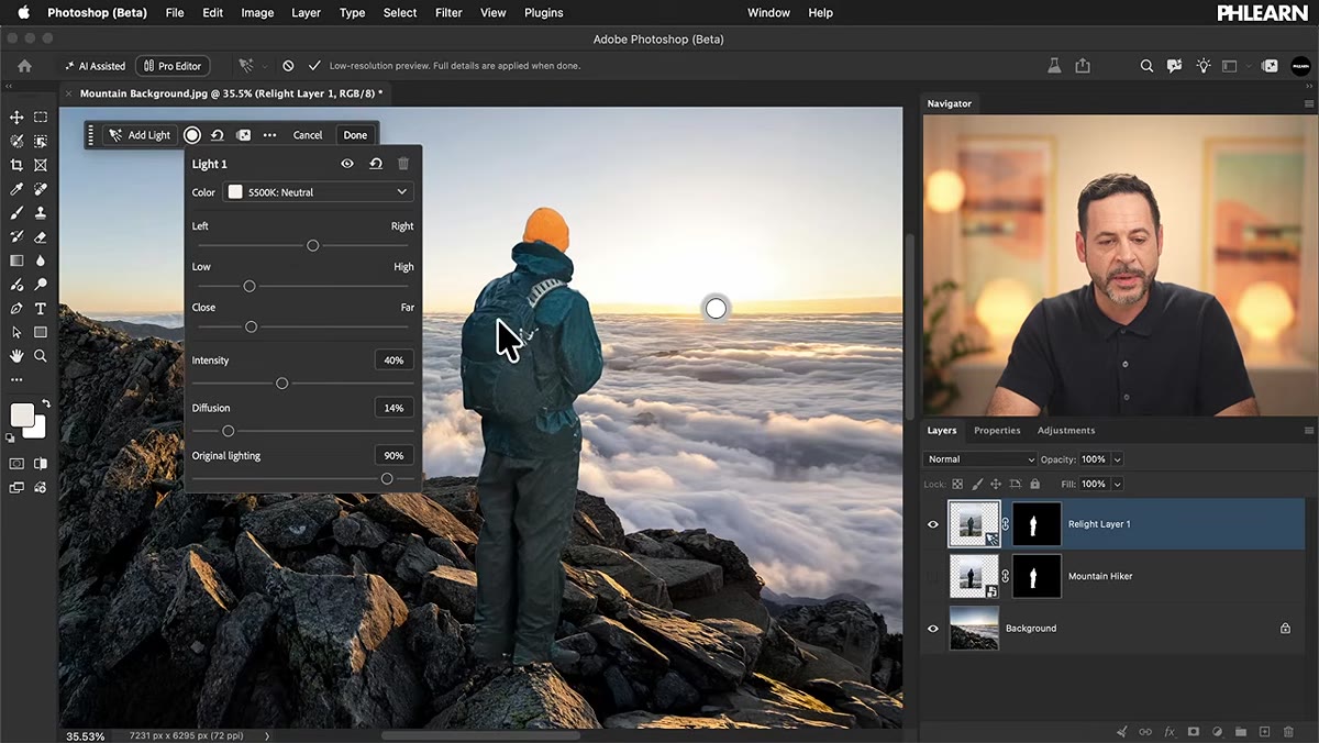
Once your light is positioned, dial in the color temperature. The default starting point sits in neutral territory, but if your background has warm sunset or golden-hour light, you need to push this slider warmer. Aaron bumps his up to around 3200K to get the light on the hiker to read as the same warm sun hitting the mountains behind him.
This slider matters more than people expect. Getting the position right but leaving the temperature cold means your subject still looks like they came from a different world. Color temperature is the thing that makes a composite feel like one photo rather than two.
Step 5: Use Close to Far to Control Light Behavior
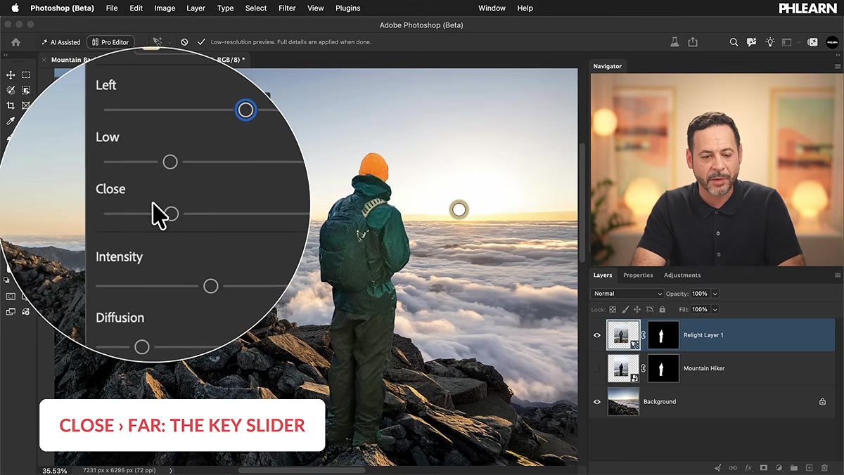 Close to Far slider being moved from left to right in the panel
This is the slider Aaron calls the most important one, and after watching it in action, I’d agree. The Close to Far slider changes how the light wraps around the subject. At the close end, the light behaves like it’s right next to the subject, creating a tight, localized highlight. As you push it toward far, the light starts to behave more like a distant source, the sun, for example, and it wraps across the subject differently.
In the tutorial, pushing this slider toward far causes the light to pass around and past the hiker in a way that looks genuinely like sunlight raking across him from a distance. For any composite where your background light source is far away, like the sun or a distant street lamp, you want this pushed toward the far end. Push it slowly and watch the preview.
Step 6: Set Intensity and Diffusion
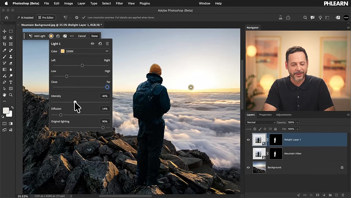 Intensity and Diffusion sliders being adjusted in sequence
Intensity controls how bright the added light is. For a sunny outdoor scene, you want this up. Aaron cranks it high to sell the idea that direct sunlight is hitting the subject. If you’re matching a softer, overcast background, you’d keep this lower.
Diffusion softens the edge quality of the light. Move it up slowly rather than dragging it straight to 100. A little diffusion makes the light feel natural and atmospheric. Too much and it starts to look smeared and artificial. Aaron finds his sweet spot somewhere in the middle and leaves it there. The right value depends entirely on your scene, so don’t treat this as a set-and-forget number.
Step 7: Hit Done and Evaluate the Result
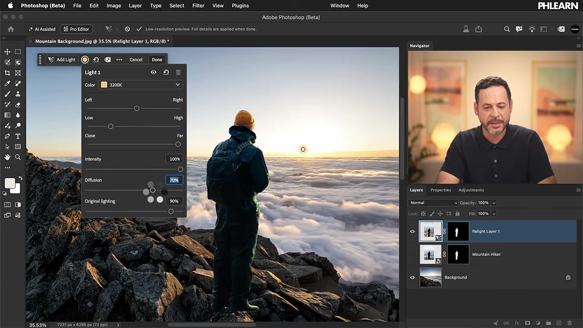 Final relit composite with hiker and mountain background
When you’re happy with the preview, click Done. This is the moment Photoshop charges 30 generative credits. The processing runs, and you get your final Relight layer. Aaron then compares this result zoomed in against Harmonize, which costs only 5 credits, to see if Relight’s output justifies the price difference.
One trick he shows: set the Relight layer’s blend mode to Lighten. This lets only the light added by the Relight layer affect the image, stripping away any parts of the result where the AI made choices you didn’t love. It’s a useful escape hatch when the full Relight output goes slightly sideways in the shadows or midtones.
My Take: Treat the Credit Cost Like a Finishing Tool, Not a First Pass
I wouldn’t burn 30 credits on every iteration while I’m still figuring out the composite. Get your background, positioning, and rough lighting direction sorted first using manual techniques, dodge and burn, color grading layers, whatever you’ve got. Then, when the composite is basically done and you need that final “this actually looks like one photo” push, that’s when you call in Relight.
Think of it the way you’d think about a senior retoucher you hire for the last pass on an important project. You wouldn’t have them sitting around watching you rough things in. You bring them in when the work is close. Thirty credits starts to feel a lot more reasonable when you’re using Relight to close out a near-finished composite rather than treating it as a live editing tool.
The tool is genuinely impressive, especially that Close to Far slider doing things that would take a long time to fake manually. Whether 30 credits is worth it versus Harmonize’s 5 comes down to how much time you’d spend doing it by hand. For complex composites with strong directional light, the answer is probably yes. For softer scenes where Harmonize can do most of the heavy lifting, maybe not.
Watch the full tutorial on YouTube to see Aaron’s side-by-side credit comparison and the Lighten blend mode trick demonstrated live.
Comments (2)
Clear and practical. No fluff. Appreciate that.
Been doing this wrong for years apparently. Thanks for the wake-up call.
Leave a Comment