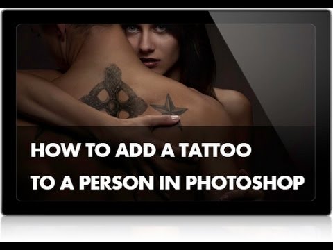
Client work has a way of throwing curveballs. A few years back, someone asked me to mock up what a sleeve tattoo would look like on their arm before they committed to the real thing. I figured it would take twenty minutes. Two hours later I had something that looked like a temporary tattoo applied by a toddler. The skin texture was fighting the ink, the tones were all wrong, and the whole thing screamed “Photoshop disaster.” I wish I’d had this tutorial then.
In this Aaron Nace (PHLEARN) tutorial, Watch the full tutorial on YouTube, Aaron walks through the entire process of lifting a tattoo from one photo and transplanting it convincingly onto a different person’s skin. The approach he uses isn’t just clever, it’s genuinely useful for anyone doing body art mockups, editorial compositing, or just messing around and wanting it to look like you actually tried. The core of it is blend mode logic and understanding how tattoo ink interacts with the skin underneath, which is something most people skip entirely and then wonder why it looks fake.
What I like about this particular method is that it’s not overly precious. Aaron moves fast, makes decisions, and explains the reasoning without padding. I’ve pulled the key steps out below so you can follow along without scrubbing through the video, but the full version is worth watching too.
Step 1: Select and Move the Tattoo Image into Your Working Document
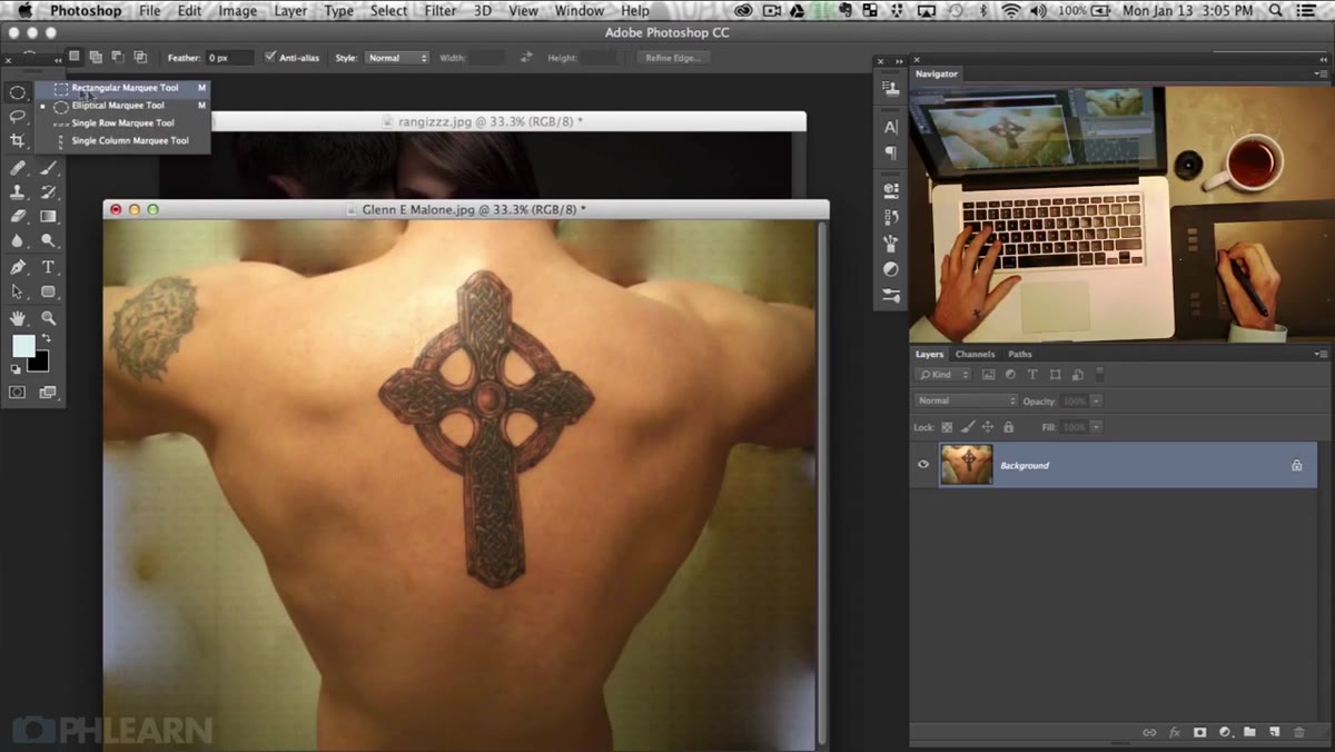 Marquee tool selecting tattoo region before dragging to new document
Grab the Marquee tool and rough-select the tattoo from your source image. You don’t need to be surgical here since you’re going to clean it up later. Use the Move tool to drag the selected area directly into your destination document. Once it’s there, drop the layer opacity down so you can see through it and start eyeballing the placement before you commit to anything.
Marquee tool selecting tattoo region before dragging to new document
Grab the Marquee tool and rough-select the tattoo from your source image. You don’t need to be surgical here since you’re going to clean it up later. Use the Move tool to drag the selected area directly into your destination document. Once it’s there, drop the layer opacity down so you can see through it and start eyeballing the placement before you commit to anything.
This is also the right moment to hit Command+T (Ctrl+T on Windows) and bring up Free Transform. Scale and rotate until the tattoo sits roughly where you want it on the body. If you’re placing it on a curved surface like a shoulder or forearm, Aaron mentions that the Warp tool or Liquify can help conform the art to the body’s contour. For a flat surface like a back, a straight transform usually gets the job done.
Step 2: Isolate the Tattoo Ink Using the Magic Wand
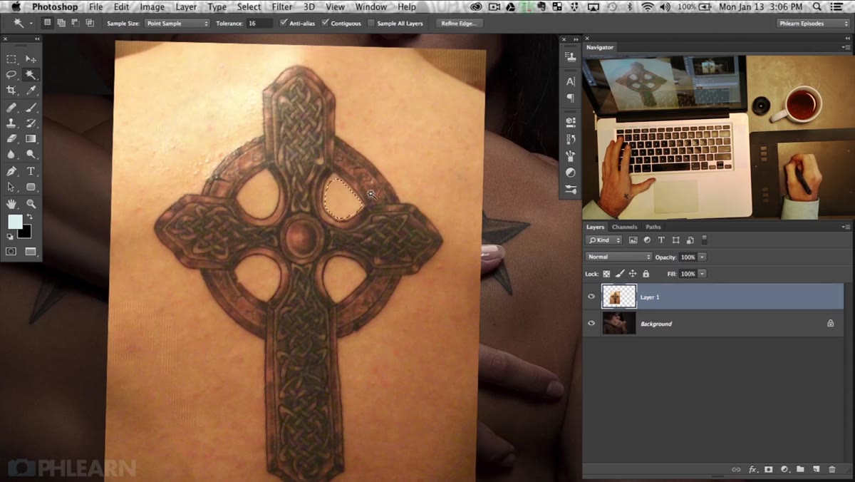 Magic Wand tool active, tolerance setting visible in options bar
Here’s where you start separating the ink from the skin of the source image. Select the Magic Wand tool and bump the Tolerance up in the options bar. A low tolerance grabs tiny isolated patches; a higher setting pulls in more of the surrounding area in one click. The goal is to select the background skin, not the tattoo lines themselves.
Magic Wand tool active, tolerance setting visible in options bar
Here’s where you start separating the ink from the skin of the source image. Select the Magic Wand tool and bump the Tolerance up in the options bar. A low tolerance grabs tiny isolated patches; a higher setting pulls in more of the surrounding area in one click. The goal is to select the background skin, not the tattoo lines themselves.
Hold Shift to add to your selection as you click through the lighter skin-colored areas. Work your way around the tattoo methodically. If the wand grabs something it shouldn’t, hold Alt (Option on Mac) to subtract from the selection instead of starting over. Aaron also brings in the Lasso tool for areas where the wand is being unpredictable, which is honestly half the time on anything with complex gradients or uneven lighting.
Step 3: Refine the Selection and Mask Out the Skin
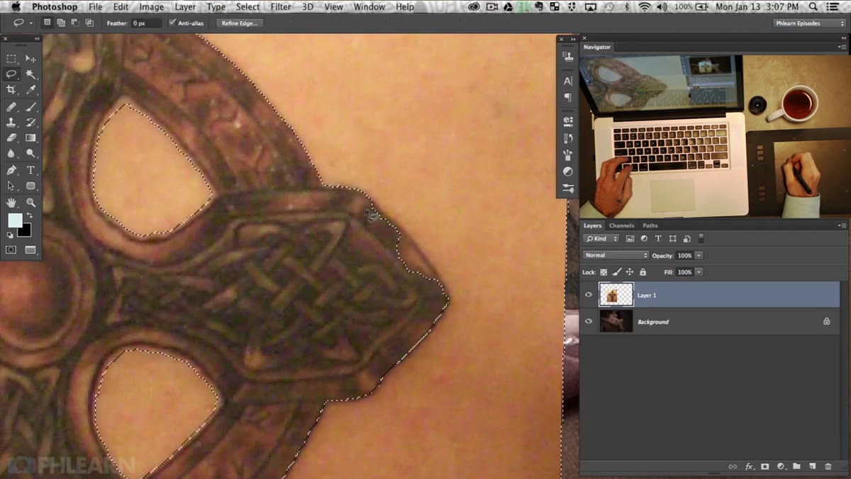 Lasso tool refining selection edges around tattoo border
Once you’ve got most of the skin selected, use the Lasso tool with the Shift or Alt keys to tighten up any weird edges or missed patches. You’re building toward a clean selection of just the tattoo artwork. When the selection looks solid, add a Layer Mask to the tattoo layer. This hides the skin from the source photo and leaves only the ink sitting on top of your subject.
Lasso tool refining selection edges around tattoo border
Once you’ve got most of the skin selected, use the Lasso tool with the Shift or Alt keys to tighten up any weird edges or missed patches. You’re building toward a clean selection of just the tattoo artwork. When the selection looks solid, add a Layer Mask to the tattoo layer. This hides the skin from the source photo and leaves only the ink sitting on top of your subject.
The mask approach is always better than deleting pixels outright. You’ll inevitably want to paint back a little here or tweak an edge there, and a mask lets you do that non-destructively with a black or white brush. Paint black on the mask to hide, white to reveal. It’s one of those fundamentals that sounds obvious until you’ve spent 45 minutes trying to undo a destructive edit.
Step 4: Set the Blend Mode to Multiply
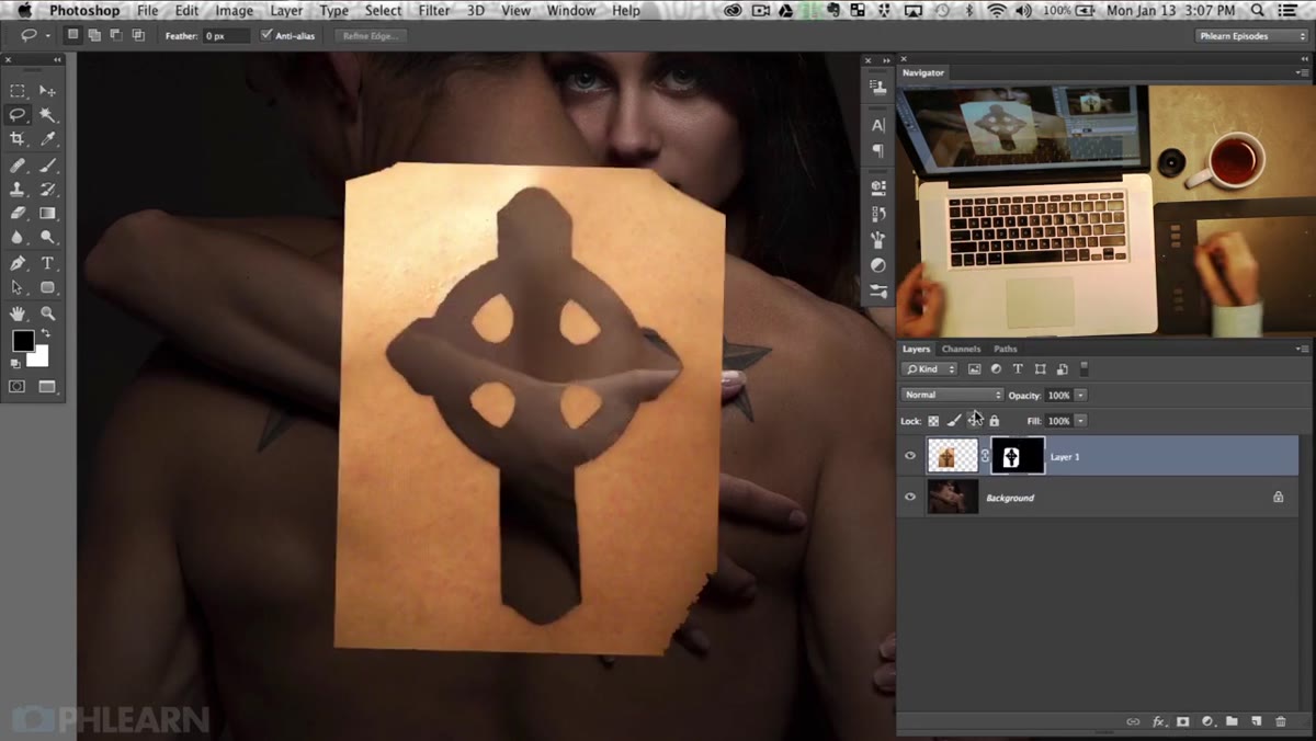 Layers panel showing tattoo layer with Multiply blend mode selected
This is the step that makes the whole thing click. With your tattoo layer selected, open the blend mode dropdown in the Layers panel and switch it to Multiply. Multiply essentially ignores anything white on a layer and makes the darker tones interact with whatever is underneath. The skin of your subject shows through, and the tattoo ink sits on top of it like it was always there.
Layers panel showing tattoo layer with Multiply blend mode selected
This is the step that makes the whole thing click. With your tattoo layer selected, open the blend mode dropdown in the Layers panel and switch it to Multiply. Multiply essentially ignores anything white on a layer and makes the darker tones interact with whatever is underneath. The skin of your subject shows through, and the tattoo ink sits on top of it like it was always there.
At this point you’ll already see a massive improvement in realism. The skin texture bleeds through the tattoo because Multiply is letting it. That’s exactly what real tattoos look like, the skin is still skin, just with pigment in it. Adjust the layer opacity to taste depending on how bold or faded you want the tattoo to read.
Step 5: Match the Tone and Color to the New Skin
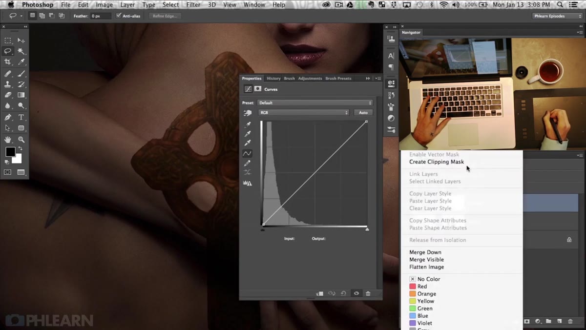 Hue Saturation adjustment layer clipped to tattoo layer
A tattoo ripped from someone else’s skin is going to carry that person’s skin tone with it, even after the Multiply mode does its work. Add a Hue/Saturation or Color Balance adjustment layer clipped directly to the tattoo layer (hold Alt and click between the two layers in the panel to clip it). Use this to shift the warmth, saturation, or overall hue of the ink until it stops looking like a foreign object and starts looking like it belongs.
Hue Saturation adjustment layer clipped to tattoo layer
A tattoo ripped from someone else’s skin is going to carry that person’s skin tone with it, even after the Multiply mode does its work. Add a Hue/Saturation or Color Balance adjustment layer clipped directly to the tattoo layer (hold Alt and click between the two layers in the panel to clip it). Use this to shift the warmth, saturation, or overall hue of the ink until it stops looking like a foreign object and starts looking like it belongs.
This step is also where you can age the tattoo slightly if needed. Dropping saturation a touch and softening the contrast a hair goes a long way toward making new ink look like it’s been on someone’s body for a few years rather than applied this morning.
A Note From My Own Experience: Source Material Matters More Than You Think
The biggest variable I’ve run into with this technique is the quality of the source tattoo image. Aaron mentions that line-art tattoos work best because they read as graphic and flat, which is exactly how Multiply blend mode wants to interpret them. Photorealistic tattoos or ones with heavy shading get complicated fast because they carry so much tonal information that the blend mode starts producing muddy results.
My advice: if you’re sourcing a tattoo from a reference photo online, look for shots taken in flat, even lighting with no harsh shadows across the tattoo itself. Any shadows baked into the source image will composite into your final image and confuse the eye. If you’re building a tattoo from scratch using custom linework or vector art, you’ve got a cleaner starting point than most. The technique holds either way, but your life gets easier with cleaner source material.
The single most important thing this tutorial nails is the Multiply blend mode logic. Everything else, the masking, the color correction, the transform work, is fairly standard compositing. But understanding WHY Multiply makes ink look like ink on skin rather than ink on top of skin is the insight that separates a convincing result from a sticker slapped onto a photo.
Watch the full tutorial on YouTube to see Aaron walk through the whole process in real time, including some additional highlight and shadow work that really sells the final result.
Comments
Leave a Comment